react-google-oauth
 react-google-oauth copied to clipboard
 CyrilSiman
A Google OAuth component for React
react-google-oauth
Directly inspired from react-google-login project.
With react-google-oauth you can quickly and easly add Login and Logout Google button.
- How it works
- Install
-
How use it
-
1- Inject and init Google API script
-
GooleApi props
- onUpdateSigninStatus - Callback
- onInitFailure - Callback
-
GooleApi props
-
2- Add a button
- GoogleLogin params
- GoogleLogout params
-
3- Get informations
- googleGetBasicProfil
- googleGetAuthResponse
-
1- Inject and init Google API script
-
Rendering
- <GoogleLogin> & <GoogleLogout>
- Text, Color, Width
- <CustomGoogleLogin> & <CustomGoogleLogout>
How it works
This module is composed by two kind of components :
- <GoogleAPI> used to inject and initialize the Google Api with your Google client ID, follow this Google's documentation to get yours
- <GoogleLogin> <GoogleLogout> <CustomGoogleLogin> <CustomGoogleLogout> components used to display buttons and connect each clickEvents to Google Oauth Api.
Install
npm install react-google-oauth
How use it
1- Inject and init Google API script
Add <GoogleAPI> component in your tree
import React from 'react';
import ReactDOM from 'react-dom';
import {GoogleAPI} from 'react-google-oauth'

ReactDOM.render(
        <GoogleAPI clientId="YOUR CLIENT ID"
            onUpdateSigninStatus={Function}
            onInitFailure={Function} >
         	<YourApp />
        </GoogleAPI>, document.getElementById('root'));
By default the Google API is initialize to make a simple Oauth with profile...
Caution : As other React component <GoogleAPI> can have only one child
GooleAPI props
See Google documentation for complete values
| Parameters | Default value | Comment | Type |
|---|---|---|---|
| clientId | REQUIRED | String | |
| responseType | 'permission' | String | |
| prompt | '' | Doc | String |
| cookiePolicy | 'single_host_origin' | String | |
| fetchBasicProfile | true | Automatically add profile and email in Scope see Doc | Bool |
| uxMode | 'popup' | String | |
| hostedDomain | None | String | |
| redirectUri | None | String | |
| scope | '' | More scope on this page | String |
| onUpdateSigninStatus | f => f | See below | Func |
| onInitFailure | err => console.error(err) | See below | Func |
onUpdateSigninStatus - Callback
Doc : listen for changes in the current user's sign-in state
A function that takes a boolean value. Passes true to this function when the user signs in, and false when the user signs out.
onInitFailure - Callback
The function called with an object containing an error property, if GoogleAuth failed to initialize
2- Add a button
Add a button component under GoogleAPI (each button component check if it is a child of GoogleAPI, if not an error message is displayed)
import React from 'react';
import ReactDOM from 'react-dom';
import {GoogleAPI,GoogleLogin,GoogleLogout} from 'react-google-oauth'

ReactDOM.render(
        <GoogleAPI clientId="YOUR CLIENT ID"
            onUpdateSigninStatus={CALLBACK}
            onInitFailure={CALLBACK} >
			<div>
              	<div><GoogleLogin /></div>
              	<div><GoogleLogout /></div>
    		</div>
        </GoogleAPI>, document.getElementById('root'));
GoogleLogin params
| Callback | Default value | Comment |
|---|---|---|
| onLoginSuccess(response) | f => f | Function called when the authentification is done. Maybe it's more preferable to use onUpdateSigninStatus from <GoogleAPI>. Fulfilled with the GoogleUser instance when the user successfully authenticates and grants the requested scopes. |
| onLoginFailure(error) | f => f | function called when a error occured. By example when a user closed the Google's popup before he choiced an account. This function take an object containing an error property. See Error Code on Google's documentation for more details. |
| onRequest() | f => f | Called just before the call to Google Api Script, you can used this callback to display a loader by example. None parameter. |
| Text | ' Sign in with Google' | Text displayed in button |
| backgroundColor | #4285f4 | See Rendering paragraph |
| disabled | False | See Rendering paragraph |
| width | 240px | See Rendering paragraph |
GoogleLogout params
| Callback | Default value | Comment |
|---|---|---|
| onLogoutSuccess() | f => f | Function called when the user has been signed out |
| onLogoutFailure(error) | f => f | function called when a error occured. This function take an object containing an error property. See Error Code on Google's documentation for more details. |
| onRequest() | f => f | Called just before the call to Google Api Script, you can used this callback to display a loader by example. None parameter. |
| Text | ' Sign in with Google' | Text displayed in button |
| backgroundColor | #4285f4 | See Rendering paragraph |
| disabled | False | See Rendering paragraph |
| width | 240px | See Rendering paragraph |
3- Get informations
Tow methods can help you to get informations
googleGetBasicProfil
return {id : basicProfile.getId(),
name : basicProfile.getName(),
givenName :basicProfile.getGivenName(),
familyName : basicProfile.getFamilyName(),
imageUrl : basicProfile.getImageUrl(),
email : basicProfile.getEmail(),
hostedDomain : authInstance.currentUser.get().getHostedDomain(),
scopes:authInstance.currentUser.get().getGrantedScopes()}
googleGetAuthResponse
return {accessToken : authResponse.access_token,
id_token : authResponse.id_token,
scope : authResponse.scope,
expiresIn : authResponse.expires_in,
firstIssuedAt : authResponse.first_issued_at,
expiresAt : authResponse.expires_at}
Rendering
<GoogleLogin> & <GoogleLogout>
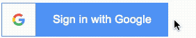
Without parameters, buttons look like this :
<GoogleLogin />
<GoogleLogout />


Text, Color, Width
With pre-define rendering you can only change the text, the width and the background color.
Sample
<GoogleLogin
  	backgroundColor="#A31515"
  	text="login"
  	width="180px"
  	/>

Hover and active state are automaticaly generate (opacity 50% for Hover state and filter:brightness(80%) for active state.)
Login button
| Parameter | Default value |
|---|---|
| text | Sign in with Google |
| width | 240px |
| backgroundColor | #4285f4 |
Logout button
| Parameter | Default value |
|---|---|
| text | Sign out |
| width | 180px |
| backgroundColor | #A31515 |
<CustomGoogleLogin> & <CustomGoogleLogout>
With CustomGoogleLogin and CustomeGoogleLogout you can custom button as you want.
| Parameters | Type | Comment |
|---|---|---|
| tag | String | You can choose kind of tag use for rendering. An onClick event is attached on this tag during rendering |
| className | String | CSS class |
Sample with this rendering 
<CustomGoogleLogout tag="div" >
<svg version="1.1" xmlns="http://www.w3.org/2000/svg" width="40px" height="40px" clipRule="evenodd" fillRule="evenodd" viewBox="0 0 500 500">
	<defs><linearGradient gradientUnits="userSpaceOnUse" id="a" x1="362.554" x2="47" y1="227.99" y2="227.99"><stop offset="0" stopColor="#008BFF" /><stop offset="1" stopColor="#0af" />
	</linearGradient></defs>
	<g>
		<rect fill="#D5D6D6" height="389" rx="23" ry="22" width="250" x="210" y="35" />
		<path d="M293 35h144c13 0 23 10 23 23v327c0 13-11 26-23 23l-144-35c-12-3-23-10-23-23v-292c0-13 10-23 23-23z" fill="#f5f5f5" stroke="#434242" strokeWidth="10" />
		<rect fill="none" height="389" rx="23" ry="22" stroke="#434242" strokeWidth="30" width="250" x="210" y="35" />
		<path d="M359 236l-95 73c-4 2-7 3-11 1-3-2-6-5-6-9v-42h-190c-5 0-10-5-10-10v-40c0-5 4-10 10-10h190v-44c0-4 3-7 6-9 4-2 7-1 11 1l95 73c2 2 4 5 4 8s-2 6-4 8z" fill="url(#a)" stroke="#434242" strokeWidth="10" />
	</g>
</svg>
</CustomGoogleLogout>
 CyrilSiman