On small window not all information is displayed correctly
Checklist
- [X] I'm reporting a problem with Chatterino
- [X] I've verified that I'm running the most recent nightly build or stable release
- [X] I've looked for my problem on the wiki
- [X] I've searched the issues and pull requests for similar looking reports
Describe your issue
2 Issues that may belong together
If you have multiple Tabs open, the last Tab sticks to the "add chat button (+)" and gets in the second line if its not enough space in the first line for both.
The stream information bar under the tabs looks ugly or doesn't show everything when the main window is small and shows a lot of information or the username is too long
Screenshots
waste of space
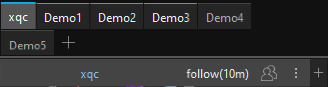
Not everything can be displayed correctly on a small window

OS and Chatterino Version
Chatterino Nightly 2.3.5 (commit 63119661 modified) Windows 10
Some ideas I had
- option to show the "add chat button" and the "add split button" only if "CTRL + ALT" or something else is pressed
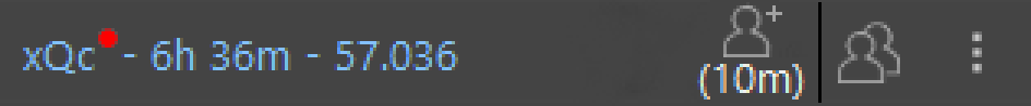
- instead of displaying "xqc (live)", display a small red dot after the channel name, just like the tabs themselves do
- for follower mode, slow mode,... maybe some little icons for each status, like in my quick edited screenshot for follower mode
These are my ideas, what are your opinions on them
Quick edit (more space to display more things or longer usernames correctly)
Does no one have an opinion on that? Have I done anything wrong by creating these issues, except for the misclick?
Does no one have an opinion on that?
Not really, I'm aware of the "last" channel always jumping to the next line even if there's space (keeping an empty channel on the last line fits the channel back into the spot), but as for the small window not having enough room, that seems very low priority.