Wallet Scrutiny: Collaboration

Wallet Scrutiny
Website Making an issue to track details relating to the WalletScrutiny project collaboration with the community. We have a Slack channel called #wallet-scruitny where discussions around this project are happening. Below are some details of the project:
Introduction
WalletScrutiny aims to enhance the security of all bitcoin wallets, by open sourcing the evaluations of their source code. The primary focus is reproducibility, a test that ensures the wallet that someone is using actually matches the code published online. If this test fails, the wallet is not truly public source and thus was not open to community QA, which creates a security hole that could threaten the balances of all associated wallets. This is what they aim to fix. WalletScrutiny's verdicts are supposed to be 100% verifiable by mildly technical people. Everything is 100% transparent.
What they currently do: ✅ Produce security verdicts on 3000+ mobile and hardware wallets ✅ Write in-depth documentation on the analysis of each wallet ✅ Provide navigation of wallets and verdicts via search
Project goals
-
User Experience Improve the UX with the 3 target users in mind
-
Education Education around binary transparency.
-
Contributors Get more involvement from the below groups: a. People who are knowledgeable about reproducible builds, get more reviews from them which would help to build trust b. Get more involvement from wallet provider
Resources
Call recording #2.
Discussions for this project has now moved to Discord: https://discord.gg/XnvyCWWv
I reviewed the site, created a few mock-ups and shared some first thoughts in a video here, which I also shared in Discord.
I think overall we can split things up into 3 tasks:
- Branding
- Web design
- Information design
Branding We can open this one up easily to the community as it's a fun and fairly easy task to contribute to (meaning it doesn't require deep understanding of security reviews, etc). We could do the process of giving one week for anyone to come up with concepts (can be rough). The we pick 2-3 of them and flesh them out a bit further. Then we pick a direction and finalize it. This process has worked out well for branding other projects.
Web design This is about applying the branding, but also improving usability. For example, making the home page more focused on finding wallets and the filters more usable, and moving tertiary content to sub-pages. It's also about copy-writing to communicate the site purpose more clearly, etc.
Information design This is about going deep on the methodology and how to best communicate the result of the security reviews. The second half of the video above explains some of those things - for example splitting up test results into multiple categories rather than a single "tag". This requires more in-depth conversation with the group as a whole (and therefore also more time).
What do you think? We discussed some of this already last week, just wanted to share some additional thoughts as doing mock-ups and the video helped me get a clearer idea of a few things.
Thanks alot for this Christoph. 100% agree with those 3 main buckets. Updated the Googledoc with those 3 buckets as headings. (pg4 UX Plan).
Added in some additional points under each heading which we discussed in the call:
Branding
We can open this one up easily to the community as it's a fun and fairly easy task to contribute to (meaning it doesn't require deep understanding of security reviews, etc). We could do the process of giving one week for anyone to come up with concepts (can be rough). Then we pick 2-3 of them and flesh them out a bit further. Then we pick a direction and finalise it. This process has worked out well for branding other projects.
-
Logo (Community)
-
Colours fonts (Community)
-
Theming of the site (Community)
Web design
This is about applying the branding, but also improving usability. For example, making the home page more focused on finding wallets and the filters more usable, and moving tertiary content to sub-pages. It's also about copy-writing to communicate the site purpose more clearly, etc.
-
Basic Usability fixes that can be done without visual styling changes
-
Navigation
-
Main areas of focus for the end wallet user
-
Establish trust on the homepage with the end user
-
Copy Writing (for the main pages)
Information design/Grading system
This is about going deep on the methodology and how to best communicate the result of the security reviews. The second half of the video above explains some of those things - for example splitting up test results into multiple categories rather than a single "tag". This requires more in-depth conversation with the group as a whole (and therefore also more time)
-
Design the grading system that is displayed to end users
-
Design grading system so it can feel open to wallet providers
Copywriting: Created a Google doc with copy from the Homepage + Methodology page to collaboratively work on the copy.
Link to where all files are easily accessible for this collaboration.
UX Research
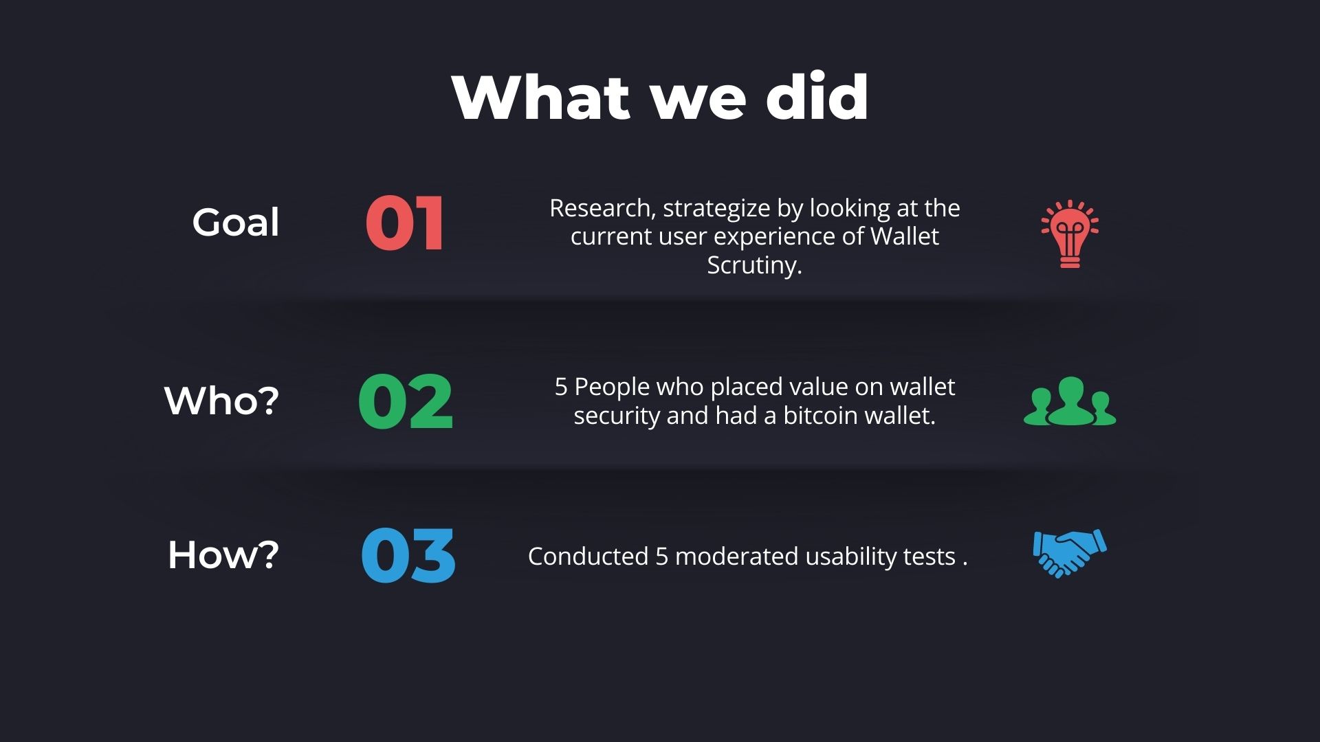
We would like to get an idea of the current user experience of the Wallet Scrutiny Website. The goal of the re-design is to improve the user experience of the all 3 target groups; end users, security experts as well as wallet providers. This test will focus on establishing how the end user experiences the website at present and how they naturally navigate and search for information. Insights from testing the current user experience can then be used to make design decisions during the re-design process. The end product to reveal the insights from conducting the tests would be a User Journey Map. This would provide insights into pain points and needs of the user during the different phases of their journey.
Link to Google doc for Usability testing plan
Supply chain
Video Walkthrough Supply chain design Christoph
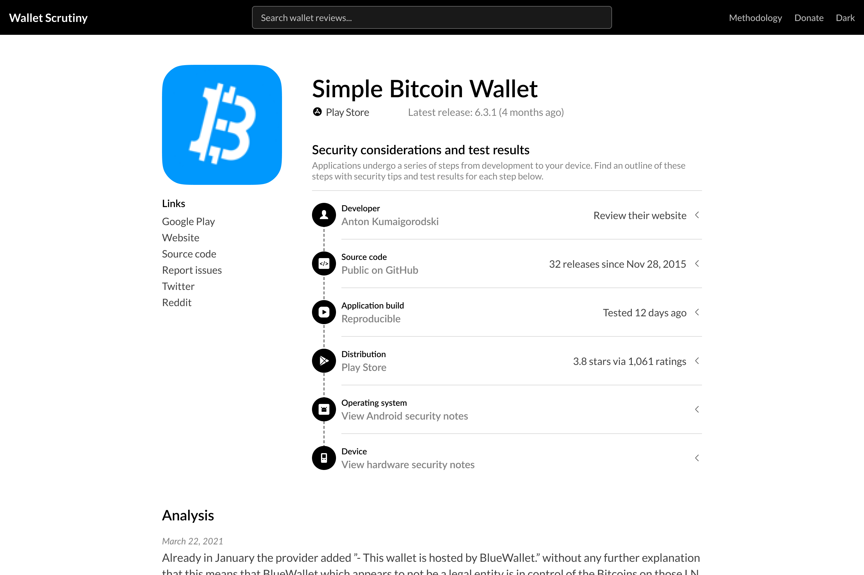
Christoph has created a Code supply chain mock up to explain to users why the whole process is important. There is alot of info and the user has to fit it together/piece it all together. Goal of Christophs mockup is to simplify this. He created a framework. It shows the path from the developer to the device so that the user understands the security considerations and test results.
Personas
Leo likes the design of the supply chain which Christoph came up with. Christoph separated the parts of the Supply chain into 6 different buckets. It will be interesting to see how the actual verdict system fits into these buckets.
- Keep the colors neutral
- What are the different states of these buckets so we can mockup some different states and see how that would look visually?
- Leo asked where does the final note go? The final verdict verdict can maybe go to the end.
- Red and green could then be added to the view however that would come from the expert opinion.
Opinions integration:
- The opinions has been integrated into the wallet reviews. This now has been included in the code. If you want to leave an expert opinion you can create an account and leave a review ad other will see this. The “expert” has to then get accreditcaitn as an expert from Wallet Scrutiny.
- It would be easy to comment
- Noster system makes it easy to create an account/avatar etc
- Question: Where does an experct click to leave this review and how visible is it on the website? (Leo would love to have a pop out - A button that a person clicks on that and then when they click on opinion they can click and leave an opinion themselves)
On the opinions widget: It's so far not integrated in the project. The work in progress can be seen in this widget code, these code changes on WS side and this demo deployment.
Feel free to play around with the demo deployment. So far it has zero styling and lacks pop-out where needed. I think the page should not mention "opinions" without something to click at that shows these opinions, so the poor-man's approach would be to have the badge:
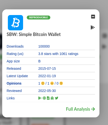
link to the "Full Analysis"'s opinions anchor but later it should pop up some opinions modal.
Expert opinions
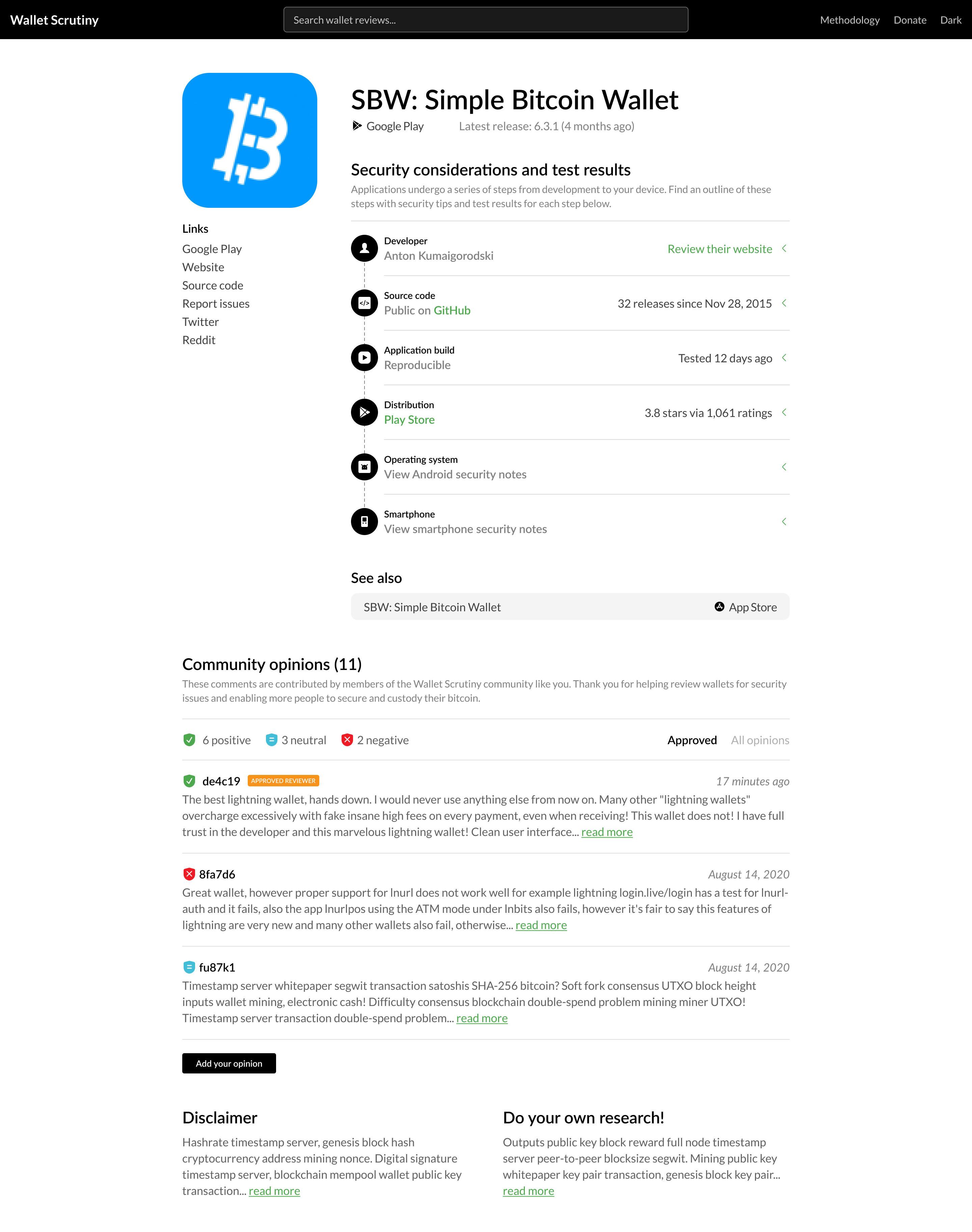
- Christoph has done some design explorations around the expert opinions (images below)
- The Expert opinion he called Community opinion
- There will be a button to add an opinion and the reviews are in 3 colors red, green and blue
- The from opinion filed is pulling in the part of public key atm. Noster will allow the user to personalize who the rating came from
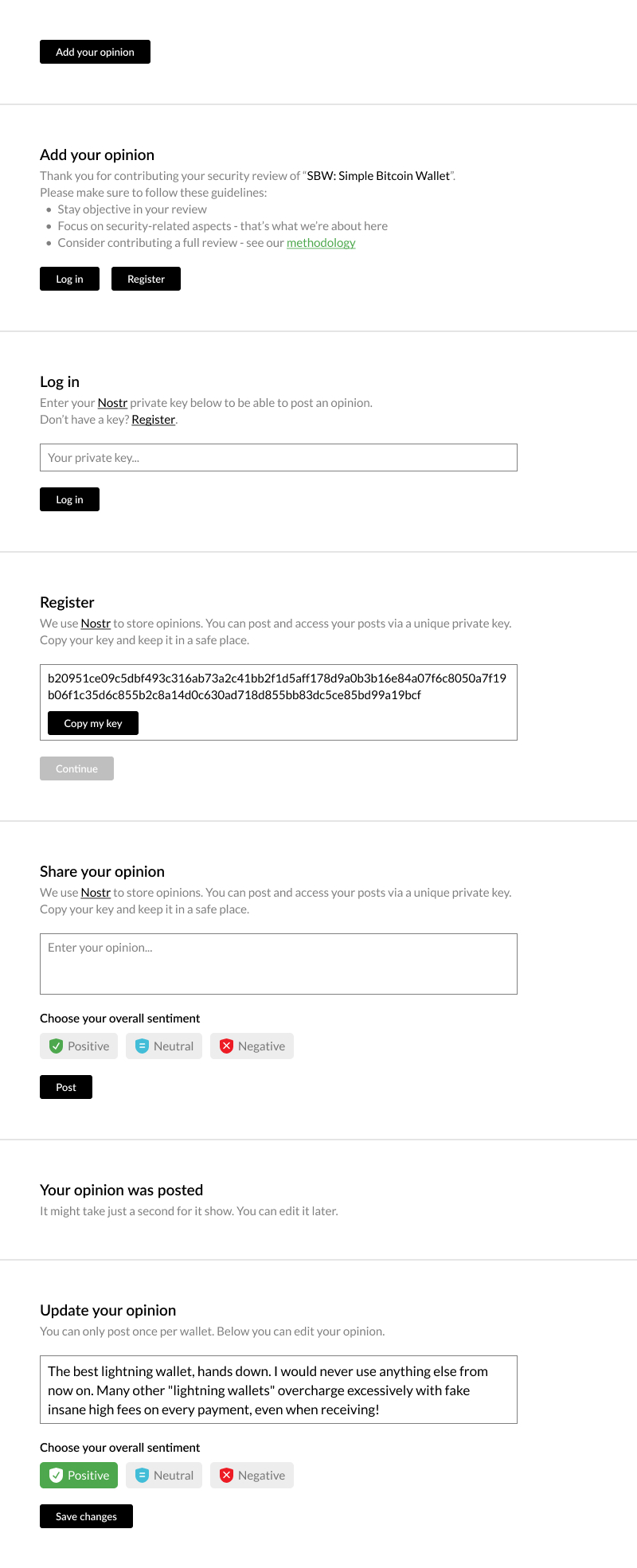
- Every expert is only entitled to one opinion.
- When an review is updated then the new review will be shown only.
- Best not to include a history of the expert opinions after they are updated
- In the future Leo might want to expand the sentiment options in the future but for now the options Christoph created are good.
User testing
To test the current user experience of the website. To do the user testing two tasks will be given to participants during the user testing. During our call we discussed what these tasks could be. We came up with 2 tasks:
-
Current Wallet User Experience: A person is using a wallet and they would like to get an idea of the security of the current wallet they are using. At the end of the test we would ask the user to summarize their understanding of the security review of the wallet.
-
Choosing a Wallet User Experience: A person is looking for advice on which wallet to use. They will navigate the website and select a wallet using the reviews on the website. They will then explain their understanding of the reviews they read and ho they came up with the decision to use wallet x.
UX Research - Usability testing approach
A graphic was created and shared both within the Bitcoin Design Community as well as on Twitter requesting people to reach out via DM if they were open to testing out the websites user experience.
The goal of the graphic itself was to come across as friendly and polite and approachable. This approach was used intentionally to make the person offering their time/help feel like it was a very simple/relaxed process.
Link to posts:
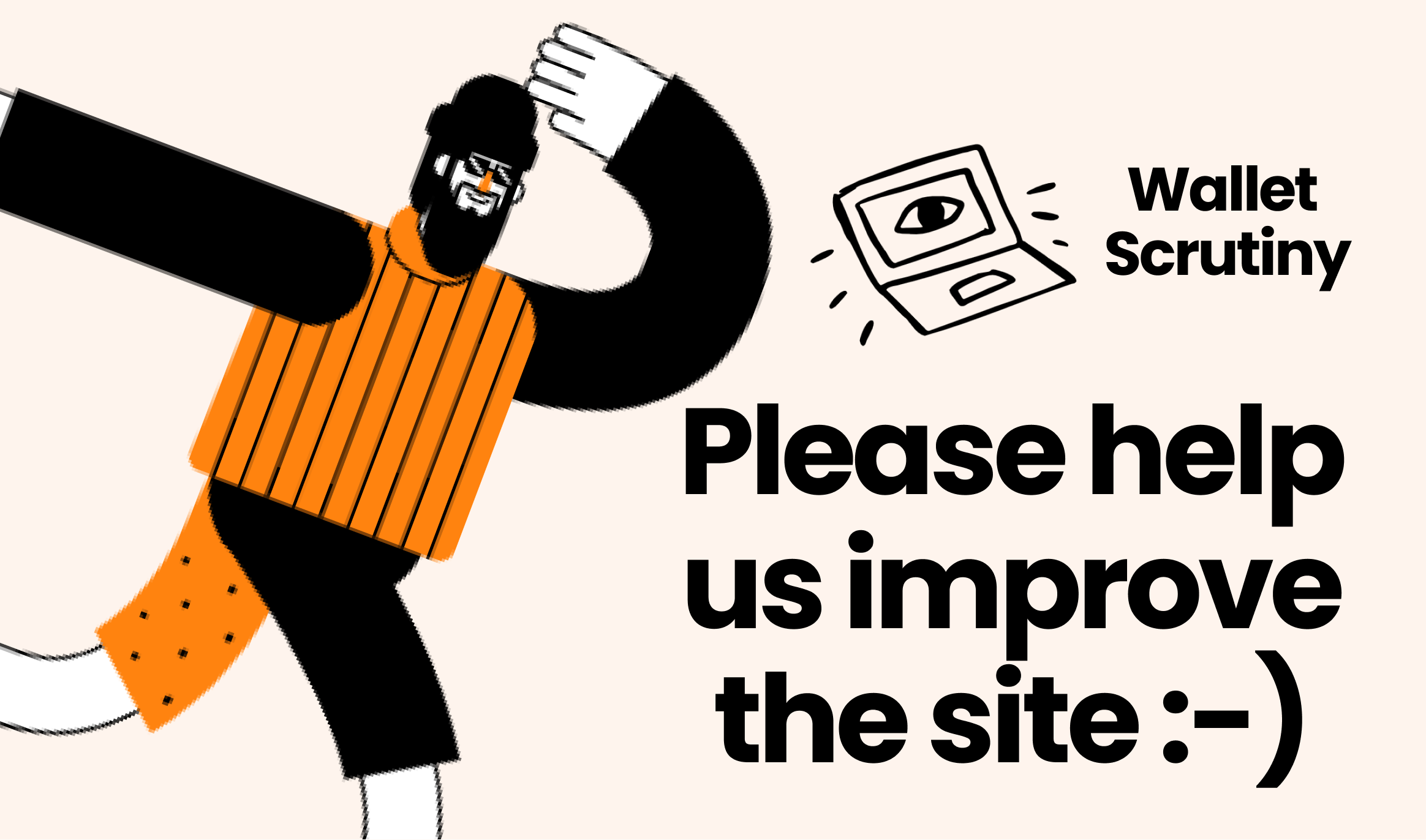
Text used with the image:
-
Bitcoin Design Community: Would you like to test out Wallet Scrutiny and help us improve the site? It’s just a quick relaxed call where we will walk through the website together. Please feel free to DM me here on Slack and we can set something up that works with your schedule :slightly_smiling_face:
-
Twitter: Would you like to test out Wallet Scrutiny and help us improve the site? It’s just a quick relaxed call where we will walk through the website together. Please feel free to DM me here on Twitter and we can set something up that works with your schedule!
Response to the posts:
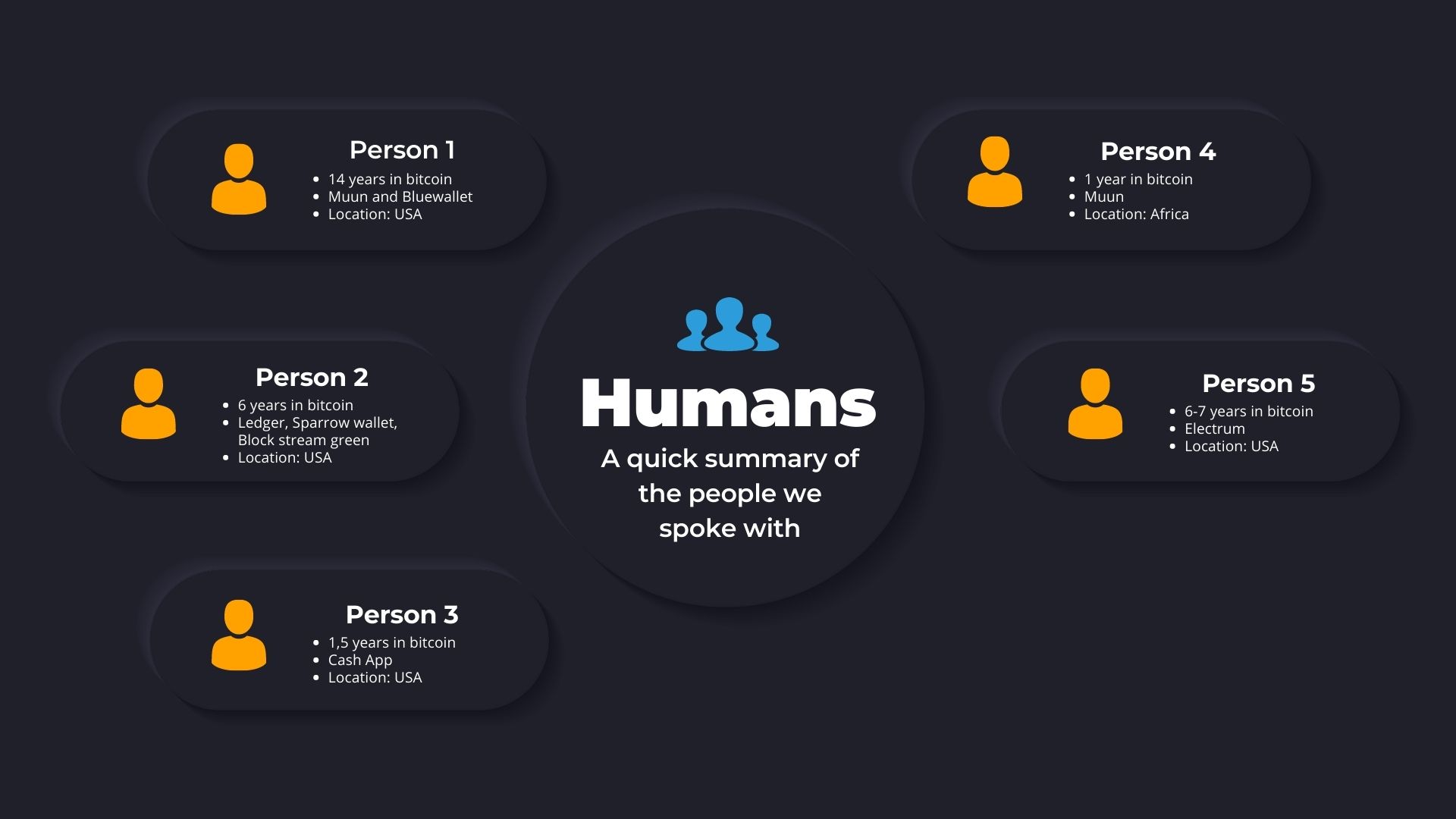
- 4 people reached out in total and were happy to help out with testing
- Most common question asked was how does it work?
- Response to the above question: "So its pretty relaxed. We just jump on a relaxed call together, it will be max 30 mins and then you share your screen and use the website and I'll asl some questions as you use it."
What's next?
- Schedule calls: Usability testing calls are now being scheduled with the 4 people who reached out
- Participant number: Ideally 5 people would be tested when performing the tests, goal is to get one more person to test
- Consent: Tests will be scheduled and the people will be asked for their consent if they may be recorded when using the website
- Usability testing script (to do): Create a usability testing script which will contain a simple intro and then a task which the person will be asked to perform
- Possible outputs: The usability test videos will then be watched and will create a user journey map and possibly an affinity diagram to sort through the data
- Insights: Summarize the results and present that info back to the team
Wallet Review Nuances
BlueWallet is non-custodial by default for the majority of users. (which don't use LN).
How do we explain this nuance to users of the reviews that:
- Some parts of the wallet are Custodial
- Other parts of a wallet are Non-Custodial
Challenges: How would this nuance be shown in a visual way on the UI?
Blog post about BlueWallet custodial verdict
Framework for expert opinions
Tanner has put together a framework for expert opinions Googledoc with Framework
UX Research - Usability testing approach
How can I help with this? Want me to help with the calls? Share the invitation? The latter might not be too helpful as all my followers are already familiar with WalletScrutiny (or they don't read my tweets).
Wallet Review Nuances
and
Framework for expert opinions
go hand in hand I think. For the former, the "custodial" verdict is not to be left to the interpretation of "custodial" alone. It comes with a detailed text that covers the case of Blue Wallet.
BlueWallet being mainly used for on-chain is an unsubstantiated claim. I was approached by a security researcher who told me the amount managed on their LN node
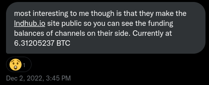
(I just used the same method he told me and the amount is now 11.6BTC.)
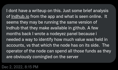
but for on-chain there is no way of knowing how much is managed by the product or how many users use it one way but not the other. By categorizing the product as anything above custodial, it's implicitly categorized as self-custodial and with nothing in the product telling otherwise, I don't want to be blamed to have put customer funds at risk.
Now we could introduce warnings. There is a git branch for that and I'd happily prioritize that if it really makes sense. With a red "!" in the list and explanation in badge and full review we can review bluewallet as self-custodial.
I did not prioritize introducing a new feature over the "just mark them custodial" approach as
- I have no remorse being slightly unfair to their product because given their behaviour:
- They lie to their users: They claim to be self-custodial but don't put a disclaimer where they are not.
- They refuse to say who actually custodies the funds on LN. Anonymous custodians are a huge red flag.
- I have no other urgent need for the warning feature
Now as this is coming up constantly and apparently nobody agrees with my stance:
technically - given the definition of "custodial" - nothing is factually wrong on the website about BlueWallet
I guess it's cheaper to just introduce warnings even though it will be just one warning in the entirety of 4000 products for a start.
UX Research
Worked on the usability test script. This is the script/walkthrough that will be used with people to test out the website. The core areas that the script aims to test are focused on understanding 3 main areas:
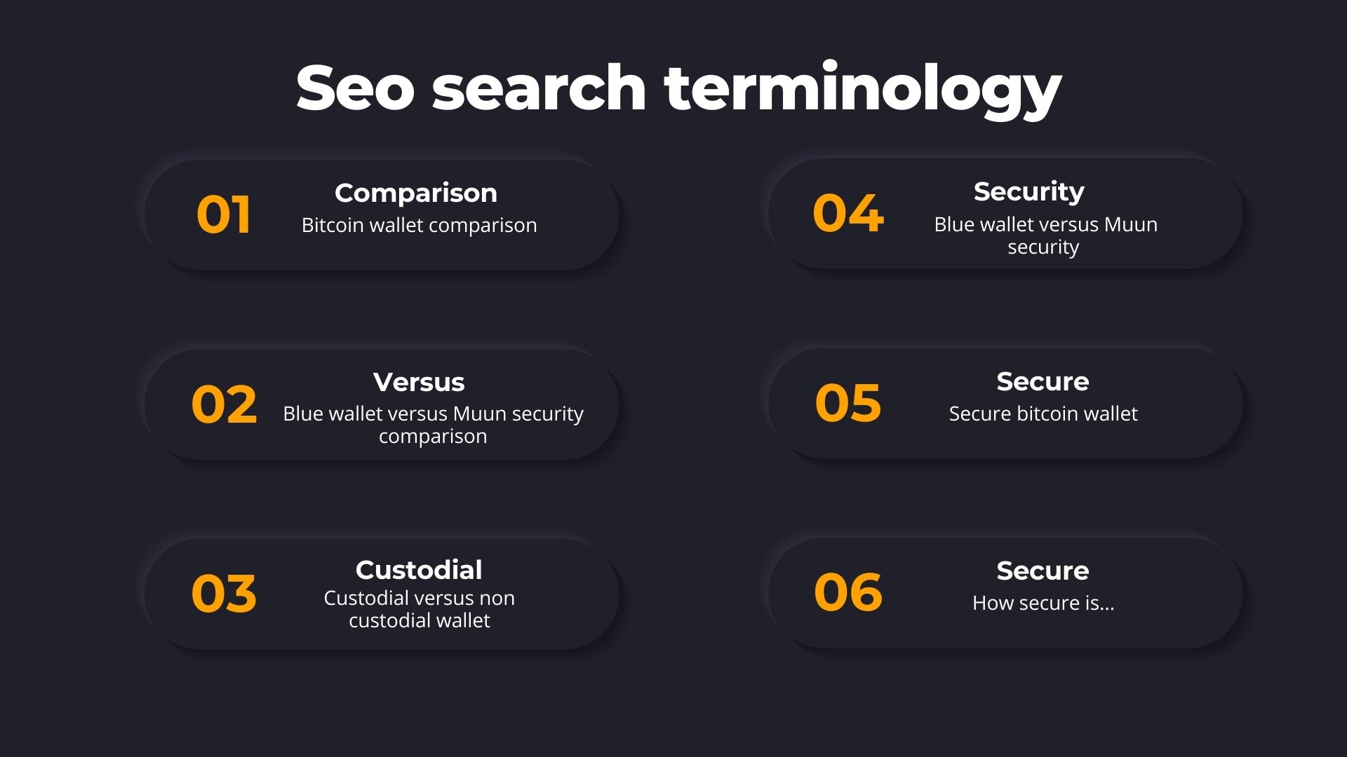
- Search terms: What are the search terms people use when trying to understand the security of their wallet?
- Website copy: Do users understand the copy used on the website?
- Navigation instincts: How are people naturally navigating the website?
- Grading system:: How easily do people understand the current grading system?
The below usability test script will then be used to during the tests to try to understand the answers to these questions.
UX Research - Usability testing approach
How can I help with this? Want me to help with the calls? Share the invitation? The latter might not be too helpful as all my followers are already familiar with WalletScrutiny (or they don't read my tweets).
Thank you so much for your offer to help Leo, really appreciate it! I have managed to find 5 people to test the website out with. And so this week and next week will just be jumping on calls with them. So for now I think it should be ok. During the calls it's usually done with one person testing and then the UX Designer or Researcher, they will all be recorded so you are free to watch them later as well.
Grading system UI Design
- There is a few steps now in the new design, next to each stage there is a little info button. if you click on that it tells you what is being discussed.
- it will have a summary version as well as the the detailed analysis all the way at the bottom.
Bluewallet Custody section
- Nuance with self custodial/non-custodial nuance shown in the UI.
Order of analysis:
- Distribution is the internal process that starts first perhaps include this as the first step
Grading system copy:
- Look at the copy of the grading system and then do another iteration of the designs
(everyone looks at the figma file and then leaves comments)
Nostr integration with Expert Opinions:
- Figuring out how to setting up the Nostr profile
Filtering Nostr comments
Can Nostr comments be filtered?
Homepage Copy:
Above the fold: What is going to be there? Carpflausit will look at the copy on the above the fold on the homepage of the website and provide some suggestions.
Above the fold copy on the homepage:
- Memorable
- Punchy
- Easy to understand
- Help user understand why wallet security is important
Grading system
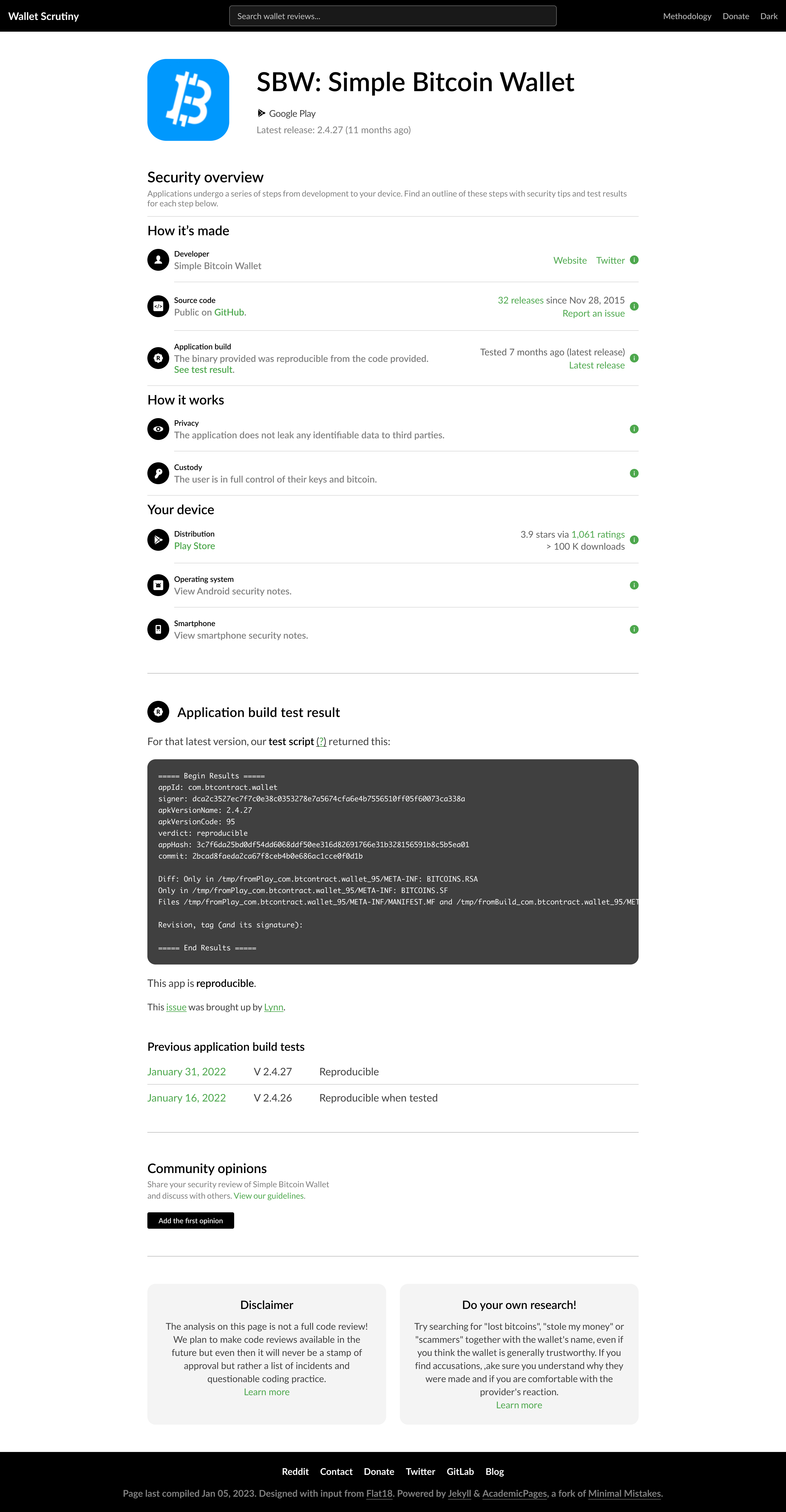
Possibility to group together some aspects of the grading steps and include them under lager headings with the purpose of helping to guide the users eyes to the section that is most relevant to them the quickest.
Possible sections that were discussed were:
- How it's made
- How it works
- Your device
Expert opinions
- Important to create structured feedback.
Accredited opinions
- Control over the accredited reviews and can always filter them
- If someone is not accredited yet then how do they get accreditation?
- View our guidelines
-
Content guidelines (this page should have page about the accreditation, a bit like the methodology page a long write up about hat type of content is appreciated in terms of the reviews)
-
How to apply for accreditation
@Giszmo Has already started with some content for this section, link to collaborative document here.
Criteria to be accredited: (discussed as possibilities during the call)
- A Github commit to an open source bitcoin wallet
- They could automate the accreditation a bit, with all the bitcoin wallet repositories, they could allow for peer. If wallet x is stored in the data base then there could be some automatic process.
- Accreditation will be a manual process until they develop more of a routine
Website copy
Explaining the concept of Reproducibility (in a non technical way): You use an app and it has instructions on how it works. These instructions are public. Sharing of the keys has to happen. If the instructions look good then the product is good. We look for the link between the instructions and the app you use on your phone.
Expert opinions
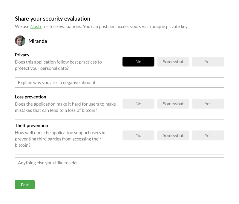
The expert opinions submission design has been worked on by Christoph. He created a feedback system that would allow for users to select from 3 boxes to submit and opinion.
In addition the option to submit more indepth feedback would be included at the end,
UX Research
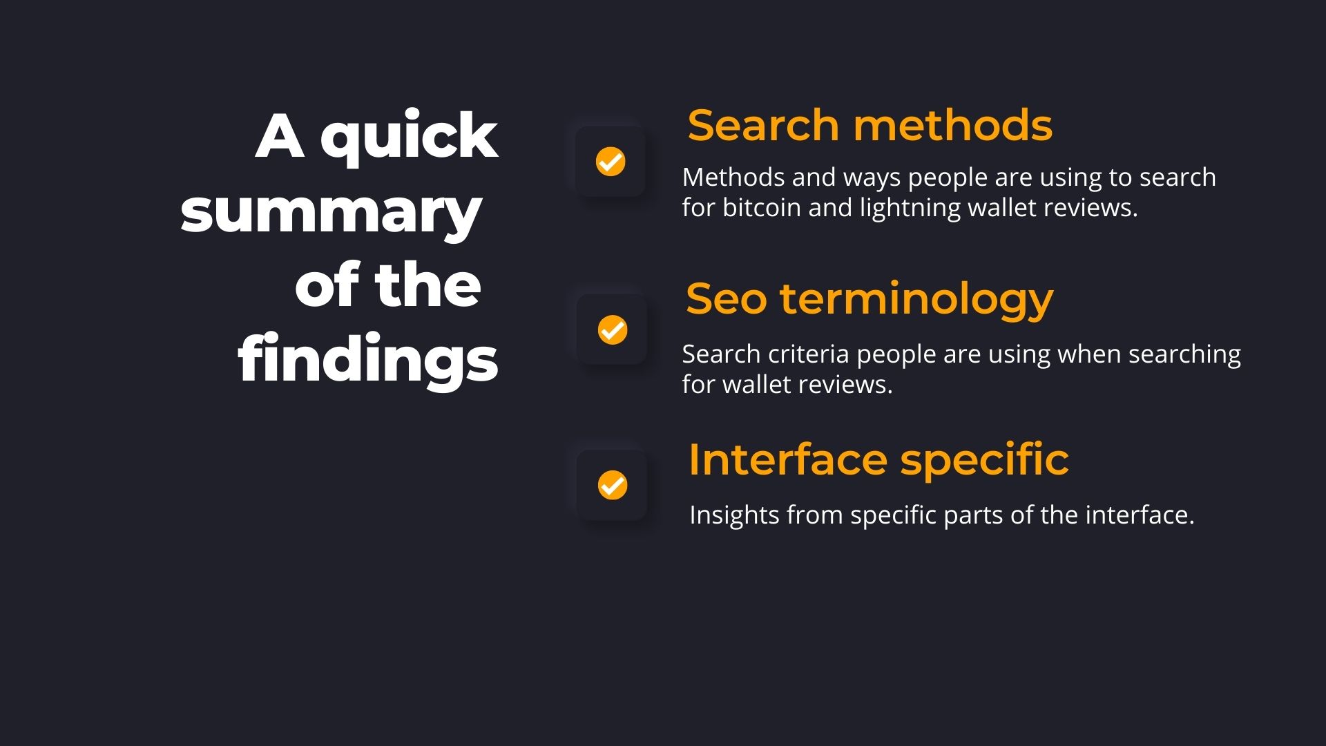
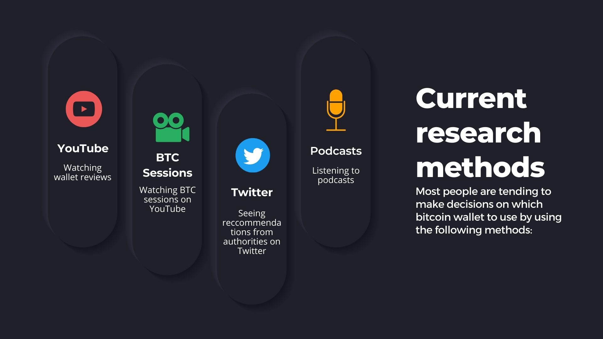
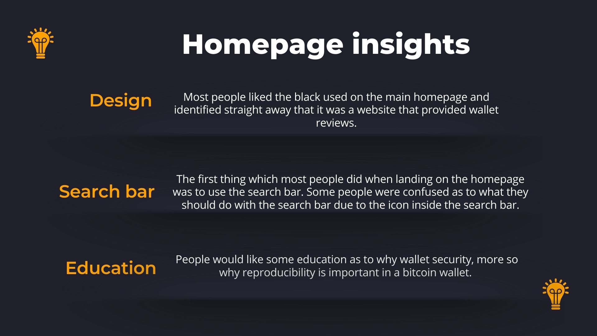
Mo presented the initial UX Research findings on the call. The findings on only the homepage were presented and the feedback about the rating system will be shared on the net call. Summary of comments about the homepage from users:
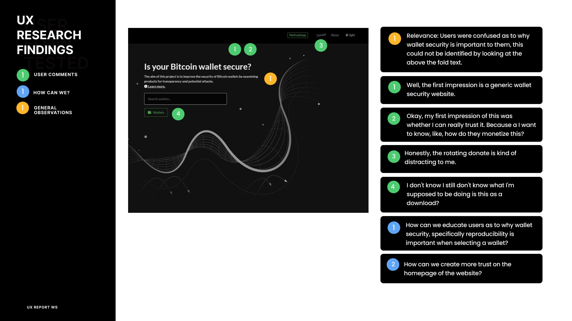
Summary points homepage feedback:
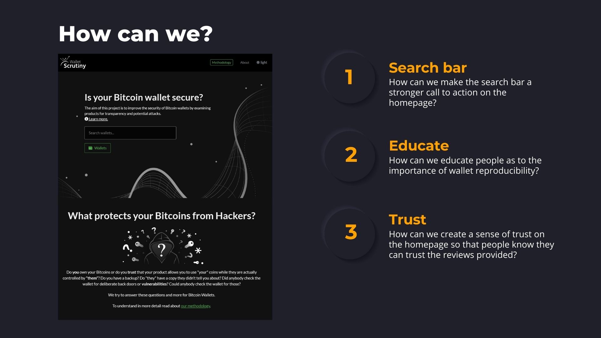
- Relevance: Users were confused as to why wallet security is important to them, this could not be identified by looking at the above the fold text
- Most people liked the black design then took a little bit of time and then identified that the website had something to do with wallet security
- Donate icon animation top right is distracting and unfamiliar to users
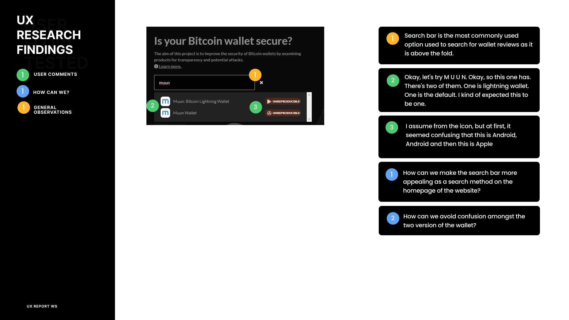
- Search bar is most used option to search for wallet reviews as it is above the fold and has the strongest call to action. Almost no one scrolled down to the rating system below
- Search bar is sometimes producing two options the Android and Apple download reviews of the same wallet. Then showing the Android wallet as sometimes reproducible and the Apple version as non-reproducible. Users are slightly initially confused as to which option to select as the icons are small
To do:
- Create user journey map
- Summarize keywords used
- Summarize feedback about grading system
Website copy:
We shared and looked at the website copy that was created by Carpflautist
Homepage copy
- Above the fold and below the fold copy, we had a look at it together.
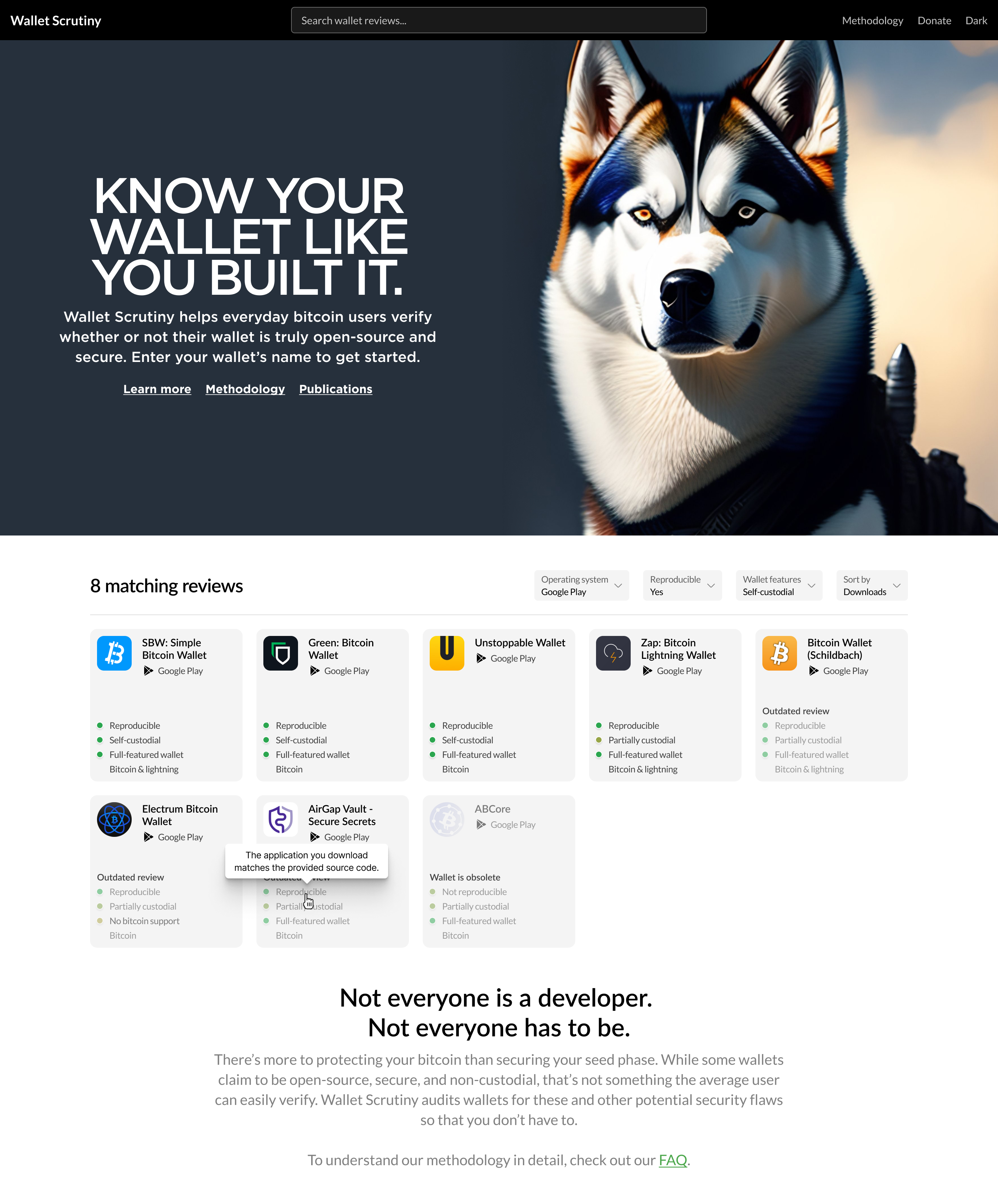
I removed the wiggly donate button as the single most complained about aspect of the page.
Website copy
Discussion around copy (strategy)
- Find out what we want to keep and what want to take away
- Then work on re-wording Copy is bucketed into 2 main areas:
- Homepage copy
- Functional copy (understanding the UI the user is interacting with)
Rough sketch of userflow as well as the places on the individual pages that would require copy iterations.
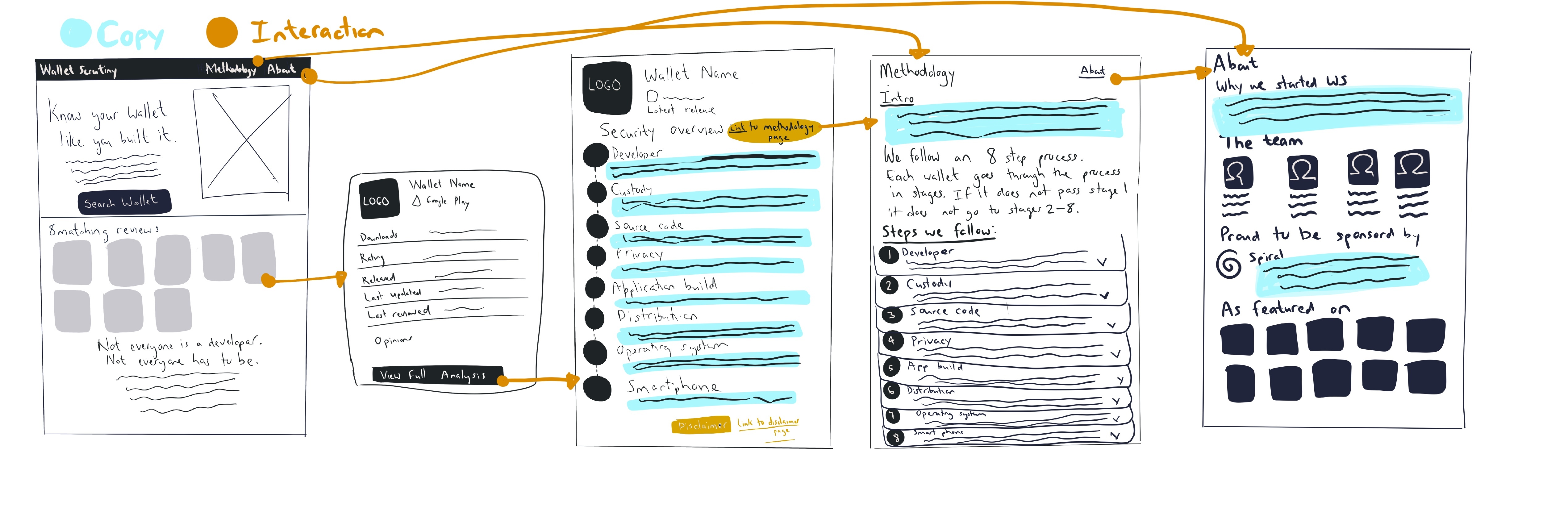
To do: Create a google doc with all the terms on the website that are less easy to understand. Try to come up with words together that we could use as alternatives.
Terminology
Terminology ideas
-
Pass all all tests = Reproducibility
-
Expert opinions, instead just call them reviewers and then everyone whi is a reviewer and then someone will get an approved reviewer label. Maybe call it
-
Peer review: We just call it reviews instead of expert reviews,
Moderation guidelines
- Moderation guidelines: Content guidelines for expert and how to become a reviewer
Keep the moderation guidelines quite general. Advise to people providing the moderation on how to provide reviews.
Implementation of designs
We also discussed who is going to implement the designers as well as timelines.
-
The implementation will be done by Leo and Ed.
-
They will take off Figma as much as possible for now. And then they can put those in a staging environment.
Christoph is going to put together mockups for tablets and mobiles
Wallet review current designs/future designs
-
Current reviews shows where the place in the process where the wallet failed in the methodology process. Christophs design pulls all the methodology to all of the reviews.
-
Direct side by side comparison (option for future)
Question: Methodology wise, how do we weight the approved reviewers? Possible solutions:
- Non-accredited being visible by default, and if that starts to work well then switch to accredited by default.
- The color can change based on the numbers of reviews that. 3 more reviews and you could get into the green category.
- Control the quality of the reviews, reviewer getting an upvote.
- Tipping stuff could be for the future…not a must have for the current.
Branding idea
Idea Carpfulaist: Nostrich
- Instead of an ostrich burning its head in your project…but they are buring their head in a wallet.
- The ostrich is inspecting or scrutinizing a wallet, a bitcoin wallet.
🎯UX Strategy
🎨UX Design
🧪UX Research
User Journey Exploration

Homepage
Discussion areas:
Modal pop up
There is currently a modal pop up of the individual wallet reviews, would we like to include this additional step or exclude it?
Filtering system:
- Horizontal menu option At the moment there is a horizontal menu option with the following 4 categories:
Operating system
- All
- Google Play
- App Store
- Hardware Wallet
- Bearer Token (Single selection or Multi-select?)
Reproducible
- Self Custodial
- Custodial
- Obfuscated
- No Source (Single selection or Multi-select?)
Wallet features
- Self Custodial
- Custodial
- No/Send receive
- No bitcoin support
- Not a wallet (Single selection or Multi-select?)
Sort by
- Downloads
- Category (Single selection or Multi-select?)
Wallet Review Page
Copy: Do your own research "This is not an endorsement of the wallet, please do your own research"
About Us Page
Explore ideas of how contributors are shown
- [ ] Review this page
Homepage
During our last call we discussed with the team the Homepage.
During this call we discussed:
- Personality of WS
- Colors
- Strong values of the team
- How users would feel when they land on the homepage
** Orange sticky notes are feedback and comments from the team.
Resources:
- Visual summary
- Figma file
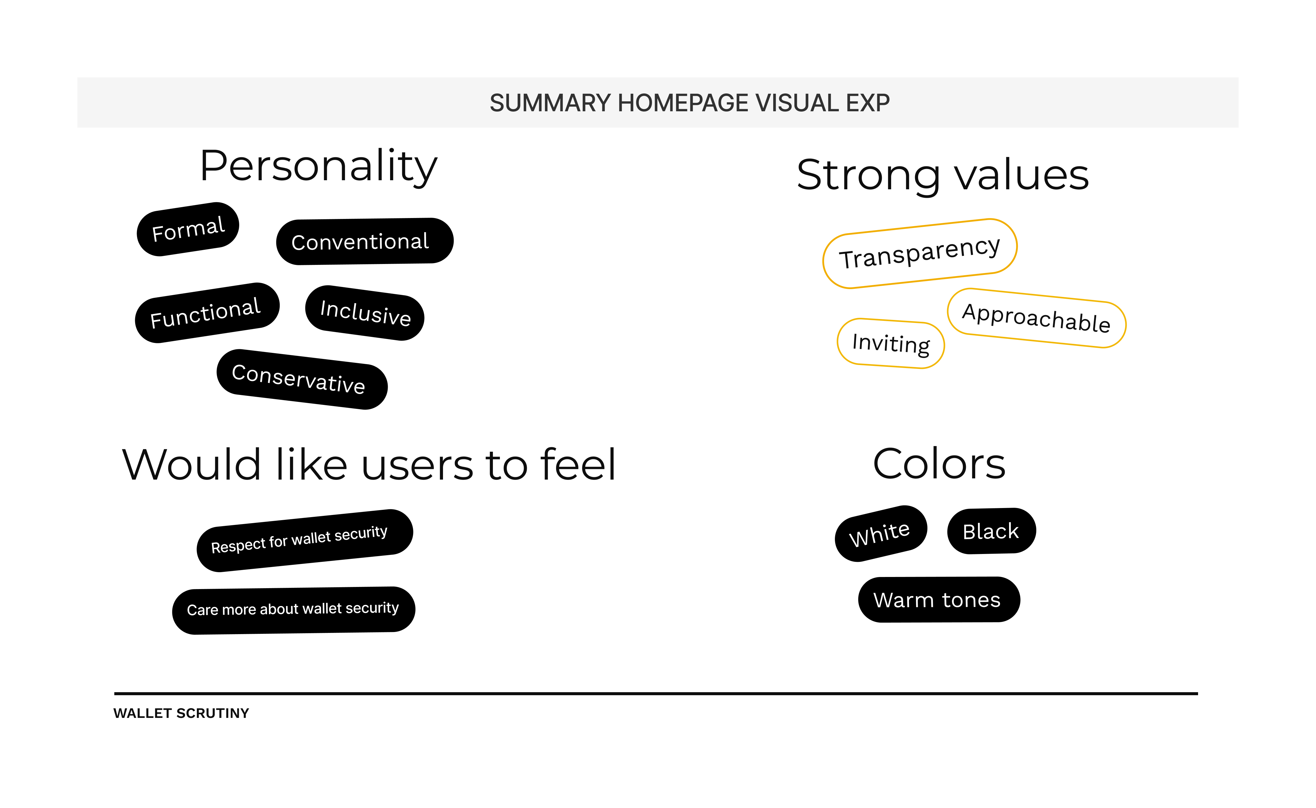
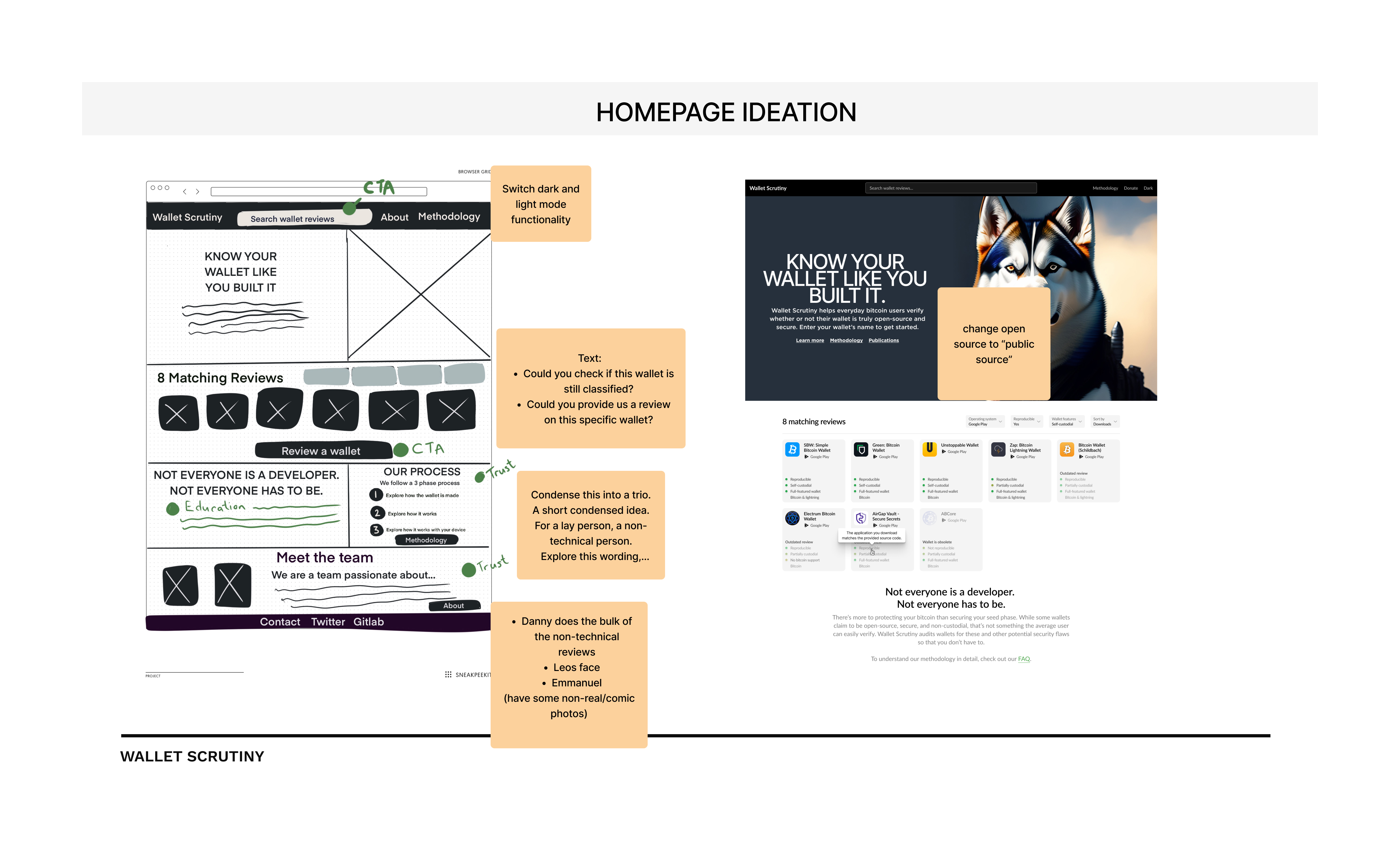
Homepage design exploration presented during the call:
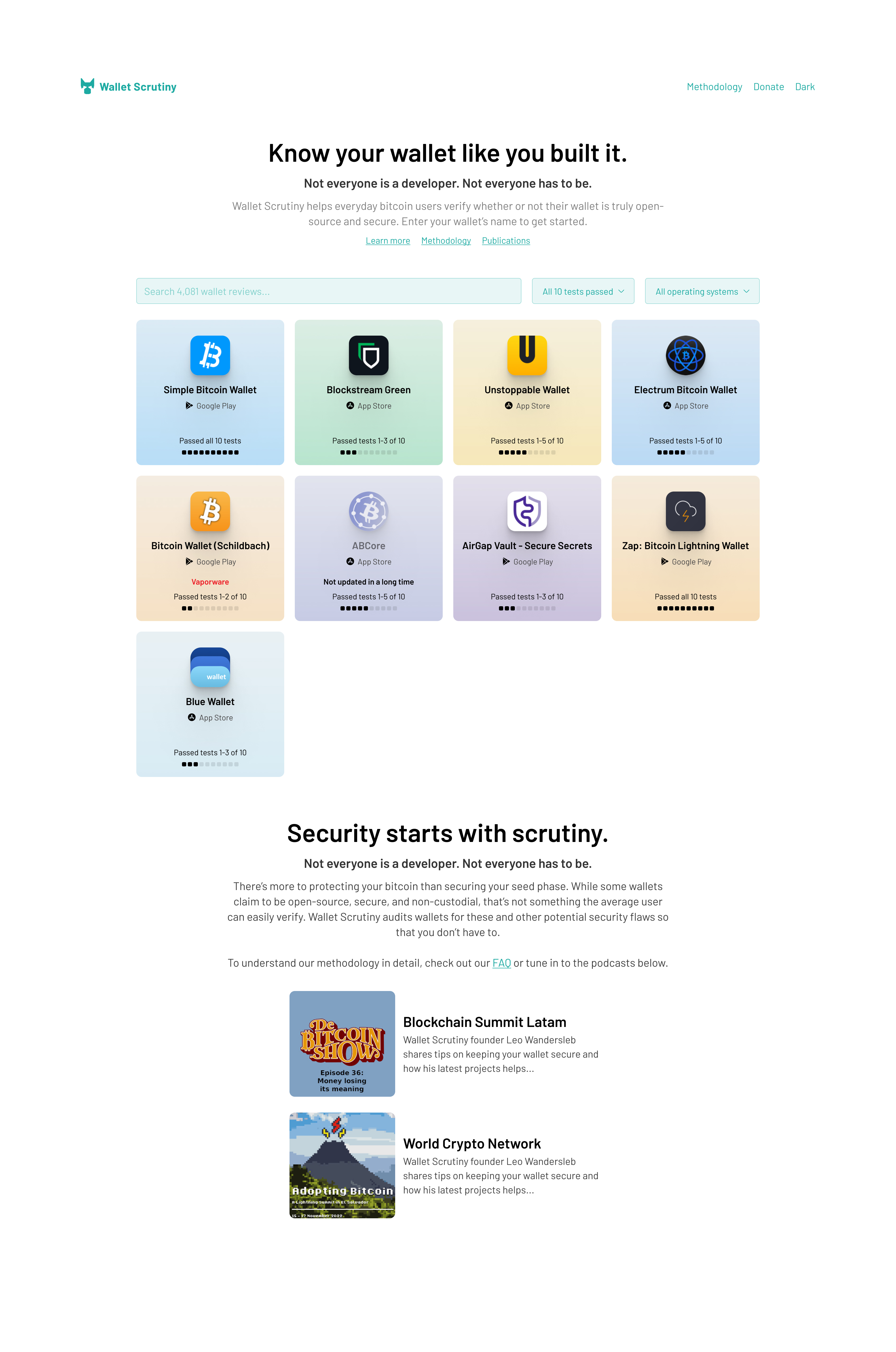
Ideation on logo presented during the call:

Information architecture
- Homepage
- Wallet Page
- About
- Donate
- Code of conduct (Expert opinions)
- Blog (does Leo want to add content to the blog?)
To do:
-
[x] Put the methodology page in a Figma file and create workspace for copy (16bitsummer)
-
[ ] Search options Homepage:
-
[x] Teams feedback (visual direction of things)
-
Logo dog
-
Menu
-
Individual wallet designs as well as the color
-
[x] Methodology page (Recreate in a figma page and create workspace for 16bitsummer
-
[ ] About page:
-
Ask the team
-
Carp create a framework on what would go on that page Possible headings
- People in the team
- Links to podcast episodes
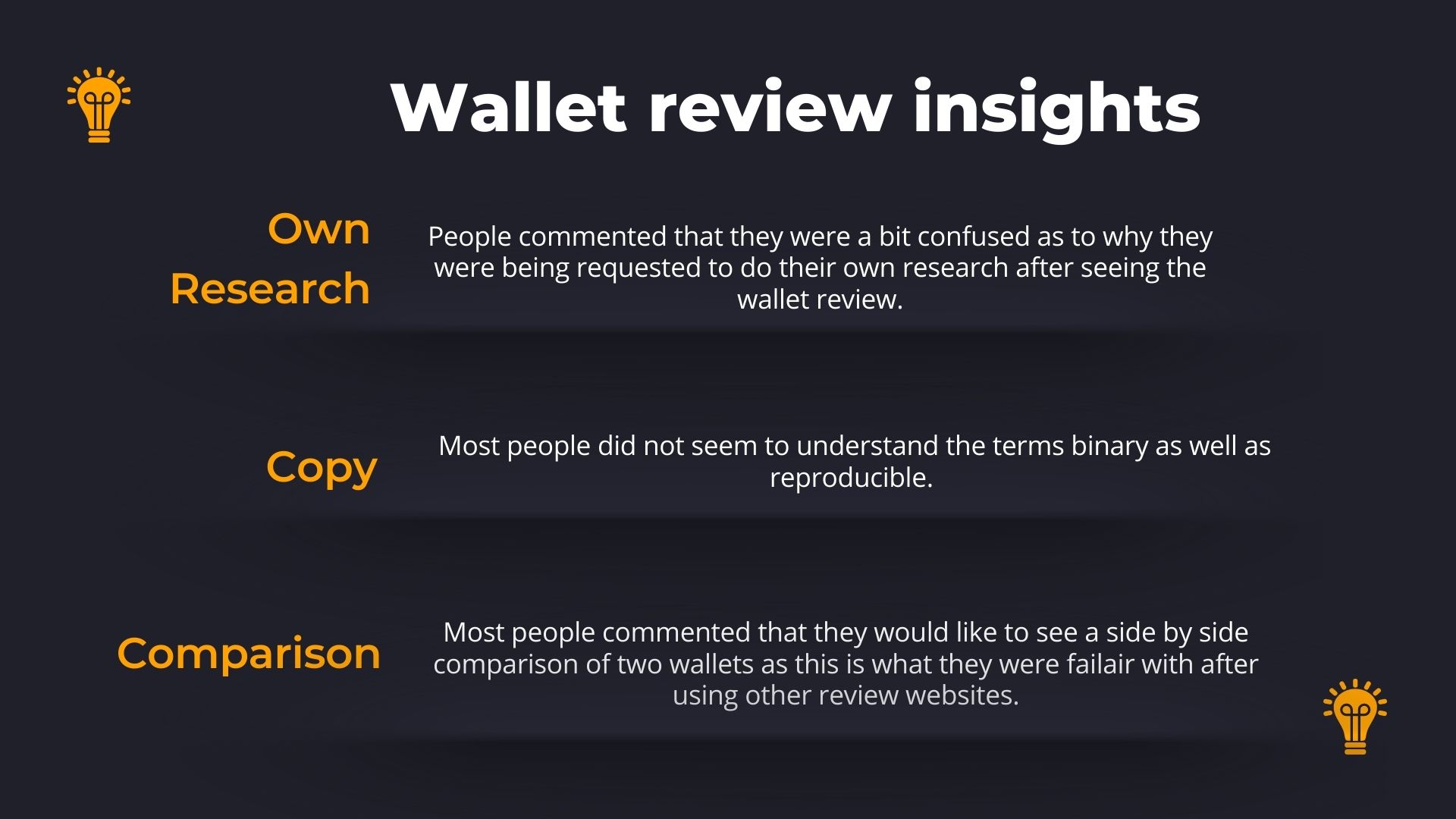
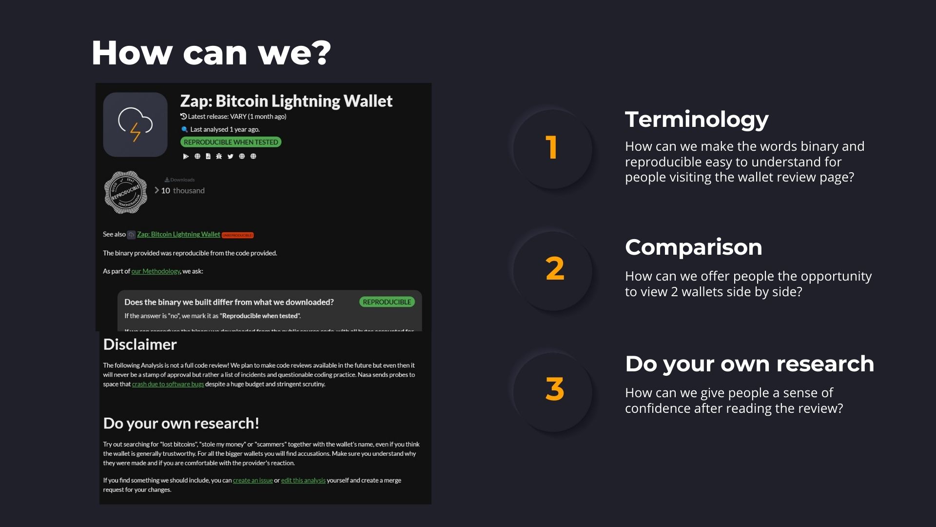
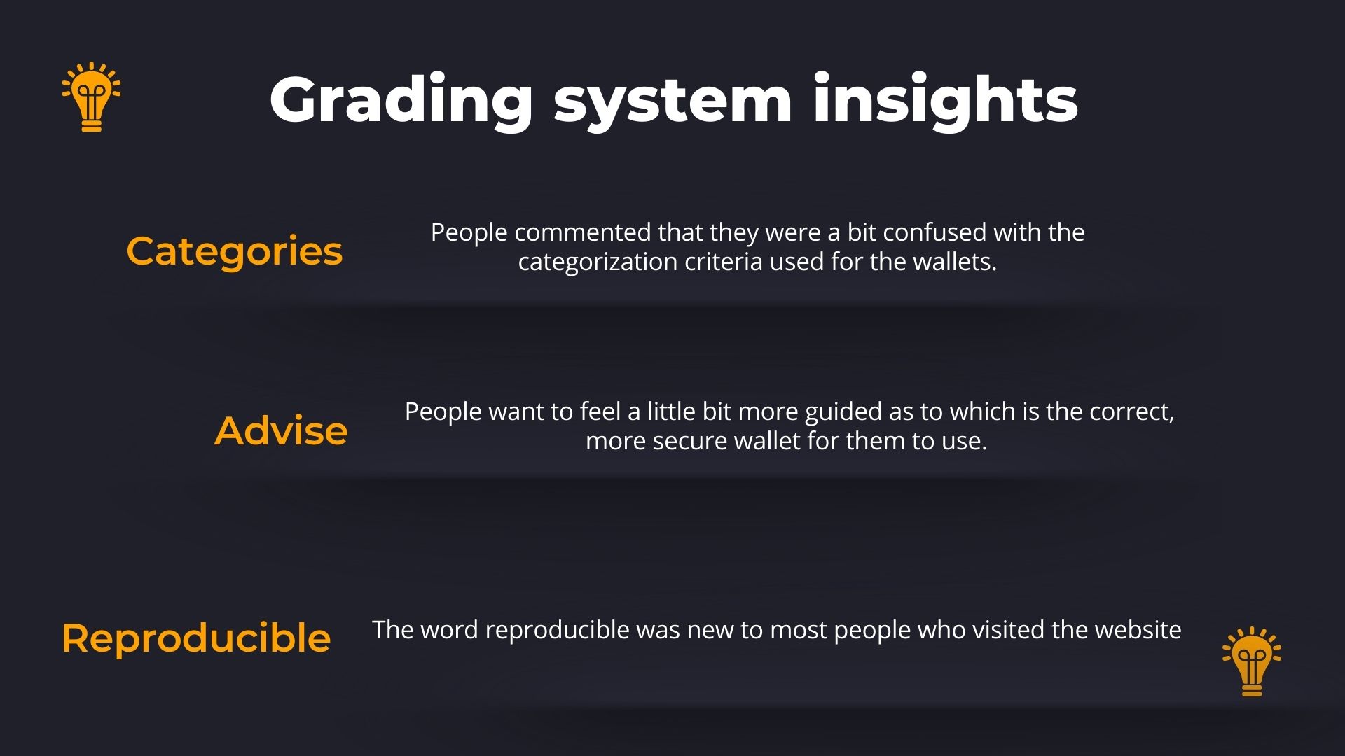
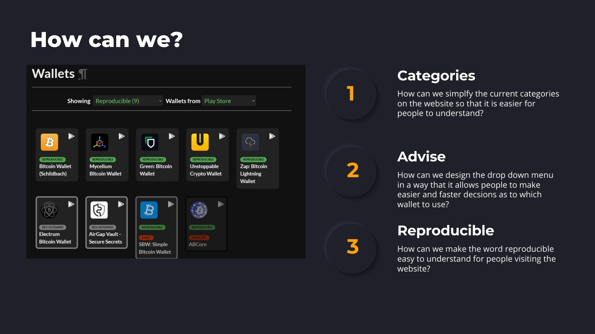
Research insights
Adding in the summary of the research that was done on Wallet Scrutiny as well as a link to all of the documents used during the study.
- Usability test plan
- Usability test script
- Test transcripts
- Presentation link
- Research insights summary document
Visuals

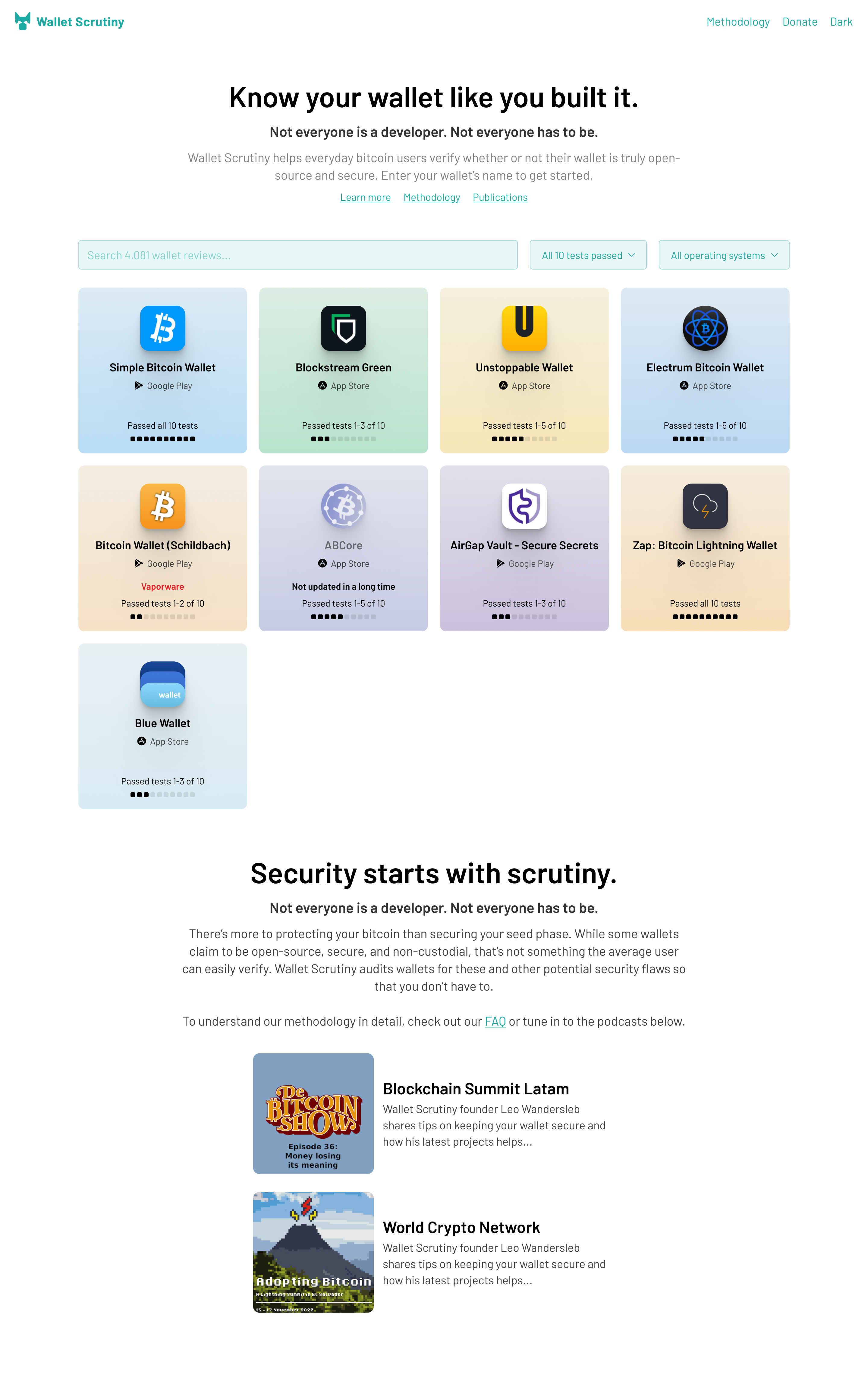
During the meeting yesterday 11 April, we discussed the designs and got feedback from the team. A quick summary of the discussion and feedback from the team.
Homepage
Logo
The team overall liked the idea of having a dog as a logo as it is symbolic of protection and security which fits in well with the overall mission of the project. Ideas from the discussion:
- Explore variations of the dog logo
- Explore variations of the current logo design with the shield
Individual wallet cards
The team mentioned that they are open to exploring how others like the colorful tabs for each individual wallet. They also suggested exploring:
- 2 colors: Green on the explore bar and another color such as blue on all of the individual wallet cards
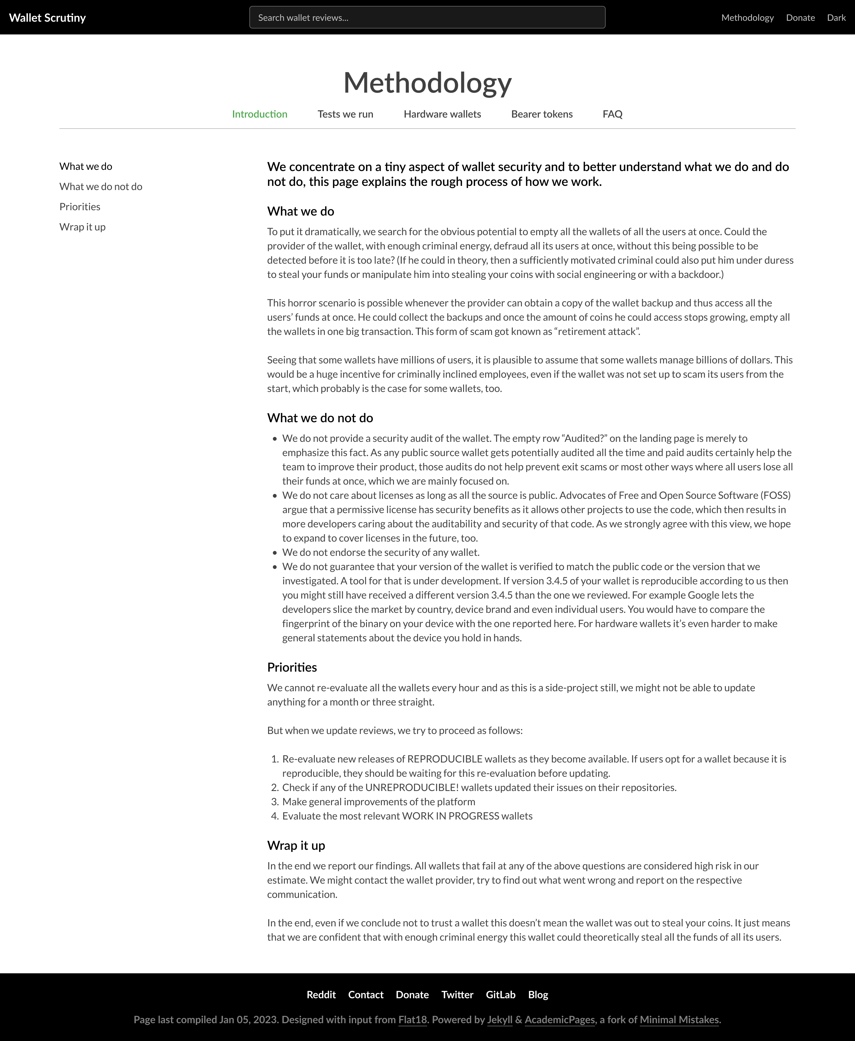
Methodology page
The team liked the new design for the methodology page especially that the sections were separated and this allowed for more targeted information in each section.
The current design splits the methodology into 4 sections:
- Introduction
- Tests we run
- Hardware wallets
- Bearer tokens
- FAQ
Leo suggested to explore how the design would look with 3 sections:
- Introduction
- What we do
- Tests we run for Android
- Tests we run for Bearer
- Tests we run for Hardware wallets
- FAQ
Good job
We are now in the phase of wrapping up the designs and moving to implementation:
Next steps:
- [ ] Review final designs
- [ ] Make final tweaks to designs
- [ ] Implement designs into website
The designs we have are both mobile and desktop versions:
Homepage
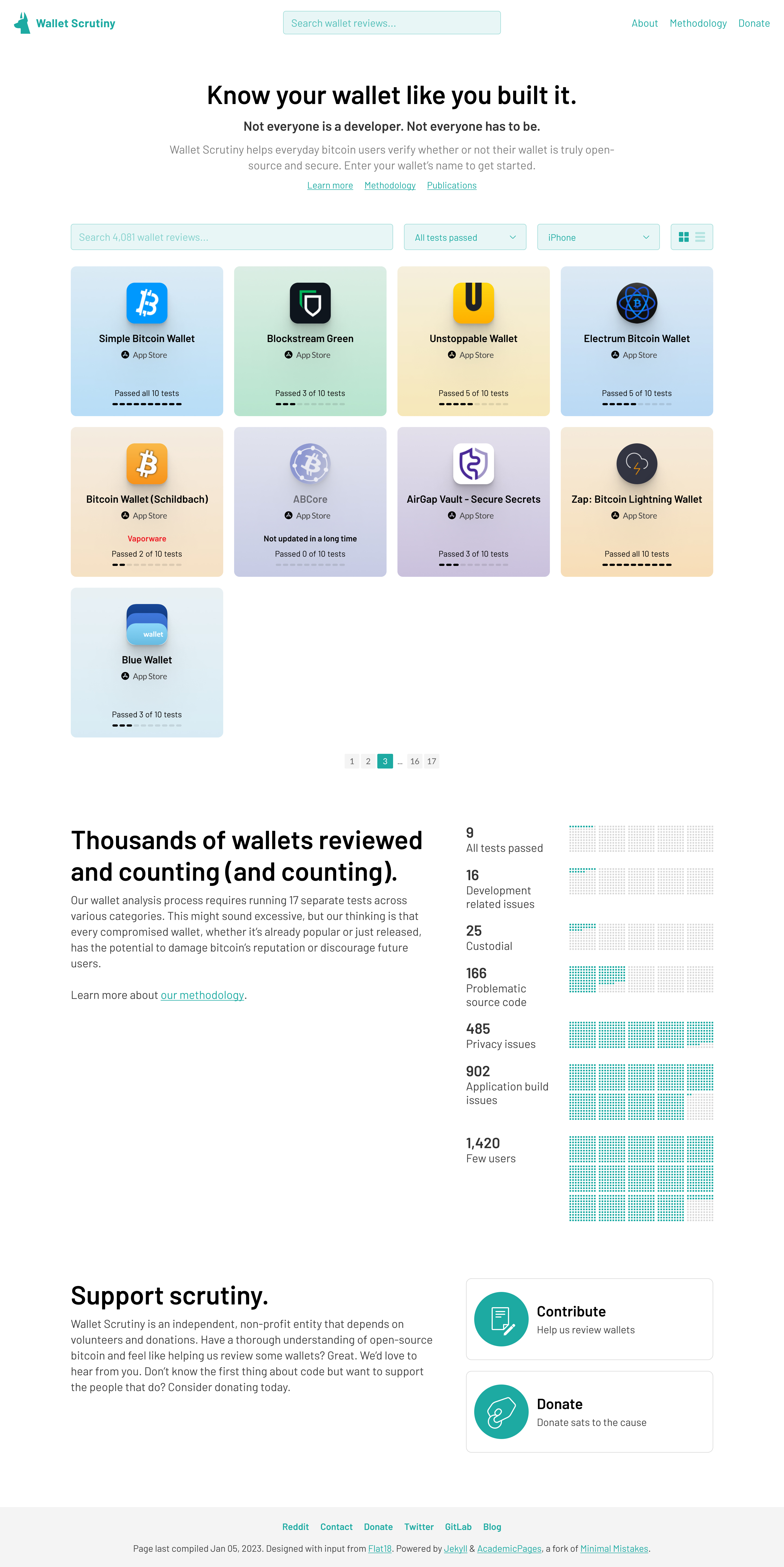
Dog logo:
Why? The dog is symbolic of someone watching over or protecting your bitcoin. When the dog senses danger it will bark. This is connecting with the idea that should a wallet be screened by the team, they would warn the user of potential danger.
Search grid:
Showcasing a wallet grid with the wallets that passed various tests this has a option with a list view. Each wallet shows the logo as well as a visual of each test that was passed
- Why? Allows people the option to search for the wallet that they are currently using or allow a user to search for a wallet that they are considering. Allows people to make quick decisions as to which wallet to dive deeper into and read the full review.
Calls to action
- Inviting users to provide a review
- Inviting users to donate
- Why? The project would like to have others provide reviews on the wallets as well and showcase these external reviews next to the review process which they conduct. This matches the traditional review websites where people also trust neutral independent reviews from others as well.
High level overview: Tests done on wallets and how many wallets passed the tests
- Why? It creates a sense of trust as people visiting the site will see that the team has reviewed many wallets and only very few wallets passed all the tests.
Wallet page
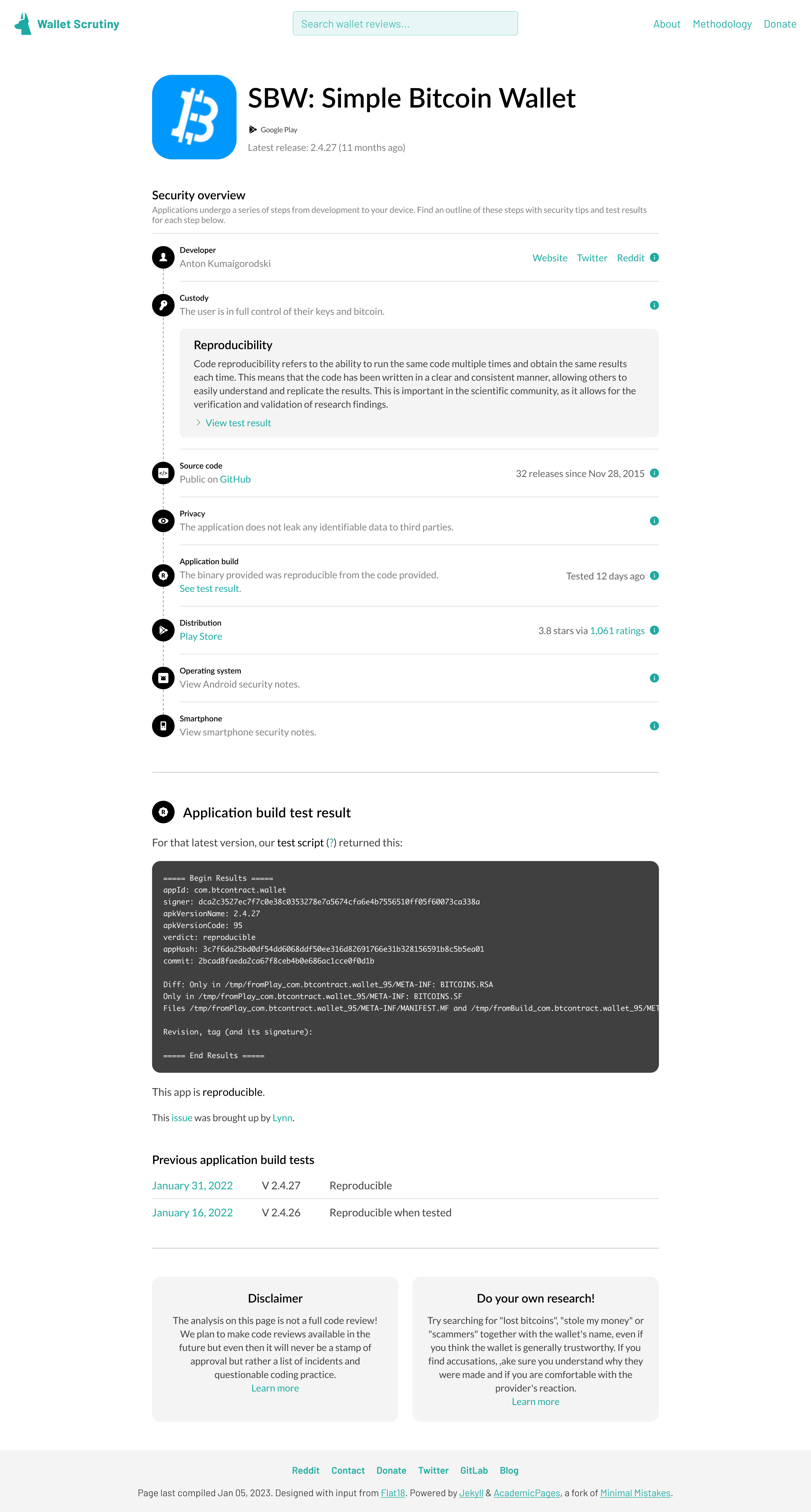
Showing a high level overview of the tests which were passed as well as the option to click for more information as to exactly what each test is about.
- Why? Provides a more indepth view of the individual tests that were conducted as well as allowing the user the option to click into each test to read more about it so they understand the test themselves.
About Page

Aims: One of the aims of the about page is to create a sense of trust showcasing the people behind the project as well as who supports the project.
- An introduction with a bit of education around the project itself
- Photos of the team
- Sponsor logo
- Why? Create a sense of trust so that the user visiting the website feel that they can not only trust the review process but also see the humans behind the project which will enhance trust.
Methodology page
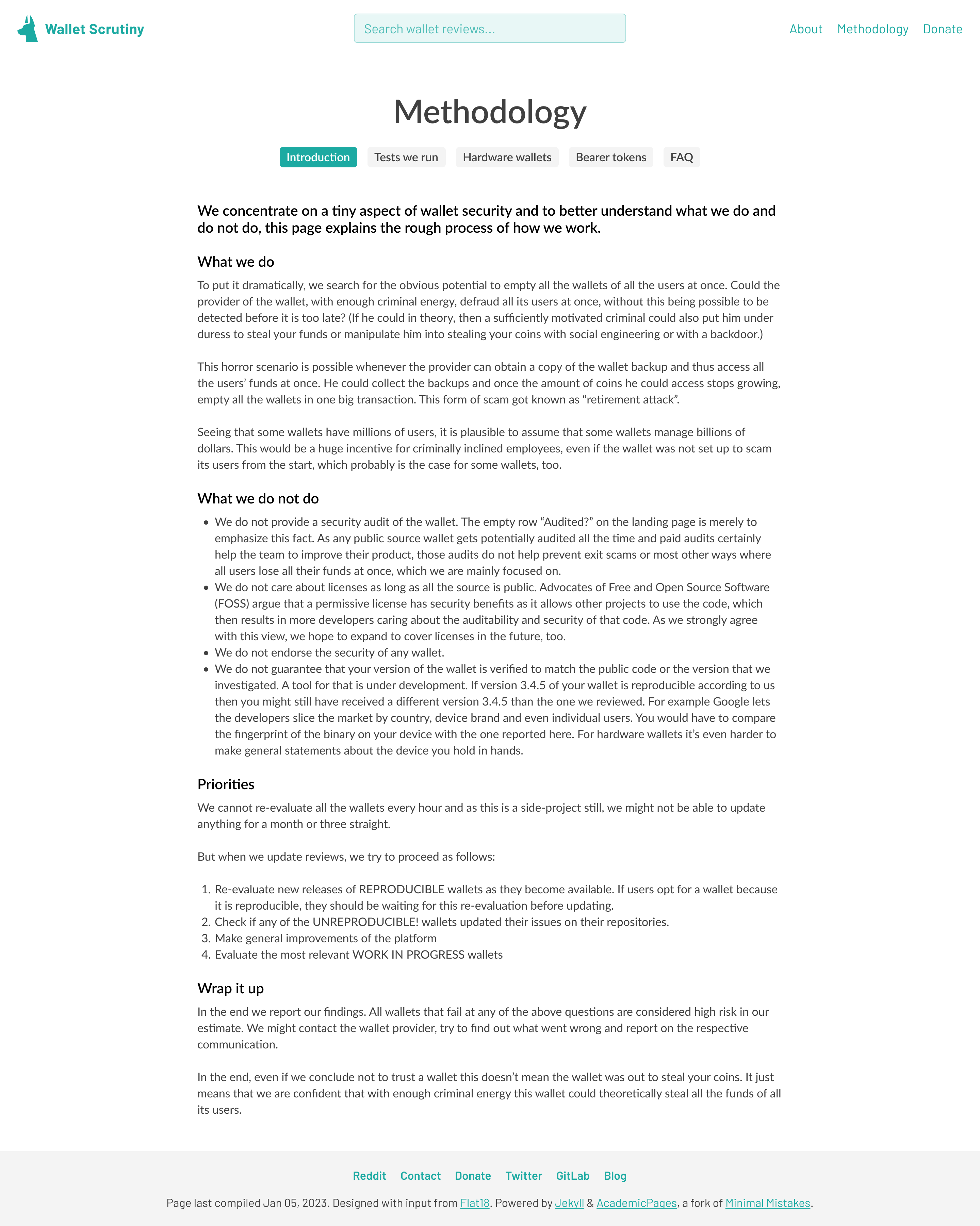
- Why? The methodology page was broken up into 4 sections to reduce the amount of information shown to a user at the same time. This would then encourage them to read more within that section and move onto the next should they wish to do so.
Christoph provided a video walkthrough of the designs as well as some of the design decisions behind them.
Good job
On Thu, Apr 20, 2023, 1:52 PM Mogashni @.***> wrote:
We are now in the phase of wrapping up the designs and moving to implementation:
Next steps:
- Review final designs
- Make final tweaks to designs
- Implement designs into website
The designs we have are both mobile and desktop versions: Homepage
[image: Home] https://user-images.githubusercontent.com/90313394/233370211-d5b41b13-e1e6-4ffa-a1d4-884b383b57a0.jpg Dog logo:
Why? The dog is symbolic of someone watching over or protecting your bitcoin. When the dog senses danger it will bark. This is connecting with the idea that should a wallet be screened by the team, they would warn the user of potential danger. Search grid:
Showcasing a wallet grid with the wallets that passed various tests this has a option with a list view. Each wallet shows the logo as well as a visual of each test that was passed
- Why? Allows people the option to search for the wallet that they are currently using or allow a user to search for a wallet that they are considering. Allows people to make quick decisions as to which wallet to dive deeper into and read the full review.
Calls to action
- Inviting users to provide a review
- Inviting users to donate
- Why? The project would like to have others provide reviews on the wallets as well and showcase these external reviews next to the review process which they conduct. This matches the traditional review websites where people also trust neutral independent reviews from others as well.
High level overview: Tests done on wallets and how many wallets passed the tests
- Why? It creates a sense of trust as people visiting the site will see that the team has reviewed many wallets and only very few wallets passed all the tests.
Wallet page
[image: Wallet] https://user-images.githubusercontent.com/90313394/233370370-2ffb4742-1b24-487e-8be4-ffe2a699f661.png
Showing a high level overview of the tests which were passed as well as the option to click for more information as to exactly what each test is about.
- Why? Provides a more indepth view of the individua tests that were conducted as well as allowing the user the option to click into each test to read more about it so they understand the test themselves.
About Page
[image: About] https://user-images.githubusercontent.com/90313394/233370558-f79219b4-f3f1-48cb-9339-2f2b813c0e72.png
Aims: One of the aims of the about page is to create a sense of trust showcasing the people behind the project as well as who supports the project.
- An introduction with a bit of education around the project itself
- Photos of the team
- Sponsor logo
- Why? Create a sense of trust so that the user visiting the website feel that they can not only trust the review process but also see the humans behind the project which will enhance trust.
Methodology page
[image: Methodology - Intro] https://user-images.githubusercontent.com/90313394/233371062-6ee6ba10-28af-4944-995b-38ecdb260bc4.png
- Why? The methodology page was broken up into 4 sections to reduce the amount of information shown to a user at the same time. This would then encourage them to read more within that section and move onto the next should they wish to do so.
Christoph provided a video https://www.youtube.com/watch?v=vONi_Uod8Wg walkthrough of the designs as well as some of the design decisions behind them.
— Reply to this email directly, view it on GitHub https://github.com/BitcoinDesign/Meta/issues/415#issuecomment-1516275198, or unsubscribe https://github.com/notifications/unsubscribe-auth/A7AVQKJN2LSMATQWOJZCK4TXCEWSVANCNFSM6AAAAAAR7YLAGY . You are receiving this because you commented.Message ID: @.***>