Guide
 Guide copied to clipboard
 BitcoinDesign
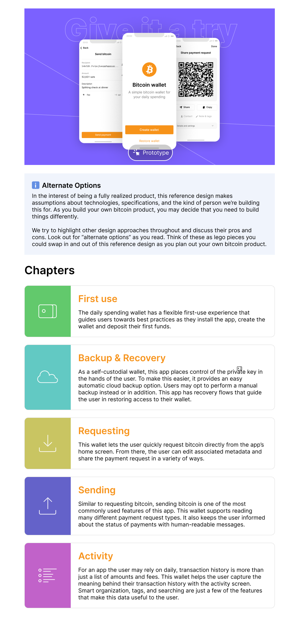
Updated daily spending wallet landing page
For #782. Work in-progress.
TODO: Get a finished figma prototype for the "see it in action section".
Deploy Preview for bitcoin-design-site ready!
| Name | Link |
|---|---|
| Latest commit | 6f871d7a3bed205091822a87412d2033ef7493fa |
| Latest deploy log | https://app.netlify.com/sites/bitcoin-design-site/deploys/63308db8777fe20009f09098 |
| Deploy Preview | https://deploy-preview-904--bitcoin-design-site.netlify.app |
| Preview on mobile | Toggle QR Code...Use your smartphone camera to open QR code link. |
To edit notification comments on pull requests, go to your Netlify site settings.
![netlify[bot] avatar](https://avatars.githubusercontent.com/in/13473?v=4 "Published by a pub.dev verified publisher")
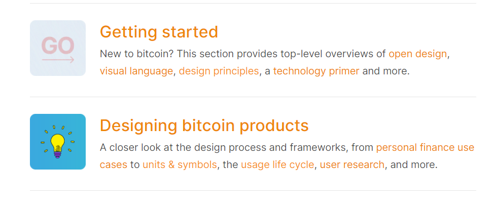
Regarding @Bosch-0's comments on yesterday's call about making the chapters list more visual, here are some ideas.

I prefer the second one. If we use the page heading visuals, they will not carry over well at a small size. Let's just use an icon to represent each idea and a color.
I think it's a good idea to keep the content in a somewhat linear fashion. While they can also be read and appreciated independently, they do work together to tell a story about how this product works. I think this makes more sense than a very visual grid layout.
I like the second one more also, could make the images radius slightly rounded to match other areas of the site (such as the home page below).
The page looks great. Something I'd love to see are more cross-links in the top-half. We can link to the day-to-day spending paragraph in the personal finance page, the self-custody principle, lightning services, etc. So if anyone arrives at this page and is not familiar with some of those aspects, they can easily catch up.
As for "making things more visual", I think this is not a worthwhile goal without the addition of "in order to communicate more effectively". The small icons can work as visual shortcuts. For example, the cloud next to the words "Backup & recovery" very effectively tells you something extra about the content. The colors used do not match the strong purple in the header and prototype images, maybe those could be tweaks.
By the way, we already have two styles of boxes, on the calendar and projects pages. Boxes are helpful when you have content that is visually somewhat unstructured. I also find that they are over-used and it's better to first try to resolve lack of visual structure by adjusting spacing, proportions, typography, etc. Just a random comment.
As for rounded corners, the original design direction from two years ago asked for sharp edges, which you can see in the next/previous buttons and footer. But TBH, who cares if they are slightly rounded in a few places. Part of the original direction was also for the style to be a bit of a neutral framework, so creatives have freedom of expression and don't get overly concerned about 100% consistency.