New Bitcoin Design Guide landing page
When clicking on the guide the current landing page doesn't showcase a lot of our content and users have to scroll, for example, to get to our main reference design - The Daily Spending Wallet.
In a general sense to this page doesn't really conform to what is considered standards in landing page design which are outlined quite nicely by NN/g here. We could do a lot more to succinctly explain what the guide is (preferably in one sentence) and highlight our main pieces of content.
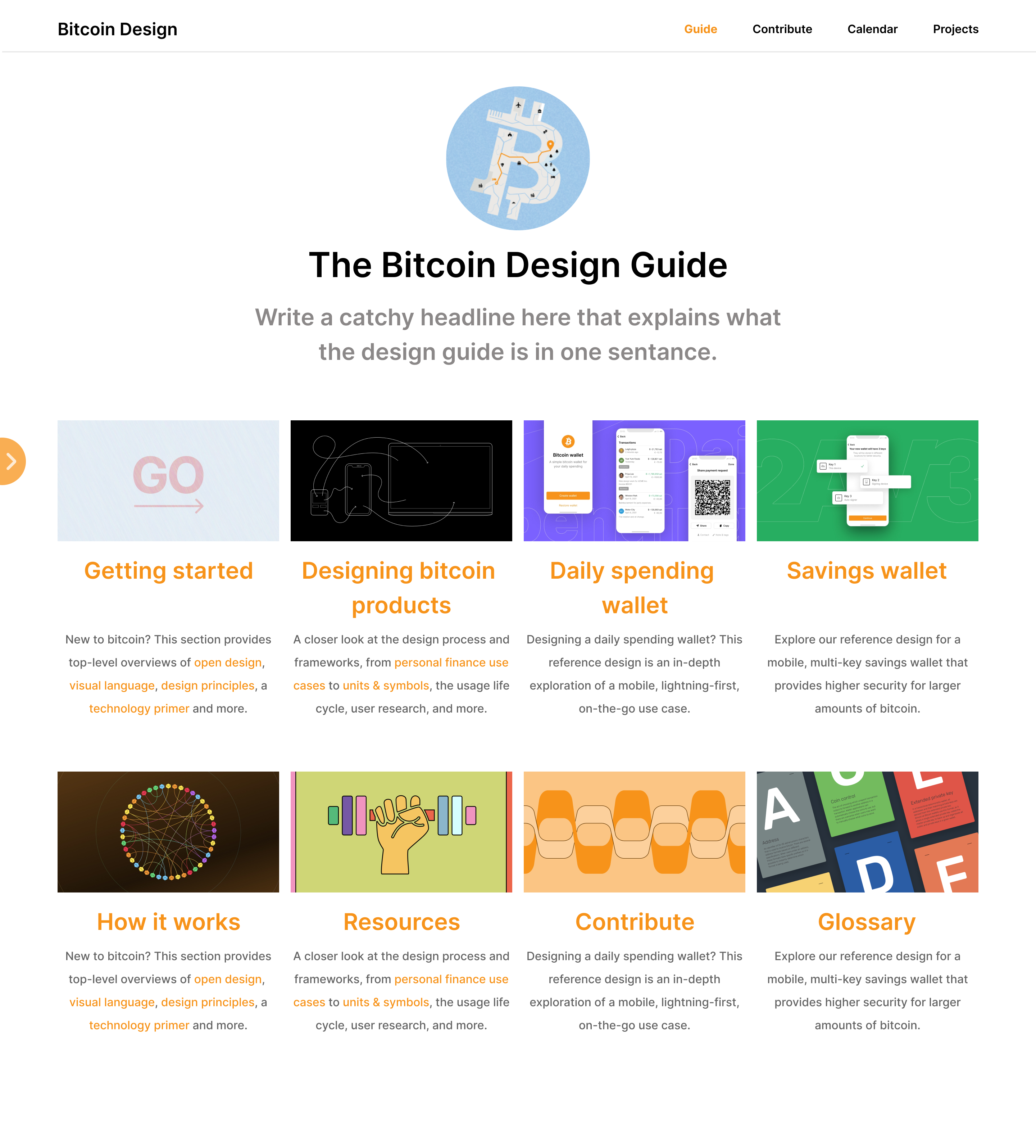
Below is a design I did for a new landing page we could implement. It keeps content focused to the center, removes a lot of clutter (more white space), has a clear tag line that explains what the guide is (just a placeholder for now), and highlights 4 main areas of the guide on the most commonly used screen resolution (1920×1080) without having to scroll or take any action to see them.
Images, titles, and copy could could be tweaked, sharing this as is for feedback before refining.
Another feature that would be good to have would be to show the left hand menu for users who prefer to navigate that way. Included a small video below that demonstrates how this would function.
https://user-images.githubusercontent.com/55287964/167537637-a30d05b4-1454-4fd1-a090-0986eb76c4ef.mp4
Hmm, this is very interesting approach, curious to hear what others have to say, I personally like it. What are some of the issues we're trying to address in the current landing page? To me it seems you're trying to solve:
- visibility
- story (conciseness)
Are there any more that we'd like to tackle in this redesign, if we decide to opt-in for it . For sure wider community consensus will be needed, but personally concept ACK from me.
I like having a visual paired with the heading at the top. It's also nice getting significantly more content above the fold. I don't like the hiding navbar as much. Would you envision that being on all pages, or just the Guide landing page?
What are some of the issues we're trying to address in the current landing page?
Mostly usability, it makes more content quickly accessible when you land on the guide. A one sentence tag line explaining what value offers the user also makes it more clear why you would use the guide. The current copy is a little abstract and isn't super clear WHY you would find value in the guide imo.
I have a few mixed thoughts and suggestions, hope they are helpful.
My main problem is that this design flattens the visual and content hierarchy making it visually more consistent and pleasing but harder to make sense of the content. In the design update we merged a month ago, we intentionally created a hierarchy that highlights the reference designs (partially because in the previous design everything looked the same). They are visually bigger and grouped under the title "Reference designs", which is also repeated in the sidebar. Similarly, we listed out the pages in "How it works" as it's such a mixed bag that it might be helpful for readers to see what's included right away. This new design removes the distinctions again and makes all content of the same importance. "Resources" and the "Daily spending wallet" look like they are similar content on the same level of relevance. So from the perspective of content readability, this is a worse design IMHO. But maybe there's a way to address this with a few tweaks.
As for the sidebar, didn't we also discuss this in the last revision of this page just 1-2 months ago and decided against it?
Generally agree with the idea of tightening things up. The text at the top could be trimmed and instead the introduction page of "Getting started" can be a more elaborate introduction. But this really requires a copy proposal. It is not proven that we can explain the guide in a tagline until we actually write that copy.
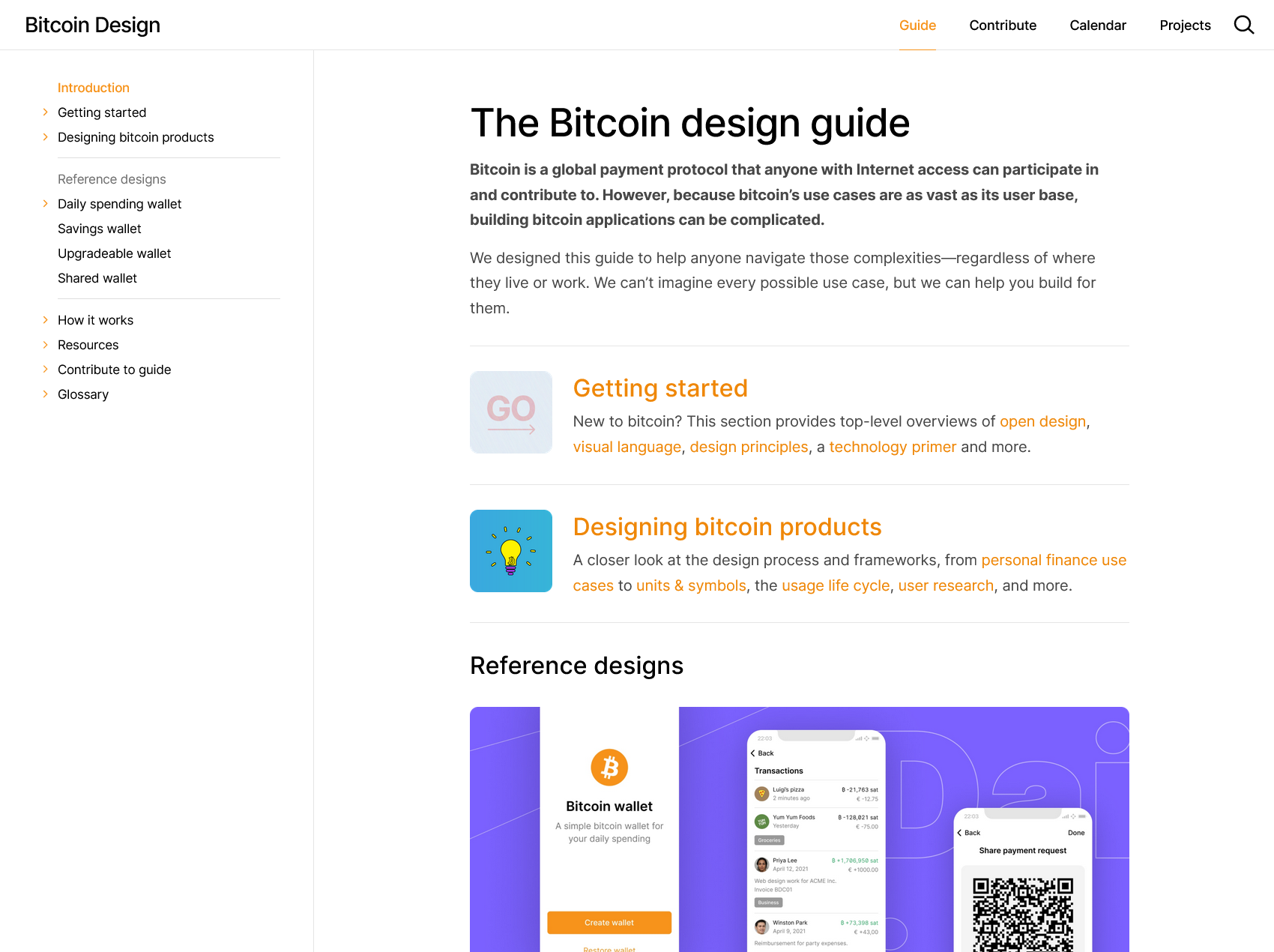
To be more constructive in regards my main criticism above, I briefly butchered together a frankenstein-mock to show what I mean about the visual hierarchy:
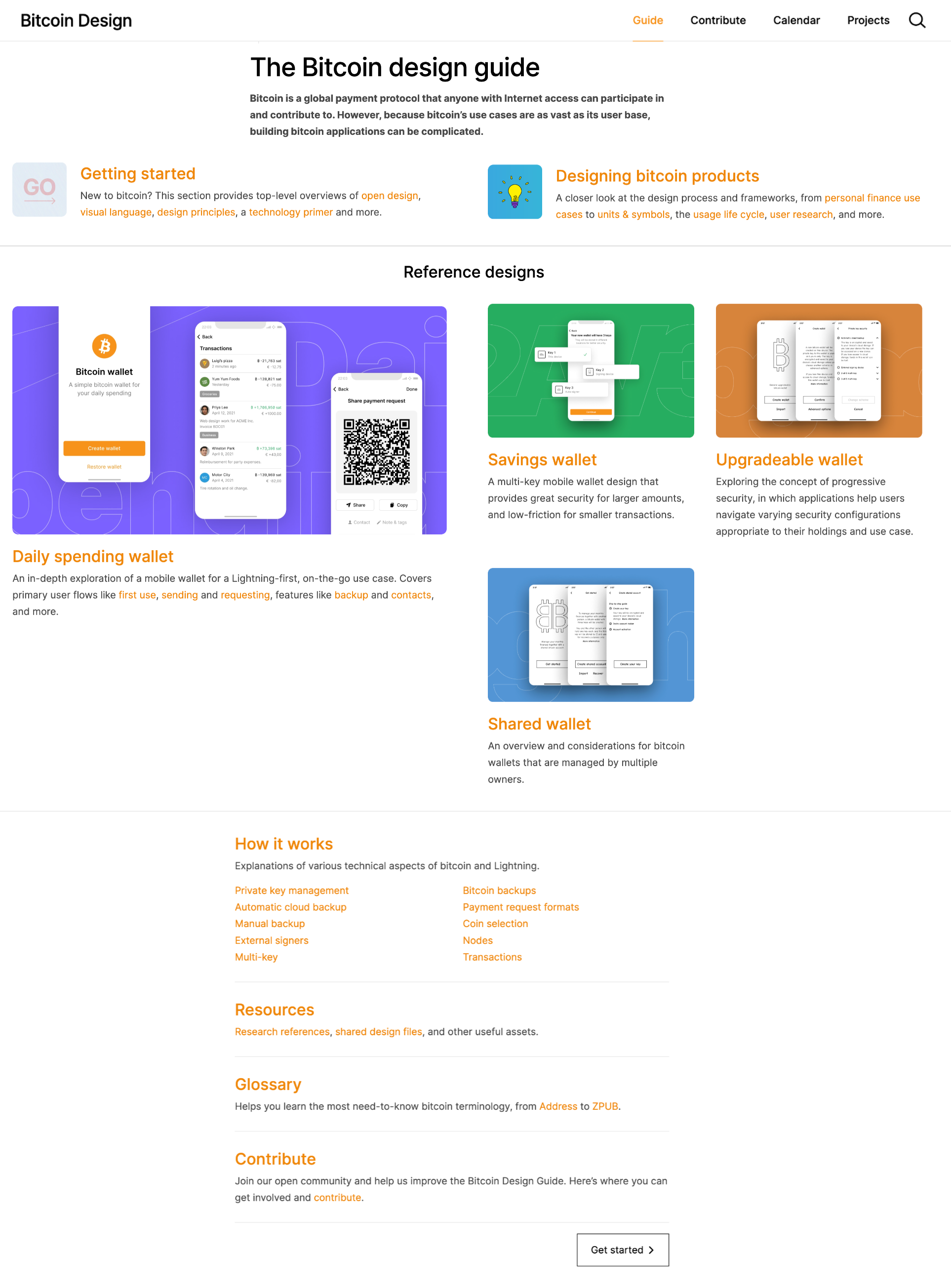
Ignore visual details (and the bottom half), I just cut up a screenshot and moved things around. Just wanted to visualize an alternate approach to the problems that this proposal is looking to address. The space on wide screen is used more efficiently and content is higher up. The "Reference designs" title is still there, and there's a clear visual hierarchy to inform me which content is the most important.
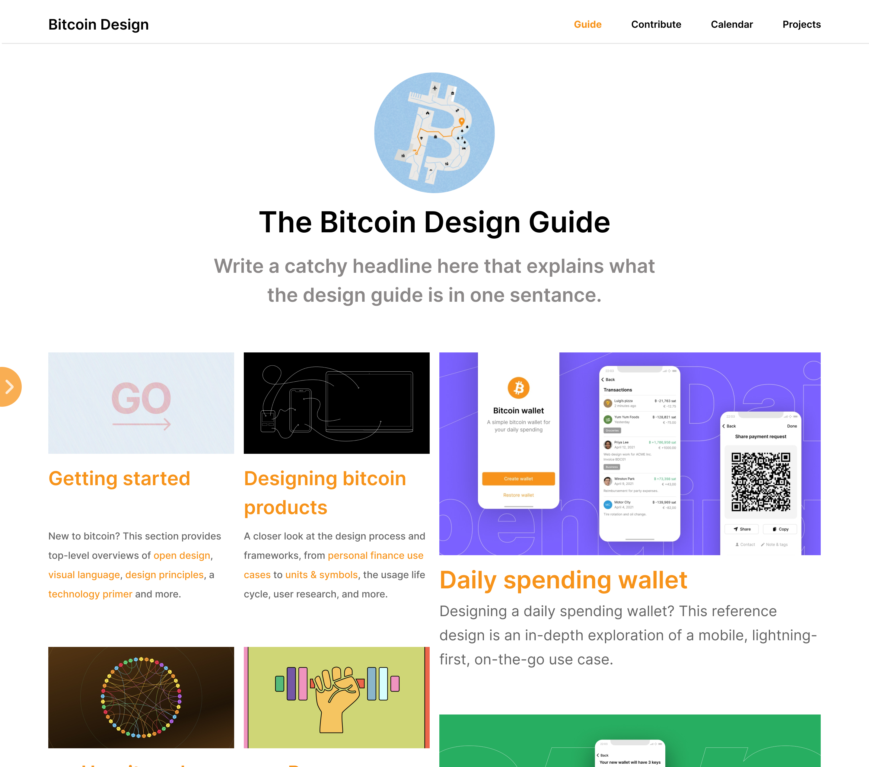
Below is what I see when I land on the design guide. I agree with your points on visual hierarchy. Though it's clear the current landing page does not achieve this either. Even though the DSW page is visually larger, I can't even see what that is without scrolling so the Getting started and Designing Bitcoin Products get the visual priority so it doesn't matter that its larger in its current state.
My screen is larger than the most used screen size so most people would see even less content than this.
But maybe there's a way to address this with a few tweaks. So from the perspective of content readability, this is a worse design IMHO.
I don't think it's a matter of a few tweaks, the current landing page is just not a landing page imo. I barely get 30% of the content without scrolling, it does little to inform the user on what the guide is about or the value it gives the reader, our main content is not visible, and visually just looks cluttered.
I'd suggest reading the NNgroup article I linked + content elsewhere on landing pages. We should really be following the best practices that 99% of websites in the world follow when it comes landing page design - which we currently do not do.
To address the hierarchy point, I did a quick change to my design to fix that (fyi this image matches the resolution of the image I showed above).
As for the sidebar, didn't we also discuss this in the last revision of this page just 1-2 months ago and decided against it?
We agreed to not remove it entirely, didn't really discuss this middle ground of having it collapsible. The benefits of the extra white space that helps us prioritize our content more, especially on smaller screen sizes, outweighs any downside of not showing the sidebar by default. Visually it also looks a lot cleaner without it.
and instead the introduction page of "Getting started" can be a more elaborate introduction.
Yeah agree, I suggested this when we were doing the re-structure. Much better way to do things, landing pages should be succinct and to the point.
It is not proven that we can explain the guide in a tagline until we actually write that copy.
This is very much possible, do we even really understand our product if we can't do that? I will get something up for this soon. The current copy says nothing about how the guide would give value to the user (reader of the guide), this is all it should be doing.
Overall, the main idea I wanted to convey here is that our current landing page really needs a revamp, and I'm not suggesting my solution is the answer but a change is necessary.
 .
.