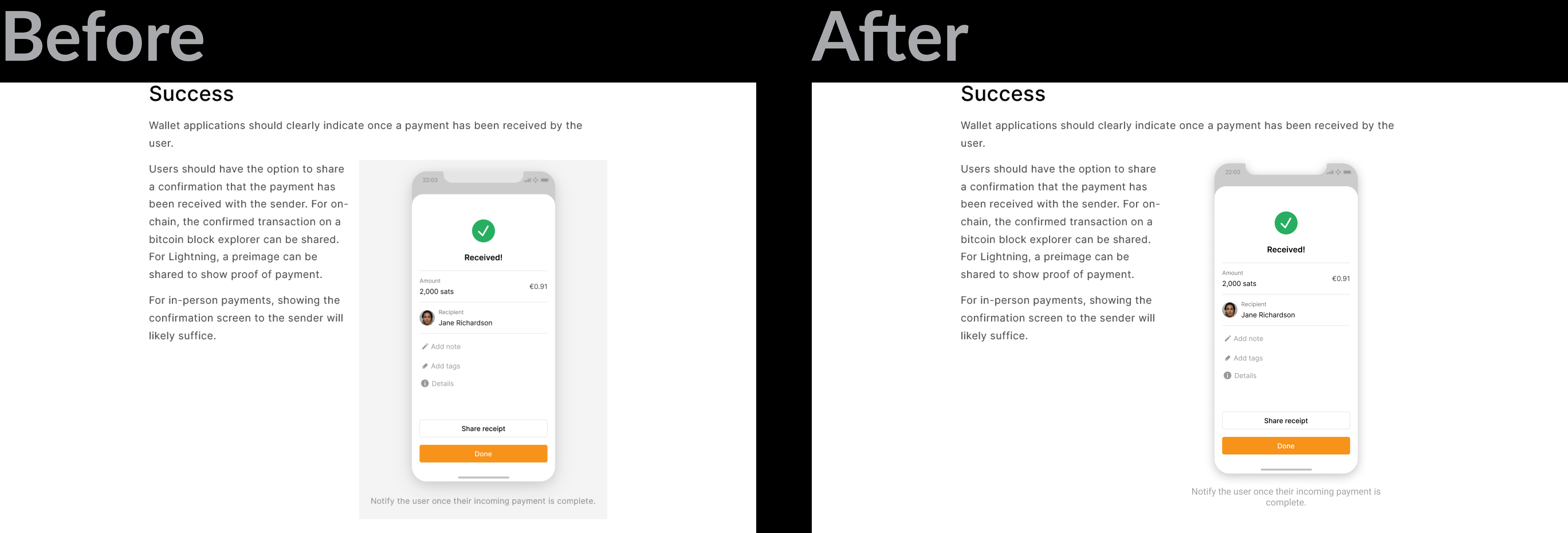
Remove grey background on images
Currently when using single images (not gallery) a grey background is shown (image on left below). It looks much cleaner to remove this (image on right).
Simply removing the -background does not suffice. Making the -background property white for these single use image instances would suffice.
Maybe on the gallery images too... Maybe just a personal preference but the background is unnecessary visual clutter.

I am not totally sold on this, for a few reasons:
- The light background provides extra contrast for people with less-than-optimal eye sight. Don't think the light shadow is enough on its own. White-on-white is tricky.
- It brings some extra visual structure to pages. Looks a bit too ragged at times.
- One of the initial ideas was to allow different background colors to let writers/designers be more expressive with this (see here). Been thinking about adding this in.
I don't think it's needed for dark images (and it is optional there), but screens that are mostly white, with white edges, need solid contrast.
- Could just make the shadow less blurred for improved contrast.
- I'm not a fan of having custom colors, could make the guide look very cluttered / inconsistent.
I'm not a fan of having custom colors, could make the guide look very cluttered / inconsistent.
Could be just an option for black or white. I think it would be useful for pages like the case studies or reference designs that might intentionally use a more expressive style.
@Bosch-0 it seems that https://github.com/BitcoinDesign/Guide/pull/675 is closed, should we close this one as well, or is there a clear list of tasks needed to be done in order to proceed with this one?
Hi, is there an update here? If yes, seems like an easy UI fix- I'd like to take it up! @Bosch-0 @GBKS