Add how it works visuals to `Private Key Management` sections
Each section in the private key management chapter has a 'How it works' section. Currently these sections are all just text based but as designers I think we should be showing rather than telling. I propose we include a Bitcoin application carousel using the UI kit showing how the PKM scheme works to each How it works section in the following PKM pages:
- [ ] Automatic cloud backup
- [ ] Manual backup
- [ ] External signers
- [ ] Multi-Key
What do you think of using diagrams instead of screen mockups? When I tried to figure out what user interactions multi-key wallets require, I created diagrams like the one below, which really helped me understand things. Then we can keep UI mock-ups for these schemes in the case studies in the context of specific products and use cases.
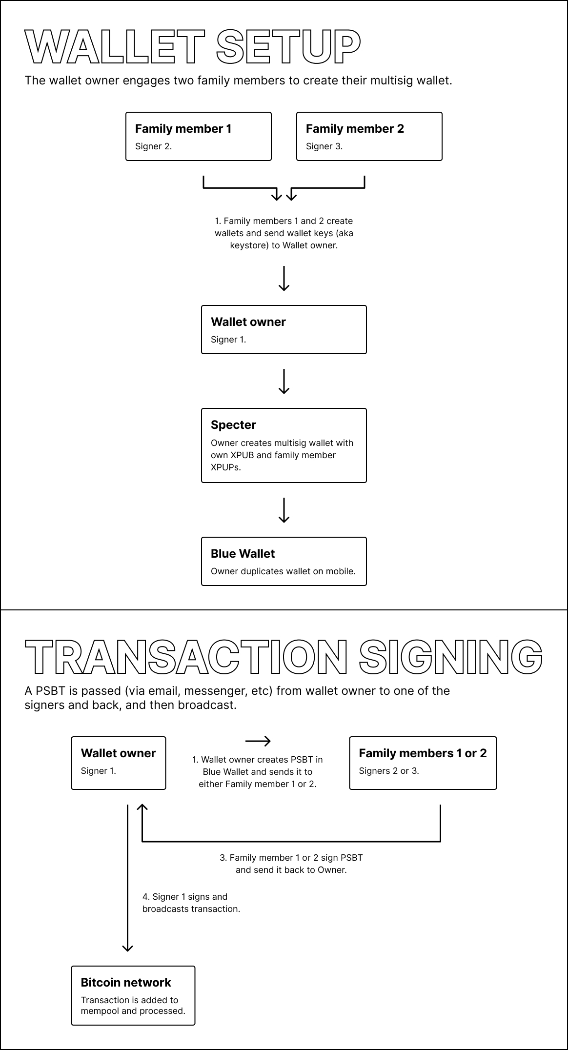
Yep diagrams are also great, fits in well with the PKM overview page which uses these visuals also.
Concept ACK, after reviewing these pages it really felt like we should provide graphics in the how it works section. @Bosch-0 are you taking on this one?
Yep I can take on this one! Christoph and Daniel already has a lot of the foundations laid out so shouldn't take long
@GBKS Is taking this one, realized in bitcoin core meetings that it's helpful to have a visual way to explain these.
This is now done for the multi-key page via #1064. I will take a look at the other pages to see if diagrams make sense. Those flows are a lot simpler, so it may not be warranted. But I'll take a look.