 Badgerati
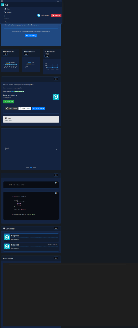
top navigation menu not responsive
everything is looking awesome when it is on a full page on the desktop but changing the resolution break the layout the top navbar is on top of another elements, also the mobile nav button on the right looks bigger, and the code editor not changing his size
Not toooo surprising, I've never done mobile responsiveness before and always left Bootstrap to deal with it. Usually it's fine, but I guess here, especially in the nav bar there's a lot more custom elements.
The code editor I should be able to fix, and I can have a shot at the nav bar but might have to put out a call for help 👀
i will try to find time to help with the mobile nav
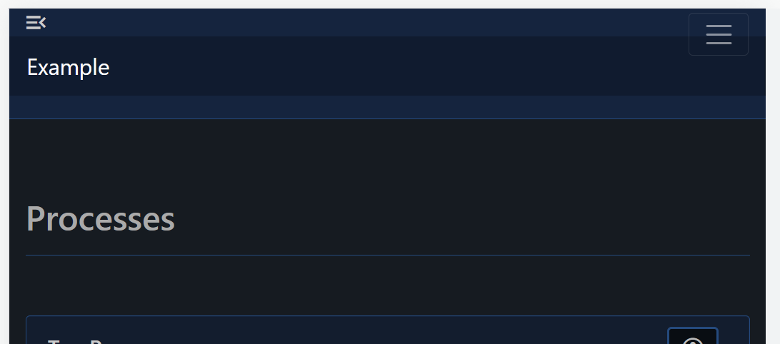
@AlonGvili Is this one of the things you're referring to (the overlap)?
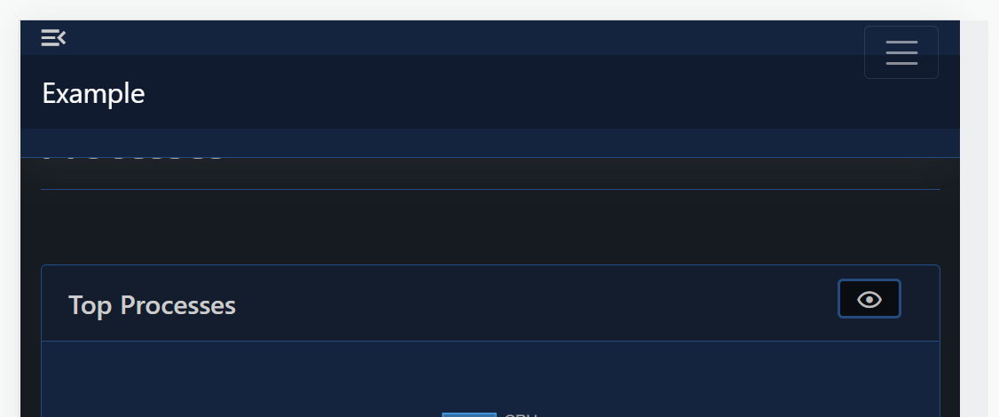
Removing the fixed-top class from the first nav element results in this which is better although I'd reduce some of the padding:
Hello, will anything be fixed here? and is it possible to hide the entire top part from the menu?