BEE2.4
 BEE2.4 copied to clipboard
Redesigned item context window
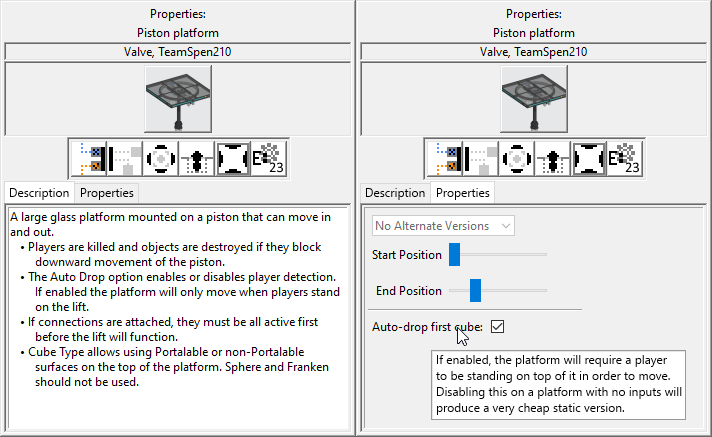
- The lower half of the window is split into two tabs. The Properties tab shows default properties (replacing Change Defaults), itemvars, and alternate versions (hidden when none are present). Descriptions appear in tooltips when hovered over.
- The placement icons are centered and entity count is displayed down here. These could also possibly be moved into the properties tab, though that might make it too cluttered.
- More Info is removed entirely. At some point we want to move all item info into the app, so this would be unnecessary. Markdown links would be supported in item descriptions, allowing you to still link to additional info if necessary.
Thought of a few other things that could probably be improved with this design:
- The Properties tab should be split:
- Normal item properties would go in an "Editor Settings" or "Default Settings" tab, with text at the top explaining that it sets the defaults for the in-editor settings
- Itemvars and alternate versions would go in a "Global Settings" tab, with text at the top explaining that they apply to all copies of the item and can be saved into palettes.
- The alternate versions dropdown should have a label, and disappear if the item has no alternate versions
- Either/both settings tabs could also be hidden entirely if they would be empty
- The subtype display could probably be made more compact, maybe using arrows or a dropdown instead of showing all the icons?
- Internally, property descriptions would be defined directly in the editoritems
Propertiesblock, and stripped out when exporting.
I was thinking about it and do we really need the item placement icons at all? Getting rid of them would make things a lot less cluttered, and it's not like you can't figure out that information yourself from in-editor testing (except entity count, but that could be moved back to the top-right where it is currently).
A further note, description should be expanded so it can fit more text, the current one is a little too small.
Thought of a few other things that could probably be improved with this design:
- The Properties tab should be split:
- Normal item properties would go in an "Editor Settings" or "Default Settings" tab, with text at the top explaining that it sets the defaults for the in-editor settings
- Itemvars and alternate versions would go in a "Global Settings" tab, with text at the top explaining that they apply to all copies of the item and can be saved into palettes.
- The alternate versions dropdown should have a label, and disappear if the item has no alternate versions
- Either/both settings tabs could also be hidden entirely if they would be empty
- The subtype display could probably be made more compact, maybe using arrows or a dropdown instead of showing all the icons?
- Internally, property descriptions would be defined directly in the editoritems
Propertiesblock, and stripped out when exporting.
I was working on rewriting the properties window (the code was really messy), added descriptions exactly as you mentioned, and it now is saved in palettes. Subtypes display could be smaller yeah, change it into showing 3 items perhaps, with arrows either side?
For the alternate versions, I kinda want to just fold those into itemvars, make it a generic dropdown.
Yeah probably, we could maybe keep the old alternate versions for backwards compatibility but I'm not sure if anyone actually uses them anyway