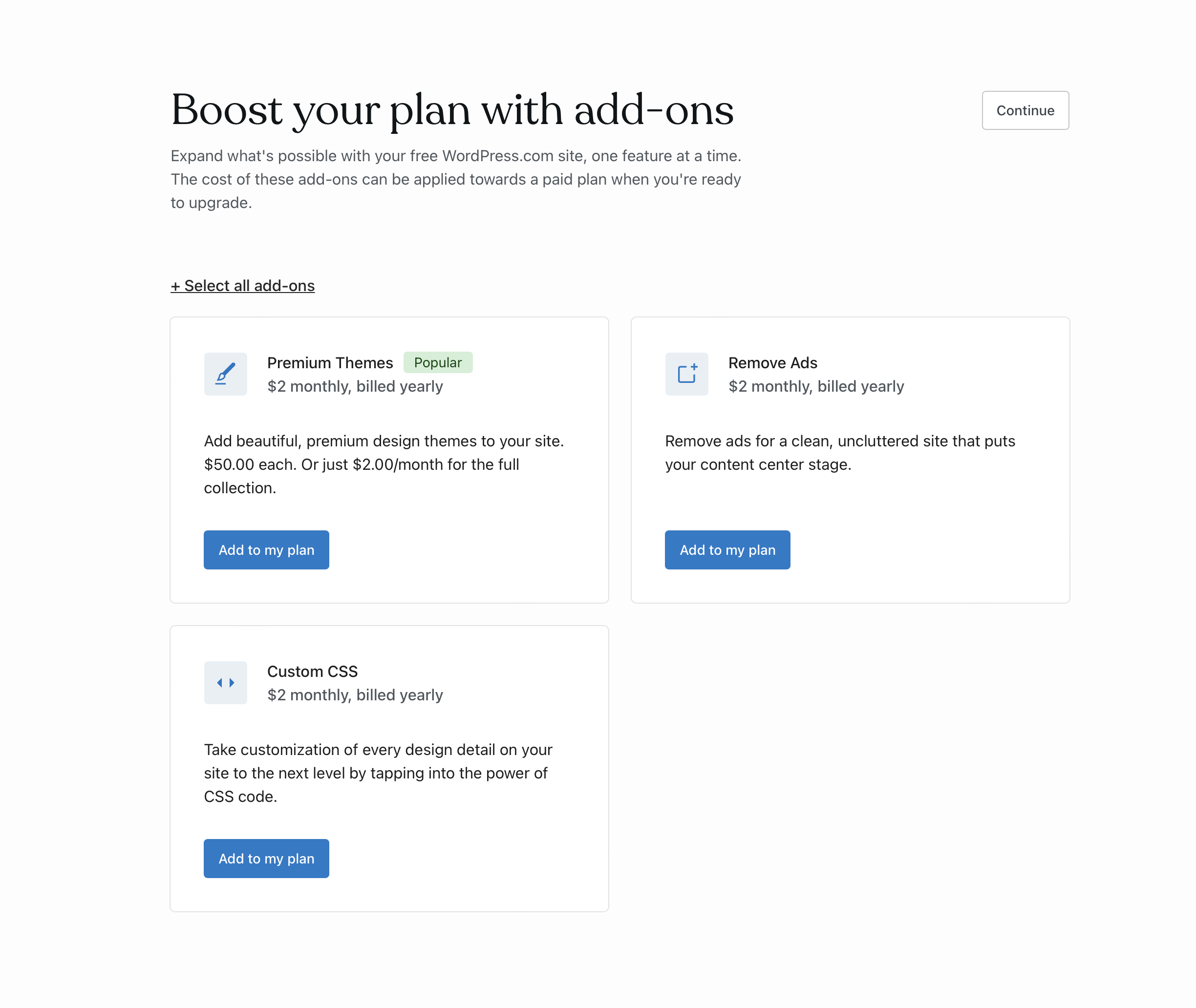
Reviewing UI/UX in the Add-ons page for Free Flow
This is the flow I'm currently seeing (text related notes in #65410)
- [ ]
Continueshould beSkipsince Continue has an implicit action first you don't need to make in reality. If we rather want people to take an action, we could either hide temporarily Continue - [ ] Select all add-ons should be more discreet. Without + and only Select all.
- [ ]
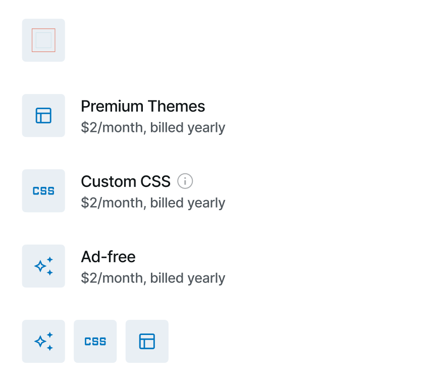
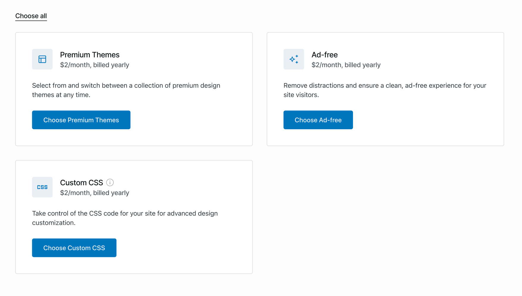
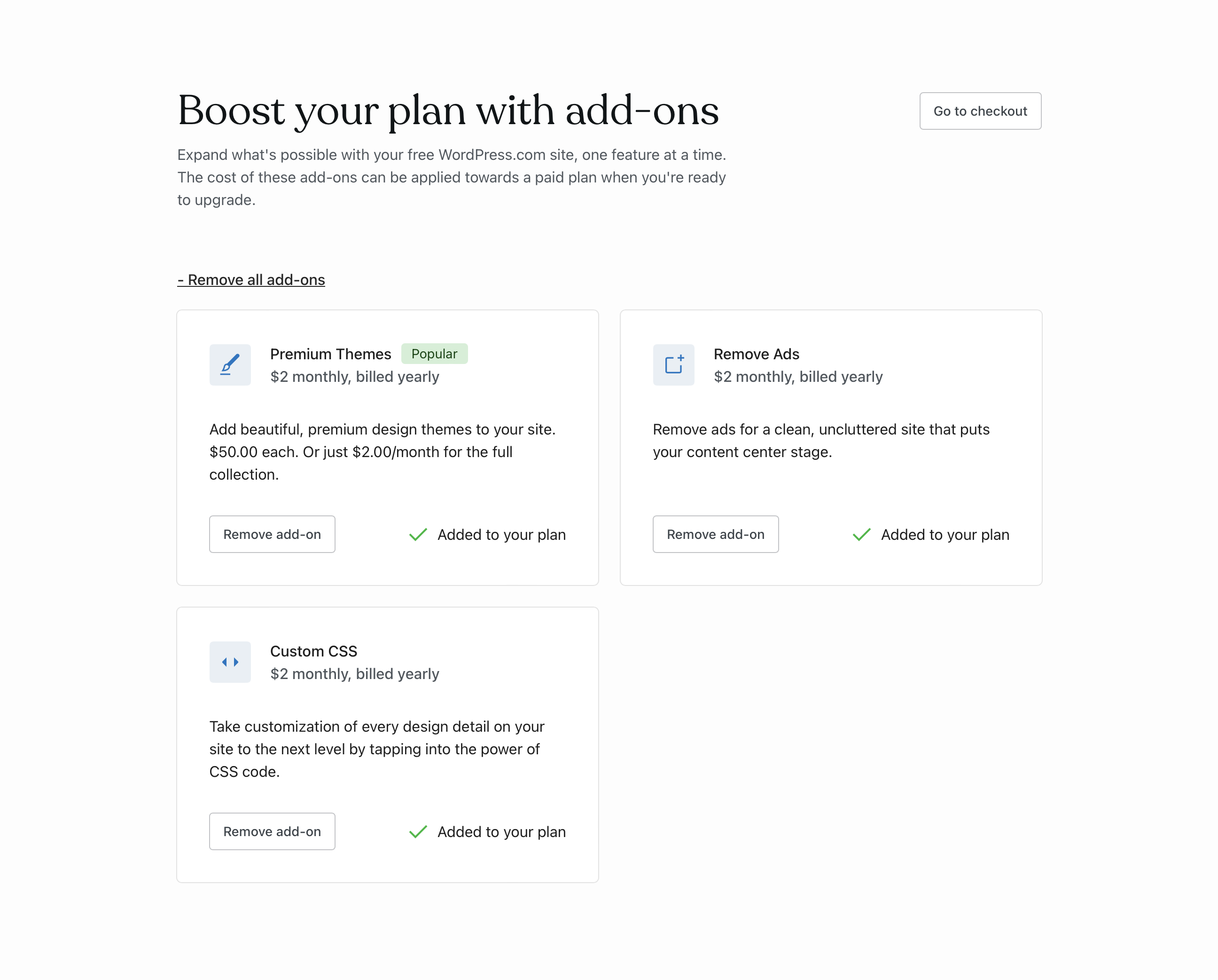
Add to my plan>Select/Add/Get/Buy (name of the add-on) - [ ] The icons aren't fully representative of the add-on. Like the CSS or the Ads-Free. Premium Themes should be connected to how we highlight them in the design picker/showcase or more related to a layout icon. We don't use that brush elsewhere.
- [ ] Once you select one or multiple, we should surface the price alongside the check out button to give anticipation of what you are paying for, which you don't see until you we load the check out page.
- [ ]
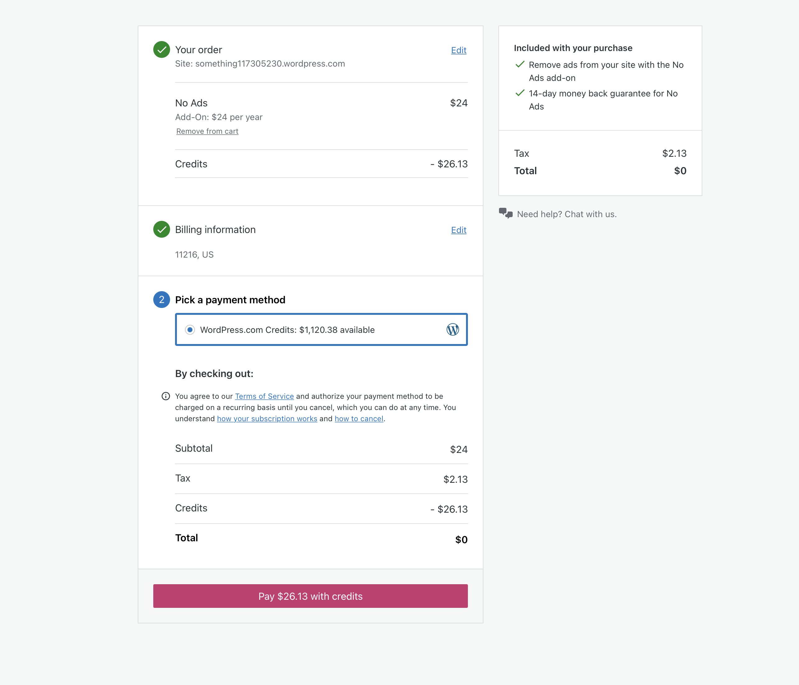
Check out>Continue to payperhaps. - [ ] It'd be better to have a layout of horizontal rows so it's more scalable to any number of add-ons. At least of we add more than two in.
@lucasmendes-design @simison @ianstewart @michaelpick
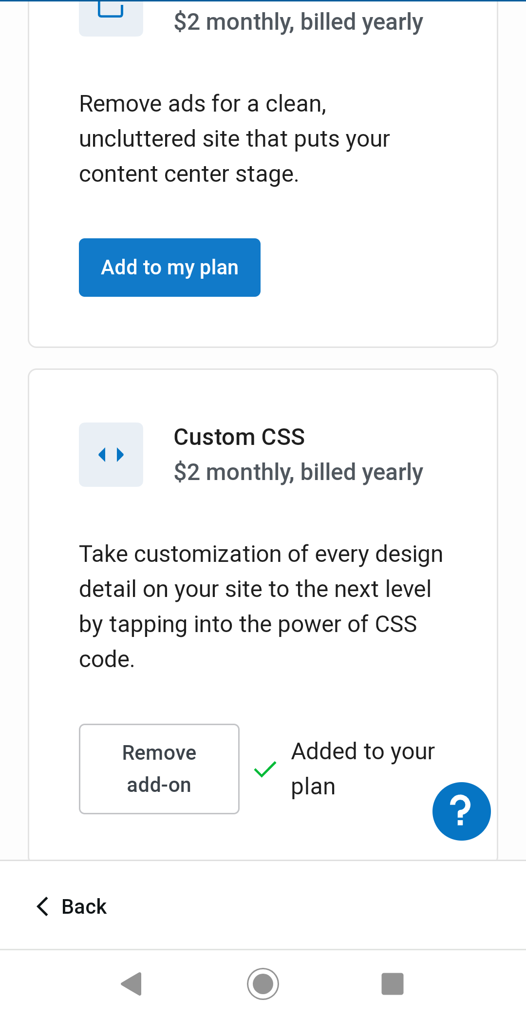
There's also a UX issue here on mobile specifically -- once you scroll down to the bottom of the list and select an add-on, you are kind of stuck, until you realize you have to scroll all the way up again to find the new "Go to checkout" button.
Probably some kind of checkout option towards the bottom of the screen would help with this (and might be somewhat helpful at desktop widths too).
This is what you see currently after selecting an add-on at the bottom of the list:
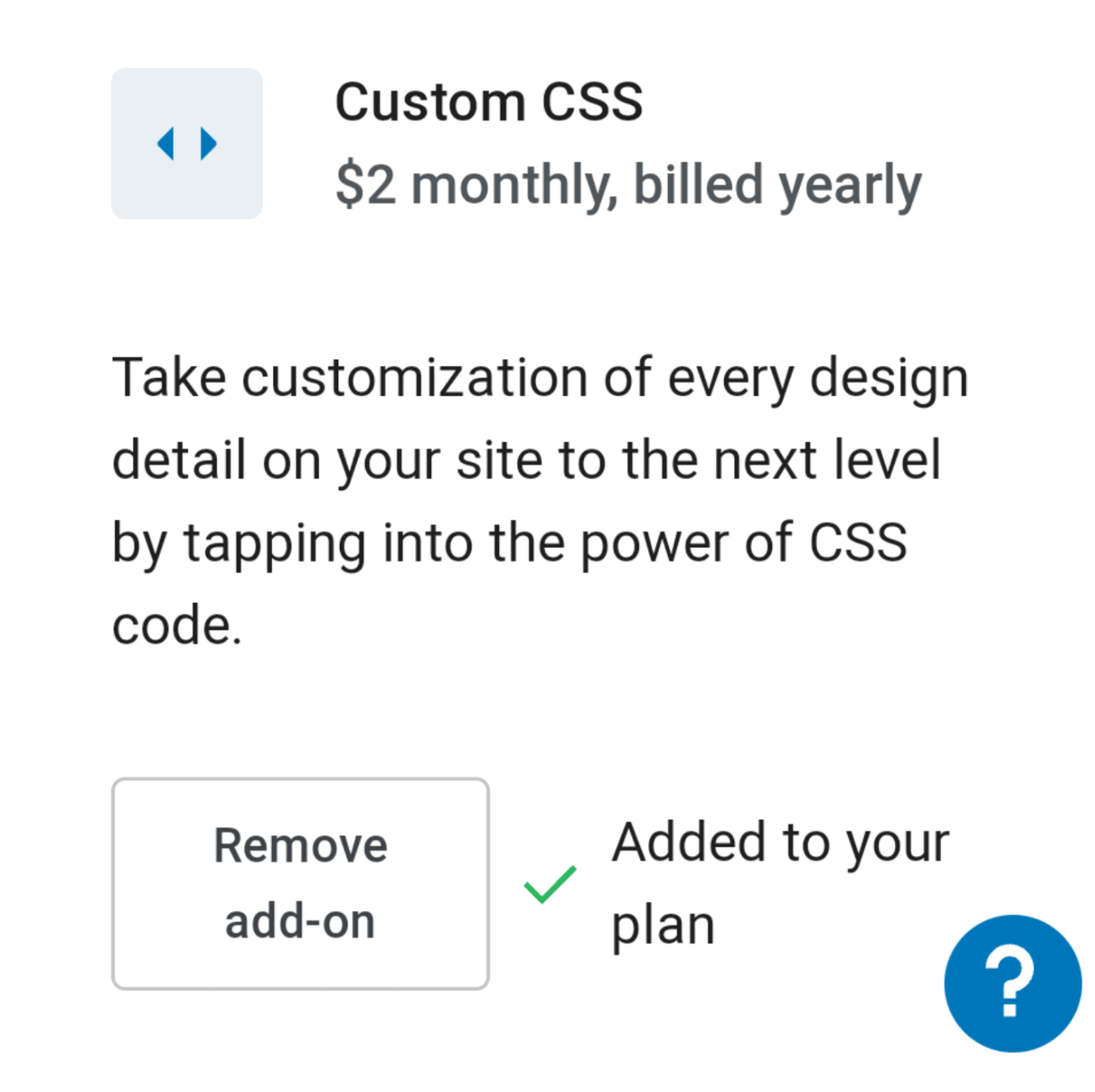
The icons aren't fully representative of the add-on. Like the CSS or the Ads-Free. Premium Themes should be connected to how we highlight them in the design picker/showcase or more related to a layout icon. We don't use that brush elsewhere.
Agreed, The CSS I tried to use something like "< >" because it's similar to HTML and CSS. I'll find a better one, otherwise, I'll do a specific icon for each one.
Once you select one or multiple, we should surface the price alongside the check out button to give anticipation of what you are paying for, which you don't see until you we load the check out page.
Got it!
It'd be better to have a layout of horizontal rows so it's more scalable to any number of add-ons. At least of we add more than two in.
I think we need to balance the layout and how we can sell the add-ons with enough space, I'll iterate on that for the next launch when we have more add-ons to offer.
There's also a UX issue here on mobile specifically -- once you scroll down to the bottom of the list and select an add-on, you are kind of stuck, until you realize you have to scroll all the way up again to find the new "Go to checkout" button.
Thanks for this @DavidRothstein. It makes a lot of sense to have a better interaction for mobile. I'll work on that 🙌🏼
Add to my plan > Select/Add/Get/Buy (name of the add-on)
I followed the same pattern on the pricing page (Choose + Name of the add-on).
Select all add-ons should be more discreet. Without + and only Select all.
✔
The icons aren't fully representative of the add-on.
I'm creating new icons for Free Ads
Once you select one or multiple, we should surface the price alongside the check out button to give anticipation ....
✔
Web flow
Once the user select a add-on, the button changes to secondary to primary. If we want to create friction we can also try to use the Skip action on subtitle, the same rationale for Pricing page (example)
https://user-images.githubusercontent.com/98343583/178377151-0256a33f-ec3c-498e-a201-5816d0a47f92.mov
Mobile flow (@DavidRothstein)
For mobile, we can use a different approach to show the price alongside the purchase button.
https://user-images.githubusercontent.com/98343583/178378741-08ba3b72-3270-46cc-8580-61a7ffc72bc0.mov
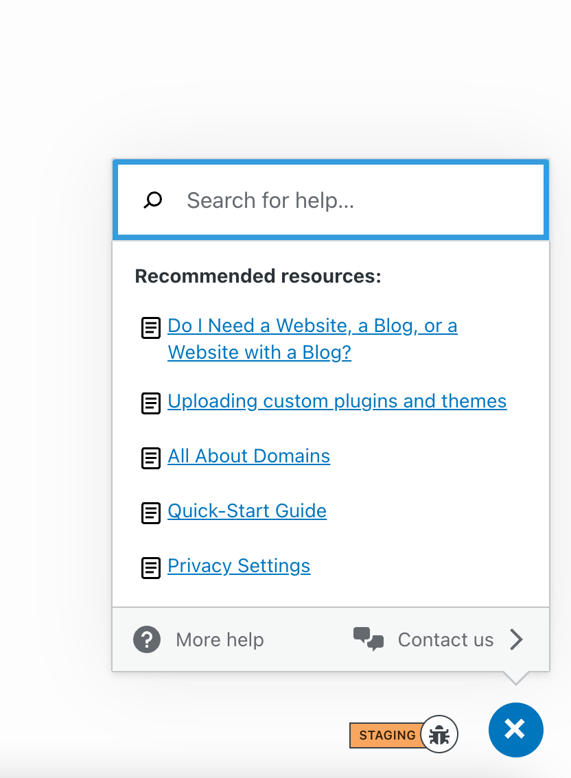
Btw, I think we should get rid of that or use the same links as WordPress Support Add-on for the help center, otherwise, it's out of context.. cc @DavidRothstein @gmovr