Aurora.3
 Aurora.3 copied to clipboard
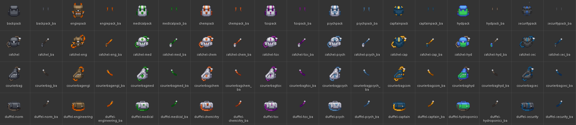
New backbag sprites and a lot more!
- rscadd: "Compresses bag types and adds seperate color selection option in the loadout. Color selection only works for leather satchels, pocketbooks and rucksacks. Select 'None' for default color."
- rscadd: "Adds Faction-specific Backpacks! Matches your corporation."
- rscadd: "Adds new Job-specific bags, namely for all the Heads of Staff, the Psychiatrist, and EMTs."
- imageadd: "Adds resprited backpacks and satchels from /tg/, the rest sprited by yours truly."

 forgot zeng-hu because i am sleep deprived
Note : Swapped around the leather satchel and the grey satchel in code for tidiness reasons.
Inhands will be done at a later date because I am very tired.
Maybe put this up for a test merge so people know the option exists. And report any issues they have.
Hope you enjoy. Thanks.
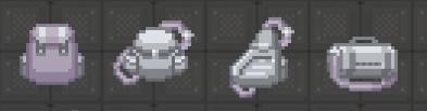
The shading on these ones are nice, but it would be interesting to see what the Idris and NanoTrasen backpacks would look like with the logo since it seems like there's just a missing space (especially since the latch is missing on the NT satchel/isn't that clear).
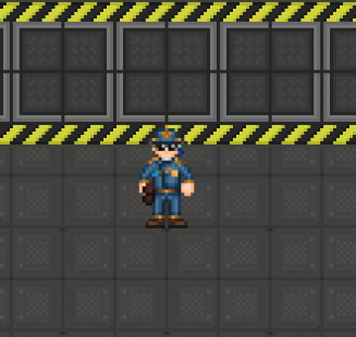
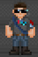
These new sprites aren't bad, but there is one major issue - the straps are ludicrously thick and obscure a huge portion of the character's outfit.
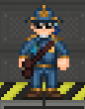
 Compare your new leather satchel to the old one - your design would have a diagonal third of the character's outfit obscured by the strap, and there isn't a single backpack item you're adding that is slimmer than this. In fact, the strap looks so thick that it resembles what the back-worn assault rifle sprites look like. These absolutely need to be slimmed down, because a character's sprite is the only visual expression of that character, and these new backpacks highly distract the sprite as a whole.
Was PMCG missed? Might also be worth having variants in black for Zavodskoi as well. Or that the bags are all together black. As is, Orion and Zavodskoi are the same beyond a splash of red.
I think they look pretty good, I do agree on the straps being too wide. Otherwise, I like them personally and dont think they clash with the style(too much).
The Idris bags are very low contrast and monochromatic. Adding a real accent color and some hue-shifted lighting like the original TG bags would help. The Nanotrasen bags are low-contrast to a lesser extent as well, and could use darker shadow areas imo.
 Added PMCG bags, I forgor 💀 . Thanks, Nienna.
 Also, as requested, I added a feature where you can hide your strap under your clothing.
Might also be worth having variants in black for Zavodskoi as well. Or that the bags are all together black. As is, Orion and Zavodskoi are the same beyond a splash of red.
Originally, Zavodskoi was black, however they didn't play nice with their Science uniforms, so they are brown.
The Idris bags are very low contrast and monochromatic. Adding a real accent color and some hue-shifted lighting like the original TG bags would help. The Nanotrasen bags are low-contrast to a lesser extent as well, and could use darker shadow areas imo.
I'm using the currently established uniform palettes for now, they may be changed on a later date.
I think these changes for bags are a bit too drastic. The shading is going to look out of place with literally every clothing item - it's just not gonna work.
Personally, I think these are an improvement over the 2012-era /tg/ desaturated goop we had. For people with really out there customised clothing, most of them already use the recolorable leather satchels and pocketbooks anyway.
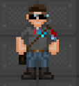
I think "add the ability to remove the straps entirely" is a very bizarre solution to "three pixel wide straps simply do not work" problem. Why not just make the straps, well, not that thick? I don't follow the logic - especially because the straps are an important visual indicator of whether or not you're even wearing a bag at times, and they often contribute to aesthetics. There's nothing wrong with straps existing - the problem is with them being way too thick. This PR essentially presents you with two flawed choices: Go without the strap altogether, or have the aesthetic annihilating three-pixel straps.
I think "add the ability to remove the straps entirely" is a very bizarre solution to "three pixel wide straps simply do not work" problem. Why not just make the straps, well, not that thick? I don't follow the logic - especially because the straps are an important visual indicator of whether or not you're even wearing a bag at times, and they often contribute to aesthetics. There's nothing wrong with straps existing - the problem is with them being way too thick. This PR essentially presents you with two flawed choices: Go without the strap altogether, or have the aesthetic annihilating three-pixel straps.
Because one tile straps look absolutely terrible. A thin, one pixel line gives little-to-no space to work with and has the worst of both worlds - it clutters the sprite like a three-wide without giving the additional space to work with, and on the otherhand, it's hard to see anyway, so might as well remove it.
Here are some examples by our contemporaries with well-established artstyles. Eris and Colonial Marines has had them removed. /tg/ has them 3-wide. It has been tried and tested, by teams of talented, some commisioned, spriters. They simply do not work.
Addendum : Funnily enough, we already have things with 3-wide straps. See the fireaxe back and bluespace backpack sprite.
This pull request has conflicts, please resolve those before we can evaluate the pull request.
I think "add the ability to remove the straps entirely" is a very bizarre solution to "three pixel wide straps simply do not work" problem. Why not just make the straps, well, not that thick? I don't follow the logic - especially because the straps are an important visual indicator of whether or not you're even wearing a bag at times, and they often contribute to aesthetics. There's nothing wrong with straps existing - the problem is with them being way too thick. This PR essentially presents you with two flawed choices: Go without the strap altogether, or have the aesthetic annihilating three-pixel straps.
Because one tile straps look absolutely terrible. A thin, one pixel line gives little-to-no space to work with and has the worst of both worlds - it clutters the sprite like a three-wide without giving the additional space to work with, and on the otherhand, it's hard to see anyway, so might as well remove it.
Here are some examples by our contemporaries with well-established artstyles. Eris and Colonial Marines has had them removed. /tg/ has them 3-wide. It has been tried and tested, by teams of talented, some commisioned, spriters. They simply do not work.
Addendum : Funnily enough, we already have things with 3-wide straps. See the fireaxe back and bluespace backpack sprite.
Even if you are correct about one pixel straps (you aren't, to be frank), you're creating a false dichotomy by suggesting there are two options and two options alone - three-pixel straps or one-pixel straps. In reality, two-pixel straps work just fine - we already use them and, well, they look good.
 Here's the fact of the matter: I have not encountered even a single player that has liked the three-pixel strap design. So no, they really don't work.
Three-pixel straps work for fireaxes and assault rifles. Not backpacks that people wear 24/7 at all times. Odds are if you're wearing one of these things, your sprite will already be obscured.
Here's the fact of the matter: I have not encountered even a single player that has liked the three-pixel strap design. So no, they really don't work.
Three-pixel straps work for fireaxes and assault rifles. Not backpacks that people wear 24/7 at all times. Odds are if you're wearing one of these things, your sprite will already be obscured.
This pull request has conflicts, please resolve those before we can evaluate the pull request.
This pull request has conflicts, please resolve those before we can evaluate the pull request.
This pull request has conflicts, please resolve those before we can evaluate the pull request.