ProgressRingPlugin
 ProgressRingPlugin copied to clipboard
 AndreasHennig
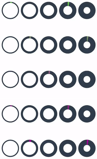
Progress Ring Control Plugin for Xamarin.Forms
Features
- Adjustable colors (both base and progress color)
- Adjustable ring thickness
- supports ProgressTo animation similar to the ones that come with the standard Xamarin.Forms ProgressBar
Setup
- Available on NuGet: https://www.nuget.org/packages/Xam.Plugins.Forms.ProgressRing

- Install into your PCL project and platform projects.
In your iOS project you have to call ProgressRingRenderer.Init() after global::Xamarin.Forms.Forms.Init():
public override bool FinishedLaunching(UIApplication app, NSDictionary options)
{
  global::Xamarin.Forms.Forms.Init();
  LoadApplication(new App());

  ProgressRingRenderer.Init();

  return base.FinishedLaunching(app, options);
}
On Android this is not necessary.
Platform Support
- Android
- iOS
Usage
Code
var progressRing = new ProgressRing { RingThickness = 20, Progress = 0.5f };
XAML
- Add XAML namespace:
xmlns:control="clr-namespace:ProgressRingControl.Forms.Plugin;assembly=ProgressRing.Forms.Plugin"
- Then add the xaml:
<control:ProgressRing RingThickness="20" Progress="0.5"/>
So all together your xaml file could look something like this:
<?xml version="1.0" encoding="utf-8"?>
<ContentPage xmlns="http://xamarin.com/schemas/2014/forms"
    xmlns:x="http://schemas.microsoft.com/winfx/2009/xaml"
    xmlns:control="clr-namespace:ProgressRingControl.Forms.Plugin;assembly=ProgressRing.Forms.Plugin"
    x:Class="TestProgressRing.TestProgressRingPage">
	<control:ProgressRing RingThickness="20" Progress="0.5"/>
</ContentPage>
Bindable Properties
- RingThickness
- RingBaseColor
- RingProgressColor
License
Licensed under MIT (see license file)
 AndreasHennig