redux-responsive
 redux-responsive copied to clipboard
 AlecAivazis
Redux store is not updated after screen width is changed.
Hi, Alec Aivazis, thank you for your efforts in creating this library.
I've tested redux-responsive library, and fix me if I'm wrong, but with the default configuration, redux-responsive does not respond to all media-query changes.
I've created a sample video of the issue:
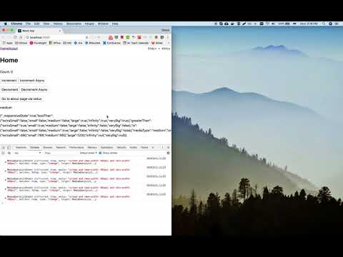
Notice, that just by changing the screen size, on the largest screen I'm able to get values 'medium' 'large' and 'veryBig', where only the last one should be possible.
However, if I make a hack and remove the if statement which checks when the query matches then this problem disappears. However, I'm really not sure what implications this would have for the general use cases.
I've created a repository which is used in this video.
Tested on: OS: macOS 10.13.3 (17D47) Google Chrome: 64.0.3282.186 (Official Build) (64-bit)
Additionally tested on BrowserStack and the same behaviour is visible on:
• Internet Explorer 11 on Windows 8.1 • Firefox 58 on Windows 8.1 • Safari 6 on OS X Lion
Hey @lukaskl - thanks for reporting this. I just made a brand new project using create-react-app, added the following depdencies: redux react-redux redux-responsive, copied the store and reducer from the README, and it seems to be updating appropriately. Here is a video demonstrating the behavior.
Which if statement are you referring to? Also, i'm not sure what you mean by
Notice, that just by changing the screen size, on the largest screen I'm able to get values 'medium' 'large' and 'veryBig', where only the last one should be possible.
This is in fact the intended behavior. A responsive website is one that responds to many different browser widths. For more information, wikipedia has a great article. It mentions "screen size" because the motivation is really mobile devices, whose browser take up the full width of the device screen. On a desktop, the "screen" is the browser, not your monitor.
Thank you, @AlecAivazis, for your quick reply.
For my first example I've cloned redux started project to visualize this issue, however, to make sure I've didn't do anything unnecessary I've created another repository and made the same steps as you wrote.
And indeed, it works with the steps you described, but I believe, this time I was able to localize what is causing the problem.
The problem appeared when I've changed the reducer (git commit) from
browser: responsiveStateReducer to browser: createResponsiveStateReducer(null, {...}).
Also, sorry for not making clear about the screen width. Indeed I was referring to a browser width not a screen width.
What I've meant to show in the video is that when I resize my browser to a half width of my screen, I get medium media type, however if I instantly resize it to a full screen, media type still remains medium.
Worth to mention, that on macbook I'm using spectacle and on Windows I've just used native restore reduced/ fullscreen window size. I.e. I'm making width changes more drastically.
Nonetheless, the issue still remains if I'm resizing the window gradually just by dragging the corner of the window, however, the outcome is a bit different, instead of veryBig I'm getting large.
To answer the remaining question, the if statement that I've meant was shown in the video, indeed I should have made this clearer.
I've just went to /node_modules/redux-responsive/lib/util/handlers.js and I've commented out the if statement:
        mediaQueryList.addListener(function (query) {
            // if a new query was matched
            // if (query.matches) {
                // recaulate the state
                refreshResponsiveState();
            // }
        });
I understand, that this is just quick hack for a demo (although it fixed the problem for me) and I'm really not aware what implications this will have on the rest of the functionality. Also, I believe this remark can be marked as obsolete, as I was able to narrow down the problem and most likely it is not this one.
Interesting, thanks for digging a little deeper on this. I'll try to figure out what's going on over the weekend. The quick "hack" you show would cause a new action to be dispatched for every breakpoint you've set, every time you transition to another one.
@lukaskl Did you ever find a fix for this from 3 years ago?? Lol. This problem still exists today. I am using this in an enterprise app and having the exact same problem. State updates just stop working when sizing back up.
We also are using browser: createResponsiveStateReducer.
This repo has received no updates in several years, is it dead/unsupported officially @AlecAivazis ?