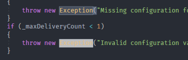
"Match color" item background too light, makes some text hard to read.
When changing the "Match color" display item background to a darker color, it makes text much more readable without having too little contrast to quickly spot the matches.

If it's possible to use outlines instead of background colors for match colors like Visual Studio Code does, that would be ideal...
...but if not, a darker background color should suffice. I used RGB(81, 41, 163), which is just a darker shade of the existing Default color. Tested it on several different symbols in different languages and it looks pretty good. I'd suggest bringing such a change into the project.
I've choosen RGB(54, 59, 69) so that the Match Text color matches the one inside of the outline box:
I think that should be the way it's done in the standard themes as well.