AdGuardDNS
 AdGuardDNS copied to clipboard
Connected devices data alignment iOS Safari
There seems to be a lot of inconsistency to how common data is visualised on the interface.
I've listed a few issues below.
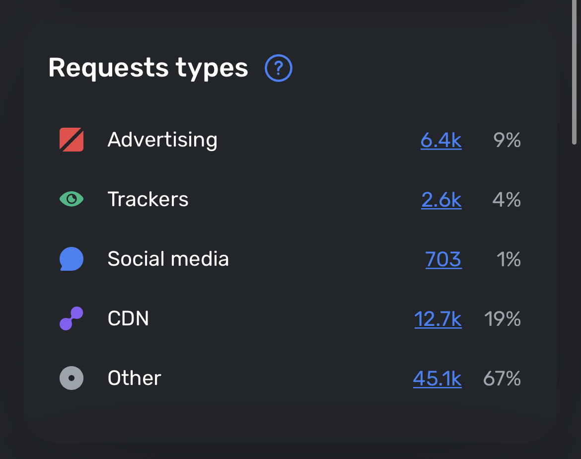
Companies data

To be clear I think this data above is presented best on mobile, and easily switches between portrait and landscape without issue.
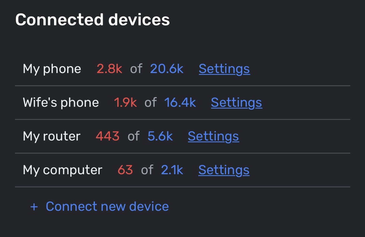
Server Settings Connected Devices

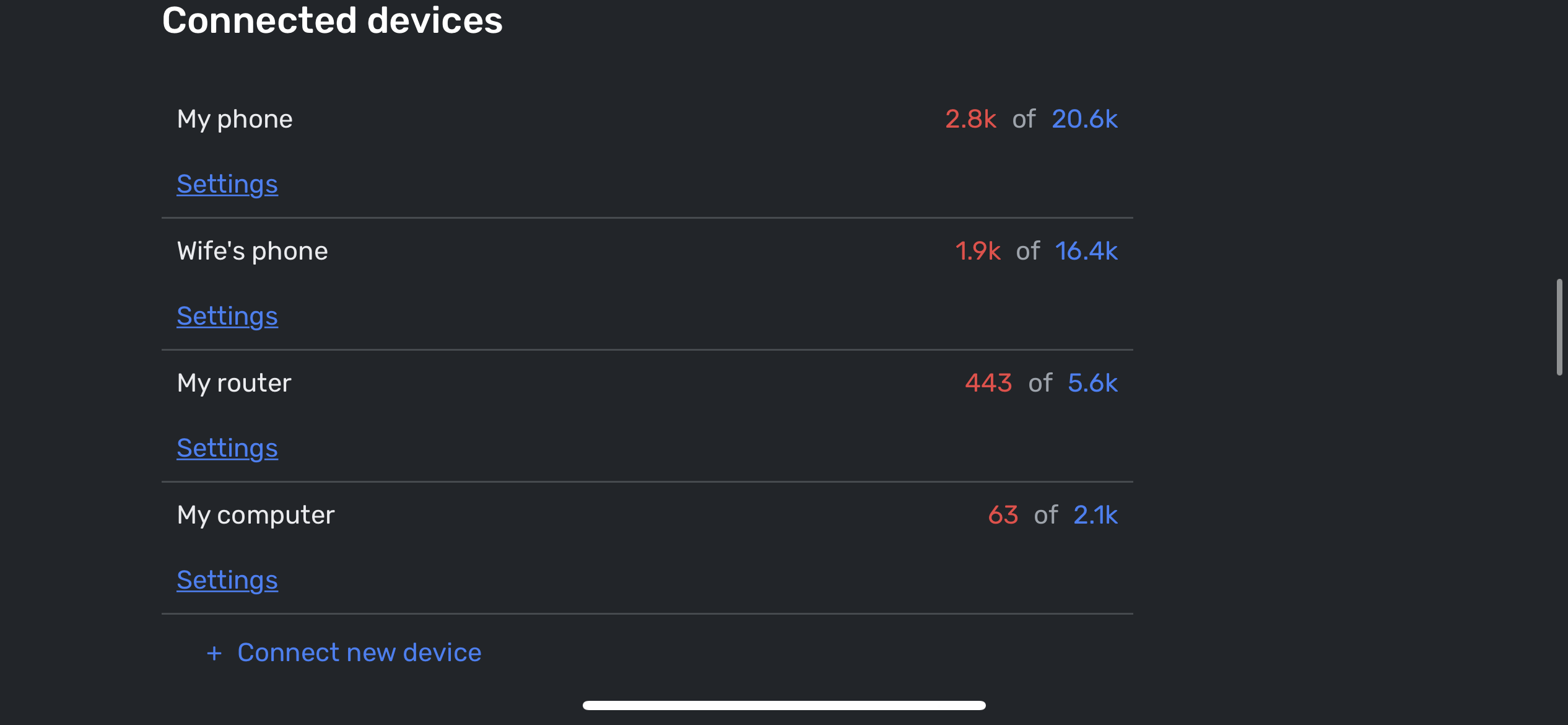
Landscape view

When the device is in landscape, the device statistics are quite neatly aligned to the right side of the page, but when in portrait mode, they seem to be squashed over to the left.
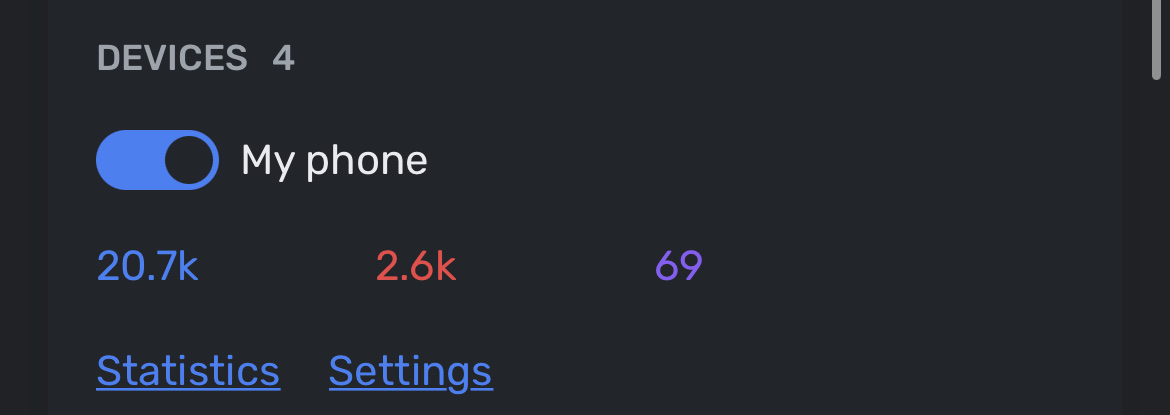
Dashboard Devices

The data here is very oddly presented on a second line, tabbed apart which looks like a waste of space.