Add display gamut mapping as a fixed function
As part of my efforts to improve my personal ACES OCIO configuration, I developed a simple gamut mapping method meant for display transforms. It's applied after the matrix transform and brings all values within the gamut. Since it's after the image has already been converted to another gamut, it can be gamut agnostic. Right now, I have it implemented as a LUT, but I think it would be great if this could be added to OpenColorIO as a fixed function. I don't know enough about the internals of OpenColorIO to feel comfortable adding this myself, so that's why I am opening an issue, in the hope that someone else can add this.
Now, I am aware that OpenColorIO already has a gamut mapping algorithm, the ACES gamut compress fixed function. However, this algorithm is not appropriate for display transforms and it does not attempt to preserve luminance. So, I still believe that there is a place for this algorithm.
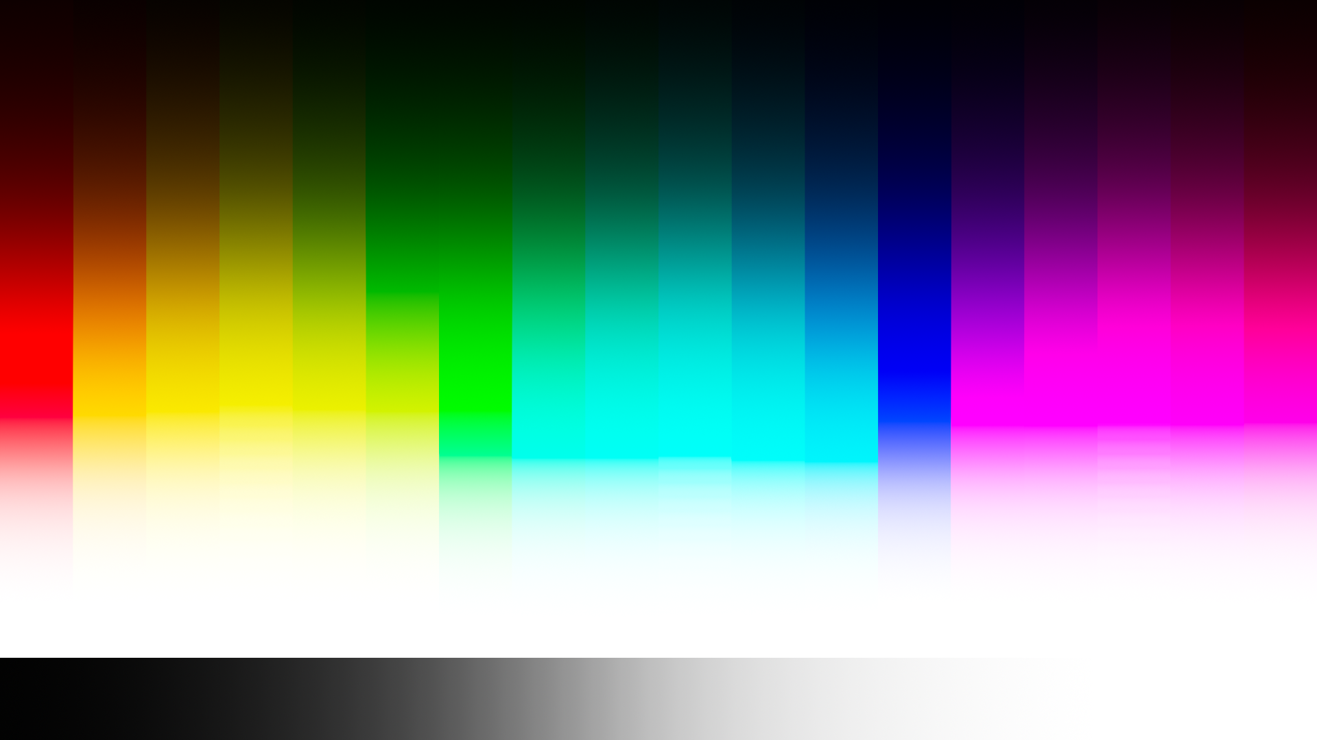
Here's an image without the gamut mapping:
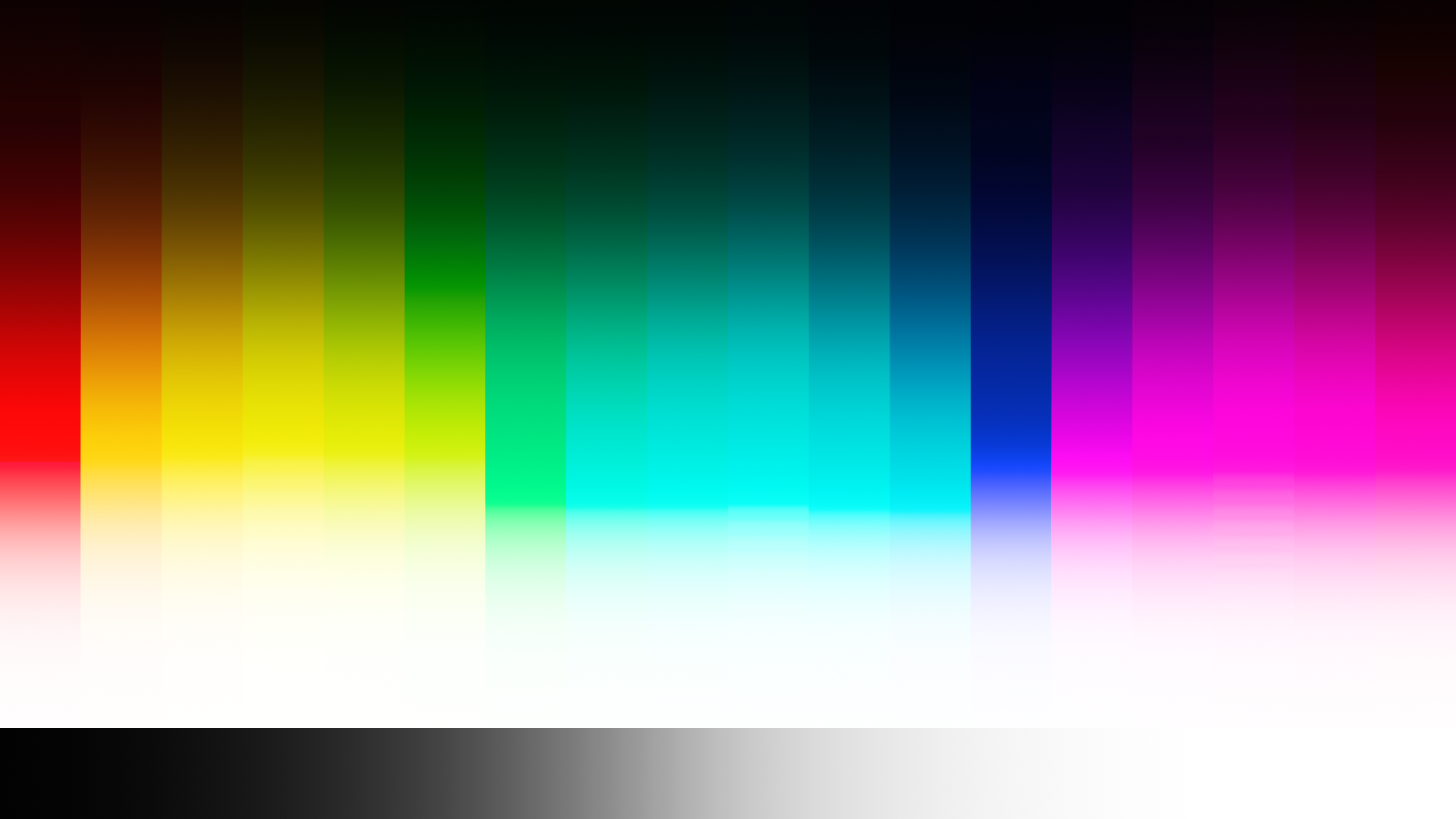
 And with:
The code for the gamut mapping is quite simple. The technique is basically that the RGB colour gets converted to HSV. Then the saturation gets remapped and the hue gets fixed. Then it's converted back to RGB and lastly the luminance gets corrected (since changing the saturation also changes the luminance). The code in Python looks like this:
def luminance(R, G, B):
    return 0.2126 * R + 0.7152 * G + 0.0722 * B

def gamutMap(R, G, B):
    Lo = luminance(R, G, B)

    # Convert to HSV
    hsv = toHSV(R, G, B)
    H = hsv[0]
    S = hsv[1]
    V = hsv[2]

    # saturation mapping
    if S > 0.98:
        S = (S - 0.98) / 0.02
        S = S / (S + 1.0)
        S = S * (0.02 / 0.91) + 0.98
        S = min(S, 1.0)

    # Fix the hue in order to make the reds and blues
    # show in a more predictable manner.
    if H >= 354.0 and (B < 0.00001 or G < 0.00001):
        H = 0.0
    if H >= 240.0 and R < 0.00001:
        H = 240.0

    # Convert back to RGB
    rgb = toRGB(H, S, V)
    R = rgb[0]
    G = rgb[1]
    B = rgb[2]

    # Make sure that the luminance is still the same
    L = luminance(R, G, B)
    Lscale = Lo / L
    R *= Lscale
    G *= Lscale
    B *= Lscale

    # If one of the RGB values is still above 1.0,
    # then scale all of the values so that the values
    # do stay within 0.0 and 1.0.
    maxC = max(max(R, G), B)
    if maxC > 1.0:
        R /= maxC
        G /= maxC
        B /= maxC

    return [R, G, B]
The toHSV and toRGB conversions are just the standard HSV conversions. The RGB_TO_HSV and HSV_TO_RGB fixed functions currently in OpenColorIO have modifications made to them, which means that they will not work with this!
The luminance function is based on the sRGB/Rec.709 gamut, but it could be anything. It could be a parameter that the configuration author can define, but it could also be some other function. Maybe just a sum, or by getting the cube root first, then a sum, and then cubed. What matters is that it's at least roughly representative of the luminance.
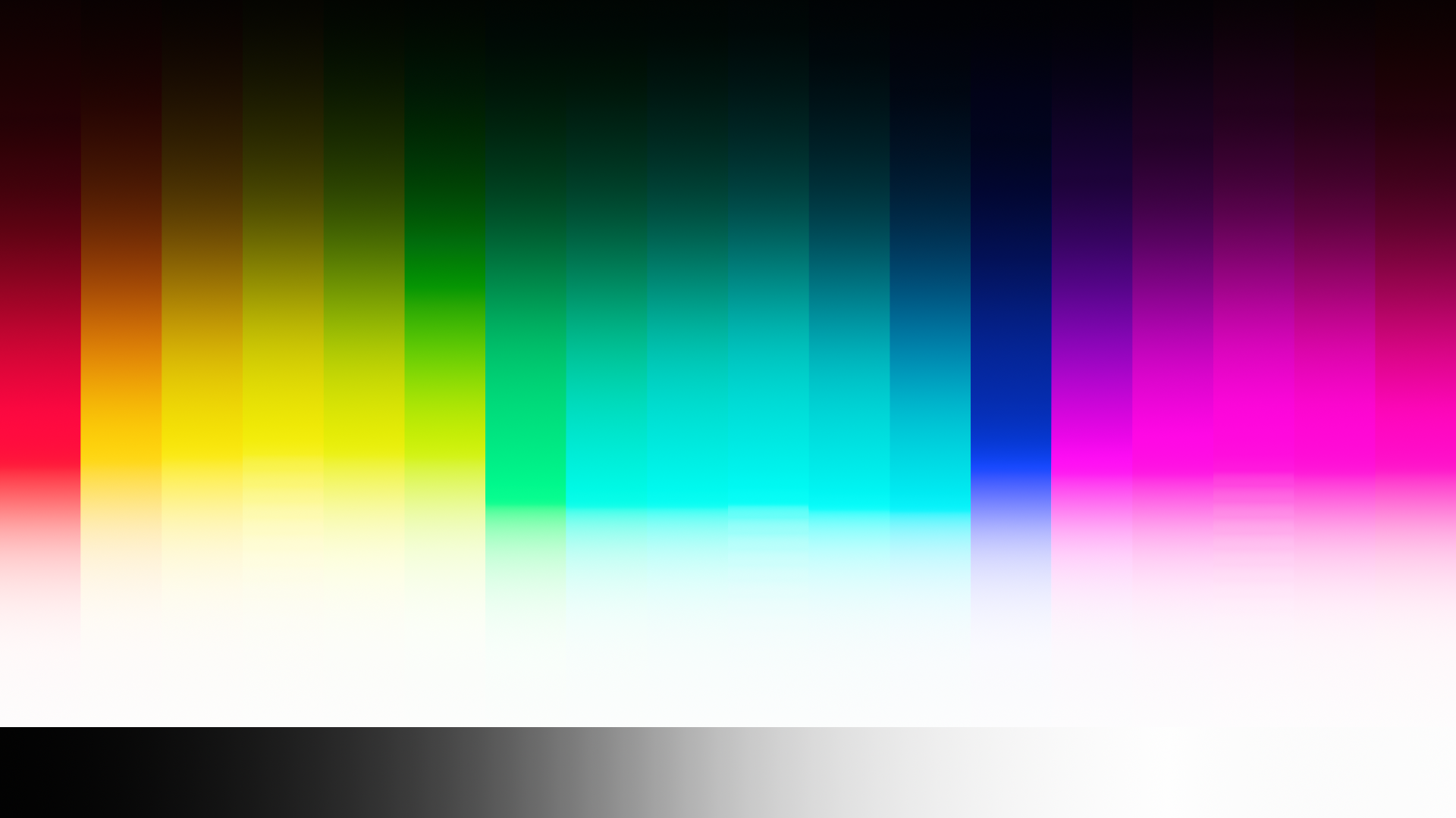
The hue correction might seem strange at first, but it's definitely needed. Here's an image without it:
 It's not the easiest to see, but take a look at the red gradient. It's slightly purple. Here's a chromaticity diagram showing what's happening:
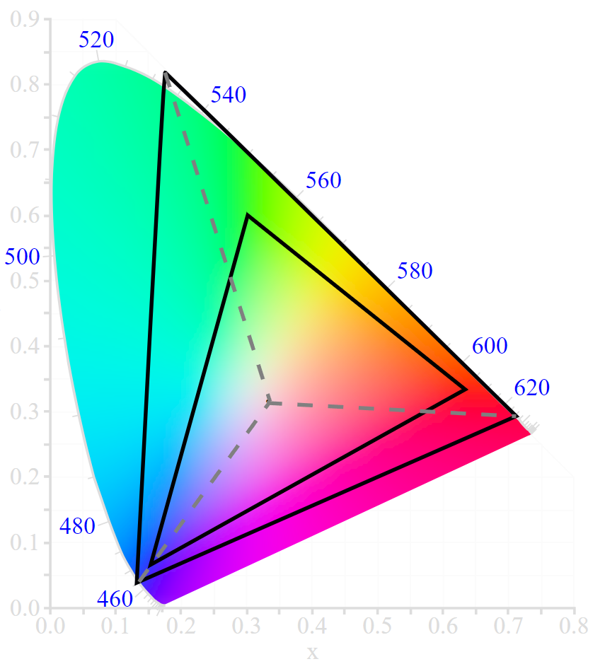 The image gets converted from the ACEScg gamut to the sRGB gamut, but when using a simple hue-preserving saturation mapping, then you get what the grey dotted lines show. You can see that the red primary will show up as purple, yet there isn't supposed to be any blue light. The hue correction attempts to fix this.
The algorithm above is specifically for display transforms, but here is a modified version that can be used as a general gamut mapping method:
def luminance(R, G, B):
    return 0.2126 * R + 0.7152 * G + 0.0722 * B

def gamutMap(R, G, B):
    Lo = luminance(R, G, B)

    # Convert to HSV
    hsv = toHSV(R, G, B)
    H = hsv[0]
    S = hsv[1]
    V = hsv[2]

    # saturation mapping
    if S > 0.98:
        S = (S - 0.98) / 0.02
        S = S / (S + 1.0)
        S = S * (0.02 / 0.91) + 0.98
        S = min(S, 1.0)

    # Fix the hue in order to make the reds and blues
    # show in a more predictable manner.
    if H >= 240.0 and B < 0.00001:
        H = 0.0
    if H >= 240.0 and R < 0.00001:
        H = 240.0

    # Convert back to RGB
    rgb = toRGB(H, S, V)
    R = rgb[0]
    G = rgb[1]
    B = rgb[2]

    # Make sure that the luminance is still the same
    L = luminance(R, G, B)
    Lscale = Lo / L
    R *= Lscale
    G *= Lscale
    B *= Lscale

    return [R, G, B]
It uses a slightly different hue correction and it doesn't clamp the value to a maximum of 1.0. So, this version supports any RGB values and, assuming that the HSV conversion algorithms support negative values, it also supports negative values. Again, the luminance function could be whatever.
If we were to consider the value as a physical quantity of light, and were to add the compliment to it, the tristimulus response would traverse a chromaticity diagram in a chromaticity linear direct line toward achromatic.
Does it seem reasonable to change the “intention” of a tristimulus coordinate relative to itself? More so, it may be worthwhile to consider just what an “intention” is for a collection of tristimulus information.
Out-of-gamut colours cannot exist in a gamut, so we need to find other colours that are within the gamut to represent them. This is an inherently creative decision and there are no wrong ways to go about it. This means that gamut mapping is a creative manipulation of colours and which method to use is all about creative intent. There is no objective gamut mapping, only subjective. Because of this, I actually support having OpenColorIO also provide a version of this method without the hue correction.
But, the hue correction in this method is in line with my creative intent and I'd argue it is in line with the creative intent of a lot of other people as well. If we have the RGB value (1,0,0) in some wide gamut, a common interpretation would be that there is no green or blue light. If we then map it into a smaller gamut, without hue correction, the end result would be akin to (1,0,0.1). This could make it appear to some as if blue light has suddenly been added. Even though it might be right from an absolute perspective, it doesn't necessarily fit with the interpretation of the artist. Another example: The AP1 primary is practically a pure 630nm red (let's assume that it actually is), so the question is then how you should represent a pure 630nm red in the sRGB gamut. I'd argue that most artists would go with (1,0,0) rather than (1,0,0.1). That's why I have the hue correction and I find it perfectly reasonable.
There is no one objective intention for tristimulus coordinates, in this case. There is only creative intention, which is subjective. That's why I support providing a version with and without hue correction. However, if the decision is made to only have one of the two in OpenColorIO, then my vote would have to be the version with hue correction, since I believe that it would be closer to the intent of the average artist.
Out-of-gamut colours cannot exist in a gamut, so we need to find other colours that are within the gamut to represent them. This is an inherently creative decision and there are no wrong ways to go about it.
Colour constancy is a key tenet.
Imagine a car painted solid blue. Does it make sense that a region of the car appears blue, and part of it turns to “cyan” or “magenta” in terms of the tristimulus representation? Or would a closer-to-light-like transport be more sensible?
so the question is then how you should represent a pure 630nm red in the sRGB gamut.
This is a fundamental question that likely relates to the other values around it.
I'd argue that most artists would go with (1,0,0) rather than (1,0,0.1). That's why I have the hue correction and I find it perfectly reasonable.
A decision to remap a value to another value that is a different “hue” could be entirely legitimate based on a number of contexts, not the least of which are the relationships of the values that one desires in the final formed image.
What is a larger problem here is the idea that a constant laser-like source would suffer bends and distortions of colour constancy.
There is only creative intention, which is subjective.
Agree. However, the subject of constancy stands.
Colour constancy is a key tenet.
Colour constancy is the constant perception under varying illumination conditions, it is not applicable to gamuts. I am making the assumption that you mean that the colours used to represent out-of-gamut colours, should appropriately represent those out-of-gamut colours. I agree with that, but what is appropriate? It depends on the image and also the artist, which brings you back to it being about creative intent.
I like the car example, because you can use it to argue against the hue correction, while I can use the exact same example to argue for the hue correction. I am going to change the colour to red (specifically the AP1 red primary), because it makes it a little bit easier to visualise my point. Does it make sense that a region of the car appears red, and part of it turns to “yellow” or “magenta” in terms of the tristimulus representation? Without more context, yeah I agree with you that it wouldn't make sense. Red should remain red. So, lets try it! Here are two swatches, both gamut mapped to sRGB.
 Now here's the question: Which of the two swatches looks more like the red from a pure red car? You imply that a shift towards magenta would be bad and that is exactly what we get in the left swatch, but that is the result of the display gamut mapping from above without the hue correction. In my subjective opinion, the swatch on the right better represents that red. I noticed this shift towards magenta and made a creative modification, even though that shift towards magenta might not be there from some absolute colorimetric perspective.
Now, you may prefer the swatch on the left and there are cases where the result on the left is the appropriate result. But, there are also cases where the result on the right is the appropriate result. It all comes back to creative intent.
Or would a closer-to-light-like transport be more sensible?
This seems to me like you are making the assumption that chromaticity-linearly desaturating the colours until they are within the gamut, is closer-to-light-like. But is it really? If we have an actual car painted AP1-red-primary, is it actually going to look like the left swatch, where the left swatch is just more muted? I don't know, I don't have such a car, but I wouldn't be surprised if it'd look more like the right swatch. But hey, that's an assumption too.
What is a larger problem here is the idea that a constant laser-like source would suffer bends and distortions of colour constancy.
This is a false assumption. The whole point is that the colour of this laser-like source cannot exist within the gamut and we have to find another colour to represent it. You cannot bend or distort a colour that cannot exist. You can only represent it in an inappropriate way, but that's dependent on creative intent.
I think the truth here is that the hue correction is within my creative intent, but it isn't within your creative intent. That's fine, or even great because we can both take authorship over what we find subjectively better. That's why I fully support having OpenColorIO provide a version with and without the hue correction. But, a notion that this hue correction is objectively bad, is just wrong.
Colour constancy is the constant perception under varying illumination conditions, it is not applicable to gamuts.
Of course it applies to gamuts.
The representation of the car paint exists relative to the input gamut. Distorting the tristimulus relationship in a nonlinear manner means that the identical tristimulus would be subject to a mechanical distortion above and beyond what is present.
This seems to me like you are making the assumption that chromaticity-linearly desaturating the colours until they are within the gamut, is closer-to-light-like. But is it really?
Of course it is. This is foundational in all of colourimetry. That is how you are reading this now; a display is based entirely upon this mechanic.
The whole point is that the colour of this laser-like source cannot exist within the gamut and we have to find another colour to represent it.
Agree that we would need another representation.
The point of contention is to appreciate that whatever the representation is, it would be constant-with-respect to tristimulus. That is, a car paint passing under an R=G=B assumed achromatic source would attenuate exactly as I described above, in a chromaticity linear fashion.
By introducing distortions in the tristimulus, long before we address perceptual related compensations, we effectively destroy any chance of colour constancy, as we are now introducing a continuum of varied values.
But, a notion that this hue correction is objectively bad, is just wrong.
A little more introspection might be worthy.
Of course it applies to gamuts.
I define colour constancy as the constant perception under varying illumination conditions, and I don't see gamuts as illumination conditions. Yet after some thinking, I do agree that you can apply the concept of colour constancy to gamuts, where it is the constant perception under varying gamuts. Although, I do consider these as two different things. I can't find a better name right now, so I'll use colour constancy as well.
But, colour constancy does start to break down for out-of-gamut colours. You no longer have absolute colour constancy, only relative colour constancy. But, relative to what metric? Should the spacing between saturation be fully preserved or maybe the luminance be preserved as well? Is it okay to collapse saturation values into one value, and what about luminance or hue values? Should it even be perceptual? Different people are going to have different criteria and those criteria are their creative intent. So we get back to creative intent.
Of course it is. This is foundational in all of colourimetry. That is how you are reading this now; a display is based entirely upon this mechanic.
This is some bad wording on my part. Your original statement there comes across as if any changes in hue don't make sense and that a chromaticity-linear desaturation, as a gamut mapping method, gives results close to how we would perceive the out-of-gamut colour. That was the assumption that I wanted to challenge. Take a look at those two red swatches that I made. Which one looks closer to a pure red 630nm laser-like source? This assumption would state that the left swatch looks closer to the 630nm laser. Now, I haven't done this experiment myself, but the red lasers that I can remember look closer to the swatch on the right for me.
We can also do a little thought experiment. If we have a colour that contains no blue light, would it make sense to then add blue light in order to represent that colour, or would it make more sense to choose a colour with the smallest amount of blue light?
That is, a car paint passing under an R=G=B assumed achromatic source would attenuate exactly as I described above, in a chromaticity linear fashion.
Yes, the specular reflection of the car paint would cause an attenuation in a chromaticity-linear fashion. I am not disagreeing about that. It's about what to do when those colours are still outside of the gamut. Different people are going to want different representations for those colours, because they have different criteria for them. They have different creative intentions.
A little more introspection might be worthy.
The hue correction would be objectively bad if the criteria is that it's as close as possible to human perception. But I don't have that criteria! My criteria are that I want the hue to behave close to what I am used to. I use HSV a lot and so I chose HSV. I want gradations in luminance be preserved, so I added that in. But, I also want red objects to be as red as possible. So red that there aren't any other colours anymore. That's why I selected an area of chromaticities that I collapse into pure red. The same for blue. That is the behaviour that I seek. Those are my criteria and the gamut mapping method that I provided here fits those criteria.
These criteria are subjective. They are people's creative intent and everyone has a different creative intent. You say that color constancy is a key tenet, but that is according to your criteria, your creative intent. I realise that and that's why I support having OpenColorIO also provide a version of this method without the hue correction. If you were to create a method that does perceptual or just chromaticity-linear gamut mapping, that fits your criteria, I would support it 100% for it to be included into OpenColorIO. Because I realise that there are people and cases where such a method is desired, just like I realise that there are cases where my method is desired. I believe that OpenColorIO should provide a few different kinds of methods, so that the users can choose the method closest to their creative intent.
Saying that the hue correction is objectively bad is wrong, because the criteria needed to do so are subjective themselves. "Objectively" without further context, only works when the criteria are objective as well.
Saying that the hue correction is objectively bad is wrong, because the criteria needed to do so are subjective themselves.
I don’t believe any of what I have said suggests this.
My sole issue with this approach is the same issue I voiced during the ACES “gamut” compression discussions; it seems terribly problematic having tristimulus distortions along a uniform object, derived exclusively from some attribute of the image formation chain.
I don’t believe any of what I have said suggests this.
You indeed did not say this. I originally said it to go further in on my statement that it's subjective. It was meant generally and not aimed at you, but can see that I could have worded that better. Your response to it:
A little more introspection might be worthy.
Does come across to me as if you disagreed with that statement and that you asked me to think about it, with the idea that I would realise that my statement would be wrong. That prompted my response.
Reading it back, I do realise that the last sentence in my response sounds like I accused you of saying that it's objectively bad. You didn't say that and I didn't mean it that way. I meant it as a general reiteration of my statement used as a conclusion of my response, but I did not word it well enough. I apologise for that.
My sole issue with this approach is the same issue I voiced during the ACES “gamut” compression discussions; it seems terribly problematic having tristimulus distortions along a uniform object, derived exclusively from some attribute of the image formation chain.
The way that I look at it, is that there are definitely a lot of cases where these modifications are not desirable and can justifiably be seen as problematic, but there are also a lot of cases where these modifications are desirable. It comes back to different people and different projects having different criteria for things like gamut mapping methods and colour renderings. Because of these different criteria, there is no one method that can be used in all cases and it would be inefficient to try and create a single method to be used in all cases. It would be more productive to provide a small selection of different kinds of methods, for the user to choose the one that fits their specific use case the best.