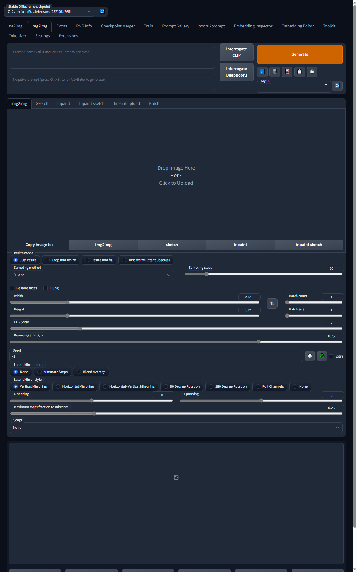
Better Inpainting UI
Describe what this pull request is trying to achieve.
Change the inpainting (and img2img) UI to utilize the full width of the screen.
Additional notes and description of your changes
See #7831 for additional screenshots and video demonstration of the changes (concept - before I did it in the actual ui scripts)
Environment this was tested in
- OS: Windows
- Browser: Edge
- Graphics card: lol
--skip-torch-cuda-test --precision full --no-half --no-half-vae --use-cpu all
Screenshots or videos of your changes
Before: #7831
Actively Changing to Show the Difference: https://files.catbox.moe/44666n.mp4
After: More usable on portrait screens in a dual monitor setup, on 16:10 screens, on <1080p screens, etc.
That screenshot wasn't with a DevTools change, it was using the changes proposed to ui.py and ui_components.py
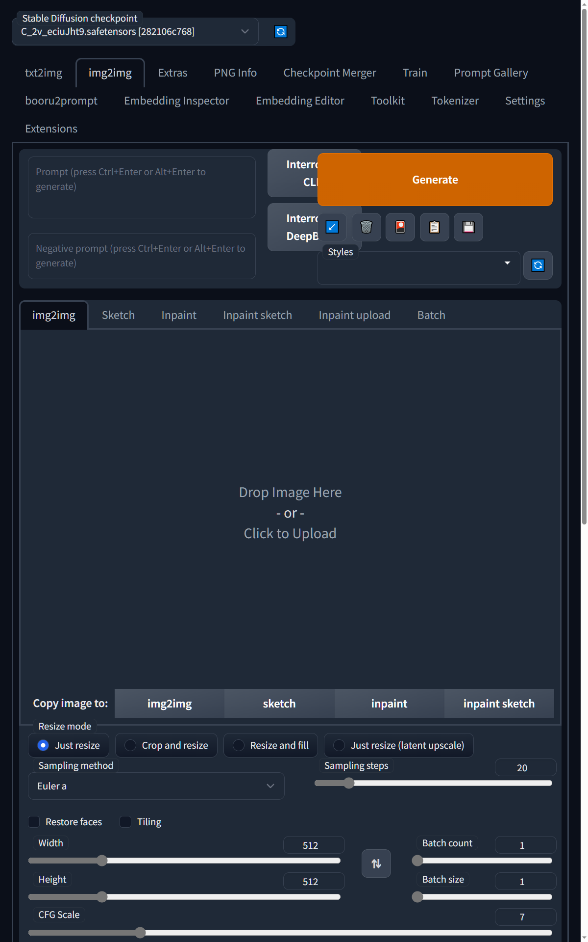
Zoom to 150%, inpainting canvas is now even larger:
Adding some more dynamic resizing, (or if Gradio supports it, making it outright user resizable) to the inpainting canvas would be ideal, but that's above my skill level.
Resizeable UI was added in https://github.com/AUTOMATIC1111/stable-diffusion-webui/pull/7519.
While the larger inpainting view is nice in this I don't think we should sacrifice the rest of the UX for it. Expanding sliders to the width of the page is a bad idea.
added
But it's not? I skimmed the PR and the screenshots look amazing but the comments...do not.
By added I didn't mean merged. And I agree with you on the comments, but that aside it's a more UX friendly implementation than this PR, imo.
I don't disagree. This was moreso a "minimal" - in terms of changed code - fix for an issue I have. I might look at it more closely later and see if I can split the canvas off from the sliders, so that it shows full width, and then beneath it you get the old column display.