Niagara-Issues
 Niagara-Issues copied to clipboard
Wasting screen space
Describe the bug
It hard to ignore, Bug or feature.
Notification preview is taking very less width. Hence could not show sufficient preview.

But initial setup help message are of comfortable width
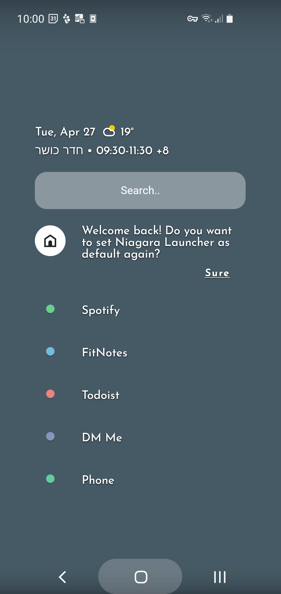
THIS WHOLE KILL THE USEFUL FEATURE OF NOTIFICATION PREVIEW. AS SO LESS PREVIEW
so please increase the widh of notification preview or give it as configurable when alphabet are not visible. three lie notification preview or configurable will be most welcome with sufficient width.utilizing all screen width
Steps to reproduce
disable alphabet listing see notification preview under icon
Does the issue also occur with other 3rd-party launchers?
Not applicable
Other 3rd-party launcher(s) tested
No response
Device name
s21
Android version
Android 12
Screenshots / Screen recordings
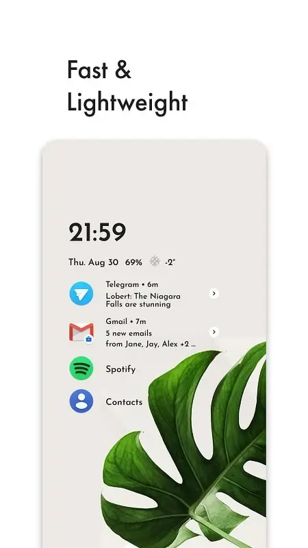

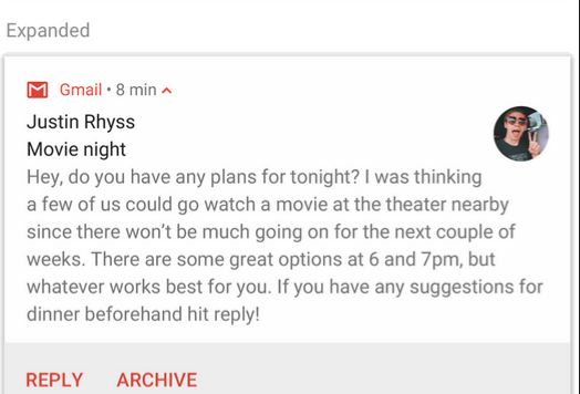
A preview is by definition a sample or overview, it's not supposed to show all the information, just to give you a hint, and it behaves slightly differently based on the content (e.g. it shows a bit more for conversations).
Is your suggestion to remove the white arrow which hints at the swipe gesture and works as a button to open the pop-up? Personally, I always use that button to open notification previews (or tap for folders), removing it would likely lead to a worse UX. And even if the notification previews were wider they still won't be enough to view most notifications without open the full embedded notification so I'm not sure such a change would be worth it at all
*Also, it's clearly not a bug as it's a design decision and works as intended
I dont know, I am sick of niagra home screen. So I came up. I even dont want to click. I like how it looks. Far better than perfect. Thats why I like to be way too better.
Closing line: Rather than preview why not you guys work on showing full notification like android expanded notification
I not interfere you guys how you recreate this screen and it will be time taking, But its all upto you, how to make a feature (Surely the paid one)
Last suggestion could be remove images in preview and maintain text formatting i. e. placing not coloring
We can not deny, toggling must produce some result other than impact
- like hiding alphabet trail should increase width of notification
Hi there 👋
As @Oddward stated, the notifcation preview on the app entry is only supposed to give you a quick preview. If you then want more information, the idea is to open the pop-up and see the more detailed notifications.
Rather than preview why not you guys work on showing full notification like android expanded notification
This would lead to all your favorites to move downwards and thus not be accessible anymore.
hiding alphabet trail should increase width of notification
This would be problematic because of two things:
- The homescreen would look rather different depending on your settings which might be confusing to some. Also it would lead to possible overlap while scrolling through the all apps list (since you can also scroll up to your favorites).
- Using the arrow button to open app pop-ups one-handedly would become difficult for left-handed users and we want Niagara to be fully usable using only a single hand.
Thus we will not be adding your requested feature.