Homepage Redesign
The front page needs some love. It really hasn't been updated since we launched so we should update it with some of the new stuff we can do.
Things I'd like to change:
- The main part of the home page, to the right of the topic list
- Everything below the topic list
Things we should avoid redesigning:
- The header
- The help/donate bar
- The topic list
The lists above are negotiable if there's a compelling reason to change them, but let's start with this list to limit the scope of what we want to build for a v1.
What are we gonna put on the homepage is up for discussion. Here's some compelling options that we might want to add, some of which are new features we can build for this (bold is stuff that should definitely appear on the homepage):
- Email signup
- Our short feature pitch: "5 Calls is the easiest and most effective way for citizens to make an impact in national and local politics"
- Total number of calls made (on the order of ~2.5M)
- Calls made last x days (maybe stats or improvements?)
- Leaderboard (users who have made the most calls in the last x days / most different topics)
- Top Reps (reps with the best 30 day contact rate?)
- A live look at which reps / states are getting calls right now
- Top call topics (list of top topics that have been made in the last x days)
Other ideas? Feel free to comment here and we can discuss it.
i'd really like to see the link to "view all active issues" way more highlighted and obvious. people often miss this on the home page.
i love the idea of "where are calls happening now" on the homepage--what sort of volume do we get hour over hour? how often would we update this? any chance of something super visual like a basic map of the US with states 'lighting up' periodically?
i also like the idea of 'most called-about' this week or today -- especially if we lean a little on that and imply that folks can influence that metric--there is research that shows that people are a lot more likely to do more of a given task if they are shown a visual that conveys their contribution somehow--a leaderboard is like this in a much more overt way--but if we can show someone that their calls might change a number on our website, that should be pretty compelling too.
Good note on more clearly calling out all issues, @piebob.
I have a pretty strong feeling against maps in this context, they feel like such an abnormally low information density item for the home page and I don't think the information is either useful or motivating to callers.
We can do a live view of topics or representatives that are being called right now (very frequent updates) and we can do lower-frequency things like relative popularity of the top 5 topics or similar.
I do really like features that make people want to appear on them or change them (mixed feelings on streak leaderboards here: are they motivating to everyone or just to the people at the top of the list?). I was thinking something along the lines of "this rep gets less calls, fix this by calling now!" but that's hard to promote to everyone since we encourage constituent calling. Still thinking about this.
Please take my opinions with a huge grain of salt since I don't have anywhere near the perspective or context that you have:
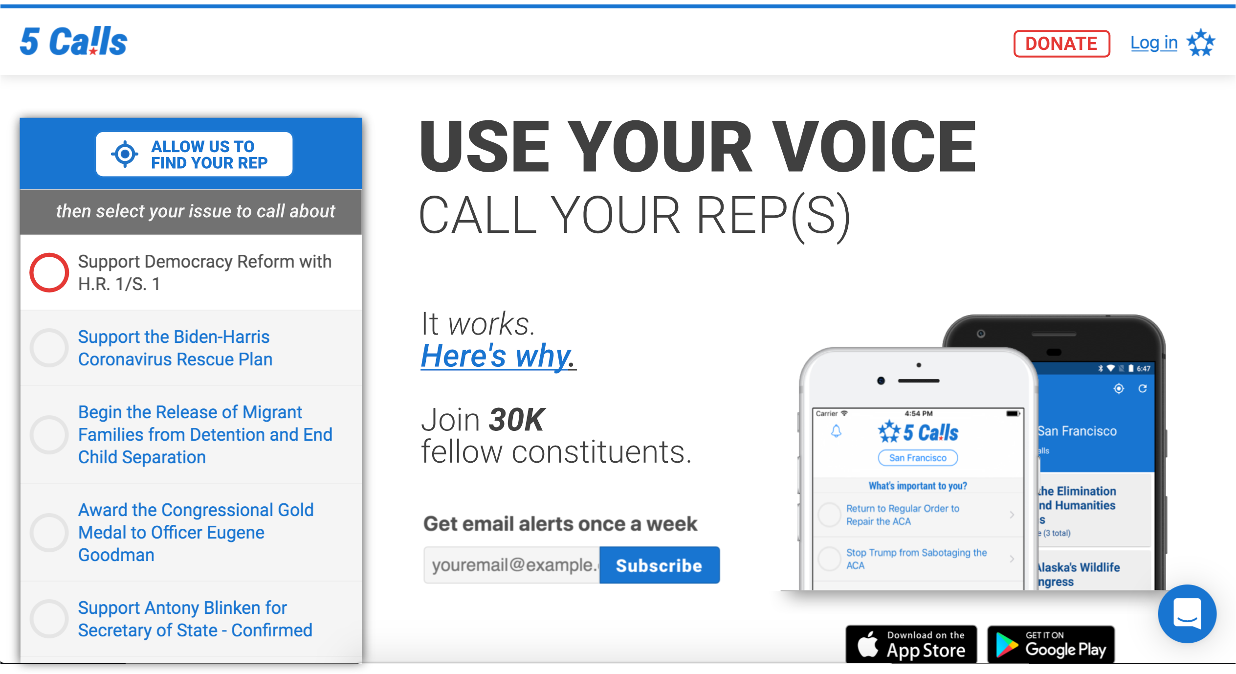
First, it sounds like this bar will remain in its present form post-redesign:

For me, this is a big problem because it overwhelms what should ideally be a single, irresistible, CTA on the home page. The red bar is visually arresting, but it is offering secondary (arguably even tertiary in the case of "get your own 5 calls page") functionality, and in my opinion should be de-emphasized.
Second, (and this might just be me) calling on the phone is something that makes me pretty anxious. So as someone like that, I would love to see a straightforward rehearsal of what I could expect for my first call on the home page. Whether that's a video of someone making a call or a sequential illustration or something, I'm not sure. For instance, before I made some calls, I had worries like "will it be awkwardly clear that I'm speaking from a script? Do I need to ad lib to seem more natural"? etc that could be allayed by a good dramatization of the process.
Finally, I suggest we talk to some other callers, both experienced and new, to get their perspectives, or at least test a couple wireframes on them before committing to a direction. A/B testing could also be very useful.
Great ideas @aholachek.
I agree that the header bar grabs attention, and it's where much of our donation support comes through so I am down to change it with the condition that we find a place to put it on the main home page. Both "Contact Us" and "Projects" are going to move to other places, so I don't have a problem removing them.
I agree that helping people understand the process of a call for the first time might be the biggest win to getting more people on the phone. I am generally for the idea of a calling video but that's a relatively large amount of work compared to a step-by-step illustration. Do you have thoughts on what an illustration might look like? If you need guidance on what steps to emphasize we should talk on slack.
We should 100% get some feedback from users, and Netlify makes it really easy for us to test branches with different features or homepage setups. Let's take this in two steps: we'll do a rough pass on layout/design for the homepage content, get some feedback from users and then for any ideas we're still unsure about for launch, we can a/b test some variations.
I think a step-by-step description with good copy and hopefully some nice imagery (either photos or custom illustration) could be fine instead of a video. Here's an (extremely ugly and quick) wireframe of what I think a baseline for the redesign could be:
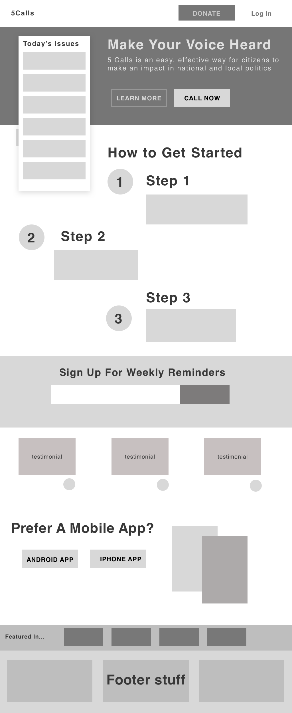 (Where "learn more" would just scroll to the "How to make a call" section)
I think we should be emphasizing getting people to just make a single call at first, I'm not sure how to message that.
Hello!
I do frontend and design, and would like to help out with this project as well! @aholachek loving the wireframe so far and I agree with your assessment on the "Get Involved" bar. I have a few questions to get more context!
Feedback from users:
- Do you get e-mails / tweets from users who are currently frustrated at the design, e.g., they find it difficult to find certain things or they jump through hoops to do what they want to do.
- Do we get e-mails of things that users would get a lot of value out of?
Users
- Do you have data on the users visiting the webpage? Is the homepage the place where people learn about 5calls or is that where they also repeatedly visit to do their calls? Do users eventually transition into using the mobile app for their calls?
- Do we get a lot of people visiting on their mobile devices? Are people mostly on their desktops?
Resources
- Do you have resources to do things like usertesting.com or pickfu.com?
- Would you be open to researching / interviewing 5call.org users?
Style
- Do you have a set style / branding guideline or are you flexible with regards for changing things like the colors on the page?
Newsletter
- I'm not sure I understand what the newsletter is for—it's not explained what people can get out of it.
- How important is the newsletter compared to everything else on the page such as logging in, donating, and calling?
I've been playing around with the mobile version of the website and made some mockups as well! So excited about this. 😊
@aholachek I like the direction! I think we can drop the testimonial and "featured in..." section, what we want to communicate on the front page now is a bit different than how we were thinking when those were introduced. I like the bannerized "subscribe to newsletter", it's is a good choice.
Specifically, our primary content should be a balance between "look at the activity that you can participate in" (as discussed with @piebob above) and "this is how easy it is to make your first call". I like where the "steps" sit in the hierarchy of the page in the wireframe.
i love that wireframe! and the '1 2 3' steps on how to get started could be gifs or just simple images with text over them showing what the first time caller can expect. i am happy to help with that kind of content, let me know how best to collaborate with you.
Thanks for the questions @jagtalon! Some answers in order:
We don't get a lot of complaints about the site (other than the "I would like to see issue x" when issue x is already on the "more issues" page), but the feedback that users send us is generally along the lines of "I never called before and you made it really easy for me to get started", so the hypothesis for including a step-by-step explanation of how the call will work is about giving more folks who have not called yet that experience.
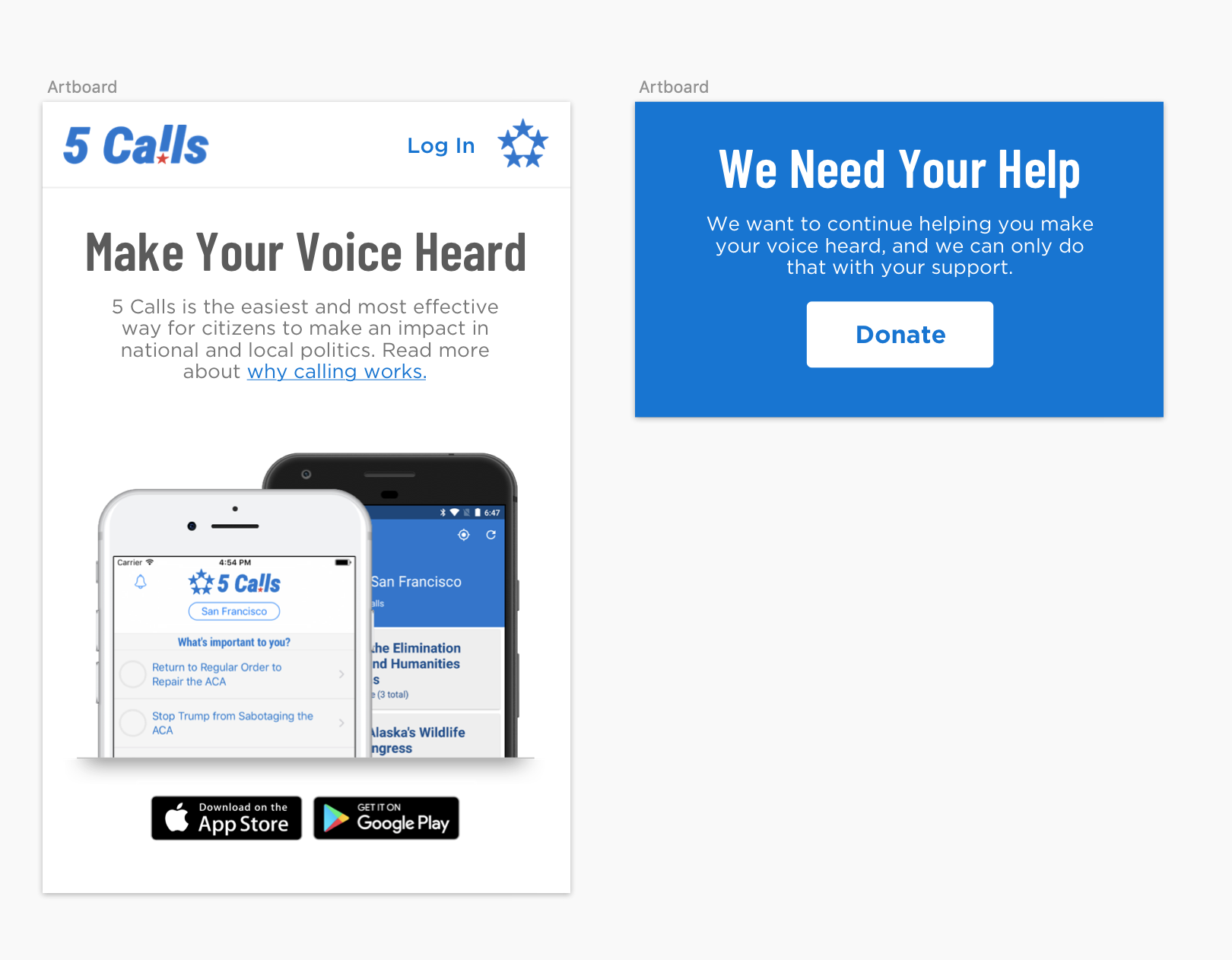
People primarily come to us via social networks, hitting the website first, and upgrading to a mobile app if they're into that. We already have the native iOS / Android "install our mobile app" banner on the site, so I'm not sure we need a visual prompt for that at all anymore. We're at about 60% desktop users on the website.
I'm open to more research. I am partial to instrumenting actions through Google analytics and serving A/B tests through our host, Netlify. We have plenty of users come through the site on a daily basis to run our tests for our own users rather than farming it out to people who are not users (pickfu), I generally don't like asking users their opinion anyway, I would rather measure what effects changes have and make decisions that way - if users have a deep dislike of something we do, they will (and do!) let us know over email.
We don't have a style guide, but it is something I would like to have and find valuable. @aholachek recently made some changes to make styles more consistent everywhere, which was great. I would like to stick with our current decision to do headers in Roboto and regular text in OS-native sans serif (which right now is -apple-system,system-ui,BlinkMacSystemFont,Segoe UI,Roboto,Helvetica Neue,Arial,sans-serif). Colors could change but it's hard for us to do changes across web / iOS / android all at the same time. If you have ideas here I am open to hearing them but our current focus is content changes over color/branding changes.
Newsletter folks get a weekly email (Tuesday mornings!) with a summary of the latest topics to call about. A certain type of user waits for these and regularly makes their calls every week based on it and we get upset emails if we skip a weekly email for some reason. It's not critical that folks sign up with the newsletter, definitely less important than understanding how calls work / calling / donating. I think the rough location in the wireframe from @aholachek is probably good.
I do like the simplicity of the mobile mocks you've shown, and I don't mind making style fixes so the mobile site feels better designed for the device. Right now it feels like a mobile version of the desktop site, which is not always optimal. Let's stick with the font choices I've noted above.
Hey all!
I have experience in User Experience design, and wanted to give some input on the homepage redesign. After reading through the comments, here are some buckets of content changes I have thought about -
Header I agree with @aholachek about the header appearing a bit jarring with the bright red, as well as the potential confusion with multiple CTAs. I think a couple color changes, as well as redesigning the content here could go a long way.
Also, @nickoneill , you mentioned that people primarily come via social networks. It might be a good idea to include social media icons in the header, so that they can access 5 calls on all platforms. Open to thoughts about this.
Issues Section - @piebob , that’s a good point about presenting the issues section in a more clear and obvious way. I think this could be solved by adding the different categories directly on the issues section of the homepage. “Trending Issues” could be default expanded, and then the other categories could be collapsed, with the option to expand. This way, people will be able to quickly find what they are looking for. I’ve illustrated what I mean here in the wireframe below.
A ‘search’ option may be useful here as well.
Emphasis on How Easy It Is I like the idea of including steps to show how easy it is to call reps. People probably are nervous about reaching out, and making it clear that there is a script included for them could help alleviate that pain point.
Testimonials could help here as well, by seeing how easy it was for other people, and that it truly did make a difference.
Look Where Activity Is - Status of Calls Data regarding how many calls have been made, or how reps are responding could also be helpful to show the impact of calling. I haven’t fully thought through how this could be represented, but included a section for it in the wireframe.
I’ve worked up my first impressions with a low-fidelity wireframe below. Please let me know your thoughts! Definitely room for improvement here.
Best, Carly
Clicking on the image shows it a bit more clearly
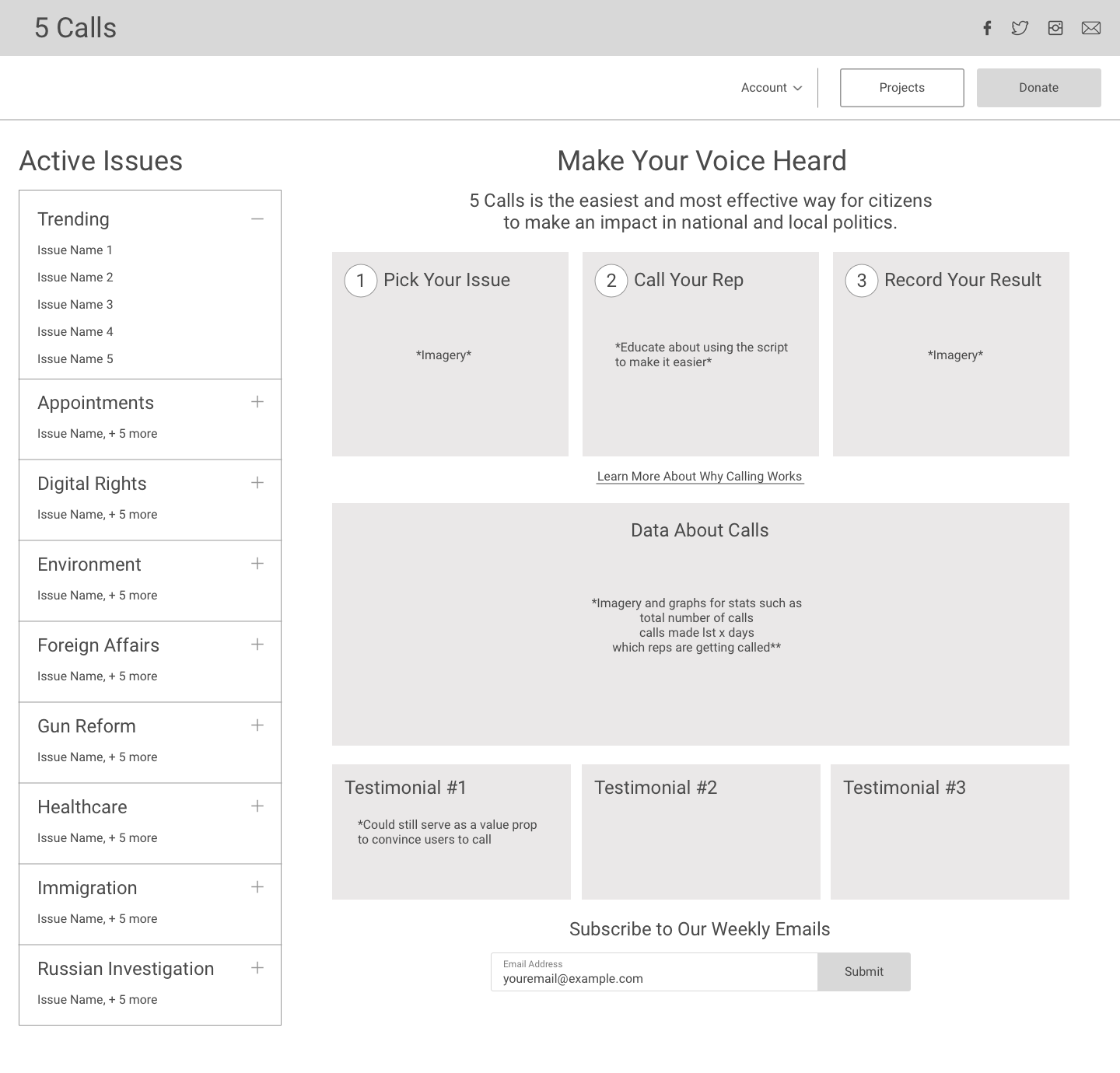
@carlyfinn95 I like that direction, it's more information-dense than mine, which is more of a traditional marketing landing page.
@nickoneill @piebob and Carly I'm wondering how we should proceed from here. I'm sort of thinking we could have 2 variants:
-
A white-space heavy, simplistic marketing page with a single clear CTA hammering home that just 1 call is all it takes to get started, it's so easy, etc (focusing on the user and their decision to make their first call)
-
A more compact, information dense page offering data about 5calls' impact, maybe more context on the issues of the day, a graph or two.
Of course that's more work but it might yield some interesting data. Or maybe we end up showing variant 1 to brand new users, and then graduate them to variant 2 once they've made a call or something
Oh and personally, I like the "featured in" section on the home page because it gives the site some social proof. Like, it's a way to signal that 5calls is progressive but in a mainstream way I guess? Otherwise you don't really know what the site is trying to get you to call about.
@carlyfinn95 Great to hear we're all on the same page for the header. We'll figure out a way to make it work without it being BIG AND RED :) I think the right approach for the sidebar is to maintain the small number of high-priority issues like we have today, and feature a "search all issues" box that would immediately filter for both high priority and other issues. My concern with categories in your wireframe are how complex it looks for a first time user - which one do they pick?
@aholachek Fair point about "featured in", it doesn't take up too much space so it's cool to keep it if you think it's valuable. I'm interested in a simplistic white-space heavy page, but I don't want to significantly alter the experience when people drop in to 5calls.org - what do you think about this project as a landing page that we can direct folks to on social / etc when they have never made a call and need more guidance? Something that could live at a nice url like 5calls.org/your-first-call (this is probably a separate project from our homepage work, I would like to talk more about it though because I see the value there)
There are lots of great options here and the only way we're going to move forward is if we try one direction. I'd like to propose that @aholachek moves forward with a slightly more high fidelity wireframe based on the previous model with these changes based on our feedback here:
- Integrate search bar into topic list
- Space for stats where "Learn more" "call now" is (design for stats TBD, let's just make space for it at the moment)
- More detail on what our steps to get started calling are
- Move social links to header (fb / twitter is probably enough, we don't have a ton of volume on instagram)
@jagtalon if you're still around I'd love to get your take on how we can visually think about surfacing interesting stats on the homepage in the area I've mentioned above. If you're still interested, feel free to drop in here or shoot me an email, otherwise we'll tackle it in the next revision.
Sounds good @nickoneill . Just to be clear, which wireframe am I editing? The one I posted or Carly's? Also, do you think I could make a pr to move the "donate" button next to "login" and get rid of the red banner? Or is that something that has to happen later?
What exactly do we want people to do with the more prominent social icons in the header? Tweet to their social networks to get others to use 5calls? If so, I wonder if we could make that a secondary CTA somewhere.
@aholachek your wireframe is closer to where we want to end up, so let's keep going with that one. I am 100% ready to ditch the bar and move the donate button as a first step, feel free to PR that now if you want. I can merge the intercom button for support around the same time to make sure folks can contact us.
I was originally thinking that it would be a convenient place to tell people they can get updates from us on these other social networks (i.e. don't tweet, just follow us), mostly for space constraints. We do a bit of share promotion around specific topics after you make a call, I think that's more effective than sharing us right from the homepage.
Sorry, I definitely kind of dropped the ball on this.. I wonder if it would be possible to hunt down a marketing designer or product person that has a good sense for effective landing pages targeted towards increasing conversion? I just worry that if it's more developer driven we won't be as creative/effective as we could be if we had someone with that specialized expertise.
Hey @nickoneill @jagtalon @piebob @aholachek @carlyfinn95 - I'm Evan, UX and Product person (among other things). I've used 5calls in the past, and was thinking it'd be super great to have it used in the next 18 months, working with all the energy from the election, to help get meaningful policies passed (ala https://www.npr.org/2021/01/22/959177050/with-biden-in-place-the-resistance-tries-to-pivot-from-defense-to-offense). So I dug around and found this thread for a way I could help out!
I saw that the last convo was 2 years ago, so wondering where this landed? I did a super basic re-mock for the above-the-fold part of the desktop homepage, loosely incorporating above comments, but mainly just trying to clean up the visual hierarchy and copy, and emphasizing getting to action via the main picker list.
Just wanted to share for now, and see where you all are at. Hope it's helpful!
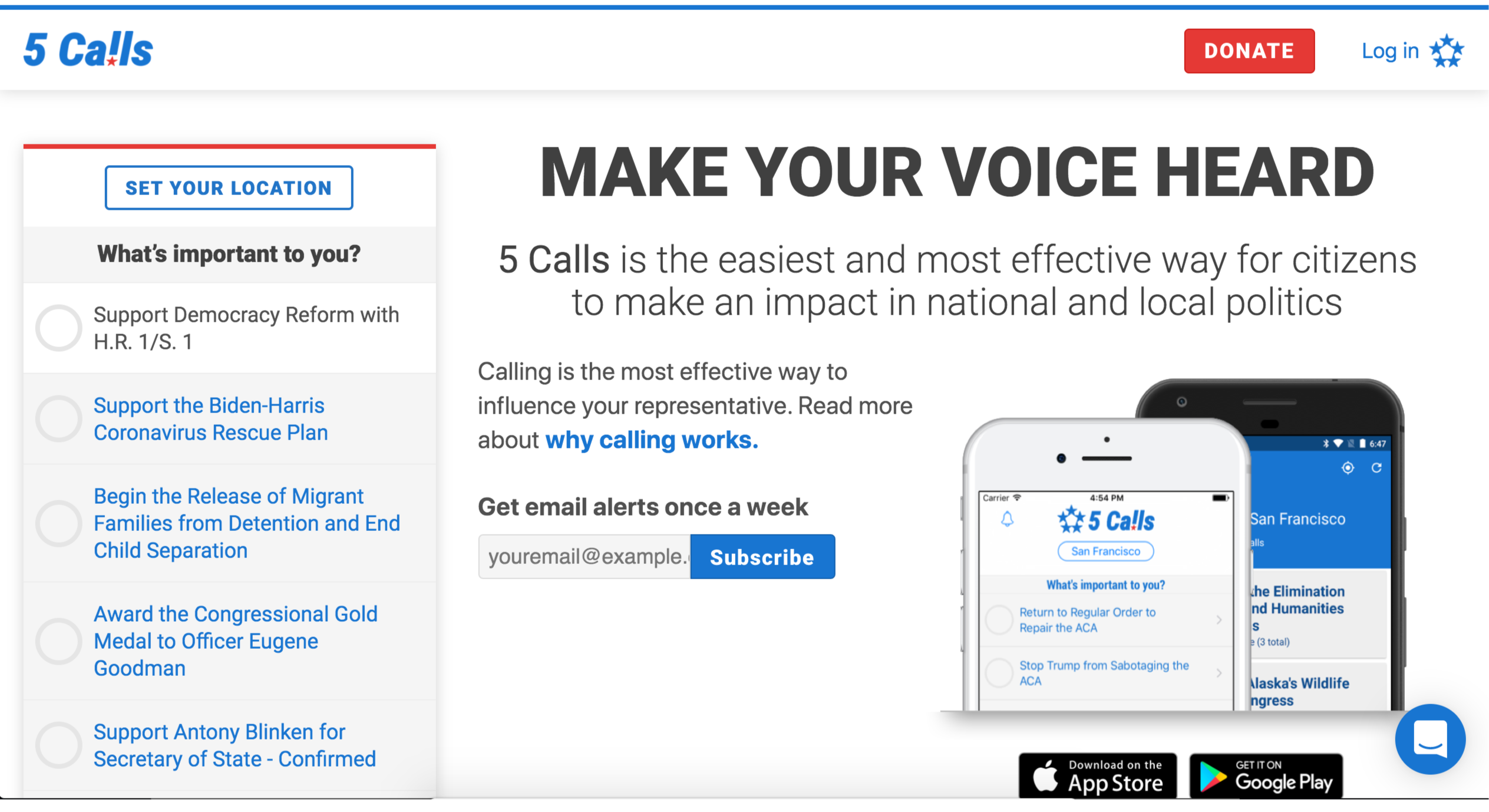
Hey @evanshulman, we've got a homepage redesign almost ready but I have something specific that could use a UX eye. Shoot me an email (nick at 5calls) and I can tell you more about it.