wumi_blog
 wumi_blog copied to clipboard
 5Mi
5Mi
Style相关
字体使用相关
-
@font-face
首先语法规则为
@font-face {
      font-family: <YourWebFontName>;
      src: <source> [<format>][,<source> [<format>]]*;
      [font-weight: <weight>];
      [font-style: <style>];
    }
详情参考这里
里面提到的fontsquirrel这个工具还是挺好用的将ttf格式转化成其他web字体格式(.eot,.woff,.svg)
-
抽出ttf中想要的字
使用win上的FontCreator 7.5还是挺简单的,把要使用的到的字体对应复制一下应该就没问题了,当时参考的这里
-
font icon
首先应该就是font awesome,然后淘宝的iconfont 可以生成好字体文件和相应的样式
负值margin相关
不会使其脱离文档流
div有设置宽度
- margin-left 和 margin-top 为负时div分别向左和向上移动距离
上和左方的 margin 负值使该元素向上和左方向移动
- margin-right 和 margin-bottom 为负时减少div的逻辑宽度和逻辑高度 即div右方 和 div下方的块会 向左 向上跟随
下和右方的 margin 负值使该元素下方、右方的元素被拉向该元素。
div没有设置宽度或宽度为auto
- margin-left 和 margin-right 为负时div会向左或向右增加宽度(但与div相关的元素以div逻辑大小布局)
- margin-top 为负div向上移动, margin-bottom为负减少逻辑高度
浮动div
-
与float方向一致时「float:left(right);margin-left (margin-right);」margin为负值会向浮动方向移动
float:left;margin-left:-15px; 则div向左移动15px;若margin-left:-100%则向左移动父级元素宽度100%
-
与float方向不一致时 margin为负值会减小逻辑大小
float:right;margin-left:-15px; 则此div左侧的div 向此div拉近15px(左边的向右窜了15px);
-
margin-top 为负div向上移动, margin-bottom为负减少逻辑高度 同上
相关结论

div有设置高度则
box 最后的显示大小等于 box 的 border 及 border 内的大小加上正的 margin 值。而负的 margin 值不会影响 box 的实际大小,如果是负的 top 或 left 值会引起 box 的向上或向左位置移动,如果是 bottom 或 right 只会影响下面 box 的显示的参考线。
div大小
box 的实际大小 = box 的物理大小 + 正的 margin 这仅对元素本身有效,对于其后面的相关元素,他们则只以 margin 的逻辑大小为准则,进行布局。
margin 值为百分比
计算为父级元素的宽度的百分比 (无论此div是否脱离文档流)
常见应用
###左右固定,中间自适应(双飞翼) 双飞翼的好处:
- 可以让主要内容出现在dom结构的前面,现将主要内容渲染
- 中间只适应,两边固定宽度的效果
两栏布局一侧固定一侧自适应同理(还是calc计算属性好用= =)
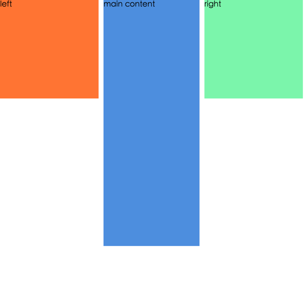
<div class="main">
            <div class="main-content">main content</div>
</div>
<div class="left">left</div>
<div class="right">right</div>
*{
        margin:0;
        padding: 0
    }
    .main{
        float: left;
        width: 100%;

    }
    .main .main-content{
        margin: 0 210px;
        background-color: rgba(33, 114, 214, 0.8);
        height: 500px
    }
    .left{
        width: 200px;
        float: left;
        background-color: rgba(255, 82, 0, 0.8);
        margin-left: -100%;
        height: 200px

    }
    .right{
        width: 200px;
        height: 200px;
        margin-left: -200px;
        float: left;
        background-color: rgba(90, 243, 151, 0.8);
    }
多列等高(乱入)
.containerdiv {
        width: 960px;
        margin: 0 auto;
    }
    .rightWrap {
        width: 100%;
        float: left;
        background: green;
        overflow: hidden;
        position: relative;
    }

    .contentWrap {
        float: left;
        background: orange;
        width: 100%;
        position: relative;
        right: 320px;/*此值等于rightSidebar的宽度*/
    }

    .leftWrap{
        width: 100%;
        background: lime;
        float:left;
        position: relative;
        right: 420px;/*此值等于Content的宽度*/
    }
    #left {
        float: left;
        width: 220px;
        overflow: hidden;
        position: relative;
        left: 740px;
    }
    #content {
        float: left;
        width: 420px;
        overflow: hidden;
        position:relative;
        left: 740px;
    }
    #right {
        float: left;
        overflow: hidden;
        width: 320px;
        background: #333;
        position: relative;
        left: 740px;
    }
<div class="containerdiv">
        <div class="rightWrap">
            <div class="contentWrap">
                <div class="leftWrap">
                    <div class="aside column leftSidebar" id="left">aaaaaaaa</div>
                    <div id="content" class="column section">fdsfsdfsfs</div>
                    <div class="aside rightSidebat column" id="right">fsdfdsfsd</div>
                </div>
            </div>
        </div>
    </div>