 10up
10up
Update component: accordion (design)
This is a ticket to update the default design of the accordion component
See other existing accordion component issues
===
Coordinate with the accordion block in the block library to ensure both work in tandem: https://github.com/10up/block-library/tree/trunk/includes/blocks/block-editor/blocks
I am interested in working on this ticket, but I would love to get some general direction/goals of what is needed:
- Is there a guideline to look at/specific style we want to achieve?
- How would this default style be presented; meaning - do we enqueue one more stylesheet or something else?
- Should we have one design or multiple to pick from like other libraries?
I did a few quick samples that are all very simple/non-specific as to be reusable in most styles of design:
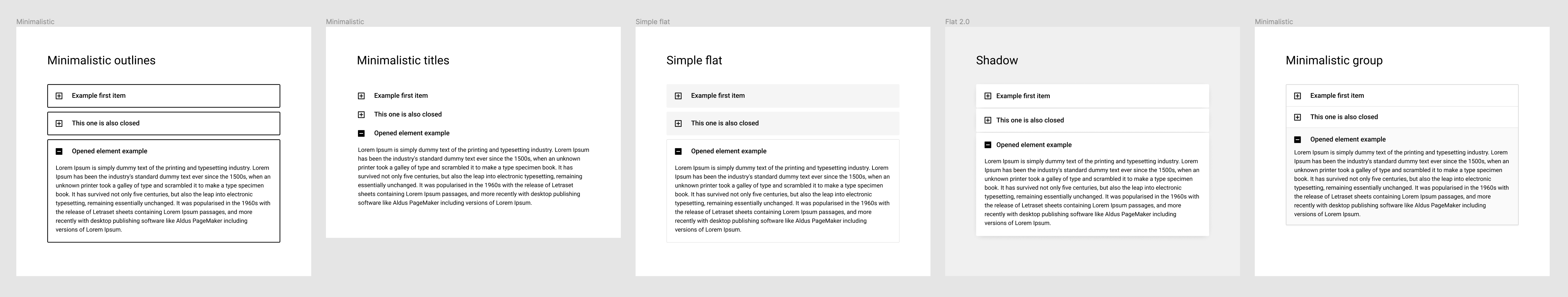
I think that if we come up with a few styles, we can have them applied to all other UI elements. I don't know how much reusable they would be for all the different designs, but it could still help every now and then.
@xavortm I actually plan on moving this forward in the next week or so. Once I get an initial PR ready, I'd love your review / feedback and we can use this as a model for the rest of the component library.