quiz
 quiz copied to clipboard
 zhangxinxu
CSS基础测试12
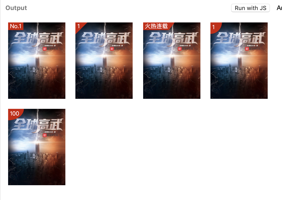
本期小测关于图片上经常出现的小标签功能实现:
每个小题2积分。
题目中使用的图片素材地址是:https://bookcover.yuewen.com/qdbimg/349573/1012237441/180
展示尺寸120*160像素,尺寸不对减1分,标签背景色是#cd0000。
请附上对应的CSS代码,注意缩进和代码高亮(没有减1分),可以使用下面语法进行高亮:
```css
你的代码在这里
```
请提供在线的可访问的demo地址(精力有限,没有demo减1分),如jsbin.com、jsfiddle.net或codepen.io,使用国内的类似工具也可以。
本期小测直播答疑为本周六9月22日上午10:00,和上周小测一起答疑,大约60分钟,直播地址:https://live.bilibili.com/21193211
首位答题者会获得100%倍被翻牌技能,每位答题者都可获得2积分底分。
感谢您的参与!
jsbin: demo
全用clip-path
   .csstest12 {
      position: relative;
    }

    .csstest12 span {
      position: absolute;
      font-size: 16px;
      top: 0;
      left: 0;
      background: red;
      color: white;
    }

    .csstest12 img {
      width: 120px;
      height: 160px;
    }

    .csstest12-mark-1 {
      width: auto;
      padding: 2px;
    }

    .csstest12-mark-2 {
      padding: 0 20px 20px 5px;
      clip-path: polygon(0 0, 0 100%, 100% 0);
    }

    .csstest12-mark-3 {
      --pl: 10px;
      padding: 2px var(--pl) 2px 2px;
      clip-path: polygon(0 0, 100% 0, calc(100% - var(--pl)) 100%, 0 100%);
    }

    /* zxx: 圆和椭圆是一个哟 */
    .csstest12-mark-4 {
      padding-left: 5px;
      padding-right: 20px;
      padding-bottom: 50px;
      clip-path: circle(50% at 0% 0%);
    }

    .csstest12-mark-5 {
      padding-left: 5px;
      padding-right: 55px;
      padding-bottom: 40px;
      clip-path: ellipse(50% 50% at 0% 0%);
    }
/* 基础容器 */
.book-cover{
  width: 120px;
  height: 160px;
  position: relative;
  display: inline-block;
  margin: 8px;
  background-color: #dddddd;
  overflow: hidden;
}

.book-cover:hover{
  text-decoration: none;
}

.book-cover .tag{
  position: absolute;
  top: 0;
  left: 0;
  z-index: 1;
}

/* tag 基础样式 */
.tag{
  font-size: 12px;
  line-height: 16px;
  padding: 0 4px;
  background-color: #cd0000;
  color: #ffffff;
  white-space: nowrap;
}
.tag::before{
  content: '';
  top: 0;
  position: absolute;
  z-index: -1;
}

/* 三角形 */
.tag._angle{
  background-color: transparent;
}
.tag._angle::before{
  right: -12px;
  border-right: 80px dashed transparent;
  border-top: 80px solid #cd0000;
}

/* 切角 */
.tag._retangle{
  background-color: transparent;
}
.tag._retangle::before{
  right: -10px;
  width: 200px;
  border-right: 12px dashed transparent;
  border-top: 16px solid #cd0000;
}

/* 圆和椭圆 */
.tag._circle{
  min-width: 1em;
  min-height: 1em;
  line-height: 1;
  padding: 4px;
  background-color: transparent;
}
.tag._circle::before{
  left: 0;
  width: 120%;
  height: 120%;
  background-color: #cd0000;
  border-radius: 0 0 100% 0;
}
.tag{
    color: #fff;
    background-color: #cd0000;
    font-size: 12px;
    position: absolute;
}
.img{
    width: 120px;
}
.tag:nth-of-type(1){
    padding: 2px 3px;
}
.tag:nth-of-type(2){
    z-index: 0;
    padding-left: 3px;
}
.tag:nth-of-type(2):after{
    content: '';
    position: absolute;
    z-index: -1;
    left: 0;
    top: 0;
    border: 1.1em solid #cd0000;
    border-right-color: transparent;
    border-bottom-color: transparent;
}
.tag:nth-of-type(3){
    padding: 2px 3px;
    padding-right: 2px;
    z-index: 0;
}
.tag:nth-of-type(3):after{
    background-color: #cd0000;
    content: '';
    position: absolute;
    z-index: -1;
    width: 30%;
    height: 100%;
    top:0;
    right: -8%;
    transform: skewX(-20deg);
}
.tag:nth-of-type(4){
    border-radius:0 0% 100%  0;
    width: 1.8em;
    height: 1.8em;
    padding-top: 0.1em;
    padding-left: 0.2em;
    box-sizing: border-box;
}
.tag:nth-of-type(5){
    border-radius:0 0% 100%  0;
    height: 2.1em;
    padding: .2em 0.8em 0.2em 0.2em;
    box-sizing: border-box;
}
.cover {
  position: relative;
  display: inline-block;
}
.cover img {
  width: 120px;
  height: 160px;
}
.tag {
  color: #fff;
  font-size: 12px;
  position: absolute;
}
.tag1 {
  padding: 4px 6px;
  top: 0;
  left: 0;
  line-height: 1;
  background: #cd0000;
}
.tag2 {
  z-index: 0;
  padding: 1px 5px;
}
.tag2::after {
  content: '';
  position: absolute;
  z-index: -1;
  top: 0;
  left: -0;
  border: 15px solid transparent;
  border-top: 15px solid #cd0000;
  border-left: 15px solid #cd0000;
}
.tag3 {
  padding: 0 6px;
  line-height: 22px;
  z-index: 0;
}
.tag3::after {
  content: '';
  position: absolute;
  top: 0;
  left: 0;
  z-index: -1;
  width: 100%;
  height: 0;
  border-width: 0px 8px 22px 0px;
  border-style: none solid solid;
  border-color: transparent transparent #cd0000;
  transform: scale(1, -1)
}
.tag4 {
  width: 25px;
  height: 25px;
  line-height: 22px;
  padding: 0px 6px;
  background: #cd0000;
  border-radius: 0px 0px 25px 0px;
  box-sizing: border-box;
}
.tag5 {
  width: fit-content;
  height: 25px;
  line-height: 20px;
  padding: 0px 10px 0 6px;
  background: #cd0000;
  border-radius: 0 0 100% 0;
  box-sizing: border-box;
}
.books {
  display: flex;
  flex-flow: wrap;
}

.book-item {
  margin: 5px;
  text-decoration: none;
}

.book-item > .tag {position: absolute;}

.book-item > img {
  display: block;
  width: 120px;
  height: 160px;
}

.tag {
  display: inline-block;
  padding: 3px 5px;
  box-sizing: border-box;
  line-height: 1.2;
  font-size: 12px;
  color: #fff;
  background: #cd0000;
}

.tag-top {
  width: 28px;
  height: 28px;
  padding: 2px 4px;
  background: linear-gradient(135deg, #cd0000 50%, transparent 0);
}

.tag-hot {
  padding-right: 12px;
  padding-bottom: 4px;
  background: linear-gradient(114deg, #cd0000 calc(100% - 8px), transparent 0);
}

.tag-number {
  min-width: 26px;
  min-height: 26px;
  padding-right: 11px;
  border-bottom-right-radius: 100%;
}
/* 第一题 */

span[type-one] {
    position: absolute;
    background-color: red;
    color: #fff;
    width: 30px;
    text-align: center;
}

/* 第二题 */

span[type-two] {
    position: absolute;
    color: #fff;
    z-index: 1;
    text-indent: 4px;
}

span[type-two]::before {
    content: '';
    position: absolute;
    width: 0;
    height: 0;
    border-width: 14px;
    border-style: solid;
    border-color: red transparent transparent red;
    z-index: -1;
    left: 0;
}

/* 第三题 */

span[type-three] {
    position: absolute;
    background-color: red;
    color: #fff;
    text-align: center;
}

span[type-three]::after {
    content: '';
    position: absolute;
    width: 0;
    height: 0;
    border-width: 8px;
    border-style: solid;
    border-color: red transparent transparent red;
    z-index: auto;
}

/* 第四题 */


span[type-four] {
    position: absolute;
    color: #fff;
    z-index: 1;
    padding-left: 2px;
}

span[type-four]::before {
    content: '';
    position: absolute;
    width: 26px;
    height: 26px;
    border-radius: 0 0 100% 0;
    background-color: red;
    z-index: -1;
    left: 0;
}

span[type-five] {
    position: absolute;
    color: #fff;
    z-index: 1;
}

span[type-five]::before {
    content: '';
    position: absolute;
    width: 35px;
    height: 26px;
    border-radius: 0 0 100% 0;
    background-color: red;
    z-index: -1;
    left: 0;
}
codepen Demo clip-path 真好用。。
.cover {
  position: relative;
  display: inline-block;
  font-size: .8em;
  line-height: 1.5;
}

img {
  width: 120px;
  height: 160px;
}

.tag {
  position: absolute;
  color: #fff;
  background: #cd0000;
  padding: 0 .4em;
}

/* 三角 */
.top3 .tag {
  width: 2em;
  height: 2em;
  clip-path: polygon(0 0, 100% 0, 0 100%);
}

/* 方形带斜角 */
.hot .tag {
  padding-right: 0.8em;
  clip-path: polygon(0 0, 100% 0, calc(100% - 0.8em) 100%, 0 100%);
}

/* 1/4圆 1/4椭圆*/
.circle .tag {
  min-width: 2em;
  height: 2em;
  padding-right: .8em;
  box-sizing: border-box;
  clip-path: ellipse(100% 100% at 0 0);
}
.tag{
  position:absolute;
  color:white;
  background:#cd0000;
  font-size:12px;
}
.img{
  width:120px;
  height:160px;
}
.tag[type="square"]{
  padding:0.1em .5em;
}
.tag[type="triangle"]{
  width: 2.5em;
  height: 2.5em;
  background: linear-gradient(to right bottom,#cd0000 50%, transparent 50%);
  text-indent: .5em;
}
.tag[type="trapezoidal"]{
  padding: .1em 3em .1em .5em;
  background: linear-gradient(135deg,#cd0000 calc(100% - 2em), transparent 2em);
}
.tag[type="circle"]{
  border-bottom-right-radius: 100%;
  padding: .1em 1.2em .6em .5em;
}
div {
  position: relative;
  display: inline-block;
  width: 120;
  height: 160;
}

span {
  position: absolute;
  color: white;
  background-color: #cd0000;
  font-size: 10px;
}
/* 第一题矩形 */
.tag-rect span {
  padding: 0 6px;
}
/* 第二题三角 */
.tag-triangle span {
  width:40px;
  height:40px;
  padding: 0px 6px 0px 6px;
  display:inline-block;
  background: linear-gradient(-45deg,transparent 40px ,#cd0000 0);
}
/* 第三题矩形切割 */
.tag-rect-tri span {
  width:auto;
  height:auto;
  display:inline-block;
  padding: 0px 16px 0px 6px;
  background: linear-gradient(-55deg,transparent 12px ,#cd0000 0);
}
/* 第四题圆形*/
.tag-circle span {
  padding: 2px 10px 10px 5px;
  border-bottom-right-radius: 100%;
}
- demo
- 前一阵子刚看了clip-path,感觉用在这里最方便了
- circle(半径 at 圆心x坐标 圆心y坐标)
- ellipse(x半径 y半径 at 椭圆圆心x坐标 椭圆圆心y坐标)
- polygon(点a的x坐标 点a的y坐标,点b的x坐标 点b的y坐标...)
- 好像还有类似svg的path,这个就是最强大的,画画贝塞尔曲线什么的
- 这次实现也全用了clip-path,具体代码如下
<div>
    <span class="tag normal">No.1</span>
    <img src="https://bookcover.yuewen.com/qdbimg/349573/1012237441/180" alt="" width="120" height="160">
</div>
<div>
    <span class="tag triangle">1</span>
    <img src="https://bookcover.yuewen.com/qdbimg/349573/1012237441/180" alt="" width="120" height="160">
</div>
<div>
    <span class="tag special-rect">火热连载</span>
    <img src="https://bookcover.yuewen.com/qdbimg/349573/1012237441/180" alt="" width="120" height="160">
</div>
<div>
    <span class="tag circle">1</span>
    <img src="https://bookcover.yuewen.com/qdbimg/349573/1012237441/180" alt="" width="120" height="160">
</div>
<div>
    <span class="tag ellipse">100</span>
    <img src="https://bookcover.yuewen.com/qdbimg/349573/1012237441/180" alt="" width="120" height="160">
</div>
        div {
            position: relative;
        }

        .tag {
            position: absolute;
            background-color: #cd0000;
            color: #fff;
        }

        span.normal{
            padding: 5px;
        }

        span.triangle {
            width: 25px;
            height: 30px;
            clip-path: polygon(0 0, 25px 0, 0 30px);
        }
        span.special-rect {
            width: 80px;
            clip-path: polygon(0 0, 80px 0, 70px 20px, 0 20px);
        }
        span.circle {
            width: 25px;
            height: 25px;
            clip-path: circle(25px at 0 0);
        }
        span.ellipse {
            width: 40px;
            height: 30px;
            clip-path: ellipse(40px 30px at 0 0);
        }
.img {
  width: 120px;
  height: 160px;
}
.tag {
  position: absolute;
  line-height: 16px;
  color: #fff;
  padding: 3px 4px;
  background-color: #cd0000;
  font-size: 10px;
}
.tag-triangle {
  width: 20px;
  height: 24px;
  background: linear-gradient(to right bottom, #cd0000 50%, transparent 50%);
}
.tag-tilt {
  padding-right: 0;
}
.tag-tilt::after {
  content: '';
  position: absolute;
  margin-top: -3px;
  border-style: solid;
  border-width: 11px 6px;
  border-color: #cd0000 transparent transparent #cd0000;
}
.tag-circle {
  padding: 3px 12px 6px 6px;
  border-radius: 0 0 100% 0;
}
demo 做完后,看了一下其他人的实现,感觉自己的方法有点笨T_T
.tag{
  --pad-left: .4em;

  position: absolute;
  z-index: 0;
  padding:0 var(--pad-left);
  font-size: 12px;
  color: #cd0000;
  background-color: currentColor;
}
.tag::first-line{
  color: #fff;
}

[data-shape="triangle"]{
  width: 0;
}

[data-shape='triangle']::before{  /*三角*/
  content: '';
  position:absolute;
  margin-left: calc(-1 * var(--pad-left));
  z-index: -1;
  width: 0;
  border-top: 2.4em solid;
  border-right: 2.4em solid transparent;
}

[data-shape='rect-triangle']::after{  /*方形带斜角*/
  content: '';
  position: absolute;
  margin-left: var(--pad-left);
  width: 0;
  border-top: 1.5em solid;
  border-right: .8em solid transparent;
}

[data-shape='circle']{ /* 1/4 圆和椭圆*/
  min-width: 2em;
  min-height: 2em;
  padding-bottom: .6em;
  padding-right: .8em;
  box-sizing: border-box;
  border-bottom-right-radius: 100%;
}

.img{
  display: block;
  width: 120px;
  height: 160px;
}
.ul {
				padding: 0;
				margin: 0;
				list-style: none;
			}

			.ul li {
				width: 120px;
				height: 160px;
				float: left;
				position: relative;
				margin-left: 3%;
			}

			.comme {
				position: absolute;
			}

			.imgcom {
				width: 120px;
				height: 160px;
			}

			.tagcom {
				background: #cd0000;
				color: #FFF;
				z-index: 1;
			}

			.tag1 {
				padding: 3px;
			}

			.tag2 {
				width: 50px;
				height: 50px;
				color: #fff;
				z-index: 5;
				padding-left: 8px;
				padding-top: 2px;
			}

			.tag2:before {
				content: '';
				width: 0;
				height: 0;
				border: 30px solid;
				border-color: transparent #cd0000 transparent transparent;
				position: absolute;
				top: -30px;
				left: -30px;
				transform: rotate(45deg);
				z-index: -1;
			}

			.tag3 {
				width: 80px;
				height: 33px;
				text-align: center;
				line-height: 33px;
			}

			.tag3:after {
				content: '';
				width: 40px;
				height: 33px;
				clip-path: polygon(40px 0, 20px 0, 20px 33px);
				-ms-clip-path: polygon(40px 0, 20px 0, 20px 33px);
				background: #cd0000;
				position: absolute;
				top: 0;
				right: -24%;
			}

			.tag4 {
				width: 30px;
				height: 30px;
				border-radius: 0 0 50px 0;
				padding-left: 8px;
				padding-top: 4px;
			}

			.tag5 {
				width: 50px;
				height: 30px;
				border-radius: 0 0 100% 0;
				padding-left: 5px;
				padding-top: 5px;
			}
.img{
  width: 120px;
  height: 160px;
}
.tag{
  box-sizing: border-box;
  position: absolute;
  text-align:center;
  font-size: 12px;
  color: #fff;
  min-width: 2em;
  min-height: 2em;
  padding: .3em .5em;
}
.tag[type="1"]{
  background: #cd0000
}
.tag[type="2"]{
    padding: .1em 1.2em .4em .2em;
    background: linear-gradient( to top left, transparent 50%, #cd0000 0 )
}
.tag[type="3"]{
    padding-right: 1.5em;
    background: linear-gradient( -60deg, transparent 1em, #cd0000 0 )
}
.tag[type="4"]{
    padding: .1em 1em .4em .2em;
    background: radial-gradient( 100% 100% ellipse at left top, #cd0000 100%, transparent 0 )
}
.tag-box{
  display: inline-block;
  position: relative;
  width: 120px;
  height: 160px;
  overflow: hidden;
  color: white;
  font-size: 12px;
}
.tag{
  position: absolute;
  left: 0;
  top: 0;
  background-color: #cd0000;
}
.tag.square{
  padding: 2px 4px;
}
.img{
  display: block;
  width: 100%;
}
.tag.triangle{
  width: 30px;
  height: 30px;
  padding-left: 6px;
  box-sizing: border-box;
  clip-path: polygon(0% 0%, 0% 100%, 100%  0%);
  margin-left: -1px;
}
.tag.bevel{
  padding: 3px 12px 3px 8px;
  box-sizing: border-box;
  clip-path: polygon(0% 0%, 100%  0%, calc(100% - 12px)  100%, 0% 100%);
}
.tag.circle{
  width: 25px;
  height: 25px;
  padding: 2px 5px;
  box-sizing: border-box;
  clip-path: ellipse(25px 25px at 0% 0%);
}
.tag.ellipse{
  width: 36px;
  height: 28px;
  padding: 2px 5px;
  box-sizing: border-box;
  clip-path: ellipse(36px 28px at 0% 0%);
}
基本css
img{
    width: 120px;
    height: 160px;
}
.tag{
    position:absolute;
    background:#cd0000;
    color:white;
    font-size: 12px;
}
方形,宽度跟随内容
.tag-normal{
    padding:2px 4px;
}
<span class="tag tag-normal">No.1</span>
<img src="https://bookcover.yuewen.com/qdbimg/349573/1012237441/180">
三角
.tag-triangle{
    width:28px;
    height:28px;
    text-indent:4px;
    clip-path: polygon(0 0,100% 0,0 100%);
}
<span class="tag tag-triangle">1</span>
<img src="https://bookcover.yuewen.com/qdbimg/349573/1012237441/180">
方形带斜角
.tag-trapezoid{
    padding:3px 12px 3px 4px;
    clip-path:polygon(0 0,100% 0, calc(100% - 10px) 100%,0 100%);
}
<span class="tag tag-trapezoid">火热连载</span>
<img src="https://bookcover.yuewen.com/qdbimg/349573/1012237441/180">
1/4圆,1/4椭圆
.tag-ellipse{
    line-height: 1em;
    min-width: 1em;
    padding: 4px 10px 8px 2px;
    clip-path: ellipse(100% 100% at 0 0);
}
<span class="tag tag-ellipse">1</span>
<img src="https://bookcover.yuewen.com/qdbimg/349573/1012237441/180">
<span class="tag tag-ellipse">100</span>
<img src="https://bookcover.yuewen.com/qdbimg/349573/1012237441/180">
  <div class="one container">
    <span class="tag">No.1</span>
    <img class="img" src="./1.jpg" alt="">
  </div>
  <div class="two container">
    <span class="tag">1</span>
    <img class="img" src="./1.jpg" alt="">
  </div>
  <div class="three container">
    <span class="tag">火热连载</span>
    <img class="img" src="./1.jpg" alt="">
  </div>
  <div class="four container">
    <span class="tag">1</span>
    <img class="img" src="./1.jpg" alt="">
  </div>
  <div class="five container">
    <span class="tag">1</span>
    <img class="img" src="./1.jpg" alt="">
  </div>
    .container {
      position: relative;
      margin-bottom: 20px;
      overflow: hidden;
    }

    .container span {
      position: absolute;
      top: 0;
      left: 0;
      color: white;
      font-size: 14px;
    }

    img.img {
      display: block;
      width: 120px;
      height: 160px;
      border: 1px solid #ccc;
      background-color: gray;
    }

    .one span {
      background-color: darkred;
      padding: 2px 5px;
    }

    .two span {
      padding: 5px;
    }

    .two::before {
      position: absolute;
      top: 0;
      left: 0;
      display: block;
      content: '';
      width: 0px;
      height: 0px;
      border-top: 40px solid darkred;
      border-right: 40px solid transparent;
    }

    .three span {
      padding: 5px;
    }

    .three::before {
      position: absolute;
      top: 0;
      left: 0;
      display: block;
      content: '';
      width: 70px;
      height: 0px;
      border-top: 30px solid darkred;
      border-right: 10px solid transparent;
    }

    .four span {
      padding: 3px 5px;
    }

    .four::before {
      position: absolute;
      top: -30px;
      left: -30px;
      display: block;
      content: '';
      width: 60px;
      height: 60px;
      border-radius: 50%;
      background-color: darkred;
    }

    .five span{
      padding: 5px;
    }
    .five::before{
      position: absolute;
      top:-30px;
      left:-40px;
      display: block;
      content:'';
      width:  80px;
      height:  60px;
      border-radius: 40px/30px;
      background-color: darkred;
    }
.cover{
  display:inline-block;
  position:relative;
  overflow:hidden;
}
.badge{
   position: absolute;
   left:0;
   top:0;
   color:white;
   z-index:1
}
.badge-squ{
   padding: 2% 4%;
   width:24%;
   height:8%;
   background:#cd0000;
   text-align:center
 }
.badge-tri{
  padding:5px 0px 0px 7px;
}
.badge-tri:before{
   display:block;
   content:'';
   position: absolute;
   left:0;
   top:0;
   width: 0;
   text-align:center;
   border-top: 45px solid #cd0000;
   border-right: 45px solid transparent;
   z-index:-1
}
.badge-skew{
  padding:3px 0px 0px 5px;
}
 .badge-skew:before{
   display:block;
   content:'';
   position: absolute;
   left:-10px;
   top:0;
   padding: 2% 4%;
   width:85px;
   height:25px;
   color:white;
   background:#cd0000;
   text-align:center;
   transform: skew(-10deg);
   z-index:-1;
}
.badge-circle{
  padding:8px
}
.badge-circle:before{
   content:'';
   position: absolute;
   left:-40px;
   top:-40px;
   width:80px;
   height:80px;
   border-radius:50%;
   background:#cd0000;
   z-index:-1;
}
.badge-oval{
  padding:4px
}
.badge-oval:before{
   content:'';
   position: absolute;
   left:-130px;
   top:-50px;
   width:180px;
   height:95px;
   border-radius:50%;
   background:#cd0000;
   z-index:-1;
}
1
.cover {
  position: relative;
  overflow: hidden;
  display: inline-block;
}
.tag {
  background-color: #cd0000;
  color: white;

  position: absolute;
  padding: 4px;
}
.img {
  width: 120px;
  height: 160px;
}
2
.cover:nth-child(2) > span {
  background-color: transparent;
}
.cover:nth-child(2)::before {
  content: '';
  width: 50px;
  height: 50px;
  background-color: #cd0000;

  position: absolute;
  top: -25px;
  left: -25px;
  transform: rotate(45deg);
}
3
.cover:nth-child(3) > span {
  background-color: transparent;
}
.cover:nth-child(3)::before {
  content: '';
  width: 100px;
  height: 30px;
  background-color: #cd0000;

  position: absolute;
  left: -20px;
  transform: skewX(-20deg);
}
4
.cover:nth-child(4) > span {
  background-color: transparent;
}
.cover:nth-child(4)::before {
  content: '';
  border: 40px solid #cd0000;
  border-radius: 50%;

  position: absolute;
  top: -40px;
  left: -40px;
}
5
.cover:nth-child(5) > span {
  background-color: transparent;
}
.cover:nth-child(5)::before {
  content: '';
  border: 50px solid #cd0000;
  border-radius: 50%;

  position: absolute;
  top: -50px;
  left: -50px;
  transform: scale(1, 0.7);
}
html
<article class='cover'>
  <span class='tag'>No.1</span>
  <img src='https://bookcover.yuewen.com/qdbimg/349573/1012237441/180' class='img'>
</article>

<article class='cover'>
  <span class='tag'>1</span>
  <img src='https://bookcover.yuewen.com/qdbimg/349573/1012237441/180' class='img'>
</article>

<article class='cover'>
  <span class='tag'>火热连载</span>
  <img src='https://bookcover.yuewen.com/qdbimg/349573/1012237441/180' class='img'>
</article>

<article class='cover'>
  <span class='tag'>1</span>
  <img src='https://bookcover.yuewen.com/qdbimg/349573/1012237441/180' class='img'>
</article>

<article class='cover'>
  <span class='tag'>100</span>
  <img src='https://bookcover.yuewen.com/qdbimg/349573/1012237441/180' class='img'>
</article>
<div class="book">
  <span class="tag">No.1</span>
  <img src="https://bookcover.yuewen.com/qdbimg/349573/1012237441/180" class="img">
</div>
<div class="book">
  <span class="tag">1</span>
  <img src="https://bookcover.yuewen.com/qdbimg/349573/1012237441/180" class="img">
</div>
<div class="book">
  <span class="tag">火热连载</span>
  <img src="https://bookcover.yuewen.com/qdbimg/349573/1012237441/180" class="img">
</div>
<div class="book">
  <span class="tag">1</span>
  <img src="https://bookcover.yuewen.com/qdbimg/349573/1012237441/180" class="img">
</div>
<div class="book">
  <span class="tag">100</span>
  <img src="https://bookcover.yuewen.com/qdbimg/349573/1012237441/180" class="img">
</div>
.book {
  position: relative;
  margin-bottom: 20px;
}
.img {
  width: 120px;
  height: 160px;
}
.tag {
  position: absolute;
  left: 0;
  top: 0;
  font-size: 12px;
  color: #fff;
  background-color: #cd0000;
}
.book:nth-of-type(1)>.tag {
  padding: 2px 3px;
}
.book:nth-of-type(2)>.tag {
  height: 16px;
  width: 16px;
  text-align: center;
  line-height: 20px;
  z-index: 0;
}
.book:nth-of-type(2)>.tag::before {
  content: '';
  position: absolute;
  left: 0;
  top: 0;
  border: 16px solid;
  border-color: #cd0000 transparent transparent transparent;
  z-index: -1;
}
.book:nth-of-type(2)>.tag::after {
  content: '';
  position: absolute;
  left: 0;
  top: 0;
  border: 16px solid;
  border-color: transparent transparent transparent #cd0000;
  z-index: -1;
}
.book:nth-of-type(3)>.tag {
  height: 20px;
  padding-left: 2px;
  line-height: 20px;
  z-index: 0;
}
.book:nth-of-type(3)>.tag::after {
  content: '';
  position: absolute;
  right: 0;
  top: 0;
  transform: translateX(15px);
  border-width: 20px 15px;
  border-style: solid;
  border-color: #cd0000 transparent transparent transparent;
  z-index: -1;
}
.book:nth-of-type(4) {
  overflow: hidden;
}
.book:nth-of-type(4)>.tag {
  height: 20px;
  width: 20px;
  text-align: center;
  line-height: 20px;
  background-color: transparent;
  z-index: 0;
}
.book:nth-of-type(4)>.tag::after {
  content: '';
  position: absolute;
  left: -25px;
  top: -25px;
  border: 25px solid #cd0000;
  border-radius: 50%;
  z-index: -1;
}
.book:nth-of-type(5) {
  overflow: hidden;
}
.book:nth-of-type(5)>.tag {
  height: 20px;
  width: 25px;
  text-align: center;
  line-height: 20px;
  background-color: transparent;
  z-index: 0;
}
.book:nth-of-type(5)>.tag::after {
  content: '';
  position: absolute;
  left: -35px;
  top: -25px;
  border-width: 25px 35px;
  border-style: solid;
  border-color: #cd0000;
  border-radius: 50%;
  z-index: -1;
}
开始没看到标签,所以都用的伪类,css代码可能有点多了 demo HTML
  <div class="box-1 box"></div>
  <div class="box-2 box"></div>
  <div class="box-3 box"></div>
  <div class="box-4 box"></div>
  <div class="box-5 box"></div>
CSS
    .box {
      width: 120px;
      height: 160px;
      margin-bottom: 20px;
      background-image: url('https://qidian.gtimg.com/yuewen/v1/css/images/ip2/book/quanzhigaoshou3.png');
      background-size: cover;
    }

    .box-1::before {
      content: 'No.1';
      display: inline-block;
      padding: 3px 8px;
      text-align: center;
      font-size: 12px;
      color: white;
      vertical-align: top;
      background-color: rgb(205, 0, 0);
    }

    .box-2 {
      position: relative;
    }

    .box-2::before {
      content: '';
      display: inline-block;
      width: 0;
      border: 15px solid;
      border-color: rgb(205, 0, 0) transparent transparent rgb(205, 0, 0);
      vertical-align: top;
    }

    .box-2::after {
      position: absolute;
      top: 0px;
      left: 5px;
      content: '1';
      color: white;
      font-size: 12px;
    }


    .box-3 {
      position: relative;
    }

    .box-3::before {
      content: '火热连载';
      display: inline-block;
      padding: 3px 3px;
      text-align: center;
      font-size: 12px;
      color: white;
      vertical-align: top;
      background-color: rgb(205, 0, 0);
    }

    .box-3::after {
      content: '';
      display: inline-block;
      width: 0;
      border-width: 11px 5px;
      border-style: solid;
      vertical-align: top;
      border-color: rgb(205, 0, 0) transparent transparent rgb(205, 0, 0);
    }

    .box-4 {
      position: relative;
    }

    .box-4::before {
      content: '';
      position: absolute;
      width: 0;
      border: 15px solid;
      border-color: rgb(205, 0, 0);
      border-radius: 0 0 100% 0;
      vertical-align: top;
    }

    .box-4::after {
      content: '1';
      position: absolute;
      top: 3px;
      left: 5px;
      font-size: 12px;
      color: white;
      vertical-align: top;
    }

    .box-5 {
      position: relative;
    }

    .box-5::before {
      content: '';
      position: absolute;
      width: 0;
      border-width: 12px 20px;
      border-style: solid;
      border-color: rgb(205, 0, 0);
      border-radius: 0 0 100% 0;
      vertical-align: top;
    }

    .box-5::after {
      content: '100';
      position: absolute;
      top: 3px;
      left: 3px;
      width: 0;
      font-size: 12px;
      color: white;
      vertical-align: top;
    }
/* 1.方形,宽度跟随内容 */
.cover-box {
  width: 120px;
  height: 160px;
  position: relative;
  margin-bottom: 20px;
  display: inline-block;
}
.cover-box .img {
  width: 100%;
  height: 100%;
}
.cover-box .tag {
  position: absolute;
  top: 0;
  left: 0;
  background: #cd0000;
  color: #fff;
  padding: 2px 4px;
  font-size: 12px;
}
/* 2.三角 */
.triangle .tag {
  background: transparent;
  z-index: 1;
}
.triangle .tag::before {
  position: absolute;
  z-index: -1;
  left: 0;
  top: 0;
  content: '';
  border-width: 15px;
  border-style: solid;
  border-color:#cd0000 transparent transparent #cd0000;
  height: 0;
  width: 0;
}
/* 3.方形带斜角 */
.square-triangle .tag {
  padding-right: 2px;
}
.square-triangle .tag::after {
  position: absolute;
  right: -10px;
  top: 0;
  content: '';
  border-width: 10px 5px;
  border-style: solid;
  border-color:#cd0000 transparent transparent #cd0000;
  height: 0;
  width: 0;
}

/* 4. 1/4圆 1/4椭圆 */
.circle .tag {
  border-radius: 0 0 100% 0;
  padding: 2px 8px 8px 2px;
  text-align: center;
  min-width: 16px;
}
<!-- 1.方形,宽度跟随内容  -->
<div class="cover-box square">
  <span class="tag">No.1</span>
  <img src="https://bookcover.yuewen.com/qdbimg/349573/1012237441/180" class="img">
</div>
<!-- 2.三角 -->
<div class="cover-box triangle">
  <span class="tag">1</span>
  <img src="https://bookcover.yuewen.com/qdbimg/349573/1012237441/180" class="img">
</div>
<!-- 3.方形带斜角 -->
<div class="cover-box square-triangle">
  <span class="tag">火热连载</span>
  <img src="https://bookcover.yuewen.com/qdbimg/349573/1012237441/180" class="img">
</div>

<!--4. 1/4圆 1/4椭圆  -->
<div class="cover-box circle">
  <span class="tag">1</span>
  <img src="https://bookcover.yuewen.com/qdbimg/349573/1012237441/180" class="img">
</div>

<div class="cover-box circle">
  <span class="tag">100</span>
  <img src="https://bookcover.yuewen.com/qdbimg/349573/1012237441/180" class="img">
</div>
html
<!DOCTYPE html>
<html>
<head>
  <meta charset="utf-8">
  <meta name="viewport" content="width=device-width">
  <title>JS Bin</title>
</head>
<body>
  <div class="box">
    <span class="tag">No.1</span>
    <img src="https://bookcover.yuewen.com/qdbimg/349573/1012237441/180">
  </div>

  <div class="box box1">
    <span class="tag">1</span>
    <img src="https://bookcover.yuewen.com/qdbimg/349573/1012237441/180">
  </div>

  <div class="box box2">
    <span class="tag">火热连载</span>
    <img src="https://bookcover.yuewen.com/qdbimg/349573/1012237441/180">
  </div>

  <div class="box box3">
    <span class="tag">1</span>
    <img src="https://bookcover.yuewen.com/qdbimg/349573/1012237441/180">
  </div>

  <div class="box box4">
    <span class="tag">100</span>
    <img src="https://bookcover.yuewen.com/qdbimg/349573/1012237441/180">
  </div>

</body>
</html>
css
.box{
  position:relative;
  overflow:hidden;
}

.box img{
  width:120px;
}

.tag{
  position:absolute;
  left:0;
  top:0;
  background: #cd0000;
  color: #fff;
  font-size: 12px;
  z-index:1;
  padding:2px 6px;
}

.box1 .tag{
  background:transparent;
}

.box1 .tag::before{
  content:'';
  position: absolute;
  width:0;
  height:0;
  border: 15px solid transparent;
  border-top-color:#cd0000;
  border-left-color:#cd0000;
  z-index:-1;
  left: 0px;
  top: 0;
}

.box2 .tag::before{
  content:'';
  position: absolute;
  width:0;
  height:0;
  border: 10px solid transparent;
  border-width: 1px 10px 20px 9px ;
   border-top-color:#cd0000;
  border-left-color:#cd0000;
  z-index:-1;
  right: -19px;
  top: 0;
}

.box3 .tag{
  width:52px;
  height:52px;
  border-radius:40px;
  box-sizing:border-box;
  left:-25px;
  top:-25px;
  line-height:70px;
  text-align:center;
  text-indent: 1.2em;
}

.box4 .tag{
    border-bottom-right-radius: 20px;
    padding-bottom: 6px;
    padding-right: 8px;
    left: -7px;
}
.content {
  position: relative;
}
.tag {
  position: absolute;
  top: 0;
  left: 0;
  padding: 3px;
  background: #cd0000;
  color: #fff;
  font-size: 12px;
}
.img {
  width: 120px;
  height: 160px;
}
.tag1 {
  position: absolute;
  top: 0;
  left: 0;
  width: 22px;
  height: 22px;
  padding: 3px;
  background: linear-gradient(135deg, #cd0000 0%, #cd0000 50%, transparent 50%, transparent 100%);
  color: #fff;
  font-size: 12px;
}
.tag2 {
  position: absolute;
  top: 0;
  left: 0;
  padding: 3px;
  background: #cd0000;
  color: #fff;
  font-size: 12px;
}
.tag2::before {
  position: absolute;
  top: 0;
  left: 100%;
  content: "";
  width: 0;
  height: 0;
  border: 11px solid;
  border-color: #cd0000 transparent transparent #cd0000;
}
.tag3 {
  position: absolute;
  top: 0;
  left: 0;
  width: 12px;
  height: 20px;
  padding: 0 4px;
  border-radius: 0 0 100%;
  font-size: 12px;
  color: #fff;
  background-color: #cd0000;
}
.tag4 {
  position: absolute;
  top: 0;
  left: 0;
  width: 32px;
  height: 20px;
  padding: 0 4px;
  border-radius: 0 0 100%;
  font-size: 12px;
  color: #fff;
  background-color: #cd0000;
}
.pic {
  width: 120px;
  height: 160px;
}
// 第一小题
.tag {
  color: #fff;
  font-size: 14px;
  padding: 3px 3px;
  position: absolute;
  background: #cd0000;
}
// 第二小题
.tag-triangle {
  padding: 0 3px;
  width: 18px;
  height: 28px;
  background: linear-gradient(to right bottom, #cd0000 50%, transparent 50%);
}
// 第三小题
.tag-rectangle {
  padding-right: 12px;
  padding-bottom: 4px;
  background: linear-gradient(114deg, #cd0000 calc(100% - 12px), transparent 0);
}
// 第四小题
.tag-circle {
  width: 1.2rem;
  height: 1.2rem;
  border-radius: 0 0 100% 0;
}
.tag-ellpise {
  padding: 0 8px 4px 0;
  border-radius: 0 0 100% 0;
}
       .content {
            position: relative;
            text-decoration: none;
            color: white;
        }

        .tag {
            vertical-align: top;
            line-height: 1.5;
            padding: 0 .2em;
            background: #cd0000;
            position: absolute;
        }

        .img {
            display: inline-block;
            width: 120px;
            height: 160px;
        }

        .tag-triangle {
            width: 2em;
            height: 2em;
            clip-path: polygon(0% 0%, 100% 0%, 0% 100%);
        }

        .tag-cut {
            padding-right: 10%;
            clip-path: polygon(0% 0%, 100% 0%, 80% 100%, 0% 100%);
        }

        .tag-circle {
            padding-right: .8em;
            clip-path: ellipse(100% 100% at 0% 0%);
        }

        .tag-circle::after {
            content: '';
            padding-bottom: calc(100% + .4em);
        }

        .tag-ellipse {
            padding-right: 1em;
            clip-path: ellipse(100% 100% at 0% 0%);
        }
.img{
  width: 120px;
  height: 160px;
}
.tag{
  position: absolute;
  color: #fff;
  padding: .3em;
  background: #cd0000;
  font-size: 12px;
}
.tag.triangle {
    width: 20px;
    height: 20px;
    clip-path: polygon(0 0, 100% 0, 0 100%);
}
.tag.oRectangle {
    padding-right: 10px;
    clip-path: polygon(0 0, 100% 0, calc(100% - 6px) 100%, 0 100%);
}
.tag.quarterCircle {
    width: 30px;
    height: 30px;
    clip-path: circle(30px at 0 0);
}
.tag.quarterEllipse {
    width: 35px;
    height: 25px;
    clip-path: ellipse(35px 25px at 0% 0%);
}
Demo https://codepen.io/crazyboy/pen/bGbQzge
<p>
	<span class="tag shape-rect">No.1</span>
	<img src="https://bookcover.yuewen.com/qdbimg/349573/1012237441/180" class="img">
</p>
<p>
	<span class="tag shape-triangle">1</span>
	<img src="https://bookcover.yuewen.com/qdbimg/349573/1012237441/180" class="img">
</p>
<p>
	<span class="tag shape-trapezoid">火热连载</span>
	<img src="https://bookcover.yuewen.com/qdbimg/349573/1012237441/180" class="img">
</p>
<p>
	<span class="tag shape-quarter-circle">1</span>
	<img src="https://bookcover.yuewen.com/qdbimg/349573/1012237441/180" class="img">
</p>
<p>
	<span class="tag shape-quarter-oval">100</span>
	<img src="https://bookcover.yuewen.com/qdbimg/349573/1012237441/180" class="img">
</p>
.img {
	width: 120px;
	height: 160px;
}
.tag {
	position: absolute;
	color: #ffffff;
	font-size: 0.6em;
	display: inline-block;
	padding-left: 0.3em;
}
.shape-rect {
	background-color: #cd0000;
	padding-top: 0.2em;
	padding-right: 0.3em;
	padding-bottom: 0.2em;
}
.shape-triangle {
	width: 2em;
	height: 2em;
	background: linear-gradient(135deg, #cd0000 50%, transparent 50%);
}
.shape-trapezoid {
	padding-right: 1em;
	padding-bottom: 0.2em;
	background: linear-gradient(110deg, #cd0000 90%, transparent 90%);
}
.shape-quarter-circle {
	width: 2em;
	height: 2em;
	background: radial-gradient(circle at top left, #cd0000 2em, transparent 2em);
}
.shape-quarter-oval {
	width: 4em;
	height: 2em;
	background: radial-gradient(ellipse at 0 0, #cd0000 4em, transparent 4em);
}
<style>
img {
    width: 120px;
    height: 160px;
}

.tag {
    position: absolute;
    font-size: 12px;
    color: #fff;
}

.square {
    padding: 2px 4px;
    background: #cd0000;
}

.triangle {
    margin-left: 3px;
    z-index: 1;
    background: transparent;
}

.triangle::after {
    margin-left: -8px;
    z-index: -1;
    position: absolute;
    content: '';
    border-top: 25px solid #cd0000;
    border-right: 25px solid transparent;
}

.trapezoid {
    z-index: 1;
    line-height: 20px;
    background: transparent;
}

.trapezoid::after {
    position: absolute;
    content: '';
    margin-left: -48px;
    width: 50px;
    z-index: -1;
    border-top: 20px solid #cd0000;
    border-right: 15px solid transparent;
}

.circle {
    margin-left: 5px;
    z-index: 1;
    background: transparent;
}

.circle::after {
    position: absolute;
    margin-left: -10px;
    content: '';
    width: 25px;
    height: 25px;
    z-index: -1;
    border-radius: 0 0 100% 0;
    background: #cd0000;
}

.oval {
    margin-left: 3px;
    z-index: 1;
    background: transparent;
}

.oval::after {
    position: absolute;
    margin-left: -22px;
    content: '';
    width: 35px;
    height: 25px;
    z-index: -1;
    border-radius: 0 0 100% 0;
    background: #cd0000;
}
</style>
body{
  background-color:#FBCEE9;
}
/* 背景颜色设定 */

.img{
  width:120px;
  height:160px;
}
/* 图片尺寸设置 */

.tag{
  font-size: 13px;
  background: #cd0000;
  color: white;
  position:absolute; /* 因为要使用clip-path,需要position为absolute或fixed的情况,选position是因为有标签跟随内容的要求 */
}
/* 标签的基本设置 */

.tag:nth-of-type(1){
  padding: 2px 3px;
}
/* 第一题,方形标签 */

.tag:nth-of-type(2){
  padding: 0 18px 12px 4px;
  -webkit-clip-path: polygon(0 0, 0 100%, 100% 0);
}
/* 第二题,三角标签 */

.tag:nth-of-type(3){
  padding: 2px 10px 3.3px 5px;
  -webkit-clip-path: polygon(0 0, 100% 0, calc(100% - 0.8em) 100%, 0 100%);
}
/* 第三题,方形带斜角 */

.tag:nth-of-type(4)
{
  padding: 2px 20px 50px 5px;
  -webkit-clip-path: circle(50% at 0% 0%);
}
/* 第四题,1/4圆 */

.tag:nth-of-type(5){
  padding: 2px 10px 7px 5px;
  -webkit-clip-path: ellipse(100% 100% at 0 0);
}
/* 第四题,1/4椭圆 */