woocommerce-blocks
 woocommerce-blocks copied to clipboard
`Active filters` block: update the front-end and block panel according to the new design
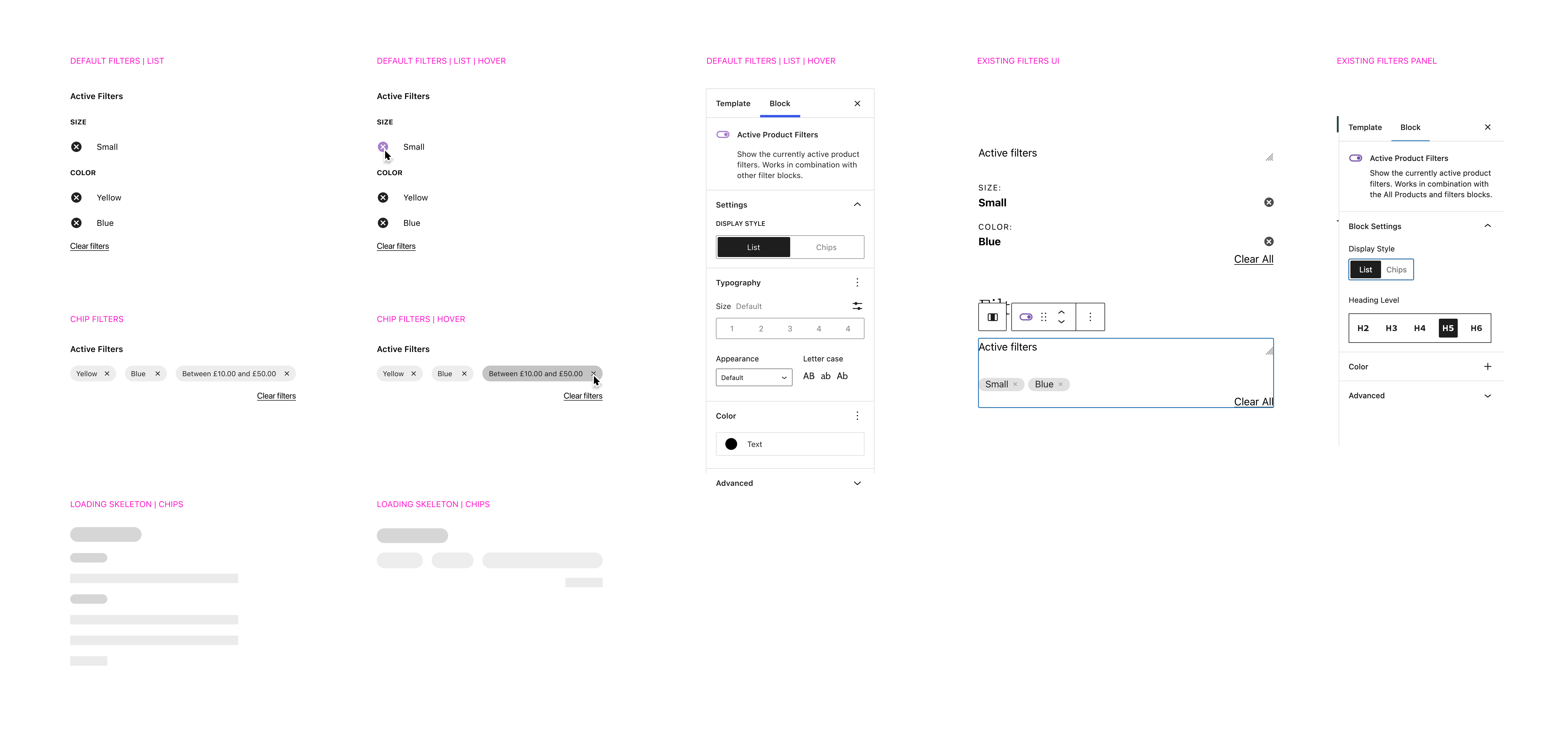
@vivialice I have a few design questions for this task:
- What should the hover state look like for the chips view?
- Do we want that specific purple color for the hover state or should we set it to a changeable accent color of some sort?
- Does the Background Color option in the Colors panel refer to the dark chips? Or does it also apply to the outlined chips?
Thanks in advance! 🙂
Hey @danielwrobert ! Thanks for your questions.
For the chips, it would be great if we could pull from the theme but there might be issues if the color doesn't meet contrast standards. Do you have any thoughts on how this could work?
What should the hover state look like for the chips view?
For the outline chips, a light grey by default. If we use a theme color, a light version of that color.
Do we want that specific purple color for the hover state or should we set it to a changeable accent color of some sort?
No, the purple in the designs signifies the CTA theme colour. If we are unable to use theme styles, I'd use shades of grey for the hover interactions for all.
Does the Background Color option in the Colors panel refer to the dark chips? Or does it also apply to the outlined chips?
Both. It would be the changeable colour - so it would be the background of the dark and the outline of the border. Ideally this would have a separate control name but I didn't think we could customize the label. Something like chip color.
@vivialice thank you, this is very helpful!
If we are unable to use theme styles, I'd use shades of grey for the hover interactions for all.
I'll stick with shades of grey to start with. The issue with theme colors is that, since themes can define their own color palettes, there's not really a reliable name that we can grab across themes (AFAIK). But there seems to be an open discussion on the topic that I'll keep an eye on. Maybe we can circle back on this and adjust, if that gets resolved in a way that works for this scenario.
Both. It would be the changeable colour - so it would be the background of the dark and the outline of the border. Ideally this would have a separate control name but I didn't think we could customize the label. Something like chip color.
I believe we may be able to remove the current color setting and then implement it in a more customizable way via the core PanelColorSettings component. I'll look into that route.
Currently, in 2f4e3e0, I have it set to where the chip outline and text color is controlled by the text color control. But it sounds like you want the outline and the text colors to be able to be controlled separately, correct?
Somewhat related, the "remove" buttons for the chip and the list are currently coming from two different locations and have a slightly different look between the two of them. It would be nice if we could make those consistent between the two views. Perhaps we can also do this as a follow-up item.
But there seems to be https://github.com/WordPress/gutenberg/issues/29568 that I'll keep an eye on. Maybe we can circle back on this and adjust, if that gets resolved in a way that works for this scenario.
Okay, thanks for letting me know about this issue! Let's keep an eye on it.
But it sounds like you want the outline and the text colors to be able to be controlled separately, correct?
Ideally, yes. I can anticipate scenarios where the color for the chips could be something more vibrant to suit the store's styling, but isn't suitable for text.
Somewhat related, the "remove" buttons for the chip and the list are currently coming from two different locations and have a slightly different look between the two of them. It would be nice if we could make those consistent between the two views. Perhaps we can also do this as a follow-up item.
Yes we should make these consistent. Are you referring to the selection reset link or the clear active filters link or both?
Ideally, yes. I can anticipate scenarios where the color for the chips could be something more vibrant to suit the store's styling, but isn't suitable for text.
Perfect, thanks for the clarification! 🙂
Yes we should make these consistent. Are you referring to the selection reset link or the clear active filters link or both?
Specifically the icons themselves. They way they are implemented, the list items use a raw, embedded SVG where the chips use the Icon component from the @wordpress/icons library.
I created an Issue (#6915), which you've already discovered/responded to. Just following up here for posterity!
@vivialice I was looking at the figma file for this item and I see you note the following, re the dark alternate chip background:
Not sure if we can apply a light and dark version. It’s worth exploring if you have time but otherwise lets default to the outline.
What do you think about circling back to the light/dark version as a follow-up so we can at least get the layout and some color adjustments rolled out?
Here’s what I currently have in place in #6905:
https://user-images.githubusercontent.com/481776/185670957-4b6138a1-642c-4b80-8165-786e78ebf3e1.mp4
If you think that is suitable for this iteration, I can create a separate Issue to add in the light/dark version (and split out the text and chip background colors) in a follow-up task.
These look awesome @danielwrobert ! I am happy with starting with the outlined chips for now.
Can you possibly give me a version I can play with on my store?
@danielwrobert and I had a chat over Zoom and went through this and the other explorations to manipulate color in the filter blocks. As per our discussion, there are a few outcomes to highlight:
-
Customizing color of header labels should have a consistent experience across blocks; and as this block changes the colors of the heading, chips and link as a whole we should hold off on shipping this until the color targets can be separated. And if possible, we allow the color of the heading to change as the Attribute, Price filter blocks.
-
The Filter by Stock heading doesn't have a color control for the heading - will raise a separate issue for this
-
@danielwrobert shared some explorations breaking apart the chip color settings. We decided to push this to the next iteration to fine-tune this experience and perhaps see if we can bring it over to other blocks - the filter by price block being a good candidate.
as this block changes the colors of the heading, chips and link as a whole we should hold off on shipping this until the color targets can be separated.
@vivialice I'm not sure I understand this part, can you clarify?
The work I currently have in #6905 does not address any color adjustments other than adding a hover state to the remove buttons. I've kept my work there predominantly focused on the layout changes, since we were still having discussions about the color settings.
So that said, if we hold off on shipping #6905, this block will still change the colors of the heading, chips and link as a whole.
@vivialice I'm not sure I understand this part, can you clarify?
Of course! I mean, the colors of the heading, chips and link shouldn't be tied to one control. I know there's already work to separate the header so that should solve one aspect. Are we able to decouple the link as well, so the color setting only changes the chips?
Are we able to decouple the link as well, so the color setting only changes the chips?
@vivialice yeah, shouldn't be a problem! I propose we handle that in the follow-up where we address the color options you noted above. That way, we can go ahead and merge the layout adjustments in #6905 and then handle the color changes together. Does that sound reasonable?