smufl
 smufl copied to clipboard
Support for numbered musical notation?
On 1/12/2018 5:32 PM, Marek Ledvina wrote:
Hello Joe,
We are currently working on solfege exercises and found out that SMuFL is completely missing the chromatic solfege syllables “note heads" like you can find it for example here http://openmusictheory.com/chromaticSolfege.html
Current Bravura only contains scale degrees ( 7 ) syllables ( do, re, mi, fa, sol, la, ti [si] ) which is nice start but not usable for teaching materials.
We need “do, di, re, ri, mi, fa, fi, so(l), si, la, li, ti, (do)” and “do, ti, te, la, le so(l), se, fa, mi, me, re, ra do"
Can I ask anyone to include them into SMuFL Bravura font?
Thank you very much, Marek.
I've noticed the lack of solfege support in those noteheads also, when looking for characters for the very related topic of the various tonic sol-fa and numbered notations. While the simplest forms of tonic sol-fa were designed to be "typeset" by using a typewriter
| do re mi - |
| 1 2 3 - |
other forms use a bit more complex notation. There is some information about numbered note systems in Wikipedia[1][2][3].
While even much of the more complex notations can be produced with various carriage movements on a typewriter, the development of proportional fonts, makes it harder to achieve proper overstriking for a consistent look using modern technology. Some of the fonts do a better job than others, and one, Doulos Cipher[4] from SIL, makes a good try at being pretty complete, but it uses graphite font technology, which has somewhat limited support.
There are a fair number of variations in numbered note systems popularly used from place to place, with some special symbols not found in most fonts designed for orthography, making it somewhat hard to find an appropriate font for the numbered note systems. Wikipedia doesn't seem to delve into the regional differences between variations, nor does it include sufficient detail about any one of them to be confident of completeness of usage or rules in their articles.
I have various samples of numbered notation used together with lyrics, and some include it between the staves of CWMN (using ordinary noteheads). Other samples show four-part harmony using do re mi, together with lyrics. But while samples of usage are great, and many of the usages can be figured out by examining those examples, it would be great to find a complete exposition of the rules for various variations. I'm presently going by some of what Wikipedia says, some by the various samples I have, and some by asking questions of people that use the notation (but they are not likely true experts on the notation).
Because each note may have a cluster of other symbols around it, it seemed to be that the easiest way to achieve support in a variety of contexts and applications would be to custom design a font with the following characteristics:
- The numbers are centered, and non-spacing.
- Various dots, double dots, overbars, underbars, and accidentals, and fermatas that are placed above, below, or to the left of the basic number should be positioned on the same alignment point, and also be non-spacing.
- Hyphens and dots that follow the notes could have the same alignment point for the first one, but then space over sufficiently that using them again would produce normally-spaced appearance.
- Additional "normal" characters might be included to allow creation of the various notations for specifying key signatures and time signatures.
The above would suffice for a notation application. While I chose a centered alignment point, the techniques would work equally well for any other alignment point, as long as the relative positioning of the characters were appropriate to their use, and they were non-spacing.
For use in a text application, each group of characters forming a note group would then be followed by an appropriate width space to "complete" the group, and maybe another one or two to reach an minimally spaced point to start another group, or, of course, even more spacing to reach parity with associated lyrics on a nearby line.
It appears the Doulos Cipher font uses Graphite for combining characters (a more complex solution to character overlays than non-spacing, but perhaps more limited in total number of combined characters?), and to achieve some level of support for longer beams and slurs to also be positioned as "slur tips" with a note group, and in the appropriate software that includes Graphite, complete slurs would appear.
Not finding support for numbered notation systems in SMuFL, and not finding any existing font that had sufficient documentation, character set, and quality for a current project, I described the above needs to a friend who cobbled together a font using characters from existing public domain sources, and repositioned their alignment points and widths to achieve the above characteristics. It works well in my notation application (under development, and mostly using SMuFL), together with the slur and beam drawing support in that application. I likely didn't find and include all the characters that might be needed for full support of various numbered notation systems, but I did include everything I needed for a current project, and a bit more for potentially similar projects.
I didn't find any standard codepoints for such characters or uses, and fear that our font, if released to the public, will contribute to the music font mojibake that SMuFL is attempting to correct. Is there any support for the idea of including a range of characters for numbered notation systems within SMuFL? I'd be happy to adjust my current font and application to conform to such a range if it existed. I did currently pick a range high in the private use area that SMuFL is targeting, not currently used by SMuFL, but there may be reasons I'm unaware of that would make it not be the best range. There is some redundancy with some SMuFL characters, done to allow for them to be non-spacing, and have alignment points that make the spacing calculations for the numbered notation simple.
[1] https://en.wikipedia.org/wiki/Numbered_musical_notation [2] https://en.wikipedia.org/wiki/Tonic_sol-fa [3] https://en.wikipedia.org/wiki/Gamelan_notation [4] http://scripts.sil.org/cms/scripts/page.php?site_id=nrsi&id=ciphermusic
If you are willing to contribute the work you have done on adding support for numbered music notation to SMuFL, that would be very helpful. Could you please provide a description of each of the required characters? We will need to assign a new range of code points, but otherwise the descriptions should hopefully be possible to translate fairly easily to SMuFL. If you are also willing to share the characters you have developed in the form of a font to contribute to the Bravura reference implementation, that would also be very gratefully received.
Attached are several files.
CHBJ.ttf our numbered notation font. Since the current project is Chinese, and their numbered notation is called jianpu, you will see jianpu in the other files, and the J in this name is for jianpu.
CHBJ-spec.ods gives a complete list of the character codes that we have assigned, and would expect to be changed when integrated with SMuFL, but which are used in CHBJ.ttf.
CHBJ-spec.ods.zip CHBJ-spec.pdf
dashdot spacing.JPG shows the spacing for the progression of dashes/hyphens and dots which may follow a number to complete its duration, in jianpu.

JIANPU TEST DOCUMENT.docx demonstrates the characters in the font used in a text application.
jianpu test2 document.docx shows more of a usage of the characters in notation context.
jianpu test2 document.docx.zip
A couple screen shots showing jianpu combined with music and lyrics, and jianpu combined only with lyrics. These should not be considered in final format as work on the notation program continues, but give an idea of how the fonts might be used in practice.

The font includes characters from the standard Unicode range, but they are specific for use with the numbered notation. Whether the characters we use from the Unicode range stay in the Unicode range, or move to the private range is irrelevant to us, but it seems good to have the needed text characters in the font for proper style.
Largely, any text font could be used for these, except I think it is nice to have the "1" for jianpu key signatures be identical in appearance to the 1 used in the numbered notation. The font would have to include ♯ and ♭ (sharp and flat) to be convenient to use, and it would be nice if they matched the ones used in the music font also. So for these reasons, we decided to include a few text characters in the CHBJ font... those needed for the numbered notation, to be styled the same as numbered notation characters where appropriate, for convenience in not needing to switch among fonts to create the key signatures, etc. Note that A-G and e, i, o, and s, are used in Indonesion key signatures; A-G and sharp and flat are used in jianpu key signatures (these are all listed below).
We also very specifically included all the Unicode space characters of different widths so they could be used in text applications together with the numbered notation characters to achieve the desired spacing. We were surprised that an "EM space" character U+2003 displays as the same width as an "EN space" character U+2002 on Chinese versions of Windows, and haven't figured out why as yet (not sure where to look, and for the moment are not using EM space in our notation).
Note that we included H & J solely because they are used in the name of the font. Windows seems to like that when installing the font, if it can display its own name.
Note that other ASCII characters are included just because they were in the font we started from, but are not really necessary, as far as we know.
For time signatures, we used Unicode superscript and subscript character codes, and the fraction slash.
The Indonesian and jianpu numbered notation key signatures are enumerated below. There may be other forms of numbered notation key signatures of which we are unaware.
    'indonesian':
        'Do=Ces', # tonic_major_7b
        'Do=Ges', # tonic_major_6b
        'Do=Des', # tonic_major_5b
        'Do=As', # tonic_major_4b
        'Do=Es', # tonic_major_3b
        'Do=Bes', # tonic_major_2b
        'Do=F', # tonic_major_1b
        'Do=C', # tonic_major
        'Do=G', # tonic_major_1s
        'Do=D', # tonic_major_2s
        'Do=A', # tonic_major_3s
        'Do=E', # tonic_major_4s
        'Do=B', # tonic_major_5s
        'Do=Fis', # tonic_major_6s
        'Do=Cis', # tonic_major_7s
        'Do=Ces', # tonic_minor_7b
        'Do=Ges', # tonic_minor_6b
        'Do=Des', # tonic_minor_5b
        'Do=As', # tonic_minor_4b
        'Do=Es', # tonic_minor_3b
        'Do=Bes', # tonic_minor_2b
        'Do=F', # tonic_minor_1b
        'Do=C', # tonic_minor
        'Do=G', # tonic_minor_1s
        'Do=D', # tonic_minor_2s
        'Do=A', # tonic_minor_3s
        'Do=E', # tonic_minor_4s
        'Do=B', # tonic_minor_5s
        'Do=Fis', # tonic_minor_6s
        'Do=Cis', # tonic_minor_7s

    'jianpu':
        '1=C♭', # jianpu_major_7b
        '1=G♭', # jianpu_major_6b
        '1=D♭', # jianpu_major_5b
        '1=A♭', # jianpu_major_4b
        '1=E♭', # jianpu_major_3b
        '1=B♭', # jianpu_major_2b
        '1=F', # jianpu_major_1b
        '1=C', # jianpu_major
        '1=G', # jianpu_major_1s
        '1=D', # jianpu_major_2s
        '1=A', # jianpu_major_3s
        '1=E', # jianpu_major_4s
        '1=B', # jianpu_major_5s
        '1=F♯', # jianpu_major_6s
        '1=C♯', # jianpu_major_7s
        '1=C♭', # jianpu_minor_7b
        '1=G♭', # jianpu_minor_6b
        '1=D♭', # jianpu_minor_5b
        '1=A♭', # jianpu_minor_4b
        '1=E♭', # jianpu_minor_3b
        '1=B♭', # jianpu_minor_2b
        '1=F', # jianpu_minor_1b
        '1=C', # jianpu_minor
        '1=G', # jianpu_minor_1s
        '1=D', # jianpu_minor_2s
        '1=A', # jianpu_minor_3s
        '1=E', # jianpu_minor_4s
        '1=B', # jianpu_minor_5s
        '1=F♯', # jianpu_minor_6s
        '1=C♯', # jianpu_minor_7s
Characters in range U+F800 through U+F8FF. We picked this range to be "out of the way" of existing SMuFL codes, but would be content to have the codes shuffled some, and moved to different ranges, if they can be standardized in SMuFL. There are some significant groupings that might want to be retained as groups, albeit with different codes.
The characters in the range U+F800 through U+F83C are all have the same alignment point, and do not advance. This allows stacking the characters in one spot in any order. The characters U+F83D and U+F83E have the same alignment for the first instance, but then advance their own width to allow sequential use, so they must be last in the ordering, to build the JianPu notation for a single note.
A numbered notation note consists of a digit for the note name (0=rest, 1=do, ..., 7=la); possibly an accidental (sharp, flat, natural) to the left of the digit (jianpu) or a slash across the digit (Indonesian); possibly overlines or underlines, possibly dots above or below, possibly a fermata above, and then a few things that might be to the right: hyphen for more duration (jianpu), dot for more duration (both), and possibly a following pause comma or ceasura.
For text applications, because of the many and varied things that might be combined, it was certainly easy to simply put all of the items above as non-spacing characters with the same horizontal alignment point... we chose the center of the digits, overlines, underlines, slash, and dots above and below, but any consistent alignment point would work. If we knew more about fonts, there may be a way to do this with combining characters, but the number of combinations is fairly large, and I don't know if there are limits on combining characters that can be exceeded. The sharp, flat, and natural had "unnatural" positioning with their alignment points far to the right of the glyph, and the following hyphen and dots, while both having an advance value, have their alignment point far to the left of their glyph.
The 4 fermatas (one of which didn't get grouped with the others, because at first we didn't realize we needed the other group of three) are identical in appearance, but have different heights above the baseline to be used for different combinations of overhead slurs, dot above and overlines. If there is a way to automatically choose the right height in the various combining characters in font technology, more power to it, but I don't know how to do that, so in code I note what things are above the digit that would cause a fermata to need to be higher, and then if there are one or more causes, the appropriate fermata is chosen. For slurs, raising it the same as one dot above works fine, but slurs are probably not part of the characters that the font would see if character combining were used.
The dots above or below are used to indicate octaves. The overlines are indonesian duration adjustments, and the underlines are jianpu duration adjustments. Each line halves the duration. Indonesian, as described to me, doesn't exactly follow the duration of notes that might be used in western notation: but rather the major beat is determined, and a digit by default gets that beat duration. So it might be a half note in 2/2 time, and it might be an eighth note in 6/8 time, and then everything under an overline (which always spans multiple items) is halved. The jianpu notation the underlines halve the duration, but do not span notes (in spite of the examples shown for the Cipher font, which show underlines spanning notes! The Cipher people were more familiar Indonesian-notation, and jianpu as an afterthought, it seems, and they even say so).
The music we are notating only needs the triplet 3, but we included a whole range of tuplet digits and : (which I have no idea why it exists). I believe these characters already exist in SMuFL. I'm not sure if the size that already exists in SMuFL can be consistent with both staff notation and numbered notation, we picked a size that looked good with our numbered notation, but whether it is reasonable to scale the numbered notation to look good with the existing SMuFL tuplet digits, I don't know. There are few enough tuplet digits in use, and they are somewhat independent of the other characters, so if font size selection had to be done separately for them it would be an annoyance, but not an extreme one.
We observed that the jianpu duration dot and hyphen tend to be at the same vertical alignment and thickness in most samples available to us, whereas the Indonsian duration dot tended to be smaller with respect to digit size. My Indonesian sources told me the dot should be centered vertically on the digits, but I see the Cipher font puts the Indonesian dots on the baseline. Perhaps there needs to be 3 varieties of duration dot, one for jianpu and two for Indonesian. I note Cipher didn't quite vertically align the duration hyphen with the duration dot, but think that is mostly an error, brought on by jianpu being an afterthought for them.
Characters from U+F840 through U+F8FF (except F86e, which might want to be regrouped with the jianpu duration dot) are more ordinary, with alignment points on the left, and normal advancing.
Note that the bar lines are either to the left or right of their alignment points. This turns out to be far more convenient in coding than having them centered. The "begin bar" and "left repeat bar" are to the right of their alignment point, and the others to the left. While I draw bar lines with with graphics primitives for staff notation, it was extremely convenient to use pre-drawn bar lines in the numbered notation, drawing only slurs with graphics primitives. I haven't checked to see how Bravura text deals with the alignment point for bar lines, but I found this combination is very convenient for layout work, both in text and my scoring program (which generates HTML and SVG). I find that both HTML and SVG deal with the font nicely, effectively using many of the text-mode features regarding character groupings sharing a single alignment point. This sort of feature doesn't work for CWMN due to its two-dimensional placement, but is very effective for numbered notation since everything is relative to a single baseline, and each grouping has consistent geometries, all of which need to be relative to a common alignment point, even if implemented differently.
Most of the rest of the characters are slurs above and below, with and without triplet 3, and longer Indonesian overlines, for text usage.
I had done some Indonesian numbered notation some years back with an older program and my Indonesian notation "expert" would now be in his 90s if still living: I have lost contact with him; my current work and resources are mostly regarding jianpu notation.
I tried to be complete, but I'm sure I missed some things, but I'm happy to answer what questions I can about the numbered notation, and what the reasonings were behind any design decisions, usage patterns, and review and provide feedback on new character codes and groupings.
refer to this website for Indonesian Numeric Notation http://www.gamelan.org/library/index.shtml
Thanks very much for sharing your work on your own font for numbered notation, @Glenn-smufl.
I think the layout issues inherent in reproducing this rich form of notation go beyond the requirements of SMuFL itself: in much the same way that SMuFL does not attempt to make it possible through the use of ligatures and glyph positioning systems that conventional western music notation can be laid out precisely using only a string of characters typed in a SMuFL font, I believe that encoding all of the positioning rules for numbered musical notation is beyond the scope of what we should attempt to encode in SMuFL.
The two basic approaches that could practically be taken for this would be to create a large number of precomposed characters, or to rely on font glyph positioning features to produce correct layout from a series of combining characters. Both of these approaches quickly become very complicated.
In addition, numbered notation systems like jianpu make extensive use of musical symbols already encoded in SMuFL, such as articulations, dynamics, accidentals etc., and in order to produce a complete and workable representation of a system like jianpu that includes these symbols would require either duplication of these symbols or extensive glyph positioning and ligature support.
SMuFL's job is to encode the different symbols that are used for a given notation, not necessarily to recommend a specific implementation for how that notation might then be reproduced in a particular software application. As such, I propose that SMuFL only encodes the distinct symbols used in the notation system, and does not attempt to encode positioning rules.
The set of unique glyphs to be encoded, then, to capture jianpu notation appears to be the following:
0 = quarter rest
1 = scale degree 1
2 = scale degree 2
3 = scale degree 3
4 = scale degree 4
5 = scale degree 5
6 = scale degree 6
7 = scale degree 7
X = unpitched/untuned note
• = combining octave dot (positioned above or below)
_ = combining halve duration (positioned below)
– = double note duration (positioned following scale degree)
• = lengthen note duration by half (i.e. rhythm dot)
)0( = bar rest
Items such as barlines, dynamics, articulations, accidentals, western pitch names, fractions (for time signatures), tuplets, slurs, ties, etc. can all either be satisfactorily reproduced by text fonts, are already encoded elsewhere in SMuFL, or are already out of scope (e.g. SMuFL makes no effort to encode slurs or ties of variable length or curvature).
It is arguable whether or not the digits 0-7 and letter X should really be encoded in SMuFL, since they are readily available in any font that supports Arabic numerals and Latin alphabet, but since these digits represent the core of the notation itself, I think it's appropriate that they should be encoded in SMuFL.
Since the list of glyphs above is focused on Chinese jianpu notation, we should decide whether to create a range dedicated to Chinese jianpu notation and then create any future ranges for other numbered notations, or whether to create a more general, larger range with room for future expansion (in the order of 64 code points rather than 16 or 32) and name it more generically.
My inclination is to adopt the latter approach, since any other numbered notation system will very likely have the same core set of digits, and it would not make sense to reproduce these again and again in the encoding. So I would propose a range called "Numbered music notation" with 64 code points, and a starting set of glyphs that encode the essential elements of jianpu.
We don't include the digits 0-9 or the letter x for use in guitar tablature, yet they are as central to that notation as they are for numbered notation. I think we want to treat them consistently, but don't have a strong opinion about whether that would be including them both or excluding them both.
I agree that a larger numbered notation range sounds like the better approach. I suppose we could view tablature as a numbered notation but that doesn't seem very SMuFL-y to me.
[not wanting to go too far off, but...]
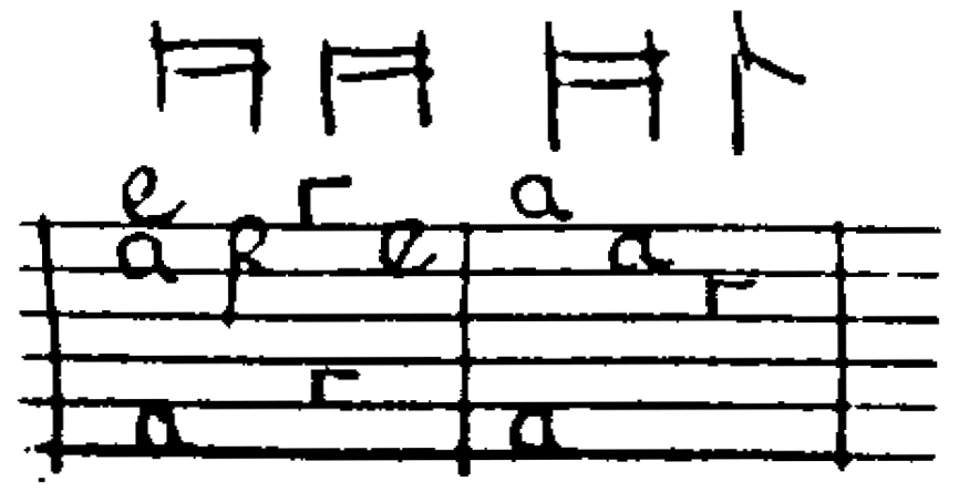
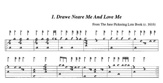
I suppose a question is: are tablature letters -- which are semantically equivalent to numbers (a = 0, b = 1, etc.) and very common in French and older English music -- are they also something to encode? Are they stylistic alternatives to numbers? Or their own range? The shape of c (looks like r) and f (second note) in this example from Lady Pickering's lute book give an example of why using letters from the text section of the alphabet wouldn't be equivalent:
This is an example from handwritten, old music, so it might be outside of SMuFL's provenance, but you can quickly find examples (e.g. https://dokumen.tips/documents/the-scottish-lute.html and excerpted below) where people are making computer notations of the same material:
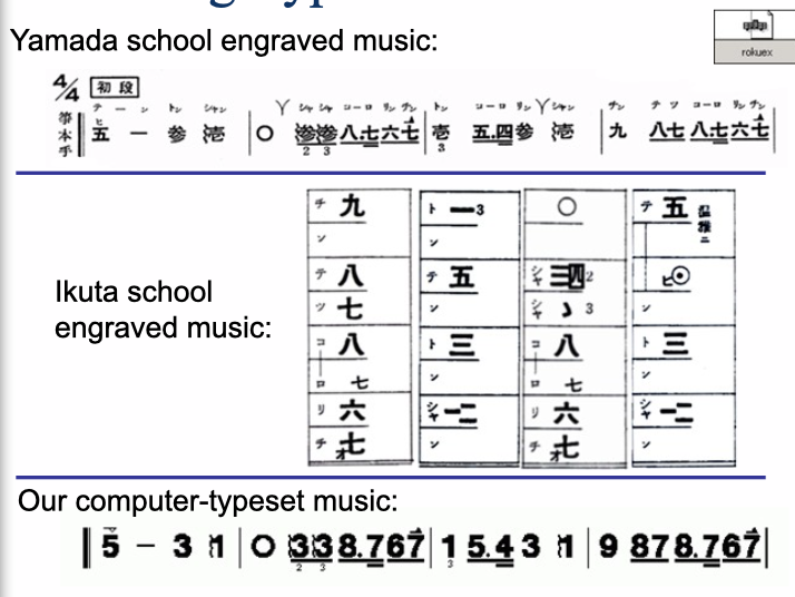
Craig Sapp's survey of encoded Koto number notation might also be consulted (https://slideplayer.com/slide/8583756/) -- we are again moving beyond CWMN -- but it is something that is engraved alongside CWMN with some regularity:
SMuFL does already encode the tablature numbers/letters for specialised tablatures such as French and English lute tablature, Italian and Spanish lute tablature, German lute tablature, and German organ tablature. The justification for not encoding the tablature numbers used in guitar tablature is that they are straightforwardly encoded in regular text fonts.
I believe the difference with numbered notation is that the other symbols – the dashes for doubled durations, the dots for rhythmic augmentation, the underlines for halved durations, and the octave dots above and below – need to work in concert with the digits, and hence it makes sense for those digits to be included in this range.
Since writing the original submission, I have been advised of this document as being a more authoritative description of Jian Pu notation. It came to me as a PDF, not sure of its exact origin in China. It differs somewhat from what we implemented, particularly regarding the underlines that shorten the duration of notes... this document indicates they are sometimes (or should be) connected across notes, more like the Indonesian overlines used for the same purpose. My consultants for my current Chinese project didn't think that was necessary or appropriate, so the individual digit-sized overline and underline seem to be useful, but specifications should probably should exist in metadata for width (distance from either end to center), thickness, and location of such lines so that they could be connected (or replaced) with line drawing primitives when desired.
Regarding the inclusion of characters, I generally agree with the idea of including the digits in the appropriate stylistic form as part of SMuFL. The following two might be better described using different terminology:
– = double note duration (positioned following scale degree) • = lengthen note duration by half (i.e. rhythm dot)
The "hyphen after note" doesn't double the duration, but rather lengthens the duration by one beat, so with two hyphens, the note is 3 beats, with 3 hyphens it is 4 beats. And the dot lengthens by a half beat... but a second dot lengthens by a quarter beat.
I am somewhat concerned with the statement:
SMuFL's job is to encode the different symbols that are used for a given notation, not necessarily to recommend a specific implementation for how that notation might then be reproduced in a particular software application. As such, I propose that SMuFL only encodes the distinct symbols used in the notation system, and does not attempt to encode positioning rules.
While I generally understand and agree with the philosophy, the numbered notation specifically aligns the digits and overdots and underdots and fermatas on a center line. So it would be highly convenient for the anchor for those characters to be centered. Choosing any different anchor would just be making extra work for every notation program, to determine the size of the character, and its center point, and do the individual alignments necessary to make them centered. I suppose the extra convenience of having accidentals and lengthening hyphens and dots also be based on that same center point, as in my submitted font, is less necessary, although it is still immensely convenient. One might observe that much of the numbered notation was created specifically to make to make it work on a fixed-spacing typewriter, and so conveniently emulating that layout in the font is appropriate. It wouldn't make it particularly harder for a notation program to deviate from that spacing if it chooses to, but by and large, not deviating from that spacing is the traditional expectation, and making that easy is beneficial. I don't see this as particularly different than choosing the anchors for most noteheads to be in the vertical center of the note, because that is the important part of the alignment for noteheads of varying sizes (standard and grace notes, for example).
I'm glad for the link to the Indonesian notation @odhot provided should I need to do another project using that notation, or update the past projects. The references to Koto (which I'd never heard of) are sparse on detail, but appear to have some similarities in some forms to Jian Pu and gamelan notations, a more complete reference (in English?) for the specifics might indicate how deep the similarities are, and if it could share a common numbered notation range, by adding a few more characters for its idiosyncrasies.
And indeed, combining these notations with CWMN is not an uncommon occurrence, as shown in my original posting.
After discussion with the co-chairs, due to the relatively high level of complexity entailed in satisfactorily creating a range that encompasses the various conventions for numbered notation, we've decided to postpone working on this for a release beyond SMuFL 1.4.