up-for-grabs.net
 up-for-grabs.net copied to clipboard
Improve Logo
Our current logo of Up-for-grabs works great in light mode but it has issues with contrast and visibility under dark mode. We need to find a way to either improve the same logo for dark mode or to use a new and better logo. A logo is something that is the root of some project or product. I wouldn't want to change it without discussions. hence, opening this for discussions on that. Ref: #3023
IMO a new logo would be OK because the current one is a bit complex and somewhat hard to read, but it's not a major deal.
Hi there, I created a new minimalist logo with a few versions for light/dark mode that I thought might be of some use, and I also made several alternate design sketches if any of those are a better fit. Please let me know if these would be beneficial, and if they are I can create a pull request from my fork that includes the files


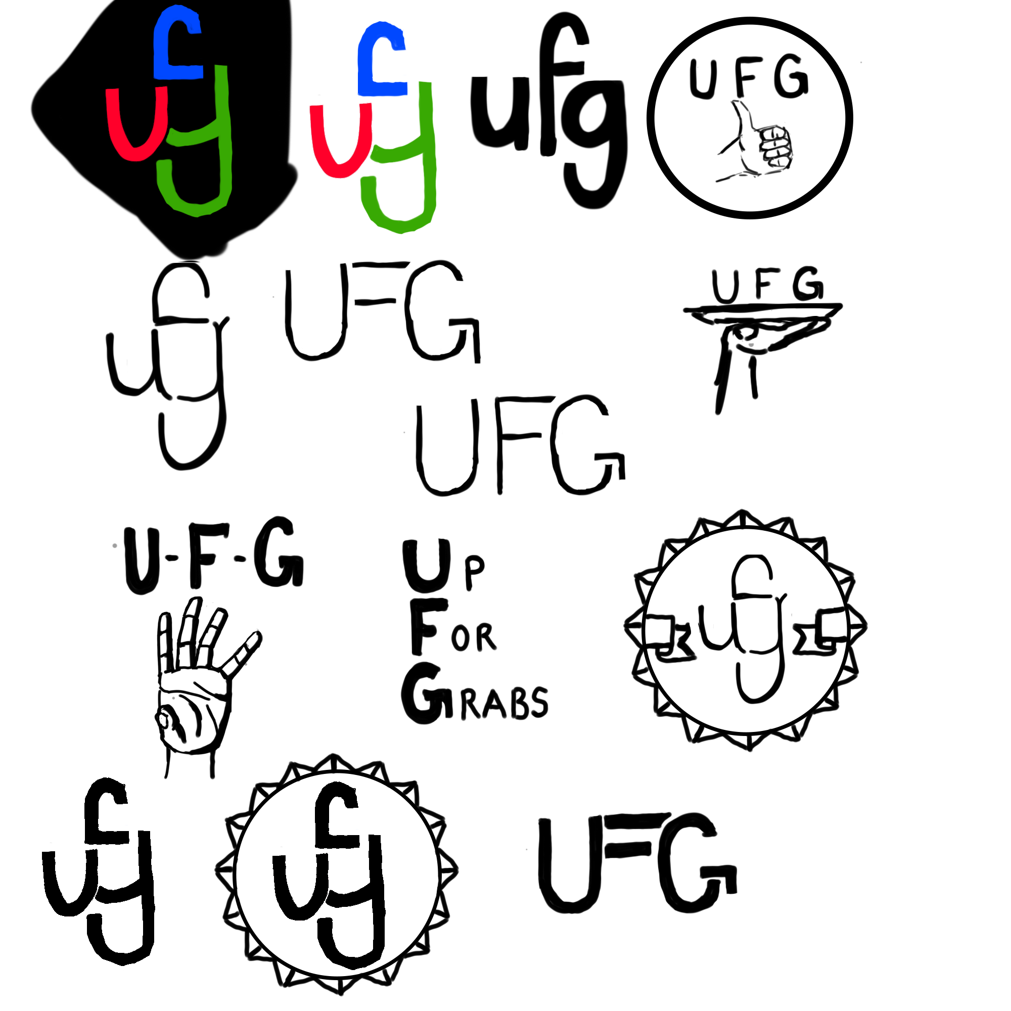
Try using a colour which is kinda a mixture of both dark and light shades. For example - sand brown is visible in black as well as white or if you wan't to keep the logo color intact you need to change the logo background
Is there anything that speaks against making an alternative dark-mode version that simply uses a different color palette and only shows up when dark mode is enabled?
@chiragkhatri19 Sure
I'll suggest that we should go for a slight minimal logo, for now there's a lot going in the logo, and as a Beginner in Open Source and stuff, When I visited the website I thought it's some NGO or something. So we should Target the new comers and I can create a Minimal Logo for Up for Grabs. I'll try to make a design layout soon so everyone can agree to that. And then we will change the logo when everyone feels satisfied
Go ahead please, will wait for your design.
I'll create and send you the design by tommorow. So if you like it I can make my First HacktoberFest PR
I'd recommend we make either the existing or new logo an svg so that we can control the colors depending on what mode it is in. I am happy to work on that for the existing logo or help brainstorm a new logo!
Make the logo filled in with white in the center, that way it will be white inside on whatever mode the website is on.
OR
Make the following items white: text, hand border, and stars on the sides.
Another logo idea: a capsule type design, it can be refined further if wanted.