typst
 typst copied to clipboard
Keming
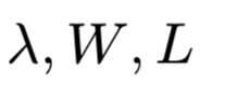
Another example; here, the comma is too far separated W:
$lambda, W, L$
Another example; here, the comma is too far separated W:
$lambda, W, L$
It looks the same in LaTeX. What you actually want is $\lambda$, $W$, $L$, because punctuation should ideally be in text mode and not math (depending on context of course). This is what LuaLaTeX with unicode math gives me
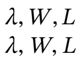 for those two alternatives. The bottom one obviously looks much nicer.
However in typst $\lambda$, $W$, $L$ has the same spacing problem as $\lambda, W, L$.
So, I dug into this a bit. Here's the test file:
\documentclass[12pt]{article}
\usepackage{unicode-math}
\begin{document}

\noindent $W, L$\\
$W$, $L$\\
$W$F

\end{document}
Using xelatex:
Omit the unicode math part and using pdflatex:
Back to unicode math, now with lualatex:
Oh, and Typst:
Observations:
- Typst and xetex are the same.
- pdflatex omits the italic correction for W before the punctuation, which looks good. It's an outlier, and I need to look into why that happens. Keep in mind, it's using a different font, though.
- All of xelatex, pdflatex and Typst include the italic correction at the end of the math.
- lualatex omits the italic correction at the end of a math block. It gets better spacing for the comma, but allows collisions .
It's hard to say that Typst's current behavior with keeping the italic correction with the math block is a bug when it agrees with standard tex variants, and that lualatex gets the win at the cost of something else. It's then a design choice, which needs to be made (should we keep the italic correction and call this not a bug, drop the italic correction as a feature and take on the (limited) risk of collisions as in lualatex, or try to do something even smarter than the TeX flavors (in which case I would label this a feature request, not a bug).
The failure to kern the comma in math mode for all three engines using the unicode math font is suspicious and makes me wonder if that's not a bug but a font limitation. I'll look into why pdflatex is getting the win here.
Here's the scoop. New Computer Modern Math and its predecessor Latin Modern have no kerning information. The GPOS table is empty. The MATH table in an opentype math font can have a kerning table, but it's this funny cut-in table for the four corners of a glyph to optimize sub/super script placement. Regardless, it's AWOL in both of these fonts.
By contrast, the original TeX Computer Modern Math Italic font has a few kerns listed in its TFM file. Most are punctuation (comma, period following a character) but also some design choices (d kerns tightly to f because of differential notation presumably). This information seems to be lost in the transition to OTF. I posted on tex stackexchange to try to confirm this; the answers weren't definitive, but there seems to be an impression that OTF doesn't support kerning and math. Instead, in contex, e.g., you can manually specify kerning pairs if you want. I wrote to one of the original designers of Latin Modern to try to get a definitive answer. Regardless of what I hear back, the font files have zero kerning information in them (not GSUB, not MATH).
Given that #1855 dealt with the original issue above, I think we have two options:
- We observe that Typst give the same output as XeTeX (has italic correction at the end of math, leads to poorly spaced comma, but never collision with a following upright). It also gives the same output as LaTeX , except that it doesn't kern within math because the kerns aren't in the font. So, if we're happy with this behavior, we close this issue.
- Decide that the LuaLaTeX policy of omitting the italic correction is better. This is different from TeX and can sometimes leads to collisions. But it has merits. If we want this, we leave this issue open and close it once this new italic correction policy has been merged from a PR.
Either way, we should open a feature request issue that there should be some mechanism for a person to specify pairwise kerns for a math font if they really want them.
For the record, I noticed that overline(V)_alpha leads to bad kerning, as opposed to V_alpha.
It would also be nice if "a', b" can have better kerning. f_(b', b) wide f_(b'#h(-0.2em), b)
I wanted to try to use selector to select "',", but it does not work. Manually writing the negative space everywhere is just too tedious and hurts readability...
Another one: too much space before the last A in
$ A (X_i - overline(X))(X_i - overline(X))^T A^T $
LaTeX also puts too much space but it looks better, maybe by virtue of having the first T lower (which also looks better I think independently of the kerning issue):
Another one: too much space before the last
Ain$ A (X_i - overline(X))(X_i - overline(X))^T A^T $
LaTeX also puts too much space but it looks better, maybe by virtue of having the first
Tlower (which also looks better I think independently of the kerning issue):
This would only be a like for like comparison if you also used scaling delimiters in LaTeX
Ah right! The Latex version with scaling delimiters:
And typst wihtout scaling delimiters:
so Latex is no better actually, maybe even a bit worse