thunderbird-android
 thunderbird-android copied to clipboard
Improve dark theme
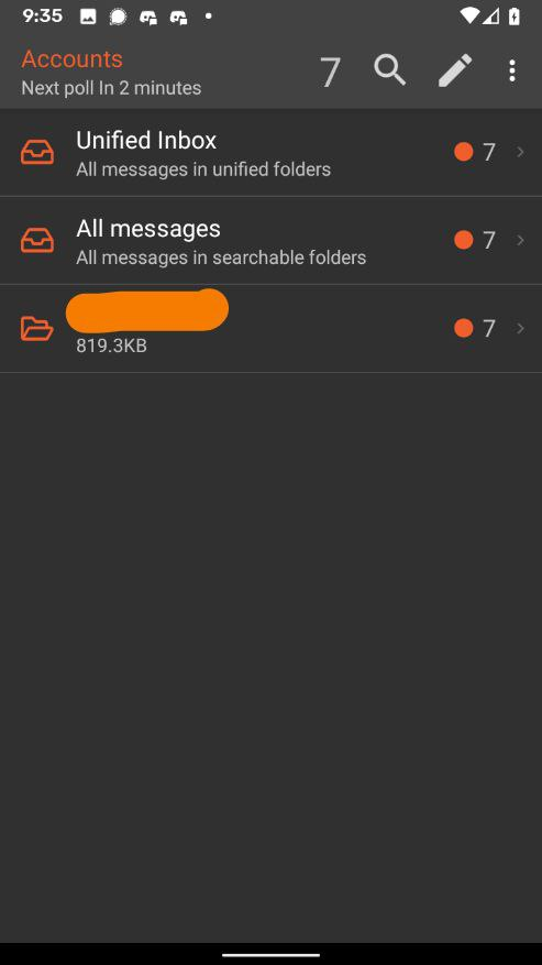
Right now the different screens are fairly inconsistent when using the dark theme as pointed out in #4316.
We should follow the Material Design guidelines to reduce eye strain and make sure there's enough contrast: https://material.io/design/color/dark-theme.html Properly using Material Components 1.1.0+ should give us most of this for free.
Related: #4198
Good morning, There is a glitch in the dark theme, which is not always applied properly to the settings panel for folder. To reproduce this issue, the easiest way is to force close the application, to start it, to open the left drawer, to press "manage the folders" then to press any folder ("outbox" for instance): the window that is opened has a white background rather than the dark grey one. If you go back to the list of folders by pressing the back arriow on the top left hand of the screen, and click again on the same folder, this time, the backgroung turns dark grey, but the text remains black, so it is hardly readable. Thanks.
@PCigales: This is an issue to track specific improvements to the dark theme. If you want to report a bug please create a new issue and supply as much information about your environment as possible. Issues like yours have been reported before by LineageOS users. See #4295.
Please, don't use suggested in https://material.io/design/color/dark-theme.html color for background. "Dark grey" (which is actually just black) will be too contrast. Current dark theme background color is perfect.
May be you can add separate "AMOLED Dark"/"Pure Dark" theme (some apps provides material's "dark grey" color as separate amoled-optimized theme).
Could you use the same background color in app and in email view, please? Because now app background is grey and it's awesome, but in email view it's black and not very good
Please consider to use accent color for the surface of the top app bar (just like it's recommended for light theme).
in email view it's black and not very good
I agree, it's too contrast currently.
May be you can add separate "AMOLED Dark"/"Pure Dark" theme (some apps provides material's "dark grey" color as separate amoled-optimized theme). Oh yes, please add one more theme using real black (not just dark grey) background for the use with Amoled displays. If the contrast is to hard, you could use some light grey for the foreground (aka font display).
I would like to suggest following the system default theme that is available from Android 10 (API level 29): https://developer.android.com/guide/topics/ui/look-and-feel/darktheme
Agreed, I actually can't use K-9 currently because the dark theme as it is is way too dark and burns text into my retinas.
In my opinion there should be a dark theme considering the contrast objections posted here by some users and a black theme that makes OLED users happy.
The /e/ fork of K-9 Mail incorporates a more modern design, maybe that one could be made upstream?
Edit: Added screenshot

Please, don't use suggested in https://material.io/design/color/dark-theme.html color for background. "Dark grey" (which is actually just black) will be too contrast. Current dark theme background color is perfect.
Yeah, the new lighter background is a regression that should be fixed.