 tailwindlabs
Pixel offset in centered grid with percentage width (i.e. w-1/3)
Hey,
I'm currently facing a problem, where children with a percentage width (i.e. w-1/3) in a centered flex element (flex mx-auto) do not have the full width and result in a slight pixel offset over full width (w-100). It seems to appear only in Chrome (tested in 78.0.3904.97) and is not be Tailwind specific.
I created a little example: https://jsfiddle.net/dcsturm/9p0bkL5r/
As @hacknug mentioned in https://github.com/tailwindcss/tailwindcss/issues/1223, this error occurs even if increasing the amount of decimals or using width: calc(100% / 3); does not fix it.
I've reported this issue to https://bugs.chromium.org/p/chromium/issues/detail?id=1024488
Daniel
The behavior seems to be the same in Firefox too, the middle column's width is rounded down, while the two on the side are rounded up.
Not sure if there is a better solution though. If all rounded up then it wraps to the next line (or overflows 1px). If all rounded down, then there is a 2px gap. If rounding the same but they antialias the contact edge then people would question why there is a 1-2px line there, with bit different colors.
@tlgreg, which version did you use? I've tested on Firefox 70.0.1, Safari 13.0.3 (macOS) and don't get any rendering issues. Microsoft Edge 76.0.181.0 (obviously running on Chromium) acts the same as Chrome. Furthermore, I'm not quite sure, but I never ran into this before with this type of solution. 🤔
Firefox dev, rn it's 71.0b9, most likely it was b8 yesterday. And I'm on windows.
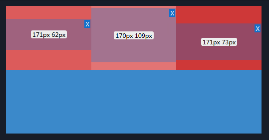
This is the behavior in all browsers for me:
What if I told you I don't see the gap today? lol (Vivaldi v2.9.1705.41 Stable channel, same as yesterday I guess)
Right now I'm thinking about this maybe being an issue of perception given the difference in luminance, lightness or whatever this is causing it. Can't remember the right term right now but this is the same thing that makes white text on a black background look different than black text on a white background (text looks thinner in one of them).
This is a screenshot after zooming in as much as I could using Preview.app
I might have misunderstood the original issue because I never saw a gap, just the different width rounding, but I think that's the best solution from the browsers. (It might be a bad idea, to comment on issues too tired.) Can you provide a screenshot @dsturm?
Best solution I can figure is to add flex-auto to each item so they all grow/shrink as needed to fill the available space:
https://jsfiddle.net/adamwathan/mvhza60g/
@tlgreg I see the difference in width in the insepctor on your screenshot, but not on the right hand side. So it renders correctly, imo. I also cannot reproduce any floor or ceil in Firefox Developer 71.0b9 on macOS. 🤔
Screenshot: 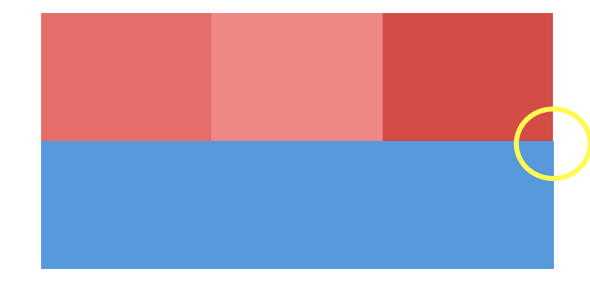
@hacknug Did you try to resize the window, though?
Btw, the issue got confirmed on https://bugs.chromium.org/p/chromium/issues/detail?id=1024488.
Hey @adamwathan, that seems to fix it, yeah. 👍🏼 flex-auto might just be needed on the "last" item only.
Interesting, might be OS dependent? If it is, then that's a weird thing to be os dependent. Because I don't see it with v78 based chromium (vivaldi) or chrome 80 (dev). I'm on windows 8.1 currently though, not windows 10.
Currently I can not test it on other OSs, but it was confirmed for chrome version #79.0.3945.0 using Mac 10.13.6, Ubuntu 16.04 and windows 10
Might be a retina display-only problem, it looks like a half pixel to me.
@adamwathan I've thought about this and tested it on a non retina display: it's the same.
The issue was stated as WontFix: https://bugs.chromium.org/p/chromium/issues/detail?id=1024488#c4