dominiontabs
 dominiontabs copied to clipboard
 sumpfork
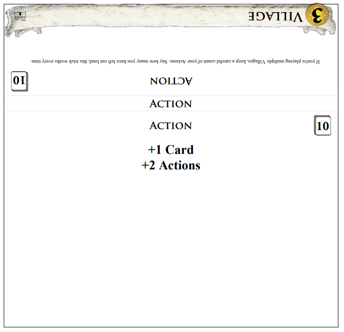
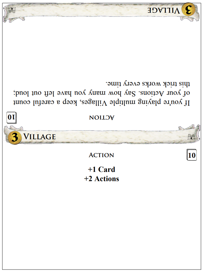
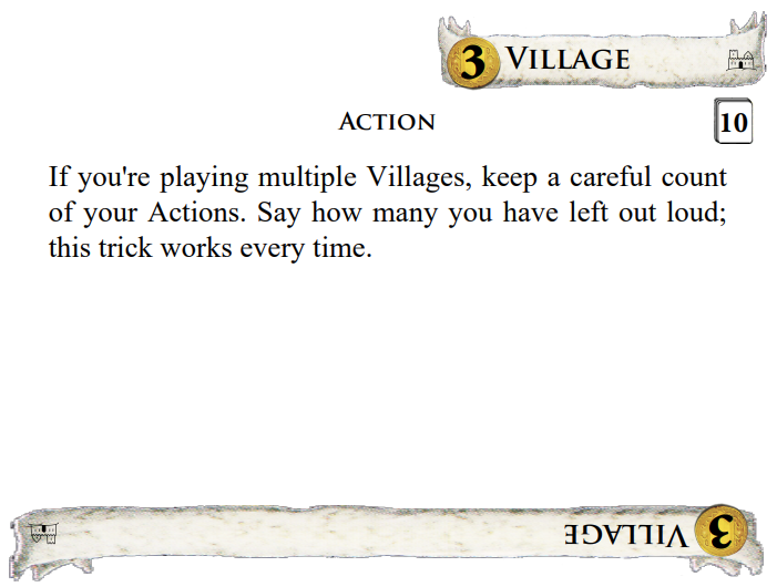
Draw engine overhaul with improved wrapper and font support
Resolves #371 and #370.
This is a large overhaul of the draw engine in the same spirit as #150. I started with the goal of generalizing the --wrapper option to support a wide range of folders and wrappers. It builds on @wvoigt's wrappers by generalizing the dividers into three main panels:
- the body, which holds everything together
- the head, used for making tabs, straps, and covers that fold over the top
- the tail, for making pull-tabs and tab folders similar to the current
--wrapperoption
All three panels can display card or rules text, upright or reversed, depending on how you want to fold them. The current --wrapper option becomes shorthand for --head=strap and --tail=folder which creates the same shape. There are a couple of other combinations like --tent which sets up the dividers the way I personally like them, folded over the top of the cards with the tab graphics on the top edge.
To handle all of the different folding shapes, I replaced the main drawing methods with more general ones that can handle all of the new shapes (which are mostly just long or short, narrow or wide, forward or backward). This eliminated a lot of special cases, like the two separate engines for double-sided cards and wrappers. It also simplified the cropmarks code a lot, as there are now just a few basic shapes with more parameters.
While I was fine-tuning the layout code, I also took the opportunity to tighten up some of the graphic design to match the cards more closely. Those changes include a new font engine that supports more of the Dominion fonts like Trajan Pro and Charlemagne Std. That includes support for some of those fonts' special features like small caps, while still providing fallbacks for installations that only have Minion and Times.
Like #150, this is a big update, and I expect that it will raise some questions and additional requests. Much of the changes have been working and stable for several months now, but there were too many loose ends to send a PR until I managed to get unblocked this week. At this point, I've tested all of the major features separately and in various combinations. Next I'm planning to actually print the stuff that I need for my own collection.
I have some sample configuration files here (domdiv.cfg and domdiv-thick.cfg) that I've been using for tests and for my personal card generation.
https://github.com/bszonye/dominion-box/pull/1/files
Here's a sample page with the new --tent option, which is how I store my cards. Each divider has the tab graphics on the top spine and at the end of the two panels. The spine still uses the plain card name as a default, and --spine=tab changes it to full tab graphics.
Wow, thanks. I'll have to try to find time to review. I'll also try to get this version up in the staging area of the online generator so it's easy for people to test. Hopefully next weekend?
Awesome, thanks! I realize that this is a big change, so I'll try to add some more information about how all of the new stuff works. I already tried to explain things well in the source code and the new --help text.
What would help me is some rough diagrams in the code explaining the various parts. For example, what a do these parts generally look like: tab, strap, cover, folder, etc. And along with them, the calculation values that are used to determine where features are. From past experience debugging issues, these diagrams really help when trying to figure out why something is not printing in the correct spot.
And at first read, I'm having a hard time seeing how the parts fit together. I guess part of that is not fully understanding what a "tent" or a "matchbook" would look like. I see your print out, but I can't tell where the fold lines are.
Yeah, I’ll put up some diagrams soon of how the options work. My first priority was to get my stuff printed and folded and put into my game boxes! Now that’s done & this is next on my list.
OK, I am putting together some mock-ups now. I had a question, though, before I forget: Where's the correct place to make changes to types_db.json? I fixed some things related to graphic alignment in src/domdiv/card_db/types_db.json but I suspect that they should have gone into card_db_src instead. However, looking at a diff I can see a lot more changes between the files than just my own changes (e.g., there's also a lot of Allies-related stuff differing between the two). Did I make a mistake, or are those two files no longer in sync?
All card db changes must happen in card_db_src as card_db gets generated from it. They should be in sync on master - you can generate one from the other using doit.
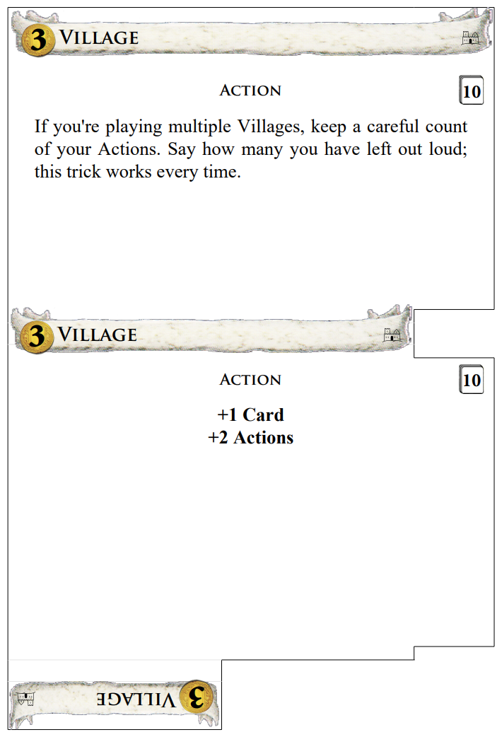
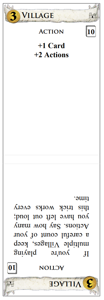
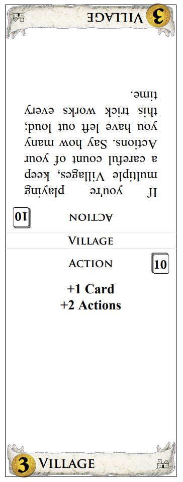
--head options
I'm using default options for everything here, except as otherwise specified. First, all examples use --tab-side=left for consistency, plus count=true and --types=true so that you can see where those options end up in the layout. Second, all of the --head examples include --head-text=back so that you can see how text layout works on the head panel.
--head=tab
This is the default, same as before.

--head=strap
This uses the same layout as the current --wrapper option. It adds a small folding spine between the body and the head. The spine is stackHeight tall, the same width as the tab, and by default displays the card name just like --wrapper does.
--head=strap --head-height=2.5
By default, the strap option makes the tab portion tabHeight tall, so the total length is tabHeight+stackHeight. The --head-height option changes that. In this example, the tab portion is 2.5 tall for a total of 2.5+stackHeight for the whole strap.
--head=cover
The cover option expands the head to the same size as the divider body. This also expands the spine area to the full width of the card. (It's still stackHeight tall.) At this size, the head can also include rules text with --head-text. The options for --head-text are card,rules,blank,front,back. The first three options directly specify what text to put on the head. The last two choices indirectly use the setting from --front or --back (as shown here). The default is blank as card and rules are already used for the other two panels.
--head=cover --head-height=2.5 --head-facing=back spine=types
The cover size is also adjustable with --head-height (reduced it to 2.5 here). --head-facing lets you turn the text around so that it reads correctly when folded over. --spine changes what's printed on the top edge after folding.
--head=cover --head-facing=back spine=tab
You can also change the spine to show another copy of the tab banner. I find that useful in conjunction with the --tent option so that the banner shows on top when you fold it over the cards.
--head=none
You can also remove the head entirely, if you want to put the card name elsewhere.
--tail options
As above, I'm using all default options here except for --tab-side=left --count=true --types=true. The default is --tail=none which produces the same result as usual.
--tail=tab
This option does not change the size of the card at all. Instead, it reserves tabHeight at the bottom of the body panel for an additional copy of the tab banner, which will be upside-down by default. This option is mainly used as part of the --tent meta-option, although I can imagine other circumstances where it would be useful. For example, you could do this along with --tab-side=full to make a fully reversible card that can go in equally well upside down.

The other notable thing about --tail=tab is that it does not create any folds, so you can still use it with double-sided printing. Here's what the back side of the output looks like:
--tail=strap
This adds a longer, folding tab to the bottom just like --head=strap does for the top. It also creates a folding section that is stackHeight long, but because this is normally under the cards, there's no equivalent to --spine for putting text on it. This option is mainly useful for putting a little hook on the bottom of the card, or a longer hook if you adjust the length with --tail-height.
--tail=cover
Analagous to the --head version, except that the cover folds under the bottom instead of over the top.
--tail=folder
This produces a tab folder just like the current --wrapper option does, but it works independently of the head panel.
--tail=folder --head=none --front=blank --tab-side=right
If you put a tab folder on the tail, you can skip the head tab in front! This is similar to the current --wrapper option, but it's just a tab folder without the little strappy bit that connects the front and back.
All card db changes must happen in
card_db_srcascard_dbgets generated from it. They should be in sync on master - you can generate one from the other usingdoit.
Thanks! I'll fix that next then. I was confused because the copies of types_db.json are different, but on closer look I think the entries are just in a different order. The doit script must do some reordering or normalization.
I fixed card_db_src/types_db.json so that it's the source of truth. I also noticed during my options walkthrough that there was no blank option for --spine, so I implemented that as well. When I first started working on this, I wondered why --wrapper put another copy of the name on top right in front of the tab that already has the name on it. I later realized that it's helpful for when you're looking directly down at the cards, but some folks might not appreciate the redundancy. Currently looking through the remaining new options to see what else I should illustrate with examples, then I'll talk a bit about the refactoring.
--notch
I kept notch outlines the same for existing options and extrapolated from similar configurations for new combinations. These are the full rules:
- Notches only appear when there is a tab somewhere on the divider. If there are no distinct tabs (e.g.
--tab-side=full), or not enough room next to the tabs, there are no notches. - Notches go on the side with more room (on the right if equal).
- The body panel always gets a notch on top and bottom. On folding edges, the notch is symmetrical across the fold.
- If the spine has artwork because of
--spine=tab, and a notch needs to cross the spine, make sure the artwork fits. - The head and tail panels get a notch on the end if and only if there's a distinct tab on that end.
Rule 5 was the tricky one. I had to decide whether to handle the head & tail panels like rule 1 (only draw a notch if there's a distinct tab at that end) or like rule 4 (make room for the notch by shrinking artwork as necessary). I tried both versions and found that they both had drawbacks, but one version had a lot more corner cases and glitches, so I reverted that change and stuck with rule 1.
Because the wrapper code is no longer a special case, notches are no longer restricted to folding wrappers. They can appear on any divider, as long as there's at least one tab with room.
Examples:
Rule 1, with a distinct tab (default settings plus --notch):
Rule 1, with no room (--tab-side=full):
Rule 2, tab on right, notch on left (--tab-side=right):
Rule 2, equal space defaults to right side notch (--tab-side=centre):
Rule 3, the body panel gets notches on top and bottom (--wrapper):

Rules 4 & 5, the spine makes room for notches, but panel ends do not (--head=cover --tail=strap --spine=tab):
One last note, I added a --notch-height option to customize both notch dimensions. If any of the three --notch* options are given, then the layout engine will try to place notches, with the same defaults of 1.5x0.25 if either dimension isn't given.
And these are examples of the two new meta-options, --pull-tab and --tent which are meant to be used with narrower dividers and full-width tabs. The pull tabs need --size equal to the full height of the cards, whereas --tent works better with slightly shorter panels.
--pull-tab --size=4.5x6.15 --tab-side=full
--tent --size=4.5x6.0 --tab-side=full
This is how the assembled tents look in use (with --spine=tab also set):
What would help me is some rough diagrams in the code explaining the various parts. For example, what a do these parts generally look like: tab, strap, cover, folder, etc. And along with them, the calculation values that are used to determine where features are. From past experience debugging issues, these diagrams really help when trying to figure out why something is not printing in the correct spot.
And at first read, I'm having a hard time seeing how the parts fit together. I guess part of that is not fully understanding what a "tent" or a "matchbook" would look like. I see your print out, but I can't tell where the fold lines are.
I'll see if I can put some ascii art back into the drawPanelOutline method, as that's the main drawing engine. I'll lay out the principles here.
First, the code doesn't have much that explicitly references the new wrapper shapes, because they only affect a few specific decisions and calculations early in the layout process:
- Does the divider have a head panel or tail panel at all?
- Is the panel attached directly to the body, or is it attached to a folding spine?
- Is the panel
tabHeight,cardHeight, or a custom size? - How much of the panel is
tabWidthand how much iscardWidth?
Existence
This one is easy: if the option is none, there's no panel at that end. This is the default for --tail.
Attachment
A tab panel is directly attached to the body. All of the others (strap/cover/folder) connect through a short folding section. The folding section is always stackHeight tall so that you can wrap it around the cards, and it's always the same width as the matching panel (including any notch taken out of it).
Dimensions
There are three basic panel shapes: the tab, the cover, and the tab folder. The tab and strap shapes are the same size: tabWidth by tabHeight (with one exception that I'll cover below). The only difference between the two is that a tab is connected directly to the main body panel, while a strap is at the end of a folding strip as described above.
The cover and folder shapes also have a similar basic outline, the same size as the card body, cardWidth by cardHeight. The folder also has a tab at the end like the current wrappers have in back. (My personal mnemonic is that "cover" is like a book cover, while "folder" is like a tab folder.) The tab at the end of a folder is also tabWidth by tabHeight, so the total height of a folder is cardHeight + tabWidth.
Exceptions
First, the --head-height and --tail-height options completely override the heights described above. Tabs and straps are normally only 0.9cm tall, but if you set a custom height, you can make them as long as you want. Likewise, covers and folders normally cover up the entire back of a card, but you can make them shorter (or longer) if desired.
The other main exception to the general rules are --head=folder and --tail=tab because either of those would normally result in a useless tab that sticks out below the bottom of the cards. Even if you fold them over, they wouldn't account for stackHeight and so they're still bad. At first, I simply omitted both options, but later I found a more useful interpretation for --tail=tab: an additional, reversible tab banner at the bottom of the main card body. It's handy if you want cards that work equally well upside-down, or if you're making double-ended tents like I use in my own organizer.
Summary The five basic end panel shapes, from smallest to largest, are:
nonetab: the smallest panel, tabWidth by tabHeight, directly attached to the main card bodystrap: same astabbut on a folding spine so that you can wrap it around the cardscover: same size as the main body, cardWidth by CardHeight, again with a folding spinefolder: same ascoverbut with atabattached to the end
@wvoigt I've added a lot more internal documentation to the drawPanelOutline method that handles the core outline engine. Specifically, I:
- added headings to the
BODYengine and theHEAD/TAILengine sections - documented all of the nested helper functions
- described all of variables that track the major x- and y-coordinate locations
- drew ascii art diagrams with labels on all of the line segments and major coordinates
- tied the diagram labels to the lines of code that draw those elements
I hope that helps with understanding! Honestly, I should have done this sooner. It would have helped me when I was sorting out the final details of the notch code earlier this week.
Looking at my wrapper samples, I'm reminded that the current tab graphics rely on the coin image dipping slightly below the bottom of the tab. That's not a problem with the old wrappers, but with some of the new options it can place the coin's shadow outside the bounds of the dividers. (Specifically, this happens with --head-facing=back or --tail-facing=front set.)
I fixed that after submitting this PR, which is part of why I was late writing up all of the docs, sorry! 😹
However, the fix was a fairly major change in itself, and I didn't want to clutter up this already-oversized PR. In short, I'm an occasional graphic designer as well as a professional software engineer, and I put my design skills to use on the coin & banner graphics. I had already put the coin update into this PR but decided it was better to leave the rest for later.
You can see a photo of my updated graphics among the docs above, or look at the files here if you're curious: https://github.com/bszonye/dominiontabs/compare/bradd/wrappers...bszonye:dominiontabs:bradd/banners
To note, I did find a bit of time to start deploying it on the dev version of the site for testing, but it'll take some work to adapt the web version to the option changes:
[ERROR]	2022-10-24T05:15:39.308Z	86ef7e5f-5803-4220-9b2c-2dce4767ece4	Exception on /preview/dominion_dividers/ [POST]
Traceback (most recent call last):
  File "/var/task/flask/app.py", line 2525, in wsgi_app
    response = self.full_dispatch_request()
  File "/var/task/flask/app.py", line 1822, in full_dispatch_request
    rv = self.handle_user_exception(e)
  File "/var/task/flask/app.py", line 1820, in full_dispatch_request
    rv = self.dispatch_request()
  File "/var/task/flask/app.py", line 1796, in dispatch_request
    return self.ensure_sync(self.view_functions[rule.endpoint])(**view_args)
  File "/var/task/lambda-handlers.py", line 170, in preview
    buf = form.generate(num_pages=1, files=request.files)
  File "/var/task/domdiv_form.py", line 301, in generate
    options = self.clean_options()
  File "/var/task/domdiv_form.py", line 285, in clean_options
    assert hasattr(options, option), f"{option} is not a script option"
AssertionError: wrapper is not a script option
looks like I'm assuming (incorrectly) that options go into the attributes with the same name, and there's obviously other options to support in this PR. I'll try to get to fixing this, but time is very tight ... if anyone has time to help, it'd be appreciated. Problem is, for real testing it'll take some setup with AWS, CDK etc. (https://github.com/sumpfork/bgtools_web) which might be too much, so .... whenever I manage to carve out the time?
If anyone wants to test, I uploaded this version of the library as 3.20.0b0 to pypi so you can install that to test.
I do want to say thanks again for this PR though - it looks overall really great and I just have to find the time to get it all integrated.
Oh excellent! I understand about the pace, as it was a similar struggle to implement everything, haha. Hopefully I can help out with the integration troubles. I'm not sure I understand that traceback exactly, because the --wrapper switch does still exist and works the same way on the command line and config file. However, it works differently internally.
Previously, the engine code would refer directly to options.wrapper, but now the original wrapper style is decomposed into its individual parts and panels, each of them separately configurable. I kept the --wrapper option but changed it so that it was just a meta-option that instructs the setup code to set --head=strap --tail=folder which is the new equivalent to the old option.
As part of that, apparently I also renamed options.wrapper to options.wrapper_meta internally (main.py:603). I'm not sure exactly why I did that, perhaps to make sure that I changed everything using the option downstream?
The --pull-tab and --tent options work the same way, setting a boolean options.pull_tab_meta or options.tent_meta which the setup code then translates to the right specific variables.
I hope that helps sort out this specific error, and if not then hopefully I can help dig deeper.
The startup code interprets the meta-options here: https://github.com/sumpfork/dominiontabs/pull/413/files#diff-ad11afcbc03e465db53244773256e8db844a3f5ce7a1d31967111877b27dce92R1152-R1167 (after which there are a few more lines setting up derived traits, like whether the wrapper has a head panel or a tail panel).
Ok, this is up at http://domdiv-staging.bgtools.net/ after a minor fix, feel free to test. I haven't exposed any of the new options yet.
Merged as #433, please check that it still all works as intended. Thanks again!
I'll put up the basic meta options on the online generator right now.