ui
 ui copied to clipboard
fix: update destructive color to improve contrast. fixes #281
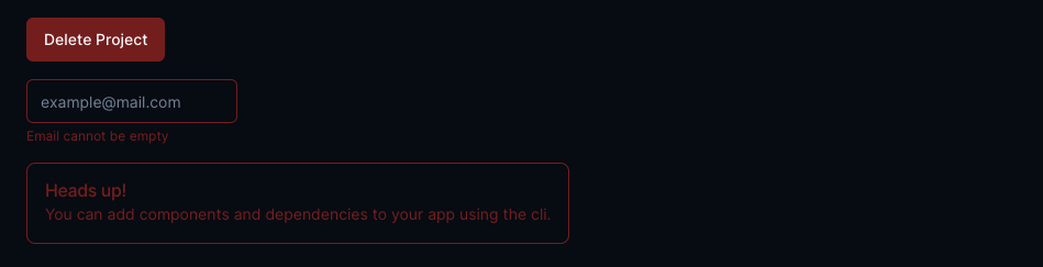
Before:
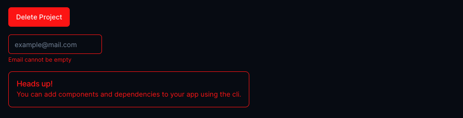
After:
Note: Destructive input is just an example, not in the library yet
Other possible solution:
If muted-destructive color is preferred, then the "Alert Component" can be similar to "Destructive Toast Component" like the screenshot below.
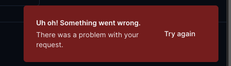
But his wouldn't work for input error messages (if implemented similar to first screenshot) because it doesn't usually have a background color.
Using the first approach is similar to the Vercel design system, which has somewhat inspired this lib's choices.
Also, this is my first ever pull request, so any criticism or feedback would be highly appreciated.
@puneet-sarhali is attempting to deploy a commit to the shadcn-pro Team on Vercel.
A member of the Team first needs to authorize it.
+1 to this. I like the saturation, maybe you could experiment with some slight saturation variations? Maybe this one is good, but maybe a little darker could fit well.
The current one is definitely a bit too dark and contrast lacking imo
The latest updates on your projects. Learn more about Vercel for Git ↗︎
| Name | Status | Preview | Comments | Updated (UTC) |
|---|---|---|---|---|
| next-template | ✅ Ready (Inspect) | Visit Preview | 💬 Add feedback | May 30, 2023 7:28am |
@puneet-sarhali I believe we fixed this one in another PR right? It not, please reopen. Thanks.