ui
 ui copied to clipboard
 shadcn-ui
Select options are truncated if they don't fit on the page
If you have lots of options, they get truncated:
<Select>
  <SelectTrigger className="w-[180px]">
    <SelectValue placeholder="Theme" />
  </SelectTrigger>
  <SelectContent>
    {[...Array(100)].map((e, i) => (
      <SelectItem key={i} value={`${i}`}>
        Item number {i}
      </SelectItem>
    ))}
  </SelectContent>
</Select>
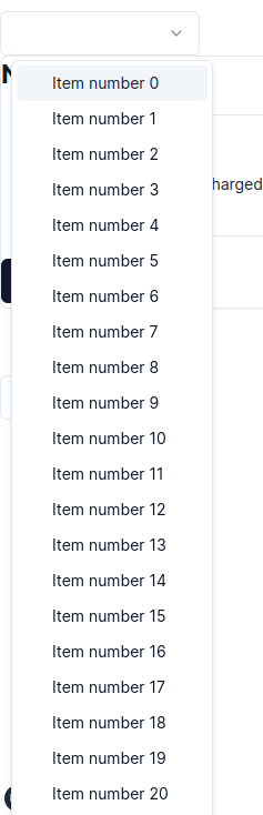
There is no way to scroll the elements, however Radix does scroll them. When there isn't enough room it adds a vertical scroll thing:
Just came here to report that. Also, looks like it only happens when SelectContent position prop is equal to popper which is the default. Besides that, to make the arrows appear when position is equal to item-aligned, you need to add SelectPrimitive.ScrollUpButton and SelectPrimitive.ScrollDownButton to the SelectContent component.
Related: https://github.com/radix-ui/primitives/issues/1980#issuecomment-1479692521
I can add scrolling to <Select />. However I'd recommend checking out https://ui.shadcn.com/docs/components/command#combobox for large sets.
ty @focux -- exactly what i was looking for. @shadcn would be cool to have it in the example docs. My use case is the timezone select, which I wouldn't want the command box for tbh.
btw, what would be the best way to integrate input for fuzzy search?
You can add the following Tailwind class if position is set to popper to make it not exceed the viewport height:
<Select.Content className="max-h-[--radix-select-content-available-height]" />
In the end, I added a @radix-ui/react-scroll-area to the component, and it seems to work for me. If anyone wants to use it, you just have to add the colors back since I'm using the Skeleton UI color tokens in my app (Click here to find out how I did that).
"use client"

import * as React from "react"
import * as ScrollArea from "@radix-ui/react-scroll-area"
import * as SelectPrimitive from "@radix-ui/react-select"
import { Check, ChevronDown } from "lucide-react"

import { cn } from "@/lib/utils"

const Select = SelectPrimitive.Root

const SelectGroup = SelectPrimitive.Group

const SelectValue = SelectPrimitive.Value

const SelectTrigger = React.forwardRef<
  React.ElementRef<typeof SelectPrimitive.Trigger>,
  React.ComponentPropsWithoutRef<typeof SelectPrimitive.Trigger>
>(({ className, children, ...props }, ref) => (
  <SelectPrimitive.Trigger
    ref={ref}
    className={cn(
      "select flex h-10 w-full items-center justify-between px-3 py-2 text-sm text-on-surface-token focus:outline-none disabled:cursor-not-allowed disabled:opacity-50",
      className
    )}
    {...props}
  >
    {children}
    <SelectPrimitive.Icon asChild>
      <ChevronDown className="h-4 w-4 opacity-50" />
    </SelectPrimitive.Icon>
  </SelectPrimitive.Trigger>
))
SelectTrigger.displayName = SelectPrimitive.Trigger.displayName

const SelectContent = React.forwardRef<
  React.ElementRef<typeof SelectPrimitive.Content>,
  React.ComponentPropsWithoutRef<typeof SelectPrimitive.Content>
>(({ className, children, position = "popper", ...props }, ref) => (
  <SelectPrimitive.Portal>
    <SelectPrimitive.Content
      ref={ref}
      className={cn(
        "relative z-50 min-w-[8rem] rounded-md border bg-surface-500 shadow-md animate-in fade-in-80",
        position === "popper" && "translate-y-1",
        className
      )}
      position={position}
      {...props}
    >
      <ScrollArea.Root type="auto">
        <SelectPrimitive.Viewport
          className={cn(
            "max-h-[40vh] p-1",
            position === "popper" &&
              "w-full min-w-[var(--radix-select-trigger-width)]"
          )}
          asChild
        >
          {/*
            TODO: Remove the inline style when https://github.com/radix-ui/primitives/issues/2059 is fixed
          */}
          <ScrollArea.Viewport style={{ overflowY: undefined }}>
            {children}
          </ScrollArea.Viewport>
        </SelectPrimitive.Viewport>
        <ScrollArea.Scrollbar
          className="w-3 px-1 py-2 bg-surface-300-600-token"
          orientation="vertical"
        >
          <ScrollArea.Thumb className="rounded-sm bg-surface-200-700-token" />
        </ScrollArea.Scrollbar>
      </ScrollArea.Root>
    </SelectPrimitive.Content>
  </SelectPrimitive.Portal>
))
SelectContent.displayName = SelectPrimitive.Content.displayName

const SelectLabel = React.forwardRef<
  React.ElementRef<typeof SelectPrimitive.Label>,
  React.ComponentPropsWithoutRef<typeof SelectPrimitive.Label>
>(({ className, ...props }, ref) => (
  <SelectPrimitive.Label
    ref={ref}
    className={cn("py-1.5 pl-8 pr-2 font-semibold", className)}
    {...props}
  />
))
SelectLabel.displayName = SelectPrimitive.Label.displayName

const SelectItem = React.forwardRef<
  React.ElementRef<typeof SelectPrimitive.Item>,
  React.ComponentPropsWithoutRef<typeof SelectPrimitive.Item>
>(({ className, children, ...props }, ref) => (
  <SelectPrimitive.Item
    ref={ref}
    className={cn(
      "relative flex w-full cursor-default select-none items-center rounded-sm py-1.5 pl-8 pr-2 text-sm outline-none focus:bg-surface-200-700-token data-[disabled]:pointer-events-none data-[disabled]:opacity-50 data-[state='checked']:bg-surface-200-700-token",
      className
    )}
    {...props}
  >
    <span className="absolute left-2 flex h-3.5 w-3.5 items-center justify-center">
      <SelectPrimitive.ItemIndicator>
        <Check className="h-4 w-4" />
      </SelectPrimitive.ItemIndicator>
    </span>

    <SelectPrimitive.ItemText>{children}</SelectPrimitive.ItemText>
  </SelectPrimitive.Item>
))
SelectItem.displayName = SelectPrimitive.Item.displayName

const SelectSeparator = React.forwardRef<
  React.ElementRef<typeof SelectPrimitive.Separator>,
  React.ComponentPropsWithoutRef<typeof SelectPrimitive.Separator>
>(({ className, ...props }, ref) => (
  <SelectPrimitive.Separator
    ref={ref}
    className={cn("-mx-1 my-1 h-px bg-surface-50-900-token", className)}
    {...props}
  />
))
SelectSeparator.displayName = SelectPrimitive.Separator.displayName

export {
  Select,
  SelectGroup,
  SelectValue,
  SelectTrigger,
  SelectContent,
  SelectLabel,
  SelectItem,
  SelectSeparator,
}
Has this been resolved yet?
I'm also trying to deal with it by enclosing SelectPrimitive.Viewport.
      <ScrollArea
        className={cn(
          position === 'popper' &&
            'w-full min-w-[var(--radix-select-trigger-width)]'
        )}
      >
        <SelectPrimitive.Viewport className="max-h-[40vh] p-1" asChild>
          {children}
        </SelectPrimitive.Viewport>
      </ScrollArea>
For me, the solution was to add the proper CSS variable as max height for Content, and add the ScrollUp and ScrollDown buttons around the Viewport.
(classes removed for readability)
<SelectPrimitive.Content className="max-h-[--radix-select-content-available-height]">
  <SelectPrimitive.ScrollUpButton>
    <IconChevronUp />
  </SelectPrimitive.ScrollUpButton>

  <SelectPrimitive.Viewport>
    <SelectPrimitive.Group>{children}</SelectPrimitive.Group>
  </SelectPrimitive.Viewport>

  <SelectPrimitive.ScrollDownButton>
    <IconChevronDown />
  </SelectPrimitive.ScrollDownButton>
</SelectPrimitive.Content>
It's easier to understand this way! I wanted to hide the button, so this is what it looks like! Thank you very much!
<SelectPrimitive.Content  className="max-h-[--radix-select-content-available-height]">
  <SelectPrimitive.ScrollUpButton />

  <SelectPrimitive.Viewport>
    <SelectPrimitive.Group>{children}</SelectPrimitive.Group>
  </SelectPrimitive.Viewport>

  <SelectPrimitive.ScrollDownButton />
</SelectPrimitive.Content>
You can add the following Tailwind class if position is set to
popperto make it not exceed the viewport height:<Select.Content className="max-h-[--radix-select-content-available-height]" />
Best solution for now! Cheers!
Not sure if helps, but i managed to solve for myself fixing the height and specifying overflow-y: scroll;
<SelectContent
      className="overflow-y-scroll !h-[300px]"
    >
// content
</SelectContent>
Is there gonna be an official fix for this? I don't know why It hasn't been done yet especially considering the fact the default select from radix doesn't have this issue.
You can add the following Tailwind class if position is set to
popperto make it not exceed the viewport height:<Select.Content className="max-h-[--radix-select-content-available-height]" />Best solution for now! Cheers!
Cleanest solution by far
For me, I added the below css class and it works across all my components using it:
  .SelectContent {
    width: var(--radix-select-trigger-width);
    max-height: var(--radix-select-content-available-height);
  }
This issue has been automatically closed because it received no activity for a while. If you think it was closed by accident, please leave a comment. Thank you.