ruffle
 ruffle copied to clipboard
demo: Show metadata on information icon click
Info icon created based on https://www.svgrepo.com/svg/24584/info-icon (which is licensed with a CC0 license). See also https://github.com/ruffle-rs/ruffle/wiki/SWF-version-chart
Fixes #7492
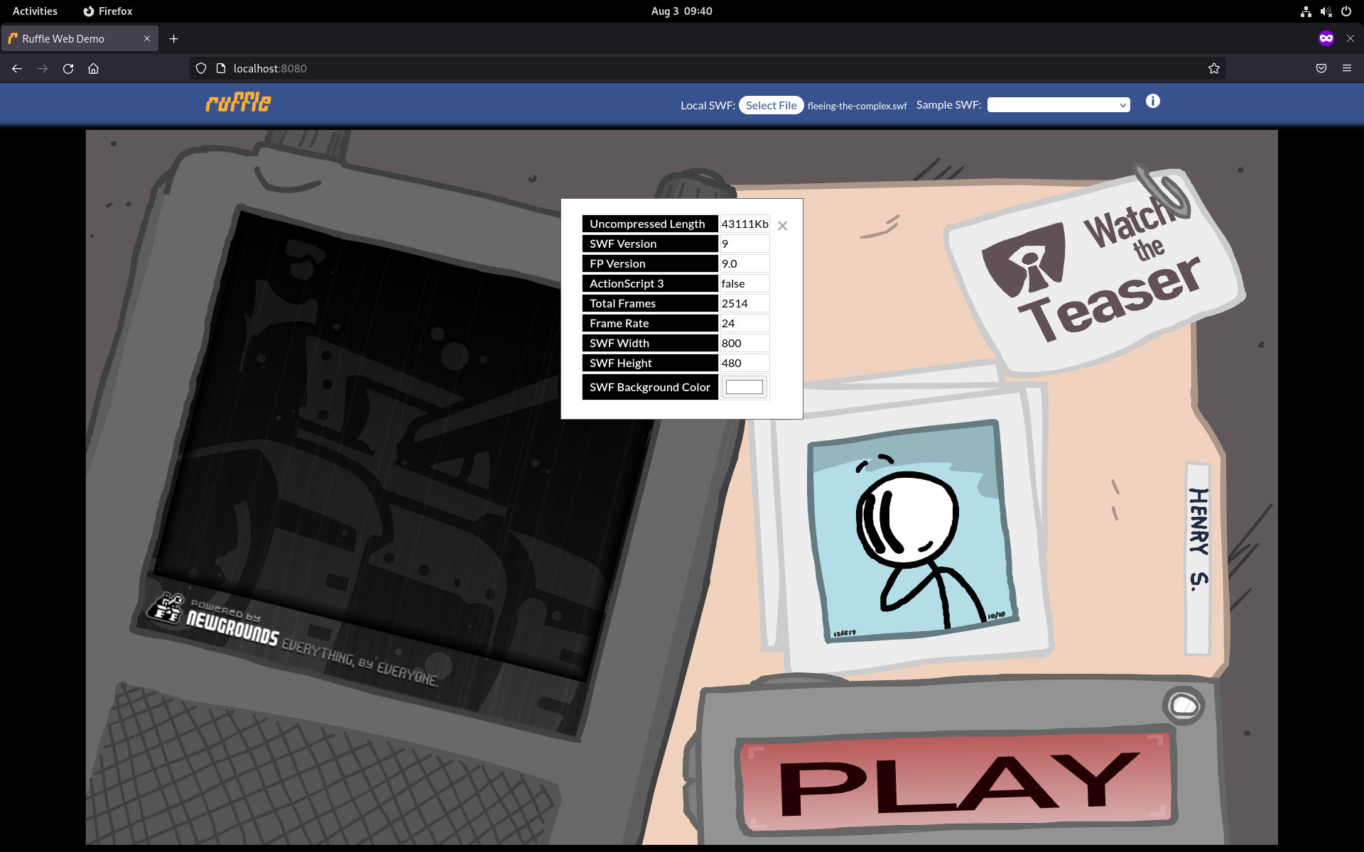
Look on a regular computer (changed uncompressedLength display to use bit-shift instead of Math.round and division since screenshot, so number is now one less for Fleeing the Complex):
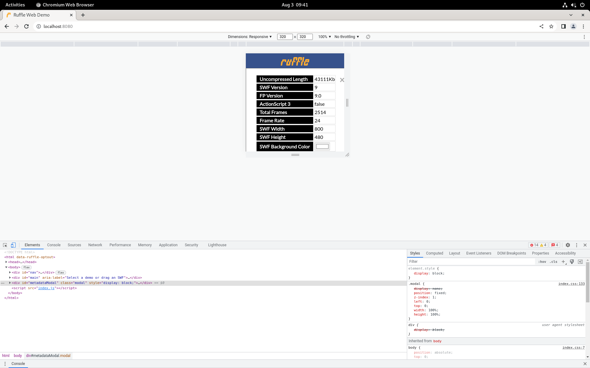
Look on 320px x 320px screen (no screen is 320px x 320px, but the ability to switch between portrait and landscape orientation means I need to take a 320px height and 320px width into account):
I think this would be useful as a general "options" panel for the demo page, as I've always wanted to ability to easily change, say, the render backend that a demo is using on the fly.
Some thoughts:
- On desktop, would this be better as a div that's attached to the upper-right of the page, that toggles on and off? Similar to the Chrome DevTools panel.
- If no SWF is loaded, maybe the (i) should be hidden.
- Seems like the (i) icon could be a little better aligned with the selectbox. Also, the (i) should have
cursor: pointer. - Should the color scheme use something more akin to the standard Ruffle color scheme? I have no design sense so I defer to you on this one :)
On desktop, would this be better as a div that's attached to the upper-right of the page, that toggles on and off? Similar to the Chrome DevTools panel.
Perhaps. The original design for this was for the info to (always) show in a status bar at the bottom of the page, but Adrian didn't like the idea of taking space from actual content, and thought the context menu may be a good place for this. However, that would have required this to be a more general web change, not just a demo page change, so I used the info icon as it takes up no extra space with it's current location, and made it pop up a modal to not take any space away from the content itself.
If no SWF is loaded, maybe the (i) should be hidden.
It's actually not currently possible for no SWF to be loaded on the demo page (unless you count when it's loading), ever since https://github.com/ruffle-rs/ruffle/pull/7405. The page starts off loading the Ruffle logo animation, which is itself an SWF, and the drop-down menu has no "None" option anymore.
Seems like the (i) icon could be a little better aligned with the selectbox. Also, the (i) should have cursor: pointer.
Agreed, I'll do this.
Should the color scheme use something more akin to the standard Ruffle color scheme? I have no design sense so I defer to you on this one :)
I'll test and see how it looks. The page may look weird with too much orange and blue though.
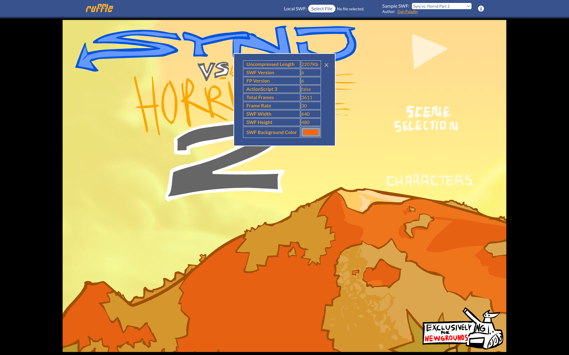
New color scheme:
Edit: Also, I like the idea of reusing this as an options panel for the demo page, but that's probably for one or more follow-up PRs.