schema-typed
 schema-typed copied to clipboard
 rsuite
Suggest add validateOnBlur,validateOnChange and hasError property to the Type and errors
validateOnBlur,validateOnChange it's very usable to describe the schema of the form for the special use, for some case, i build a reack hook form for material. and errors property hasError is very useful for disable the button eg: type.js:
class Type {
  constructor(name) {
    this.name = name;
    this.required = false;
    this.requiredMessage = '';
    this.trim = false;
    this.rules = [];
    this.priorityRules = []; // Priority check rule
+    this.validateOnBlur = false;
+   this.validateOnChange = false;
  }
....

+ checkOnChange(bool = true) {
    this.validateOnBlur = typeof bool === 'boolean'? bool: false;
    return this;
  }
+ checkOnBlur(bool = true) {
    this.validateOnChange = typeof bool === 'boolean'? bool: false;
    return this;
  }
}
schema.js:
 check(data) {
+    const checkResult = { hasError:false };
    Object.keys(this.schema).forEach(key => {
      checkResult[key] = this.checkForField(key, data[key], data);
+      checkResult.hasError === false && (checkResult.hasError = checkResult[keys[i]].hasError);
    });
    return checkResult;
  }
checkAsync(data) {
+    const checkResult = { hasError:false };
    const promises = [];
    const keys = [];

    Object.keys(this.schema).forEach(key => {
      keys.push(key);
      promises.push(this.checkForFieldAsync(key, data[key], data));
    });

    return Promise.all(promises).then(values => {
      for (let i = 0; i < values.length; i += 1) {
        checkResult[keys[i]] = values[i];
+        checkResult.hasError === false && (checkResult.hasError = checkResult[keys[i]].hasError);
      }
      return checkResult;
    });
  }
import React, { useCallback, useEffect, useRef } from 'react';
import TextField from '@material-ui/core/TextField';
import Button from '@material-ui/core/Button';
import CssBaseline from '@material-ui/core/CssBaseline';
import Paper from '@material-ui/core/Paper';
import { makeStyles, withStyles } from '@material-ui/core/styles';
import Grid from '@material-ui/core/Grid';
import { SchemaModel, StringType } from '../../utils/schemaType/index';
import { useFormx } from '../../utils/useFormX';
const loginFormSchema = SchemaModel({
account:StringType().isRequired('用户账户不能为空').minLength(3, '账户名不能短于3个字符').maxLength(5, '账户名不能长于5')
.checkOnChange(),
pwd:StringType().isRequired('用户密码不能为空').minLength(3, '账户名不能短于3个字符').maxLength(5, '账户名不能长于5')
.checkOnBlur()
});
// console.log(loginFormSchema);
// const loginFormSchema = SchemaModel({
// account:StringType().isRequired('用户账户不能为空').minLength(3, '账户名不能短于3个字符').validateOnChange(),
// pwd:StringType().isRequired('用户密码不能为空').validateOnChange()
// });
const ValidationTextField = withStyles({
root: {
'& input:valid + fieldset': {
borderColor: 'green',
borderWidth: 2
},
'& input:invalid + fieldset': {
borderColor: 'red',
borderWidth: 2
},
'& input:valid:focus + fieldset': {
borderLeftWidth: 6,
padding: '4px !important' // override inline-style
}
}
})(TextField);
const useStyles = makeStyles(theme => ({
gridContainer: {
margin:theme.spacing(2),
padding:theme.spacing(1)
},
form:{
margin:theme.spacing(2),
display:'flex',
flexWrap:'wrap',
flexDirection:'column'
}
}));
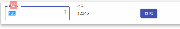
export default function LoginPage() {
const classes = useStyles();
// const { useInput, isValid } = useFormx({
// account:'hello',
// pwd:'123'
// }, loginFormSchema);
const { useInput, isValid } = useFormx({}, loginFormSchema);
return (
<CssBaseline>
<Grid className={classes.gridContainer} container alignContent="center" alignItems="center" component={Paper} elevation={6}>
<Grid item ls>
<ValidationTextField
className={classes.TextField}
autoComplete
// autoFocus
placeholder="设置初始值"
label="账户名"
margin="normal"
variant="outlined"
type="text"
{...useInput('account')}
/>
</Grid>
<Grid item ls>
<ValidationTextField
className={classes.TextField}
autoComplete
// autoFocus
placeholder="设置初始值"
label="密码"
margin="normal"
variant="outlined"
type="text"
{...useInput('pwd')}
/>
</Grid>
<Grid item ls>
<Button color="primary" variant="contained" disabled={isValid}> 登 陆 </Button>
</Grid>
</Grid>
</CssBaseline>
);
}
schema-typed only models and data validation. As for the trigger of the check should be handled by the component.
https://github.com/rsuite/rsuite/blob/next/src/FormControl/FormControl.tsx#L123
yet, we konw when using some HOC or RenderPros , it more suite to place the trigger validation config on formControl、formfield、field etc... but when we use hook , we just want to use the origin input control compoment to support to control the trigger validation , i think define when and how to check, should be the thing of the data models 。and it's not suit to place it on the custumhook itself。
In some cases, the check is not triggered only by onBlur and onChange. The Type in schema-typed is only used to define validation rules.
Reference design:
<ValidationTextField trigger='blur' >
<ValidationTextField trigger='change' >
good suggesion, so i can change to custom my hook to {...useInput('account',"blur")}. thankyou! but don't you think that add hasError property to errors is more easy for some use case without a fucntion help to check to the total result have errors , just like disable the button. errors result like:
{
  hasErrors: true,
  account: { hasError: true, errorMessage:"some errors"}
  pwd:{ hasError:false,errorMessage:""}
}