inter
 inter copied to clipboard
Published
20 hours ago •
 rsms
rsms
Kerning of ſ (long s) is not very good
Here is an image of how it looks:
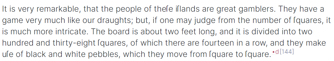
Expected behavior:
In particular, the ſq, ſe pairs should be much tighter. It almost seems like the vertical of ſ sits too far to the left (see the iſl sequence)?
Environment
- OS: Windows
- App that renders the font: Edge Version 92.0.902.22 (Official build) beta (64-bit)
- Version of font: live CSS version
Another image, later:

It reminds me of the Loch Ness monster https://en.wikipedia.org/wiki/Loch_Ness_Monster
