pyecharts-gallery
 pyecharts-gallery copied to clipboard
Just use pyecharts to imitate Echarts official example.

有两类数据,类别1共五个 [[11.56023120880127, 27.040817260742188], [-5.224257469177246, -15.477859497070312], [-19.645002365112305, -15.719226837158203], [25.8948917388916, 5.323724746704102], [-15.496088027954102, 23.81446647644043]] 类别2共10个 [[-4.203354835510254, -23.947246551513672], [-9.199494361877441, 19.46872901916504], [-3.9750850200653076, 17.684152603149414], [10.8388032913208, 15.954113006591797], [-9.237049102783203, 19.43368911743164], [19.628984451293945, 18.176530838012695], [-22.891176223754883, 7.592852592468262], [-17.271387100219727, -8.168133735656738], [-3.8871994018554688, 17.787797927856445],...
I have a question that can we join pyecharts with OHLC instead of the Kline?because I find the OHLC(self-define) on Apche Echarts website examples.But I can't find here
有什么办法可以绘制实时更新的k线图表吗? 我的想法是 已获取到股市实tick 数据(开高低收等),如何绘制实时跳动的k线图? 我的要求是通过这些数据 按照我自己的想法去作图,比如我想画实时更新价格的砖型图,xo图等! 我看了许多案例,基本上都是千篇一律的将数据提取出来再作图,最后保存为html页面,这个保存之后的页面数据对于需要实时接收数据的这种情况也就失去了实质性的意义, 请问,有什么办法可以实现吗?
先感谢作者们无私的的开源贡献! 我注意到echarts官网中图例样式更新了很多,比如: - Graph Life Expectancy的图 (https://echarts.apache.org/examples/zh/editor.html?c=graph-life-expectancy) - Line Race的图 (https://echarts.apache.org/examples/zh/editor.html?c=line-race) - 热力图 (https://echarts.apache.org/examples/zh/editor.html?c=heatmap-large-piecewise) 这些图是能不能在原来基础的图上改动得到?不知道作者们是否还有更新的计划?
Hello There I faced a problem implementing “ Bar -Bar-Toolkit” -> https://gallery.pyecharts.org/#/Bar/bar_toolbox , and in particularly the Zoom-out /In button is not working. It is selectable but then no effect...
vGrid = Grid(init_opts=opts.InitOpts(width='1100px',height= '400px',theme=ThemeType.SHINE)) vGrid.add(treeMap1, grid_opts=opts.GridOpts(pos_right='53%')) vGrid.add(treeMap2, grid_opts=opts.GridOpts(pos_left='53%')) 
代码如下: from pyecharts import options as opts from pyecharts.charts import Pie from pyecharts.faker import Faker c1 = ( Pie() .add( "", [list(z) for z in zip(Faker.choose(), Faker.values())], radius=["40%", "75%"], )...
我想用3D 散点图实现一个(x, y, z, value1, value2, value3)的一个格式的数据,如下图1 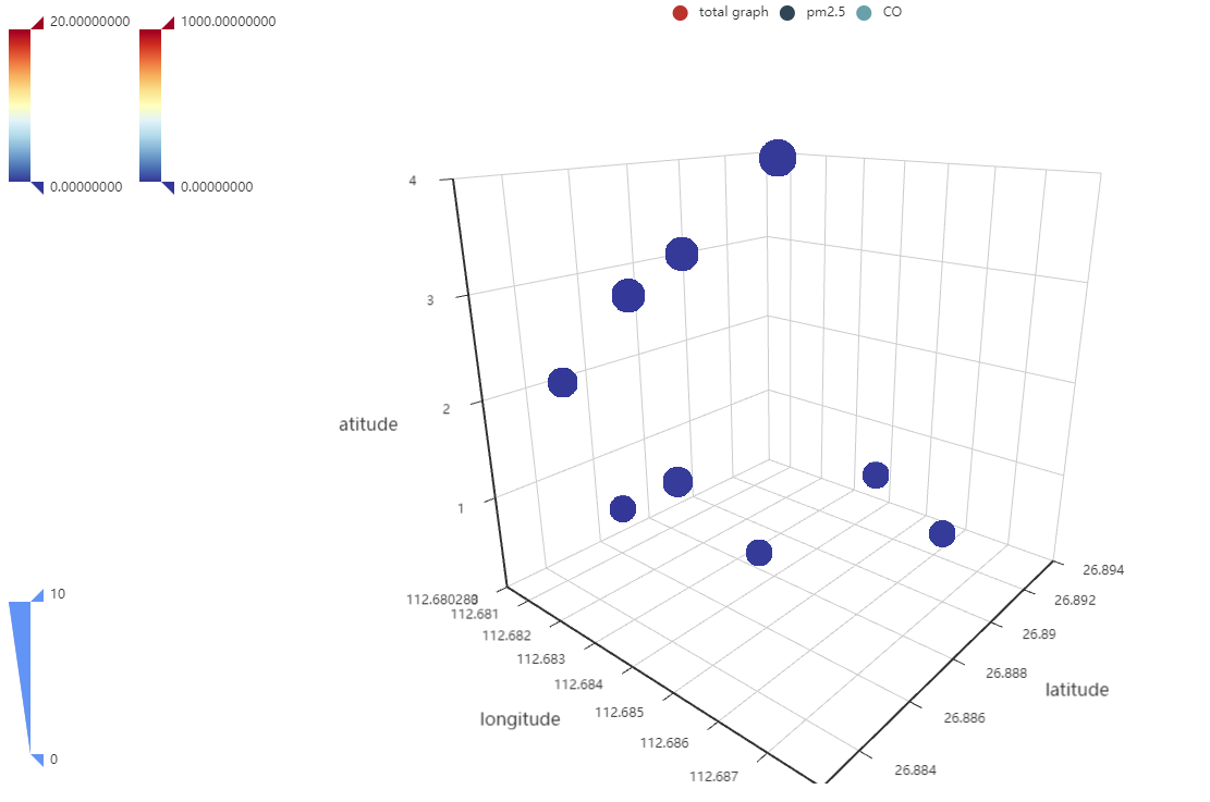 图中total的格式是(x, y, z, value1, value2, value3), 如果我吧另外两个点掉,就可以正常按照数值显示对应的预设的颜色,如图2,但是只要旁边的co或者pm2.5点亮,哪些点的颜色就全部变调了,有什么办法解决么? 是C0和PM2.5 点开之后颜色进行了混合干扰么,而且及时我只点亮CO 或者PM2.5, 那个颜色的显示也不正确,3D 散点图里面有什么配置可以解决这个问题吗? 图2 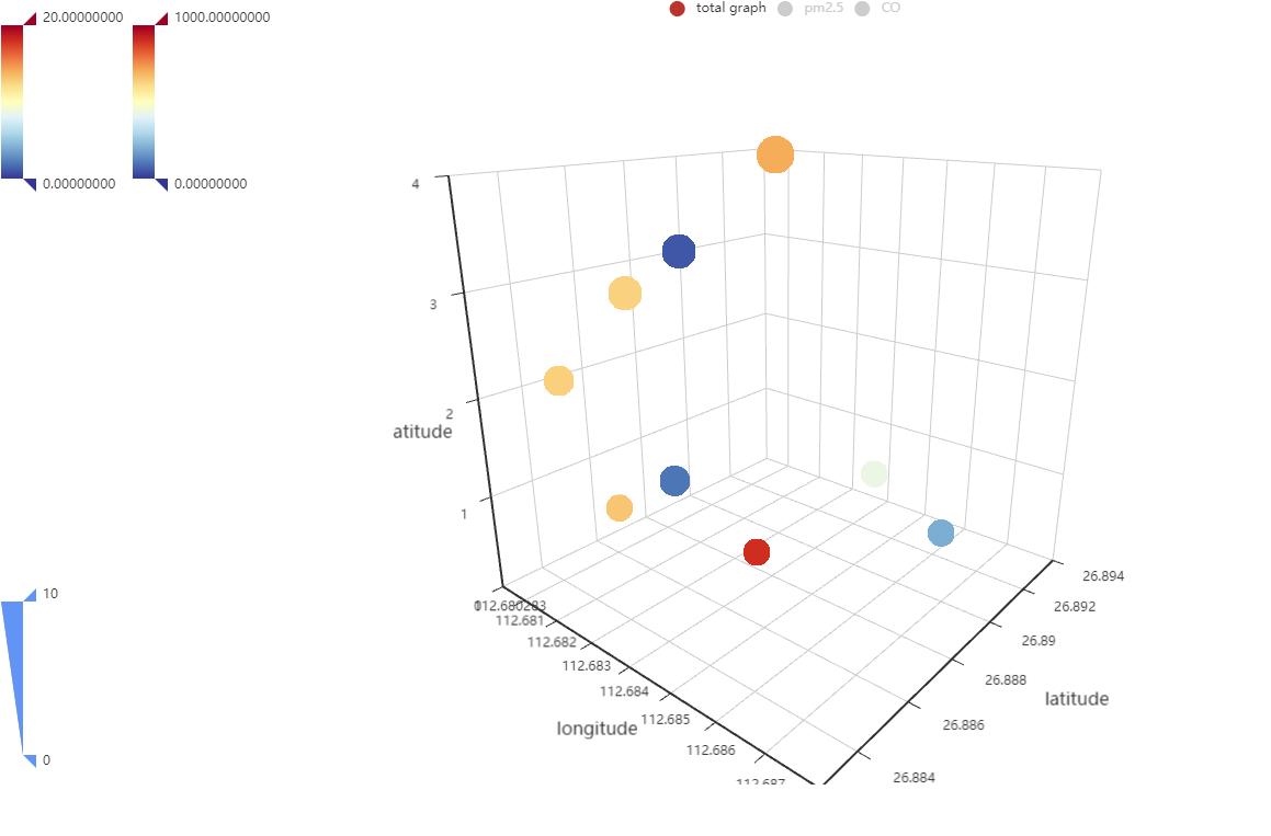
 
我这边试了下,table无法用make_snapshot导出成为png。然后用page.add(bar, table),在用make_snapshot,导出的只是bar。table表格消失不见了。 我想问下有什么办法导出table表格吗?