Plan
 Plan copied to clipboard
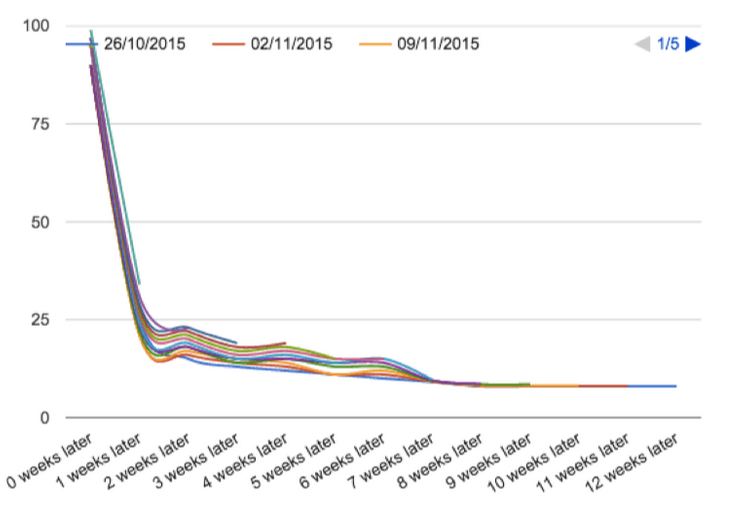
Retention Curves helps to see how long users are retaining.
I would like to be able to..
Very well explained here: https://blog.popcornmetrics.com/create-retention-curves-from-mixpanel-cohorts/
Is your feature request related to a problem? Please describe.
helps to see how long users are retaining.
I got inspired by a video again and I'd like to use a moment when implementing this to try to improve the retention prediction, or at least give some extra indicators on how well players are being retained.
No idea if this is sound data science, but my ideas are:
- Retention % by timeframe graph
- Calculate retention % for timespan.
- (This may be difficult to visualize to users so might be scrapped if it's difficult to understand)
- Retention Prediction Index
- Calculate retention % for different timespans, 1 week, 2 weeks, 3 weeks, 4 weeks - for 4 weeks back, so 16 values in total.
- Average each timespan's retention %
- Use this to calculate how many players need to join for 1 of them to be retained for that timespan
log_2(avg_retention_perc) - Compare this new metric from past to actual retention and show both as indicators so that users can assess accuracy of the metric.
- Add a Question bubble next to each one that explains how it's calculated to avoid discord questions about them.
This feature is likely to be the first new visualization to be added to server page after the server page React rewrite is done.
I want to make an interactive one where it is possible to:
- Draw the curves on top of each other as pictured (using time since register date as axis)
- Draw the curves apart starting from the day of joining and going on from there (using day as axis similar to Day by Day graph)
- Select window size: days later, weeks later, months later
- Select timeframe: Registered in 7 days, 4 weeks, 6 months, year
- Larger timeframe may limit the window size to larger if it becomes too heavy to query. (Eg. 6 months shows weeks minimum)
- Select date for start of timeframe (Optional, can use Last 7 days etc in the beginning.
Potential extra data selection consideration:
- Join addresses can be used instead of register date for grouping players
- Playtime can be used as X axis instead of time since register date
Another way it could be displayed is like this 
You choose the period during which the users first joined (like "last 45 days" in label 4) and the curve shows the percentage of those users who logged in X days afterwards