patternfly-3
 patternfly-3 copied to clipboard
 patternfly
Selectpicker with placeholder indistinguishable from disabled selectpicker
After upgrading from 3.23 to 3.31, all our selectpickers look disabled :(.
non-disabled with placeholder in 3.23:
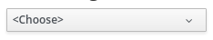
non-disabled with placeholder now:
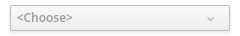
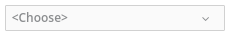
disabled:
Looks like the culprit is:
.bootstrap-select > .dropdown-toggle.bs-placeholder, .bootstrap-select > .dropdown-toggle.bs-placeholder:hover, .bootstrap-select > .dropdown-toggle.bs-placeholder:focus, .bootstrap-select > .dropdown-toggle.bs-placeholder:active {
    color: #999;
}
Cc @serenamarie125
As per @mcarrano and @kybaker here are the design directions: when nothing is selected, the text is italicized, but not gray. When disabled, the text is gray. So you could potentially have a selection but also gray out the control.
oh my @himdel this isn't good! @matthewcarleton @LHinson is this something we can look into?
Thanks! :)
I think this is especially problematic when the whole form is just a selectpicker in the beginning..
One tip.. Not sure if the problem comes more from the fact that the text is gray, or from the fact that so is the chevron..
(Also, visually it feels like even the border is grayer but that may be an illusion.)
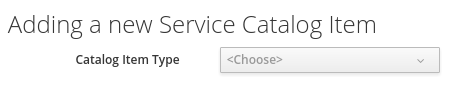
Hi @himdel this is an old issue, was this fixed? I can't reproduce it, here is what we get in patternfly: https://rawgit.com/patternfly/patternfly/master-dist/dist/tests/bootstrap-select.html
@andresgalante Yes, the issue is still present on the link you just posted :)
compare the Disabled select, with the Multiple Select select.
Both are completely grey, including the chevron. There is a slight shading difference, but ... it just looks disabled.
If you want to indicate that "Nothing selected" is special, I would suggest keeping the exact same style for the component as if it was enabled, except for just the text itself.
Right now, the "Multiple Select" comonent has:
- gray "Nothing Selected" as in disabled
- gray open chevron, as in disabled
~~* gray button border, as in disabled~~ (it just looks that way?, both are
#bbb) - 3d shading, unlike in disabled
IMO only the text itself should be grey, the rest of the component should not be changed.
@andresgalante @LHinson is this something we can look into? If so, I'd assume we need visual help first?
@serenamarie125 @LHinson I agree. If we want to make this change we'll need some design input. I'm going to move this over to design to make sure it gets the proper attention. Thanks @himdel
after discussing this with design we've received direction. I'm reopening this issue. See notes above for design direction.
Thanks :). From the other issue, I can't tell if you're going to italicize the disabled version or the placeholder version, but I'm fine with either :)