stylus
 stylus copied to clipboard
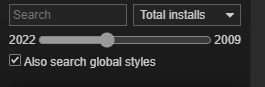
add "max age" input in popup search
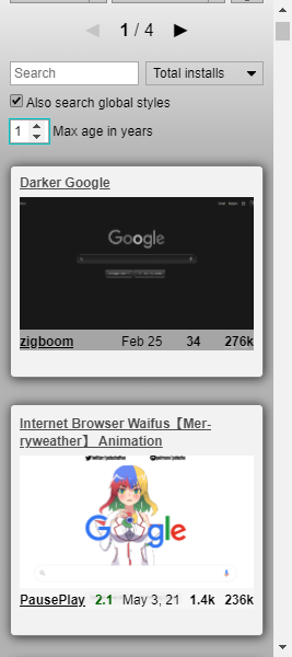
Max-age refers to updated date? If so, that's a handy little filter, and it looks fine.
On a somewhat related note, I'm testing on this github page we're currently on right now, and results are all over the place. First result is for instagram, and there's as many results for other random sites, as there are for github.
Also, why all the 404s on webp URLs?
- Yes, the updated date.
- The instagram style's category is
github, the author probably didn't understand what this means. @Gusted, could you infer the category automatically from -moz-document on USWorld? - I guess those styles don't have a preview. @Gusted, maybe you could make it mandatory? USWorld's gallery and our style finder look bleak and non-informative.
USWorld's gallery and our style finder look bleak and non-informative.
Seems so. Let's ping @vednoc as well.
First result is for instagram, and there's as many results for other random sites, as there are for github.
You can blame it on the people that put wrong categories. I reworked that system (in my upcoming changes) to hopefully prevent such issues, or at least make them less common. ATM I have to manually fix incorrectly set categories.
[...] maybe you could make it mandatory?
We thought about it and decided to leave it optional as some people might upload "random" images. And we had to deal with quite a few of those already. With that said, we might be able to get https://github.com/userstyles-world/stylus-eval up and running. IIRC it's functional, but I don't recall what @Gusted's plan was in the end. All I remember is that it used lots of resources, so we would need to run it on their Raspberry Pi or find some other way.
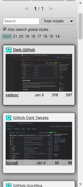
@narcolepticinsomniac, the age input looks kinda lame, so what about showing the years of the found styles instead? I've already updated the PR. Clicking the same year again unsets the filter.
I guess it does look a little nicer. My only concern would be if it's more rigid filtering by years from January on, vs years as 12 months. Also, total page numbers didn't appear to be updating
I think people normally get excited about stuff made in the current year, even if it just started, so I'd say it's fine. If there are no styles in the current year, it won't be shown anyway, as only the actually present years are shown.
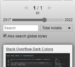
The page now holds 100 elements, so there's just one page usually, if that's what you meant. Previously we limited to 10 because that was the USO's response limit.
there's just one page usually, if that's what you meant
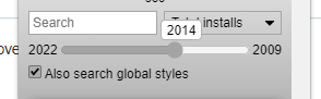
Default results on this page start 1/5. Click 2022 - 1/1. Click 14- - still 1/1. IIRC, the number input was updating this in a more expected fashion.
I get that the number input wasn't exactly impressive, but I appreciate years being calculated starting from the current date.
1/1 means there just one page in both cases so there's nothing to change. I can show the number of styles somewhere I guess? Although it may be the same sometimes just as well.
The difference is that the year label shows styles updated in that year, not a range of years.
The difference is that the year label shows styles updated in that year, not a range of years.
Oh, then this is terrible comparatively, IMO. Number input FTW, if you ask me.
IDK man, not only was it a range, it was a far more exact range. Number input was intuitive. You're sacrificing precision for aesthetics, which is just weird for you.
That's not how I see it. The years give an immediate outlook so you know if there are modern styles, and you need just one click to set the range instead of clicking through the number input.
Fair enough. Switch it to range, and maybe add some pretty little dot pseudos to separate numbers. =)
With that said, we might be able to get https://github.com/userstyles-world/stylus-eval up and running. IIRC it's functional, but I don't recall what @Gusted's plan was in the end. All I remember is that it used lots of resources, so we would need to run it on their Raspberry Pi or find some other way.
Sites with cloudflare -> Not going to work very well. It can be abused easily, it's better to create a site teaching people about making screenshots than us offering such feature(It will cost way too many time to maintain it)
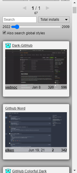
Switched to a slider
I suppose if you mention 'range' enough, it was bound to come up. It's solid, other than the styling, and perhaps a mouseover tooltip so you know what year you're currently hovering,
Sites with cloudflare -> Not going to work very well.
I thought you had it working with headless Chrome. Even if you didn't, this is a relatively small percentage.
It can be abused easily
How so?
The tooltip will be shown only when it's hovered again, not while dragging, otherwise I would have to re-implement the entire thing manually as a bunch of multiple controls, which would be quite complicated.
As for styling, I can make it gray:
Styling's fine. I assumed you'd use filters, but whatever's easiest and works well cross-browser.
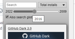
Found a simple solution for a live tooltip
Exactly that, but with a mousemove listener on the input to update the text and position with offsetX. Show/hide with hover CSS.
Exactly that, but with a mousemove listener on the input to update the text and position with offsetX. Show/hide with hover CSS
I think it works like that already but using a simpler implementation, doesn't it?
I'm talking about showing in real time as it's hovered, like a video timeline tooltip. It'd be a nice touch, is all.
Maybe, but hovering normally has a delay, otherwise it'll flicker when the cursor just travels across the control. To implement it I would have to manage the delay programmatically and use a long one at first, then remove it when the control is hovered for half a second. I'm not sure this is worth it. Right now the year is shown when the control is used i.e. clicked/dragged.
The real benefit is seeing which year you're hovering before clicking. If CSS is glitchy, add a class at the end of mousemove, and remove on mouseleave. If you want, just remove all the tootip stuff, and I'll do it soon, but not today, unfortunately.
I'm not against doing it myself, I'm against adding this complexity at all. Just had a better idea: always show the current range persistently at the end e.g. 2009-2022 and update it on change.
Note that there's no practical benefit in seeing the year before clicking. Clicking and seeing the change and the results is meaningful.
Note that there's no practical benefit in seeing the year before clicking.
I think that's an opinion based solely on how you use a slider. As many people who drag it, will guesstimate a position, and click. They shouldn't need to guess, and the code ain't that complex. That said, I've had a rough day at work, and don't feel like debating this anymore.
What is the practical usefulness of seeing the year before clicking it? It won't give you anything meaningful. It's not a library or a news search engine where knowing the exact year is useful. The practical use case for this feature is to click and drag it first, then examine the result. People normally won't go for a specific year.
Also, moved it higher just below the pager and the number of styles currently shown
Made more sense to me when the range started full, and got smaller as years were subtracted. Also not sure why we wouldn't leave the current year as a link, but NBD either way.
I'd still prefer a hover tooltip, but not enough to argue about it anymore. Only real bug I see, is that styling's currently broken, in dark mode, at least.