richie
 richie copied to clipboard
CSS max-width rule for containers should not be enabled on small device breakpoint
Bug Report
Expected behavior/code
Layouts should not be constrained to the @include make-container-max-widths() rule mixin from bootstrap when displayed on small device breakpoint.
Actual Behavior
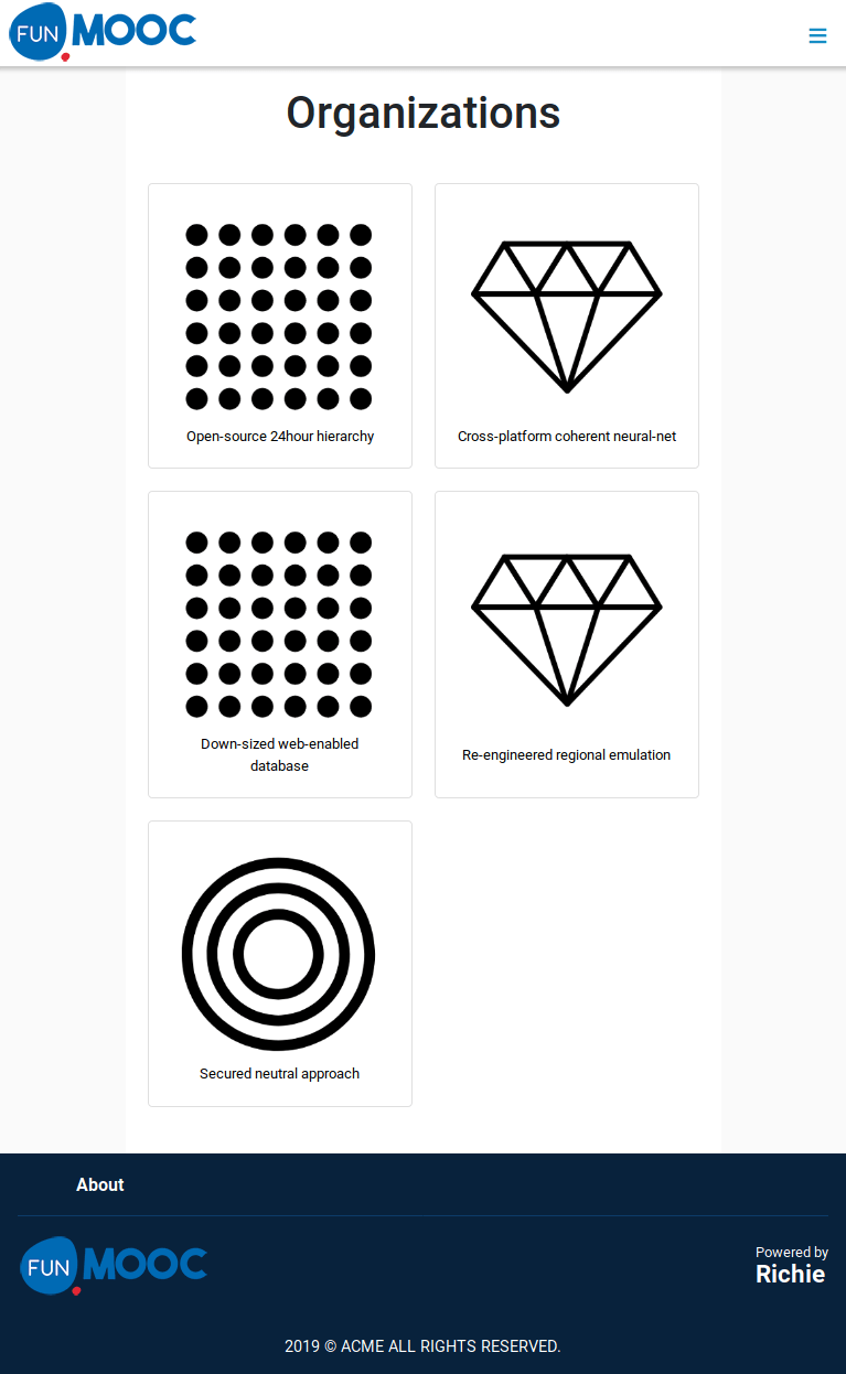
When watching a page with max-width constraint on small device (between 576px and 768px) there is too much horizontal empty space around main content. This is useless for this breakpoint and constraints included content to less space that could be used for better readability.
Steps to Reproduce
- Use a browser on a small device or turn your browser into adaptive view between 576px and 768px;
- Go to a page using the common container
max-widthconstraint like Organization details, course details, category details, organization list, course list, etc.. - There is useless empty space around main content.
Environment
- Richie version: 1.0.0-beta.1
- Platform: Ubuntu 18.04.2 LTS, Firefox 65.0.1, Chromium Version 71.0
Possible Solution Push the constraint mixin usage under media rule for medium-up breakpoint like:
@include media-breakpoint-up(md) {
    @include make-container();
    @include make-container-max-widths();
}
Once done, there could be some adjustment for cell width to take larger width inside medium breakpoint since there should be enough free space.
Additional context/Screenshots Currently:
