Layout Change in Signup Screen
Summary:
- Resizing the
TextInputEditText - Changing the color of back button
- Resizing the control being used for selecting country
Steps to reproduce: Open the app and click "Create One" textview located at bottom.
Expected behavior:
Please ignore the background as this is an edited screenshot of app to represent the idea.
Observed behavior:
Device and Android version: All devices
Screenshots: Attached above.
The green tick doesn't look good, how or where do you suppose you'll keep the 'grey arrow' button to submit mobile number? @akkywadhwa
I think I missed to place the button correctly in the above screenshot. Here is the revised screenshot.
Also, on entering the number the button might blink to make user aware about the button to be pressed. This will certainly enhance the user experience and make the application self explanatory.
@luckyman20 Please review this. I recommend also removing the boundary around the 'Enter OTP' edit text to make it look better.
@jsahil730 the boundary around is part of MaterialEditText, what we can do is we can bring it a little down or shift it to another fragment or we have re-design this screen (recommended).
If anyone of you is interested in doing so then please go ahead.
@luckyman20 I'd like it to be re-designed, but how do you think it should look? Anything that should be added or removed?
@luckyman20 I was already doing this. Will make a PR for this soon.
@jsahil730 I don't we need any additions or deletions but we can re-arrange the views and make it look proper.
@akkywadhwa I would recommend to first post the mockup here before implementing it.
@jsahil730 I don't we need any additions or deletions but we can re-arrange the views and make it look proper.
@akkywadhwa I would recommend to first post the mockup here before implementing it.
I think I missed to place the button correctly in the above screenshot. Here is the revised screenshot.
Also, on entering the number the button might blink to make user aware about the button to be pressed. This will certainly enhance the user experience and make the application self explanatory.
@luckyman20 this is the UI mockup I have proposed.
@akkywadhwa This doesn't looks very intuitive if you see through the eyes of user.
Since GCI season is going on, @rachittt @laxyapahuja @OussEmaDevCode do anyone of you want to help?
@luckyman20 the button blinking idea is very good tbh
@luckyman20 yup, can i work on it ?
@rachittt Yes, just send mockup as of now.
@luckyman20 okay
@luckyman20 Here's the UI mockup I'm proposing.

The back button on actionbar and next icon on fab should be in white, I missed it.
Also the dropdown doesn't have any border, it's just that the mockup was setting the same border to dropdown icon, thus making it invisible.
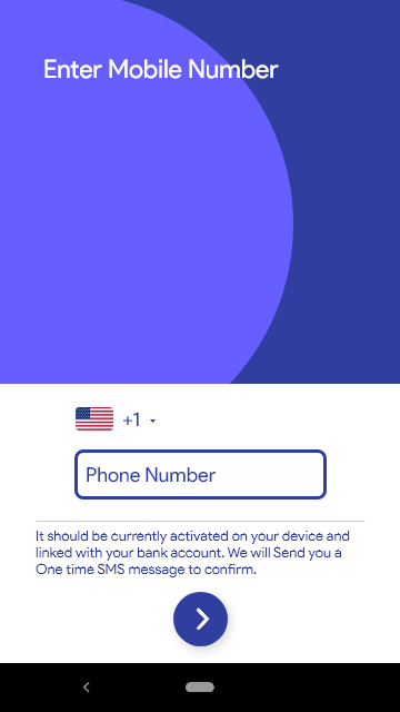
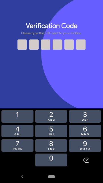
Below are the designs that i would like to propose:-
Entering Mobile Number-

Entering OTP-

creating different fragments looks like a good option to me, what do you all think ? @jsahil730 @luckyman20 @harshshinde07 @akkywadhwa
@rachittt This looks good to me.
@akkywadhwa Since you opened the issue, do you want to work on this?
@rachittt This looks good to me.
@akkywadhwa Since you opened the issue, do you want to work on this?
Yes, @luckyman20 I would be happy to work on this.
Below are the designs that i would like to propose:-
Entering Mobile Number-
Entering OTP-
creating different fragments looks like a good option to me, what do you all think ? @jsahil730 @luckyman20 @harshshinde07 @akkywadhwa
I hope we have finalized to stick with this UI. Right?
I have never received the OTP when built with development branch. Since the two different mock-ups assume different number of digits in OTP. Could you please confirm the number of digits in OTP?
@akkywadhwa Yes, we are sticking to this UI only. We will send 6-digit OTP but we don't API for that as of now so let it be.
@devansh-299 can I work on this issue?
Fixed in compose implementation