tool-suite-X
 tool-suite-X copied to clipboard
Expand the colour palette of the existing style guide.
There is a need for the colour pallet of the last cohort to be expanded into a more robust colour system for ODK-X Tools.

Why this needs to be improved:
- ODK-X Tools needs a much more comprehensive set of colours.
- A defined set of primary colours for navigation elements, accents and semantic states to guide users through the tools.
Guidance for this issue:
I just completed a robust expansion of the existing colour style for ODK-X Tools. View here: Expanded Colour.


With this:
- ODK-X can show proper hierarchy and states through a defined set of colours.
- Primary actions would be clearly defined.
- Colours for texts and backgrounds are properly defined.
- There's also a set of secondary colours to keep things fresh and interesting.
What do you think @maprehensive @wbrunette
I will leave for @maprehensive to review. After his comments it should be shared with the PMC.
I left comments on the document and on Slack, and will summarize feedback here.
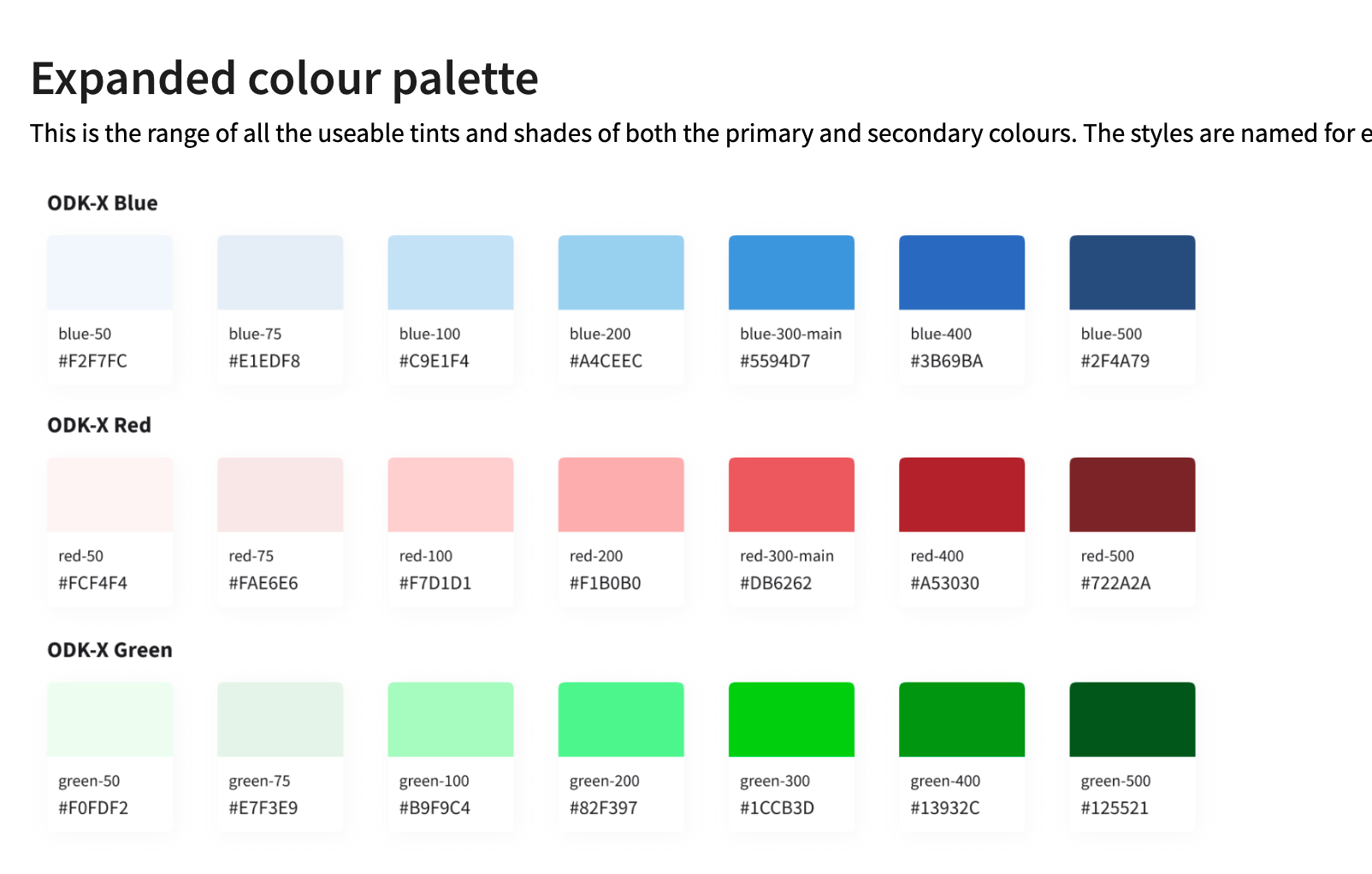
Could we reduce the number of options? That could make it simpler for future users. I wonder if it would be easier to use with an extended palette of 5 instead of 10. That should be enough options, and future designers would not have to scratch their head and wonder if it's better to use green-700 or 800.
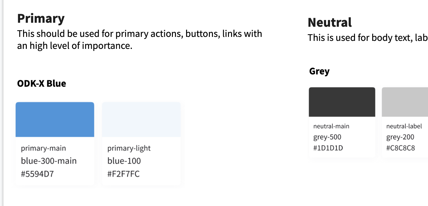
Do you intent to keep slide 2? I originally thought we should remove it, but it needs a single slide with the Primary colors I think.
Primary versus secondary - can you clarify which are the primary colors in your palette? Now the palette has 5 primary colors and 5 secondary colors - the shade variants.
Looks good, but the number of options and how to present it for easy use could be improved.
Cheers, Ben
Thanks for the feedback Ben
I agree with you on the options being too much. I'll work on reducing it to 5.
I'd also work on make it easy to understand too.
I have updated the colour styles on ODK-X Design Guidelines

New changes
- I have reduced the number of options and given more contexts to its use.
- Each colour is 'named' for easy reference for designers and developers across whatever tools they'll be working with. This could help future open-source contributors to communicate more effectively and keep things consistent across all ODK-X Tools.
- The naming system includes a name(e.g. blue) and an arbitrary number that represents the shade of the colour in relation to the system. Therefore, a lighter blue is
blue-50while a darker shade isblue-500
@Redeem-Grimm-Satoshi you can go ahead to update the android library with this
@maprehensive, please review and see if this works
@Cveman1 This is looking good, nice work.
In reality, I don't think there is a need for this many variations. It's highly unlikely the number of options would be needed for a design, and more options may create inconsistencies. e.g. would I use 50 or 75 as a shaded background or highlight?
I would remove 75 and 200 variants to get it to 5 colors.
And one minor request to include the hex values on all slide with the colors - makes it easier to quickly find a value.
Yes. I agree with you @maprehensive
I have made those changes
@Redeem-Grimm-Satoshi to send classification of colors from the Android theme so @Cveman1 can align the terminology in the style guide.
Hola @maprehensive
I have taken my time to rename all the colour values with a better naming system. @Redeem-Grimm-Satoshi Take your time to go through it here: You would understand it.

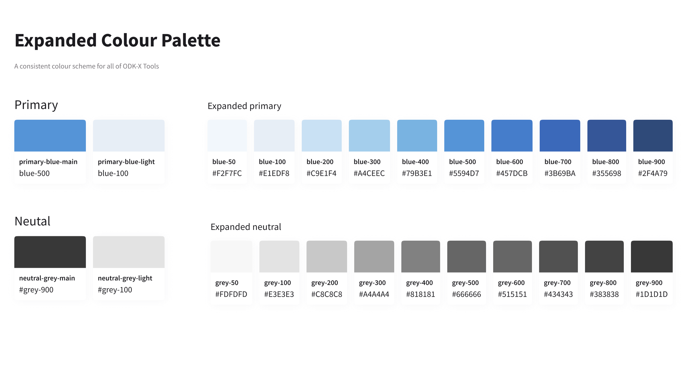
- We have one primary colour which is available in 2 shades
primary-blue-mainandprimary-blue-light. It is extended into a palette ranging fromblue-100toblue-500. - And three secondary colours, namely;
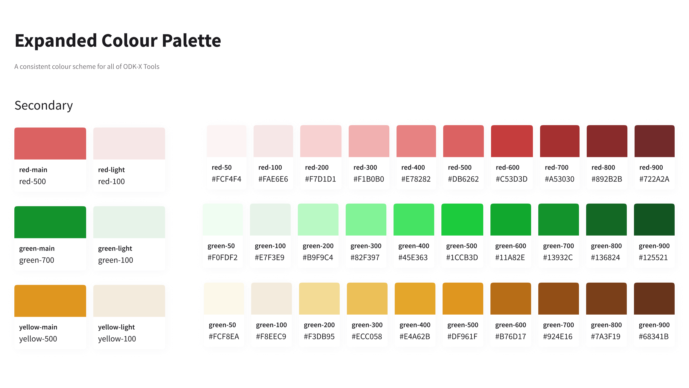
- ODK-X red which is named
primary-red-mainandprimary-red-light. - ODK-X yellow which is named
primary-yellow-mainandprimary-yellow-light. - ODK-X green which is named
primary-green-mainandprimary-green-light.
- ODK-X red which is named
- And we have neutral colours for body texts, paragraphs, borders, etc ranging from
grey-50togrey-500
Note: The extended palette with shades from
100to500is to keep usage of colours within these shades for usage in any UI element, depending on the occasion.
Colors are reflected in the style guide: https://docs.google.com/presentation/d/1Ol7YhG4WPLOWCoQZUrKHLPguHSiDz8RC3m8dNyTGGLo/
Colors are captured in colors.xml and colors.xml (night) files.
Moving this to deploy.