ui
 ui copied to clipboard
 nuxt
nuxt
feat(module): implement CSS variables to control gray shades
🔗 Linked issue
❓ Type of change
- [ ] 📖 Documentation (updates to the documentation or readme)
- [ ] 🐞 Bug fix (a non-breaking change that fixes an issue)
- [ ] 👌 Enhancement (improving an existing functionality)
- [x] ✨ New feature (a non-breaking change that adds functionality)
- [ ] 🧹 Chore (updates to the build process or auxiliary tools and libraries)
- [ ] ⚠️ Breaking change (fix or feature that would cause existing functionality to change)
📚 Description
For a long time, I wanted to implement named CSS variables to easily customize the theme without having to override every component in your app.config.ts.
We used to have --ui-background and --ui-foreground variables in Nuxt UI Pro only but those were only used to change the styles applied on <body>.
This PR introduces new CSS variables in Nuxt UI:
body {
  @apply antialiased font-sans text-[--ui-text] bg-[--ui-bg];
}

:root {
  color-scheme: light dark;

  --ui-text-dimmed: var(--color-gray-400);
  --ui-text-muted: var(--color-gray-500);
  --ui-text-toned: var(--color-gray-600);
  --ui-text: var(--color-gray-700);
  --ui-text-highlighted: var(--color-gray-900);

  --ui-bg: var(--color-white);
  --ui-bg-elevated: var(--color-gray-100);
  --ui-bg-accented: var(--color-gray-200);
  --ui-bg-inverted: var(--color-gray-900);

  --ui-border: var(--color-gray-200);
  --ui-border-accented: var(--color-gray-300);
  --ui-border-inverted: var(--color-gray-900);
}

.dark {
  --ui-text-dimmed: var(--color-gray-500);
  --ui-text-muted: var(--color-gray-400);
  --ui-text-toned: var(--color-gray-300);
  --ui-text: var(--color-gray-200);
  --ui-text-highlighted: var(--color-white);

  --ui-bg: var(--color-gray-900);
  --ui-bg-elevated: var(--color-gray-800);
  --ui-bg-accented: var(--color-gray-700);
  --ui-bg-inverted: var(--color-white);

  --ui-border: var(--color-gray-800);
  --ui-border-accented: var(--color-gray-700);
  --ui-border-inverted: var(--color-white);
}
The theme of all components has been rewritten to use those variables, here is the Card theme for example:
export default {
  slots: {
    root: 'bg-[--ui-bg] ring ring-[--ui-border] divide-y divide-[--ui-border] rounded-lg shadow',
    header: 'p-4 sm:px-6',
    body: 'p-4 sm:p-6',
    footer: 'p-4 sm:px-6'
  }
}
Now you can easily change the background of all your components as well as your app by overriding those variables in your app.vue for example:
<style>
@import "tailwindcss";
@import "@nuxt/ui";

@theme {
  --font-family-sans: 'Public Sans', sans-serif;
}

:root {
  --ui-bg: var(--color-gray-100);
  --ui-border: var(--color-gray-300);
}

.dark {
  --ui-bg: var(--color-gray-950);
  --ui-border: var(--color-gray-900);
}
</style>
📝 Checklist
- [ ] I have linked an issue or discussion.
- [ ] I have updated the documentation accordingly.
Deploying ui3 with  Cloudflare Pages
| Latest commit: |
8620554
|
| Status: | ✅ Deploy successful! |
| Preview URL: | https://dda8f4b6.ui-6q2.pages.dev |
| Branch Preview URL: | https://feat-css-variables.ui-6q2.pages.dev |
![cloudflare-workers-and-pages[bot] avatar](https://avatars.githubusercontent.com/in/85455?v=4 "Published by a pub.dev verified publisher")
This is really an amazing feat! Dealing with colors currently is confusing and this is the cherry on the cake for v3. Thanks a lot for your work🙏
I'm cooking something on top of this PR to handle app config colors through CSS variables as well 😊 This will allow to choose shades for light and dark mode!
Just updated the PR with a full design system and a major refactor of colors on top of the gray, let me know what you think!
Can you elaborate on this? Writing bg-[--ui-bg-elevated] for example whenever needed is a bit verbose
Note that we no longer define those aliases as Tailwind CSS colors so you can no longer do text-primary-500 dark:text-primary-400. This was changed to prevent overriding your Tailwind CSS colors.
[...] Writing
bg-[--ui-bg-elevated]for example whenever needed is a bit verbose
I would refer a three-key "verbose", yet.
Especially when you need to consider that you are calling a ui util, that is a background and it is of variant elevated. If you just need the background you can just do --ui-bg.
I would dare to say that it becomes more CSS-esque and easy to remember, even more once this rolls out. Not to mention that there will be your IDE helping with them.
The more I look at this PR the more I want to test it in an actual project....
I want to add that you don't have to use the shortcuts variables, you can use text-[--ui-color-neutral-500] dark:text-[--ui-color-neutral-400] for example (old text-gray-500 dark:text-gray-400).
Do you think I should keep the custom Nuxt UI colors as Tailwind CSS colors?
![pkg-pr-new[bot] avatar](https://avatars.githubusercontent.com/in/882742?v=4 "Published by a pub.dev verified publisher")
Having to open brackets and write a CSS var would become tedious as you typically write a bunch of utility classes per element. I'm not sure if the Tailwind Intellisense provides autocompletion for CSS vars but if it does it certainly would make it easier.
With that said I think the current behavior is better. Maybe an opt-in option to add utilities for those variables would be best? Enabling the option would generate bg-elevated and bg-accented, etc for --ui-bg-elevated and --ui-bg-accented respectively and so on.
@MuhammadM1998 I can't make an opt-in for this, have you looked at the src/theme/ changes? 😬 https://github.com/nuxt/ui/pull/2298/files#diff-5f29f6135235be345dc147df2e517cb5ab2248e70820ce985ea03c45cc05ba25
We could maybe add an option to define our design system colors as Tailwind CSS colors but there would still be a conflict with the neutral (like it was for gray being renamed to cool before).
Do you really think it would be tedious to write bg-[--ui-primary] instead of bg-primary-500 dark:bg-primary-400? With this system, you'll never have to write a dark: class ever again.
Personally, I would much prefer to write bg-[--ui-primary] compared to letting Nuxt UI hardcode some variables for me (especially without the need to write dark: each time and possibly altering all darks at once for an entire project).
After all I usually create my own /assets/css/main.css, and having that customization ability in one file, once per project, is insanely valuable for me.
While I do now understand @MuhammadM1998 perspective, I would much prefer being in control. Also considering a number of requests in the ability to define your own utility class colors without hardcoded variables. For those who really want to we could add a doc section explaining how it should be done via Tailwind utilities. This not only improves free of customization, but also establish a proper use of the tools IMO
@benjamincanac That's my opinion yeah maybe do a poll on twitter? 😂
I agree with @sandros94 though, adding a section in the documentation for those who won't like to use the brackets notation would be sufficient as you'll do that once per project anyway.
It is planned, I'll rewrite the entire Colors page in this PR!
You can easily define the Nuxt UI colors (design system) as Tailwind CSS colors using the @theme directive:
@import "tailwindcss";
@import "@nuxt/ui";

@theme {
  --color-primary-50: var(--ui-color-primary-50);
  --color-primary-100: var(--ui-color-primary-100);
  --color-primary-200: var(--ui-color-primary-200);
  --color-primary-300: var(--ui-color-primary-300);
  --color-primary-400: var(--ui-color-primary-400);
  --color-primary-500: var(--ui-color-primary-500);
  --color-primary-600: var(--ui-color-primary-600);
  --color-primary-700: var(--ui-color-primary-700);
  --color-primary-800: var(--ui-color-primary-800);
  --color-primary-900: var(--ui-color-primary-900);
  --color-primary-950: var(--ui-color-primary-950);
}
This would allow you to use text-primary-500 dark:text-primary-400 and can be done for all the aliases.
You can check the updated documentation here: https://feat-css-variables.ui-6q2.pages.dev/getting-started/theme#design-system. Any feedback is appreciated 😊
You can check the updated documentation here: https://feat-css-variables.ui-6q2.pages.dev/getting-started/theme#design-system. Any feedback is appreciated 😊
Looks amazing and well detailed. I'm really enjoying this "back to css-fist" configs!
What do you think of the default colors? Right now the primary defaults to green and secondary to blue like success and info 😬
What do you think of the default colors? Right now the
primarydefaults togreenandsecondarytobluelikesuccessandinfo😬
I've been using those exact colors for basically every project and test I've done so far.
The only difference is that I tend to use sky for info (secondary still defaults to blue) and add a transparent color (more useful than what you could think of).
What do you think of the default colors? Right now the
primarydefaults togreenandsecondarytobluelikesuccessandinfo😬
Its going to look like Vuetify? Although it helps to create the distinction between Success and Primary. I don't mind.
Its going to look like Vuetify?
Could you elaborate on this? 🤔
So Vuetify and Element plus use the blue colors by default. While Shadcn uses Grays by default as primary colors. Nuxt UI is currently green by default, which I like, in line with the Nuxt website and Vue color scheme.
export default defineAppConfig({
  ui: {
    colors: {
      primary: 'sky',
      secondary: 'indigo',
      success: 'green',
      info: 'blue',
      warning: 'yellow',
      error: 'red',
      neutral: 'slate'
    }
  }
})
According to this snippet. The new primary color would be sky? Its not ugly but its not unique anymore. I would prefer "green" or "emerald" combine with "gray" as neutral for deafults.
It's an error in the PR description, you have the default colors in the documentation: https://ui3.nuxt.dev/getting-started/theme#colors
I just tried the new design system approach and it's amazing!
Had a small problem though with styling the button foreground, currently it defaults to --ui--bg. It works okay in light mode where the background is white, but in dark mode where the background is black it looks a bit off. Is there a way to update the button (and other similar components) text color globally without updating the app config for each component?
Also I added my colors to @theme to be able to use them directly as utility classes without arbitrary values and they automatically change in light & dark mode so I don't have to use text-xxx1 dark:text-xxx2. Here's how my main.css looks like
@import 'tailwindcss';
@import '@nuxt/ui';

/* My app's design system*/
:root {
  --app-font-family: 'Readex Pro', sans-serif;
  --app-font-size: 14px;
  --app-background: #ffffff;
  --app-foreground: #09090b;
  --app-primary: #1d5252;
  --app-secondary: #f4f4f5;
  --app-border: var(--app-secondary);

 /* Dark Mode Overrides */
  &.dark {
    --app-background: #09090b;
    --app-foreground: #f5f5f5;
    --app-primary: #32ada8;
    --app-secondary: #1e1e1e;
  }
}

/* Overriding Nuxt UI default to use our design system */
:root {
    --font-family-sans: var(--app-font-family);

  /* Colors */
  --ui-bg: var(--app-background);
  --ui-text: var(--app-foreground);
  --ui-primary: var(--app-primary);
  --ui-secondary: var(--app-secondary);
  --ui-border: var(--app-border);
}

/* Declaring our variables as `theme` to add them as utility classes (e.g `text-primary`, `bg-muted`, etc..) */
@theme {
  --color-background: var(--app-background);
  --color-foreground: var(--app-foreground);
  --color-primary: var(--app-primary);
  --color-secondary: var(--app-secondary);
  --color-border: var(--app-border);
}
With the above CSS file, the following works in both light and dark modes
<template>
  <!-- Automatically uses #1d5252 in light mode and 32ada8 in dark mode -->
  <p class="text-primary"> Hello </p>
</template>
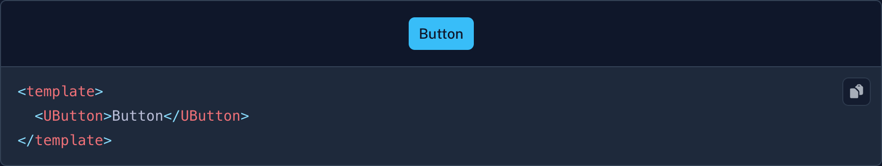
The button foreground text defaults to text-[--ui-bg] only for the solid variants. To override such specific variant, you have no choice than to use the app.config.ts and the compoundVariants key as it's not a global setting.
It is how we designed the button:
I've concluded the same after some reviewing. Thanks a lot for this PR really great work 🙏
hey guys, I'm currently deciding which UI library to use for my next major project. I quite like Nuxt UI v2, but it has some weaknesses that are now much improved in v3. Veery nice, good job! Especially design tokens are really important for me and i love that you are using tailwind v4 :) I just don't quite understand how components are (globally) customised now. In v2 i could just add all the props stylings in the app.config:
export default defineAppConfig({
  ui: {
    primary: "blue",
    gray: "slate",
    strategy: "override",
    button: {
      default: {
        color: "blue",
        size: "xl",
      },
      padding: {
        xl: "px-8 py-4",
        md: "px-4 py-2",
      },
      size: {
        xl: "text-lg rounded-full",
        md: "text-md rounded-lg",
        xs: "text-xs rounded-lg",
      },
      variant: {
        outline: "border border-slate-100  dark:border-slate-600",
      },
      color: {
        blue: {
          solid: "bg-blue-900 dark:bg-blue-800 text-white",
        },
      },
    },
  },
});
But that doesn't seem to work in v3 now. Is there an synthax error in my code, or did you change the whole logic? Sorry if this doesn't belong here. I'm just a bit pressed for time to make a decision :D Thanks!
export default defineAppConfig({
  ui: {
    colors: {
      primary: "blue",
      neutral: "slate",
    },
    strategy: "override",
    button: {
      default: {
        size: "lg",
      },
    },
  },
});
@philippwienes No this behaves the same as in v2, the strategy option is gone though and default is now defaultVariants: https://ui3.nuxt.dev/components/button#theme
Not sure it's related but one mistake I see people make is not putting their app.config.ts inside app/ when using the future.compatibilityVersion: 4 option.