tasks
 tasks copied to clipboard
 nextcloud
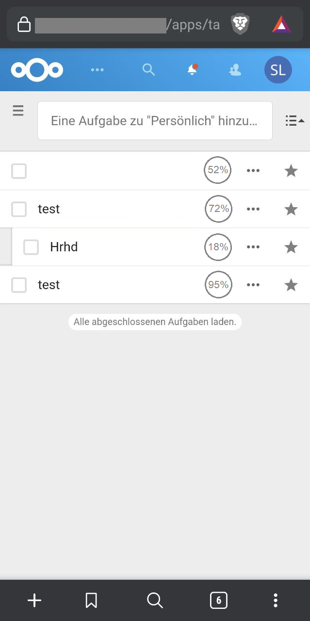
Length of completion bar is wrong
Steps to reproduce
- Go to the completed tasks
- Depending on the symbols the blue bar is longer or shorter with same completed percentage

Expected behaviour
The bar has in all cases where the completed percentage is the same the same length
Actual behaviour
Depending on symbols (notes attached etc.) the bar length differs
Server configuration
Nextcloud version: 20.0.8
Tasks version: 0.13.6
Updated from an older Nextcloud or fresh install: updated
Client configuration
Browser: Firefox 86.0
Operating system: Ubuntu 20.10
This is the expected behavior. We want to use the available space as much as possible, so the elements present resize to fill it completely.
I see that this might be controversial in some cases, so let's hear what @nextcloud/designers think.
ok. in my opinion it is just very misleading because like this if I have non finished tasks below each other it looks like they have a different percentage finished
The completion line looks very outdated, imho.
I'd like to suggest this iconography for showing the completed percentage.
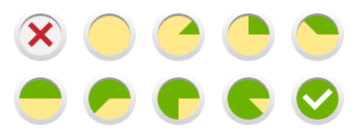 (of course the icons should get reworked to fit into Nextcloud's optic)
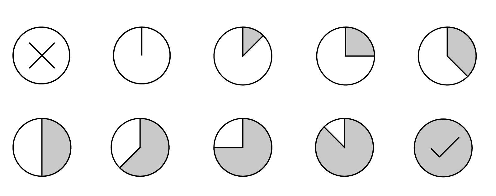
@szaimen Where should this icon go? Do you propose to replace/enhance the checkmark box with this?
Edit: And having a dedicated icon for each progress value is not really feasible. If we would want to show the progress at least in 5 % steps, we would already need 21 icons. This means this has to be realized with CSS (and Javascript).
Where should this icon go? Do you propose to replace/enhance the checkmark box with this?
My idea was originally to show this as an additional icon on the right side depending on if a completed percentage is given. But I guess it could also work by replacing the checkbox.
Edit: And having a dedicated icon for each progress value is not really feasible. If we would want to show the progress at least in 5 % steps, we would already need 21 icons. This means this has to be realized with CSS (and Javascript).
I don't know if it makes much sense to show all 5% steps with the icon because I don't think that you will be able to differentiate them. I guess having those icons that I've proposed and then calculating the usage of the best fitting icon with javascript would be the better approach.

So maybe @raimund-schluessler had a point when suggesting to auto-generate those icons. Then it will fit all possible states perfectly.

Some visual indication of the progress looks good, so a progress bar works well, but I agree that the length being not equal is a bit confusing. For the mockups, showing the percentage is a good idea, but they all look too similar, don't you think? 10% complete would look very similar to 70% complete.
Maybe we can have a fixed max length so the progress bar doesn't resize, and show the percentage at the end of the progress bar using smaller grey text. What do you think?
I am honestly no fan of the progress bar at all because it looks like a separation-line and attracts too much attention because it nearly takes the whole space of any task in primary color. So I am voting for either progress icons or simply showing the percentage as proposed. What do you think @raimund-schluessler?
@szaimen Looks quite good. Maybe you could combine your last mackup with a visual finished hint by coloring the outer circle line blue depending on the status e.g.
