server
 server copied to clipboard
 nextcloud
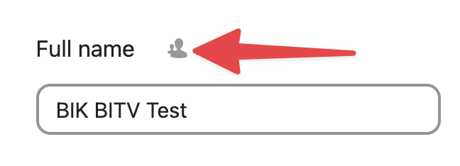
[BITV] 9.1.4.11/6.3 - All buttons "Change scope level of ..." do not meet the contrast requirements for graphical user interface components - actual contrast is 2.8:1. (1)
- [ ] Fix
- [ ] Backport
Details
https://report.bitvtest.de/default-en/d63601ac-cb34-4645-8256-66bec78964a0.html#checkpoint-3dbfb7615a-v6-n3
Dear @jancborchardt, @nimishavijay, @marcoambrosini
Here we have a next accessibility problem. The first thought how to fix this issue was to increase a contrast for interactive element. But the problem is that this icon-button is actually a dropdown. And dropdown have to be a dropdown and not a icon-button.
- Should i replace all this buttons with NcSelect? But i think that would look like "too much in one place".
- And besides this we have to restructure "sections" (full name, email, phone number ...) because right now we have an input fields which are connected to there labels. Where should a dropdown (NcSelect) belong to?
Please give me a feedback. Thanks a lot!
Agreed that using a dropdown component in place of the icon wouldn't be the best solution.
Possibly this solution is out of scope, but during the initial designs for Nextcloud profile, there were some ideas for a single column layout for the settings, which would look similar to the new contacts layout. This would allow more space for using a dropdown component if required. What do you think about this?
Thanks @nimishavijay for your answer! Do you mean that we can use dropdowns (select) instead and after some time would have a new design look for this page that everything would look much nicer with more place?
@JuliaKirschenheuter With the current layout we cannot use dropdown components, because as you mentioned it will look "too much". If we switch to a different layout, then we will have enough space to use dropdowns, and everything will look nicer. If a layout change is too much work for this issue, then we won't use dropdowns and we can find another solution :) What do you think? I will share mockups of the new layout or look for a different solution depending on what's more suitable for you :)
@nimishavijay could we probably just use an action button like everywhere?
...ant that would be already accessible
Could we probably just use an action button like everywhere?
@JuliaKirschenheuter yes that would be the simplest solution and focus on fixing the reported issue – let’s go with that. :)
I think we have a bigger problem there. It seems to me that all our action buttons have to be more visible and discoverable without focus or hover on it. For now it is only possible to recognize that we have an action button only on focus or hover state. Only an icon in place of action button is unfortunately not enough.
Some examples:
@nimishavijay @marcoambrosini Could we set an high contrast outline to each icon-only action button by default and a double outline (or something what you could suggest) to focused state? (hover state isn't as important because a cursor will be changed).
Thank you!
Can we check this one with @michaelnissenbaum I would hope that it being a button component and the icon having the right contrast to be "enough". I really wouldn't want to have all these items to have a borders by default, but am happy to be proven otherwise.
We had an information that this action buttons were not enough discoverable even if they would have higher contrast. Or would it be really enough if we just increase a contrast on icon-only action button?
@michaelnissenbaum thanks for your help!
Hi @JuliaKirschenheuter. All interactive graphical controls implemented using icons, SVGs, or elements like "img" need to have a minimum contrast ratio of 3:1 with the background. They should also be clearly distinguishable without keyboard focus or mouseover interactions.
@michaelnissenbaum for me your statement than translates to the icon needs to have the right contrast but there is no need to have a border around it (in an unselected/-focussed state)
@nextcloud/designers fine by you if we then just raise the contrast on the svgs? I would expect yes.
From my side yes but it should probably also become a button if not already done. Wasnt there alrready a PR that fixes this somewhere?
From my side yes but it should probably also become a button if not already done. Wasnt there alrready a PR that fixes this somewhere?
Not yet, i will push my changes now
1. As follow-up: focused (i will open a ticket for it) If an action menu is opened, action button itself have to be focused to. For now it is not a case.
2. As follow-up: focused (i will open a ticket for it) not sure about styles inside opened action menu: should we set a double outline on active + focused / hovered action menu item? @marcoambrosini, @nimishavijay
@JuliaKirschenheuter could you point me to the aria documentation that addresses this? I couldn't find this rule.
As a rule of thumb, we want to avoid displaying those double outlines to people that use mouses, trackpads and fingers as pointing devices. As they already know which part of the page they're interacting with.