forms
 forms copied to clipboard
Reduce Vertical Dead Space
Hello,
I have recently started using this app, and so far think that the flexibility it affords is great! However, I have noticed that the forms take up a lot of vertical dead space, reducing the amount of information and interactive elements on the page at one time.
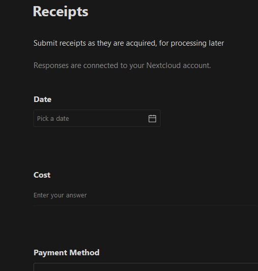
Would it be possible to reduce the amount of vertical space between elements? I personally think that it would be beneficial to apply that for everyone, but a setting to allow it would be great too.
Thanks!
Yeah, in the sharing mode the whitespace could be reduced a bit – but not a lot, cause whitespace is important for separation. Maybe 8–16px or something.
Because also, for form creators, we would like little difference/movement between the edit and view modes.
Thank you :) Yes, we should make sure to have as little movement between the different modes.
Comparison of margin-bottom between questions (80px is current). As we're using the same CSS rules for edit/view mode there will be no movement between the two modes.
@jancborchardt I think we can go as low as 50 px before we lose the separating aspect of the white space.
| 80px | 70px | 60px | 50px |
|---|---|---|---|