nextcloud-vue
 nextcloud-vue copied to clipboard
 nextcloud-libraries
Sidebar tabbed navigation normal / hover / focus / active states.
I think we should apply the same rules that are going to be implemented in the app navigation ( #425) since what we have now looks a bit confusing.
What do you think @nextcloud/designers?
@ma12-co current sidebar does not look like that and have already been updated a bit, it now have a far better contrast and usability :)
But We could definitely see how we can improve it a bit further!
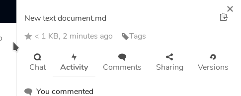
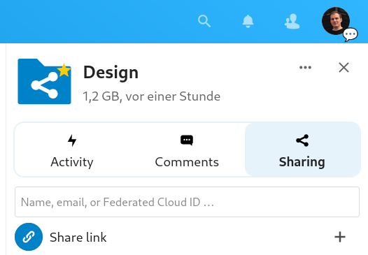
You're right @skjnldsv, this is the current sidebar:
 I still think that bringing the appnavigation behavior here would be a nice improvement!
Do you mean we should do the whole background stuff? Not sure if that would look nice on the tab bar since it has an "open top" and it would look a bit boxy, no? If you have mockups for that we can look at it for sure though. :)
Those new colors are very light, but yeah there's that risk.. Maybe we should see it with a live example, it will be easier to try out the behavior! I'll put that on my todo list ;)
So @nimishavijay trialed several design options for sidebar tabs:
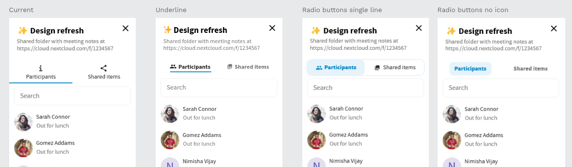
And we arrived at this being the best solution:
- Very little change from the current layout, mostly just visual design
- Works well with translations and possibly long strings
- Works well with 3 or more tabs
- Gives a clear visual indication as to how the tabs belong together

What do you think @marcoambrosini @raimund-schluessler @skjnldsv? :)
I think it looks nice.
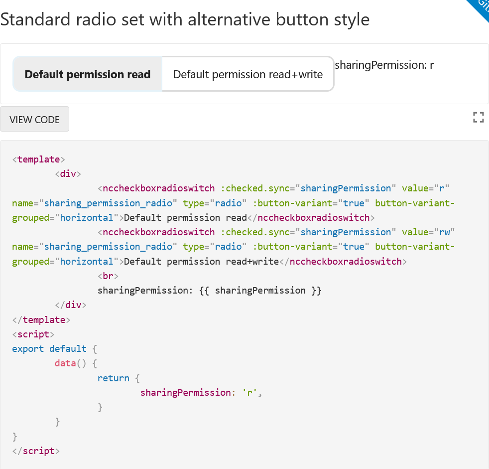
Am I right, that as a first step we would only touch the tabs bar? We could use the NcCheckboxRadioSwitch with the button-variant for this. It would need some style improvements and an icon slot, but it should work in principle. And it would help keeping everything consistent. This is how it looks at the moment:
What do you think @marcoambrosini @raimund-schluessler @skjnldsv? :)
Looks great! Could you also post what it should look like if there is like 5 or 6 tabs?
Am I right, that as a first step we would only touch the tabs bar? We could use the NcCheckboxRadioSwitch with the button-variant for this. It would need some style improvements and an icon slot, but it should work in principle. And it would help keeping everything consistent. This is how it looks at the moment:
Yes, first step would be only the tabs bar. The tabs bar is a Vue component, isn’t it, so the changes can be simply done in there?
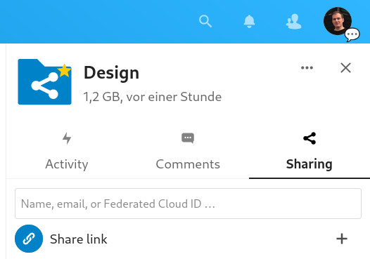
Cause also to reply to @skjnldsv question – there is very little difference from the current tabs to this mockup, essentially just a border around the whole thing and a background to the current item:
| Before | After |
|---|---|
 |
 |
I tried it out in the inspector and here’s the changes I had to make – I was only a bit confused cause a lot of them I had to do double for some reason? (Still missing focus borders, but we could just add a border by default on entries, making it look normal on hover, and 2px dark/light on focus.)
/* Inline #402 | https://cloud.nextcloud.com/apps/files/?dir=/&fileid=982 */

.app-sidebar-tabs__tab a[data-v-15932673]:not(.active):hover, .app-sidebar-tabs__tab a[data-v-15932673]:not(.active):focus {
  /* border-bottom-color: var(--color-background-darker); */
  /* box-shadow: inset 0 -1px 0 var(--color-background-darker); */
}

.app-sidebar-tabs__tab a[data-v-15932673] {
  /* opacity: .7; */
  /* border-bottom: 1px solid var(--color-border); */
  padding-top: 32px;
  border-radius: var(--border-radius-large);
}

.app-sidebar-tabs__tab a.active[data-v-15932673] {
  /* border-bottom-color: var(--color-text-light); */
  /* box-shadow: inset 0 -1px 0 var(--color-text-light); */
  background-color: var(--color-primary-light);
}

.app-sidebar-tabs__tab-icon[data-v-15932673] {
  /* top: 0; */
  /* opacity: .7; */
  top: 12px;
}

.app-sidebar-tabs__nav[data-v-15932673] {
  /* margin-top: 10px; */
  margin: 0 8px;
  border: 2px solid var(--color-primary-light);
  border-radius: calc(var(--border-radius-large) + 2px);
}

.app-sidebar-tabs__tab a[data-v-15932673]:focus {
  /* border-bottom-color: var(--color-primary-element); */
  /* box-shadow: inset 0 -1px 0 var(--color-primary-element); */
}

.app-sidebar-tabs__tab a[data-v-15932673]:hover, .app-sidebar-tabs__tab a[data-v-15932673]:focus, .app-sidebar-tabs__tab a[data-v-15932673]:active, .app-sidebar-tabs__tab a.active[data-v-15932673] {
  background-color: var(--color-background-hover);
}

/* Inline #53 | https://cloud.nextcloud.com/apps/files/?dir=/&fileid=982 */

.app-sidebar-tabs__tab a[data-v-15932673]:not(.active):hover, .app-sidebar-tabs__tab a[data-v-15932673]:not(.active):focus {
  /* border-bottom-color: var(--color-background-darker); */
  /* box-shadow: inset 0 -1px 0 var(--color-background-darker); */
}

.app-sidebar-tabs__tab a.active[data-v-15932673] {
  /* border-bottom-color: var(--color-text-light); */
  /* box-shadow: inset 0 -1px 0 var(--color-text-light); */
  background-color: var(--color-primary-light);
  border-radius: var(--border-radius-large);
}

.app-sidebar-tabs__tab a[data-v-15932673] {
  /* opacity: .7; */
  /* border-bottom: 1px solid var(--color-border); */
}

.app-sidebar-tabs__tab a[data-v-15932673]:focus {
  /* border-bottom-color: var(--color-primary-element); */
  /* box-shadow: inset 0 -1px 0 var(--color-primary-element); */
}

.app-sidebar-tabs__tab-icon[data-v-15932673] {
  /* opacity: .7; */
}
Could you also post what it should look like if there is like 5 or 6 tabs?

I imagine it would look something like this. I also tried a version with 2 rows, but it didn't look good. In the future we can try to make sure that we are not trying to fit so many tabs into such a small space
cc @jancborchardt