nextcloud-vue
 nextcloud-vue copied to clipboard
NcModal's left column width increase for french and other "large words" languages
Signed-off-by: Jérôme Herbinet [email protected]
NcModal width increase to compensate NcModal's left column width increase.
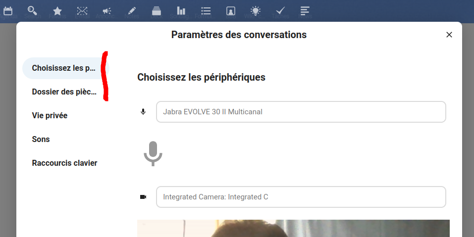
Some examples for too thing left column in French :


@Jerome-Herbinet Can you please remove the changes to package-lock.json?
Good observation! Checking the width, increasing the left column 300px leaves a lot of space to the right, at least when the language is set to English. Does this PR affect the width for all languages? If yes, then we can go with a smaller number like 256px. If this affects only certain languages then it is all good! :)
How it looks with 300px:

It affects all languages.
How about we make this fullscreen??
@jancborchardt, I tested with only 50px before doing the PR, and IMO, it's not enough ... But, as @jancborchardt says, we can leave the main modal with unchanged, why not. I'm waiting for your instructions. @raimund-schluessler, I'll remove the mentioned file.
OK @raimund-schluessler ; file deleted with a rebase.
Are you finally waiting for me to do a test with different widths ?
After testing it with @nimishavijay we decided that we could go with
400pxfor the navigation, which collapses whenisMobileis true. The width of the content was already too much anyway
Done
Done
Nice! @Jerome-Herbinet could you please post updated screenshots so it's easier for everyone to review? :)
Done
Nice! @Jerome-Herbinet could you please post updated screenshots so it's easier for everyone to review? :)
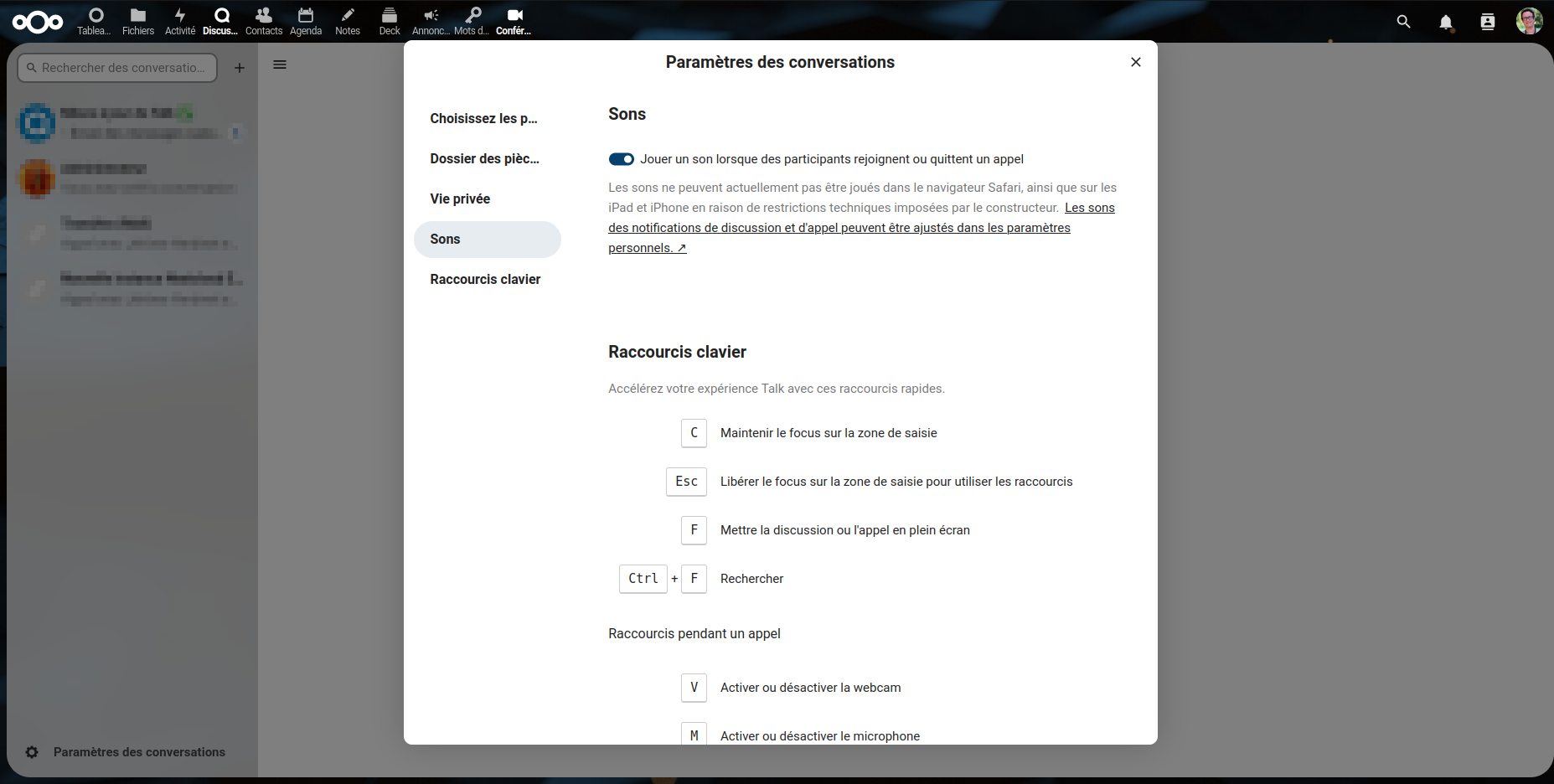
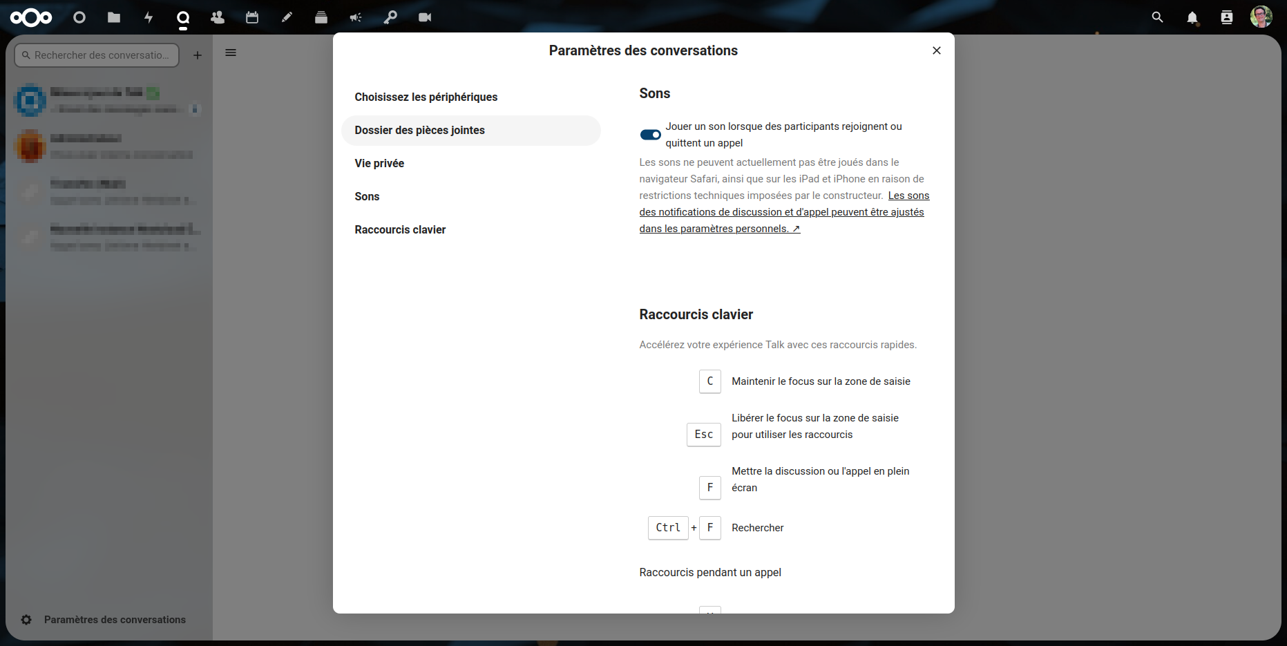
Hi @nimishavijay, below is the before and after display. However, I don't understand one thing after accepting @marcoambrosini's changes. I have, in the "Files changed" tab only the NcAppSettingsDialog.vue file, while there was also the NcModal.vue file changed (missing). Can you tell me what's going on ? Did I forget to do something, or did I do it wrong?
Before :

After :

After testing it with @nimishavijay we decided that we could go with 400px for the navigation
@marcoambrosini @nimishavijay judging from the latest screenshot, this looks way unbalanced, with nav almost as wide as content.
If this is still relevant and not fixed elsewhere, something between 250 and 300px should be enough.
@jancborchardt : Reduced to 300px (with of the navigation left column), but, as a reminder, note that global modal width hasn't been compensated.
Reduced to 300px (with of the navigation left column), but, as a reminder, note that global modal width hasn't been compensated.
Seems good to me. What does it mean that it needs to be compensated? cc @marcoambrosini
Reduced to 300px (with of the navigation left column), but, as a reminder, note that global modal width hasn't been compensated.
Seems good to me. What does it mean that it needs to be compensated? cc @marcoambrosini
I mean that i f you enlarge the left column, after, you have less space (less width) for content. So if the original left column was 200px wide and that its now 300px wide, we should make the modal 100px larger in order to guaranty that content keepa as much space (width) as before. What do you think ?
What about making the column (and modal) optionally flexible to fit content? With hard limits. So that in any language, when applicable, the column's width would be enough for the longest option but not more.
Another possible solution is keeping a lower width and wrapping the captions instead of ellipsizing them
@marcoambrosini Hm, I'm not sure about this because we rarely wrap text in the navigation or list items component, and this is the equivalent for that in a modal.
we should make the modal 100px larger in order to guaranty that content keepa as much space (width) as before. What do you think ?
@Jerome-Herbinet I would actually say that it's not necessary, since the modal is scrollable none of the text is really cut off. if it is 900px, there is a nice division of 1/3 for navigation and 2/3 for the content :) what do you think?
What about making the column (and modal) optionally flexible to fit content? With hard limits. So that in any language, when applicable, the column's width would be enough for the longest option but not more.
@ShGKme This seems like a good solution but I am afraid that it will give rise to different widths for different modals even in the same language, which is not ideal. any thoughts about this @marcoambrosini @jancborchardt or @szaimen?
@nimishavijay it's fine to ellipsize user names or email subjects but not something like setting sections. I've never seen that. I'd advise to wrap the text regardless of the column width we choose.
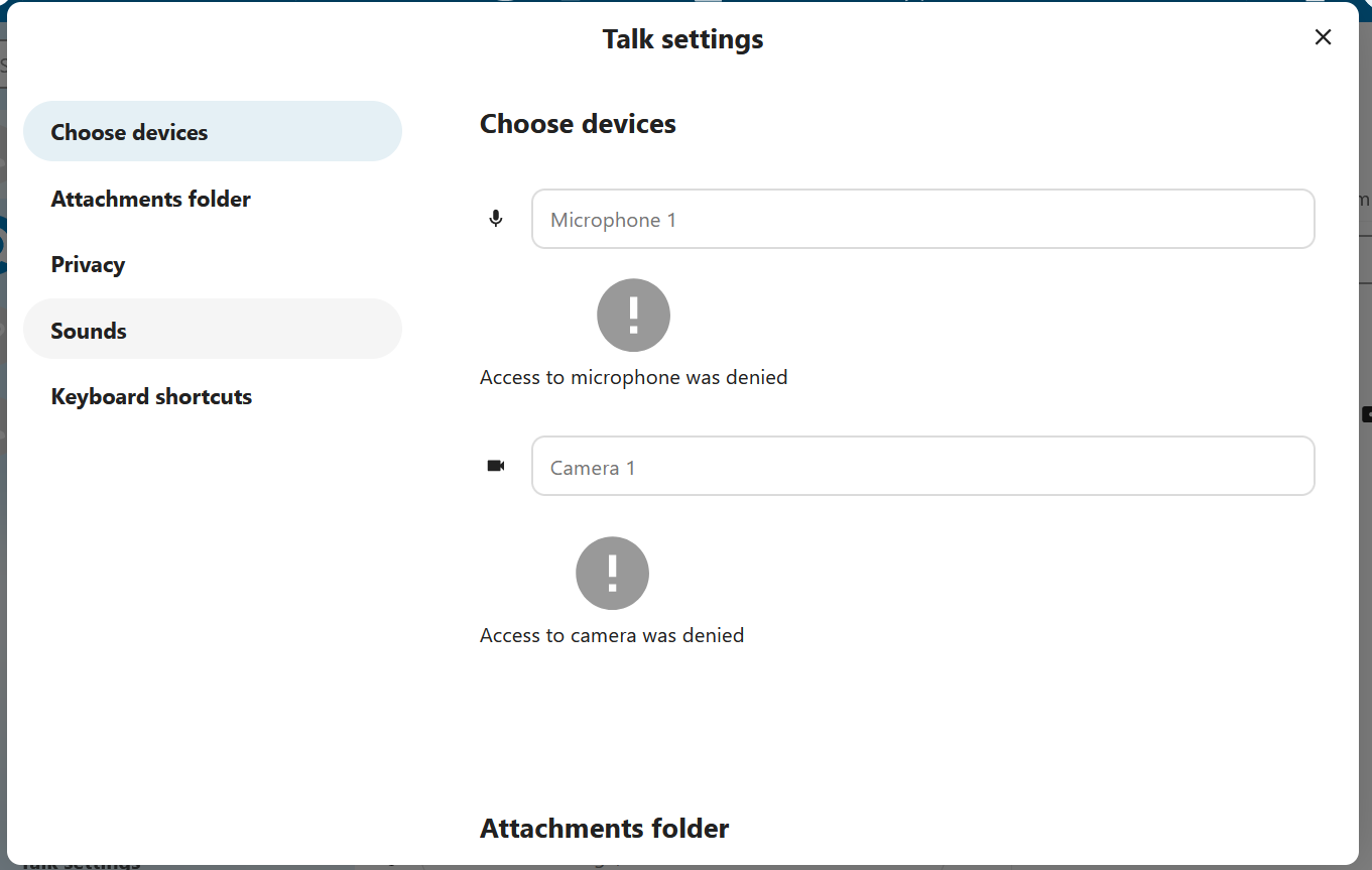
I just saw that the left column is larger than before, for example in the Talk's settings modal, in Nextcloud 28. I don't think it is due to my PR because it's still not merged. Can I close it ?
With new NcDialog design, navigation now is not limited anymore. It is as wide as needed for the widest item. Though, probably this is also an issue, because in the worth case, there is no place for content at all.
With new
NcDialogdesign, navigation now is not limited anymore. It is as wide as needed for the widest item. Though, probably this is also an issue, because in the worth case, there is no place for content at all.
Wouldn't it be possible to specify a maximum width for the left-hand column?
Wouldn't it be possible to specify a maximum width for the left-hand column?
It is possible. It's just another issue.
Wouldn't it be possible to specify a maximum width for the left-hand column?
It is possible. It's just another issue.
@ShGKme I made some tests and couldn't reproduce the issue that you described ; do you have any precise example (screenshot) ?
OK @ShGKme, thanks, it's clear now for me. @jancborchardt is this a bug or a feature ? Shouldn't we get a "max-with" coupled with an "ellipsis" in order to avoid that ?
OK @ShGKme, thanks, it's clear now for me. @jancborchardt is this a bug or a feature ? Shouldn't we get a "max-with" coupled with an "ellipsis" in order to avoid that ?
Not that great :
OK @ShGKme, thanks, it's clear now for me. @jancborchardt is this a bug or a feature ? Shouldn't we get a "max-with" coupled with an "ellipsis" in order to avoid that ?
Yes absolutely, otherwise the interface breaks with just 1 faulty text.
Also, texts and translations need to be kept aptly short. E.g. "Peripheriques" instead of "Choissisez les peripheriques" etc. if that works.
@jancborchardt can you test my last commit ?
@jancborchardt ; I've taken a look at NC 27 to 30, and it seems that the problem has been fixed since NC 28 ; the left panel is larger and the modal is well sized IMO. I close this PR.
