docs.nestjs.com
 docs.nestjs.com copied to clipboard
WIP: feat(theme): Add dark mode
Poll
Use a reaction :+1: or :-1: on this PR to vote, whether Dark Mode shall be implemented for docs.nestjs.com and you would happily use it!
Kamil:
if there are more people interested in having the dark theme, I'm completely fine with it.
PR Checklist
Please check if your PR fulfills the following requirements:
- [x] The commit message follows our guidelines: https://github.com/nestjs/docs.nestjs.com/blob/master/CONTRIBUTING.md
PR Type
What kind of change does this PR introduce?
[ ] Bugfix
[x] Feature
[ ] Code style update (formatting, local variables)
[ ] Refactoring (no functional changes, no api changes)
[ ] Build related changes
[ ] Other... Please describe:
What is the current behavior?

What is the new behavior?

Does this PR introduce a breaking change?
[ ] Yes
[x] No
Other information
I know from #613 @kamilmysliwiec is opposed to dark mode. Though since more and more platforms are migrating and I have been working the last year on a design system, I felt a huge urge to follow it as well ;)
Notes:
-
This PR uses CSS variables. This means IE11 support will be dropped. Maybe double-check the analytics, whether this is something we still should support? FYI: Stackoverflow dropped the IE11 support as well, when they introduced dark mode with CSS variables.
-
The NestJS primary color #ed2945 does not have a good contrast ratio with the background. I changed it to a lighter color (randomly picked). If you have a better strategy, feel free to let me know.
-

-
Companies do not look very good in dark mode
Next steps:
- Consider refactoring graphs to MermaidJS. Then we can easily convert those graphics to dark mode + images can be maintained in code.
Thanks for your contribution! Honestly, I'm not entirely convinced of this feature. I have a dark mode turned on in my OS (and I love it!), but I think dark themes in documentations make them less readable. I checked documentations of other popular projects like Angular, React or Vue, and I haven't noticed anything like this either. So what I'm thinking - if there are more people interested in having the dark theme, I'm completely fine with it. Nonetheless, it has to be disabled by default (for the sake of consistency between platforms) and available on-demand (so if you want to have it, you have to explicitly turn it on, otherwise, we should use the light theme by default).
@kamilmysliwiec
dark themes in documentations make them less readable
Before this feature would get merged, I would check it with Lighthouse to check the contrast colors (making it readable). Maybe automate it via #971
So what I'm thinking - if there are more people interested in having the dark theme, I'm completely fine with it.
Makes sense, fine for me :)
Nonetheless, it has to be disabled by default (for the sake of consistency between platforms) and available on-demand (so if you want to have it, you have to explicitly turn it on, otherwise, we should use the light theme by default).
Also if you have selected "prefer Dark Mode" as OS/Browser setting?
Also if you have selected "prefer Dark Mode" as OS/Browser setting?
Yes, following other documentations and StackOverflow. We can also provide a third option, "Light, Dark, System" (inspired by StackOverflow).
I checked documentations of other popular projects like Angular, React or Vue, and I haven't noticed anything like this either.
Docker docs have the "toggable" dark mode feature: https://docs.docker.com/ The doc's "light" color theme is still that light-ish blue, so logos that are white are still readable in both dark and light. Some icons change color depending on the theme, but generally the docs have limited colors and images.
As someone that uses dark theme on basically everything, either via native or via some extension/styling mod. There are a bunch of cases where going dark theme can screw stuff up, like images become unreadable. I'd say the docs are totally in the realm of possibility of having a dark theme, and Angular makes toggle themes pretty easy. (or at least I think so hehe)
@BrunnerLivio @kamilmysliwiec about a year later, and it seems there is some want from the community around dark mode. What would we need to do to scope this out and merge it?
Just wanted to add that Redux and Redux toolkit docs have a toggle for dark mode. People who work at night would definitely appreciate this feature.
@jmcdo29 @kamilmysliwiec I’d love to follow-up on this one! Just let me know when I can proceed rebasing!
I personally use the DarkReader extension, which works almost perfectly with any website (including the docs of NestJS). Available on Chrome and Firefox.
Thanks for your contribution! Honestly, I'm not entirely convinced of this feature. I have a dark mode turned on in my OS (and I love it!), but I think dark themes in documentations make them less readable. I checked documentations of other popular projects like Angular, React or Vue, and I haven't noticed anything like this either. So what I'm thinking - if there are more people interested in having the dark theme, I'm completely fine with it. Nonetheless, it has to be disabled by default (for the sake of consistency between platforms) and available on-demand (so if you want to have it, you have to explicitly turn it on, otherwise, we should use the light theme by default).
I agree that a lot of people will have an easier time reading the documentation in light-theme, however; I personally find it hard to read websites with a light background because of my visual impairment (I have moderately severe astigmatism), and dark themes are a lot less straining on my eyes (this also applies to some people outside the context of eye conditions). I wouldn't mind light theme being the default, and having the option to turn on dark theme would greatly improve my experience on the NestJS documentation website
Hi everyone 👋🏻 ,
I made some updates to this PR, fixed tons of conflicts, made some updates and changes you colors. To avoid creating another PR since there has been a long discussion here I have improved this PR, hoping it will be merged.
I attach a screenshot of what it looks like now:
Here is the link for a preview: https://deploy-preview-1138--docs-nestjs.netlify.app/ 🔥🚀
so you can view it.
If you are interesting and want this PR to be merged approve it! 🙏🏻
I hope I have been helpful.
@BrunnerLivio mission accomplished! ✅
Dark mode for NestJS documentation 👀 🔥, the story continues..... 🔥 🚀
P.s. the CI fails but not because of these changes ( for info see here: https://github.com/nestjs/docs.nestjs.com/actions/runs/5524617442/jobs/10077158987?pr=1138)
@Tony133 great job!
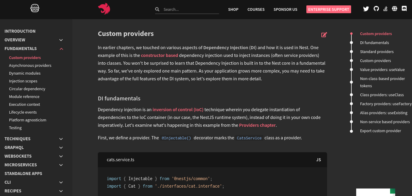
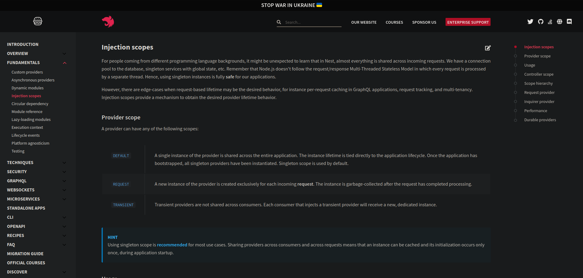
I believe we could also apply CSS filters to template illustrations we have, for example, the one we have on the Modules page:
to:
CSS:
filter: invert(1) contrast(0.85);
box-shadow: 0 0 50px #fff;
I have a great suggestion, why not move to Docusaurus or Vitepress. These are tools built specifically for this type of website and they are used by a lot of tech companies and startups.
Because migrating something that has proved to work well for several years makes zero sense
Ok, I added the css rule for illustrative images 🔥, these are the following links to check them:
- https://deploy-preview-1138--docs-nestjs.netlify.app/controllers
- https://deploy-preview-1138--docs-nestjs.netlify.app/providers
- https://deploy-preview-1138--docs-nestjs.netlify.app/modules
- https://deploy-preview-1138--docs-nestjs.netlify.app/middleware
- https://deploy-preview-1138--docs-nestjs.netlify.app/exception-filters
- https://deploy-preview-1138--docs-nestjs.netlify.app/pipes
- https://deploy-preview-1138--docs-nestjs.netlify.app/guards
- https://deploy-preview-1138--docs-nestjs.netlify.app/interceptors
- https://deploy-preview-1138--docs-nestjs.netlify.app/microservices/basics
- https://deploy-preview-1138--docs-nestjs.netlify.app/microservices/redis
- https://deploy-preview-1138--docs-nestjs.netlify.app/websockets/gateways
- https://deploy-preview-1138--docs-nestjs.netlify.app/fundamentals/lifecycle-events
There are these two pages:
- https://deploy-preview-1138--docs-nestjs.netlify.app/openapi/types-and-parameters
- https://deploy-preview-1138--docs-nestjs.netlify.app/recipes/documentation
which have images with always white background, but the css rule is not very suitable in this case 😅. (See the example screenshot) and at the moment I left them as they are without using the css rule. 😅
Let me know what you think and if you have any ideas for those two pages. 😄
Button colors don't match


The colors of the buttons have been changed to increase the contrast. In the documentation currently the contrast is low as a percentage(see screenshot)
If you use chrome's development tools you can control the contrast percentage on colors.
This only if you want to have colors with correct contrast and that are clearly visible during the light / dark mode change 🙂
It doesn't match the logo color now though
Okay, I would say it should now be similar/equal to the color of the logo 😅
link preview: https://deploy-preview-1138--docs-nestjs.netlify.app/ 🔥
We should use this SVG to remove the problematic white artifacts
https://valor-software.com/assets/img/valor-img/valor-logo.svg.
I made a change to the logo so that I removed those white parts in the lettering, now in dark mode it displays like this:
Link preview: https://deploy-preview-1138--docs-nestjs.netlify.app 🔥
then if we want to update the logo let me know 🙂
After signing up for the newsletter, the checkbox is still quite light:
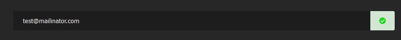
Fixed! ✅ see commit here: https://github.com/nestjs/docs.nestjs.com/pull/1138/commits/319555e735a307e78dc23c61db6873a64b7429d7
Thanks for the reporting!
Link preview: https://deploy-preview-1138--docs-nestjs.netlify.app/ 🔥
Please, merge it ASAP. My eyes are bleeding when reading these docs in the evening. Implementation of this feature is taking 3 years now
@kamilmysliwiec please consider merging this feature. There are many people who are photophobic. This is a disorder and is very frustrating. For many people this is not about style or being cool, it's just about health.