MuseScore
 MuseScore copied to clipboard
[MU4 Issue] Text and many things looks thinner in MU4
Describe the bug Comparing with MU3, many things looks thinner in MU4
To Reproduce Open any score or create new ones to compare with
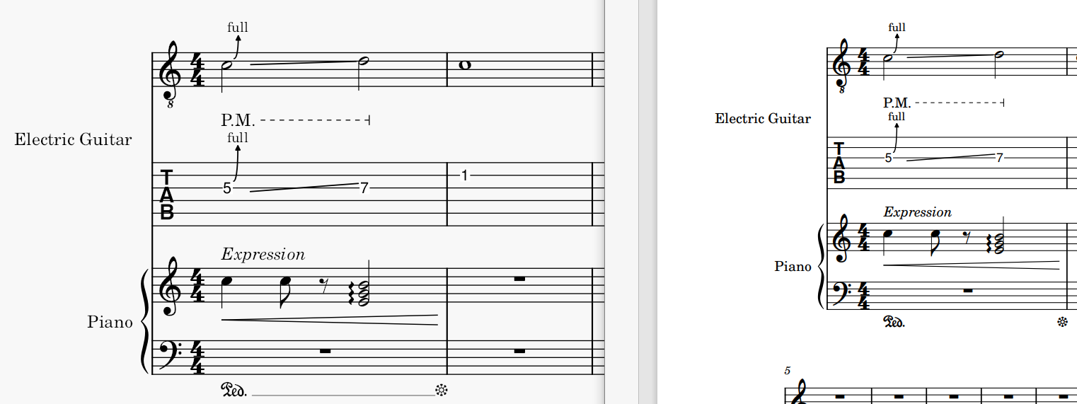
Screenshots

These two are new created scores with default settings, I see differences between:
- texts, like instrument names, expression text, dynamic, bending and P.M. marks
- lines, like P.M. segment line, note beams and eighth rest
- other things like clefs, time signatures, whole and half note stokes, arpeggio line, pedal marks and its end
I was wondering if that was an intended design change, but in new videos everything looks thick and solid
Platform information
- MU4: OS: Windows 10 Version 2009, Arch.: x86_64, MuseScore version (64-bit): 4.0.0-223472200, revision: github-musescore-musescore-5485621
- MU3: OS: Windows 10 (10.0), Arch.: x86_64, MuseScore version (64-bit): 3.6.2.548021803, revision: github-musescore-musescore-3224f34
Additional Info Tried to toggle ClearType but nothing changes, in fact it doesn't affect any appearance of any version of musescore
I think this is generally a consequence of the different UI rendering framework (QML instead of Qt Widgets). That would mean that graphics export should produce the same result as in MS3. (If that's not the case, then it might be because MS4 uses a different version of Qt than MS3.)
The changed length of the dashes for the P.M. line is an intended design change.
Based on a neutral sample of Edwin (the font in question) from another source (Inkscape so GTK), MU4 looks closer, but this may just be my perception.
This is from Inkscape:
Sorry I didn't mean to close it...
This is MU4 exported PDF comparing to MU4 itself, the PDF definitely looks thicker and closer to MU3 though at a smaller scaling. The pedal line is missing because it's set to invisible by default
This is quite bad actually; it's not WYSIWYG now, if I'm looking at this rendering result in MS4 on the left, I might toggle bold for these texts, which would result in overly bold font after exported to PDF