fluentui
 fluentui copied to clipboard
 microsoft
[Feature]: SpinButton Chevron Token & Spacing Updates (Needs: Backlog Review)
Library
React Components / v9 (@fluentui/react-components)
Describe the feature that you would like added
There are 2 updates for SpinButton:
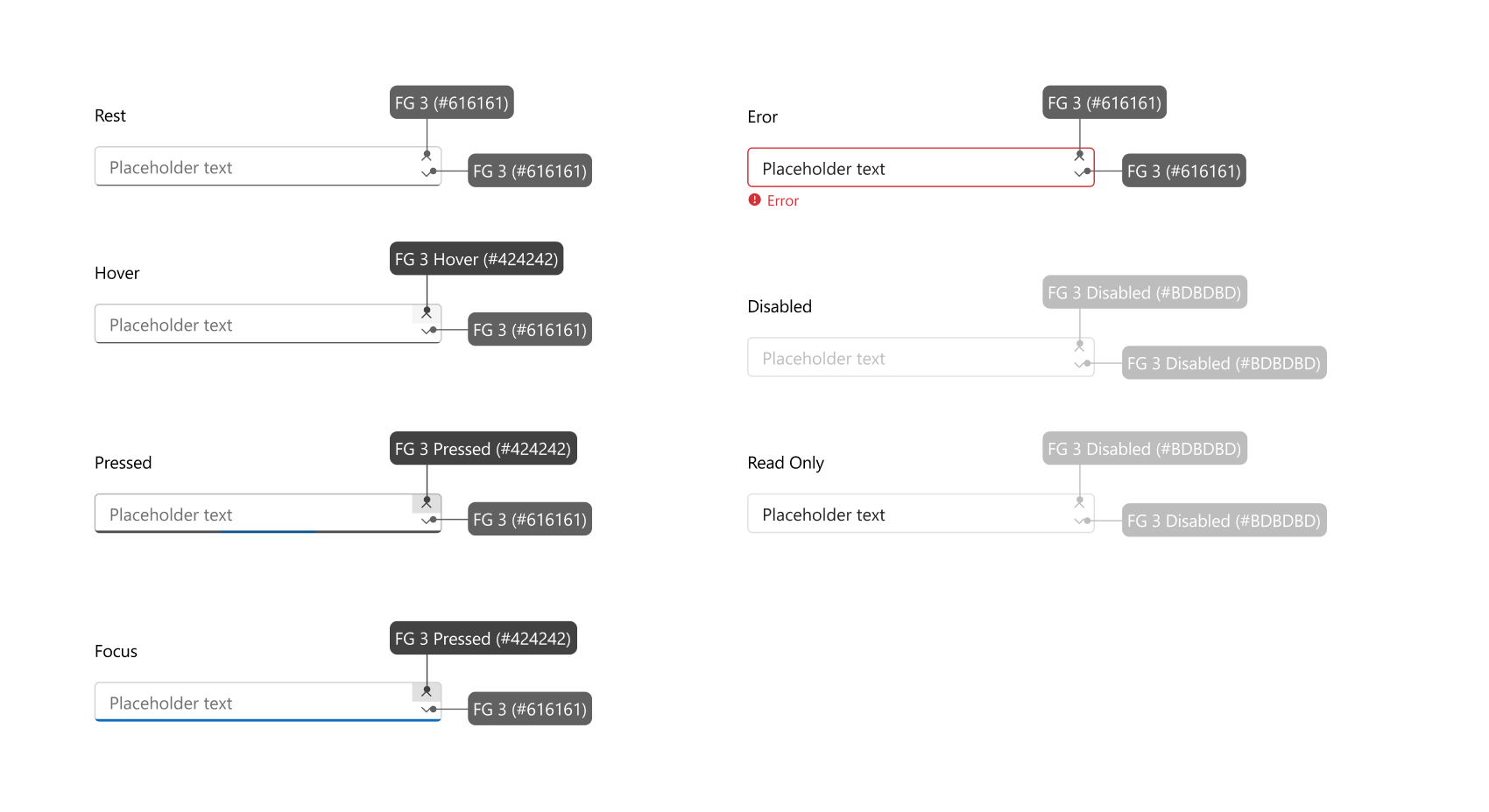
1. SpinButton chevron token updates
Spin Up and Down chevron tokens need to change depending on the state they are in. Ex. The Spin Up and Down chevrons are FG 3 in rest, but if a spin up is in hover then the chevron token should change along with it. So from FG 3 to FG 3 hover. See below:
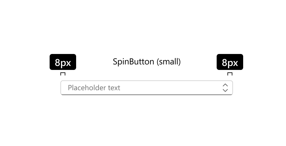
2. Small SpinButton padding space
In order to align with the other input controls, the small SpinButton needs an adjustment in the left and right padding so that they are both 8px. See below:
Thank you!
Have you discussed this feature with our team
Sean Monahan
Additional context
No response
Validations
- [X] Check that there isn't already an issue that request the same feature to avoid creating a duplicate.
@emilyamclean thanks for filing this, just to know for next time. Each change/problem/issue should be in it's own issue, so this should be 2 issues, this lets us triage the two issues independently.
These changes are visual breaking changes, and should not be made without a major revision. We do bend the rules on colors with there are accessibility issues.
We need to understand the impact of not making these changes better to be able to consider these changes. I'm less worried about the color change on hover, but the size change could cause layout issues in applications.
This issue has been automatically marked as stale because it has marked as requiring author feedback but has not had any activity for 4 days. It will be closed if no further activity occurs within 3 days of this comment. Thank you for your contributions to Fluent UI!
Hey @JustSlone! @spmonahan mentioned I could put these both in one ticket for him to update.
Colour updates: The colour updates are to ensure consistency to what's been updated in the UI kit. I originally specced the colours incorrectly, and found the mistake while reviewing the UI kit component.
Size updates: This was a part of a discussion to align all input controls across the board (such as textarea, dropdown, spinbutton, etc). We want to make sure the spacing is consistent. See here for the audit that was done: https://www.figma.com/file/1a1hBVizk7aLH76IvrnPFs/Checkbox?node-id=3771%3A8479
@emilyamclean Looks like the chevron color tokens are already correct, just very subtle.
https://user-images.githubusercontent.com/93940821/196556750-5165ec37-dcff-457b-826d-c027f0fad579.mp4